Bertrand or (The Importance of Defining Problems Properly)

We better keep an eye on this one: she is tricky (Michael Banks, talking about Mary Poppins)

Professor Bertrand teaches Simulation and someday, ask his students:

Given a circumference, what is the probability that a chord chosen at random is longer than a side of the equilateral triangle inscribed in the circle?

Since they must reach the answer through simulation, very approximate solutions are welcome.

Some students choose chords as the line between two random points on the circumference and conclude that the asked probability is around 1/3. This is the plot of one of their simulations, where 1000 random chords are chosen according this method and those longer than the side of the equilateral triangle are red coloured (smalller in grey):

Bertrand1

Some others choose a random radius and a random point in it. The chord then is the perpendicular through this point. They calculate that the asked probability is around 1/2:

Bertrand2

And some others choose a random point inside the circle and define the chord as the only one with this point as midpoint. For them, the asked probability is around 1/4:

Bertrand3

Who is right? Professor Bertrand knows that everybody is. In fact, his main purpose was to show how important is to define problems properly. Actually, he used this to give an unforgettable lesson to his students.

library(ggplot2)
n=1000
opt=theme(legend.position="none",
          panel.background = element_rect(fill="white"),
          panel.grid = element_blank(),
          axis.ticks=element_blank(),
          axis.title=element_blank(),
          axis.text =element_blank())
#First approach
angle=runif(2*n, min = 0, max = 2*pi)
pt1=data.frame(x=cos(angle), y=sin(angle))
df1=cbind(pt1[1:n,], pt1[((n+1):(2*n)),])
colnames(df1)=c("x1", "y1", "x2", "y2")
df1$length=sqrt((df1$x1-df1$x2)^2+(df1$y1-df1$y2)^2)
p1=ggplot(df1) + geom_segment(aes(x = x1, y = y1, xend = x2, yend = y2, colour=length>sqrt(3)), alpha=.4, lwd=.6)+
  scale_colour_manual(values = c("gray75", "red"))+opt
#Second approach
angle=2*pi*runif(n)
pt2=data.frame(aa=cos(angle), bb=sin(angle))
pt2$x0=pt2$aa*runif(n)
pt2$y0=pt2$x0*(pt2$bb/pt2$aa)
pt2$a=1+(pt2$x0^2/pt2$y0^2)
pt2$b=-2*(pt2$x0/pt2$y0)*(pt2$y0+(pt2$x0^2/pt2$y0))
pt2$c=(pt2$y0+(pt2$x0^2/pt2$y0))^2-1
pt2$x1=(-pt2$b+sqrt(pt2$b^2-4*pt2$a*pt2$c))/(2*pt2$a)
pt2$y1=-pt2$x0/pt2$y0*pt2$x1+(pt2$y0+(pt2$x0^2/pt2$y0))
pt2$x2=(-pt2$b-sqrt(pt2$b^2-4*pt2$a*pt2$c))/(2*pt2$a)
pt2$y2=-pt2$x0/pt2$y0*pt2$x2+(pt2$y0+(pt2$x0^2/pt2$y0))
df2=pt2[,c(8:11)]
df2$length=sqrt((df2$x1-df2$x2)^2+(df2$y1-df2$y2)^2)
p2=ggplot(df2) + geom_segment(aes(x = x1, y = y1, xend = x2, yend = y2, colour=length>sqrt(3)), alpha=.4, lwd=.6)+
scale_colour_manual(values = c("gray75", "red"))+opt
#Third approach
angle=2*pi*runif(n)
radius=runif(n)
pt3=data.frame(x0=sqrt(radius)*cos(angle), y0=sqrt(radius)*sin(angle))
pt3$a=1+(pt3$x0^2/pt3$y0^2)
pt3$b=-2*(pt3$x0/pt3$y0)*(pt3$y0+(pt3$x0^2/pt3$y0))
pt3$c=(pt3$y0+(pt3$x0^2/pt3$y0))^2-1
pt3$x1=(-pt3$b+sqrt(pt3$b^2-4*pt3$a*pt3$c))/(2*pt3$a)
pt3$y1=-pt3$x0/pt3$y0*pt3$x1+(pt3$y0+(pt3$x0^2/pt3$y0))
pt3$x2=(-pt3$b-sqrt(pt3$b^2-4*pt3$a*pt3$c))/(2*pt3$a)
pt3$y2=-pt3$x0/pt3$y0*pt3$x2+(pt3$y0+(pt3$x0^2/pt3$y0))
df3=pt3[,c(6:9)]
df3$length=sqrt((df3$x1-df3$x2)^2+(df3$y1-df3$y2)^2)
p3=ggplot(df3) + geom_segment(aes(x = x1, y = y1, xend = x2, yend = y2, colour=length>sqrt(3)), alpha=.4, lwd=.6)+scale_colour_manual(values = c("gray75", "red"))+opt

Odd Connections Inside The NASDAQ-100

Distinguishing the signal from the noise requires both scientific knowledge and self-knowledge (Nate Silver, author of The Signal and the Noise)

Analyzing the evolution of NASDAQ-100 stock prices can discover some interesting couples of companies which share a strong common trend despite of belonging to very different sectors. The NASDAQ-100 is made up of 107 equity securities issued by 100 of the largest non-financial companies listed on the NASDAQ. On the other side, Yahoo! Finance is one of the most popular services to consult financial news, data and commentary including stock quotes, press releases, financial reports, and original programming. Using R is possible to download the evolution of NASDAQ-100 symbols from Yahoo! Finance. There is a R package called quantmod which makes this issue quite simple with the function getSymbols. Daily series are long enough to do a wide range of analysis, since most of them start in 2007.

One robust way to determine if two times series, xt and yt, are related is to analyze if there exists an equation like yt=βxt+ut such us residuals (ut) are stationary (its mean and variance does not change when shifted in time). If this happens, it is said that both series are cointegrated. The way to measure it in R is running the Augmented Dickey-Fuller test, available in tseries package. Cointegration analysis help traders to design products such spreads and hedges.

There are 5.671 different couples between the 107 stocks of NASDAQ-100. After computing the Augmented Dickey-Fuller test to each of them, the resulting data frame can be converted into a distance matrix. A nice way to visualize distances between stocks is to do a hierarchical clustering. This is the resulting dendogram of the clustering:

Dendogram

Close stocks such as Ca Inc. (CA) and Bed Bath & Beyond Inc. (BBBY) are joined with short links. A quick way to extract close couples is to cut this dendogram in a big number of clusters and keep those with two elements. Following is the list of the most related stock couples cutting dendogram in 85 clusters:

Couples

Most of them are strange neighbors. Next plot shows the evolution closing price evolution of four of these couples:

examples

Analog Devices Inc. (ADI) makes semiconductors and Discovery Communications Inc. (DISCA) is a mass media company. PACCAR Inc. (PCAR) manufactures trucks and Paychex Inc. (PAYX) provides HR outsourcing. CA Inc. (CA) creates software and Bed Bath & Beyond Inc. (BBBY) sells goods for home. Twenty-First Century Fox Inc. (FOX) is a mass media company as well and EBAY Inc. (EBAY) does online auctions‎. All of them are odd connections.

This is the code of the experiment:

library("quantmod")
library("TSdist")
library("ade4")
library("ggplot2")
library("Hmisc")
library("zoo")
library("scales")
library("reshape2")
library("tseries")
library("RColorBrewer")
library("ape")
library("sqldf")
library("googleVis")
library("gridExtra")
setwd("YOUR-WORKING-DIRECTORY-HERE")
temp=tempfile()
download.file("http://www.nasdaq.com/quotes/nasdaq-100-stocks.aspx?render=download",temp)
data=read.csv(temp, header=TRUE)
for (i in 1:nrow(data)) getSymbols(as.character(data[i,1]))
results=t(apply(combn(sort(as.character(data[,1]), decreasing = TRUE), 2), 2,
function(x) {
ts1=drop(Cl(eval(parse(text=x[1]))))
ts2=drop(Cl(eval(parse(text=x[2]))))
t.zoo=merge(ts1, ts2, all=FALSE)
t=as.data.frame(t.zoo)
m=lm(ts2 ~ ts1 + 0, data=t)
beta=coef(m)[1]
sprd=t$ts1 - beta*t$ts2
ht=adf.test(sprd, alternative="stationary", k=0)$p.value
c(symbol1=x[1], symbol2=x[2], (1-ht))}))
results=as.data.frame(results)
colnames(results)=c("Sym1", "Sym2", "TSdist")
results$TSdist=as.numeric(as.character(results$TSdist))
save(results, file="results.RData")
load("results.RData")
m=as.dist(acast(results, Sym1~Sym2, value.var="TSdist"))
hc = hclust(m)
# vector of colors
op = par(bg = "darkorchid4")
plot(as.phylo(hc), type = "fan", tip.color = "gold", edge.color ="gold", cex=.8)
# cutting dendrogram in 85 clusters
clusdf=data.frame(Symbol=names(cutree(hc, 85)), clus=cutree(hc, 85))
clusdf2=merge(clusdf, data[,c(1,2)], by="Symbol")
sizes=sqldf("SELECT * FROM (SELECT clus, count(*) as size FROM clusdf GROUP BY 1) as T00 WHERE size>=2")
sizes2=merge(subset(sizes, size==2), clusdf2, by="clus")
sizes2$id=sequence(rle(sizes2$clus)$lengths)
couples=merge(subset(sizes2, id==1)[,c(1,3,4)], subset(sizes2, id==2)[,c(1,3,4)], by="clus")
couples$"Company 1"=apply(couples[ , c(2,3) ] , 1 , paste , collapse = " -" )
couples$"Company 2"=apply(couples[ , c(4,5) ] , 1 , paste , collapse = " -" )
CouplesTable=gvisTable(couples[,c(6,7)])
plot(CouplesTable)
# Plots
opts2=theme(
panel.background = element_rect(fill="gray98"),
panel.border = element_rect(colour="black", fill=NA),
axis.line = element_line(size = 0.5, colour = "black"),
axis.ticks = element_line(colour="black"),
panel.grid.major = element_line(colour="gray75", linetype = 2),
panel.grid.minor = element_blank(),
axis.text = element_text(colour="gray25", size=12),
axis.title = element_text(size=18, colour="gray10"),
legend.key = element_rect(fill = "white"),
legend.text = element_text(size = 14),
legend.background = element_rect(),
plot.title = element_text(size = 35, colour="gray10"))
plotPair = function(Symbol1, Symbol2)
{
getSymbols(Symbol1)
getSymbols(Symbol2)
close1=Cl(eval(parse(text=Symbol1)))
close2=Cl(eval(parse(text=Symbol2)))
cls=merge(close1, close2, all = FALSE)
df=data.frame(date = time(cls), coredata(cls))
names(df)[-1]=c(Symbol1, Symbol2)
df1=melt(df, id.vars = "date", measure.vars = c(Symbol1, Symbol2))
ggplot(df1, aes(x = date, y = value, color = variable))+
geom_line(size = I(1.2))+
scale_color_discrete(name = "")+
scale_x_date(labels = date_format("%Y-%m-%d"))+
labs(x="Date", y="Closing Price")+
opts2
}
p1=plotPair("ADI", "DISCA")
p2=plotPair("PCAR", "PAYX")
p3=plotPair("CA", "BBBY")
p4=plotPair("FOX", "EBAY")
grid.arrange(p1, p2, p3, p4, ncol=2)

Analysing The Rock ‘n’ Roll Madrid Marathon

Nobody’s going to win all the time. On the highway of life you can’t always be in the fast lane (Haruki Murakami, What I Talk About When I Talk About Running)

I started running two years ago and one if my dreams is to run a marathon someday. One month ago I run my first half marathon so this day is become closer but I am in no hurry to do it. Meanwhile, I prefer analysing the results of the last edition of the Rock ‘n’ Roll Madrid marathon which, by the way, will be hold again next weekend. This is the first time I do webscraping to download data from a website and it has been quite easy thanks to rvest package.

Once I go over this website form, I have timings of every runner (more than 11.000) at 5, 10, 15, 20, 21.097, 25, 30, 35, 40, and 42.195 kilometers. This, togheter with the category of each runner is the base for my analysis. I remove categories with a small number of runners.

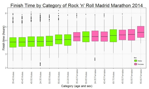
This is the Box plot of the finish time by category:

Finish Time

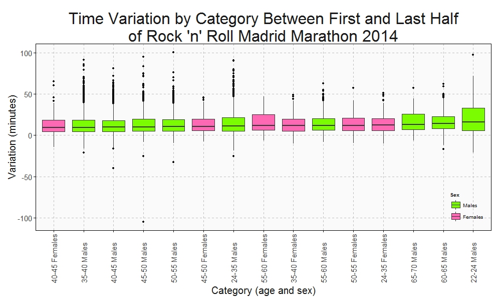
Who maintains the rhythm better? Since I have the time at the end and at the middle (21.097 km), I can do a Box plot with the variation time between first and second half of the Marathon:

Variation Time

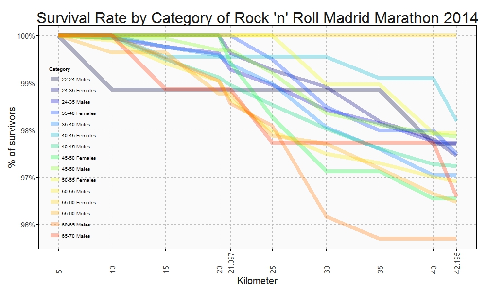
Only a handful of people pull out of the Marathon before finishing but once again this rate is not the same between categories. This is the survival rate by category along the race:

Survival Rate

This plots show some interesting things:

  • Fastest category is 35-40 years old for both genders
  • Fastest individuals are inside 24-35 years old for both genders
  • Youngest ages are not the fastest
  • Between 40-45 category is the second fastest for men and the third one for women
  • Females between 40-45 keep the most constant rhythm of all categories.
  • Young men between 22-24 years old are the most unconstant: their second half rhythm is much slower than the first one.
  • All females between 55-60 years old ended the marathon
  • On the other hand, males between 60-65 are the category with most ‘deads’ during the race

Long life forties:

library(rvest)
library(lubridate)
library(ggplot2)
library(plyr)
library(sqldf)
library(scales)
library(gplots)
setwd("YOUR WORKING DIRECTORY HERE")
maraton_web="http://www.maratonmadrid.org/resultados/clasificacion.asp?carrera=13&parcial=par1&clasificacion=1&dorsal=&nombre=&apellidos=&pais=&pagina=par2"
#Grid with parameters to navigate in the web to do webscraping
searchdf=rbind(expand.grid( 1, 0:32), expand.grid( 2, 0:55), expand.grid( 3, 0:56), expand.grid( 4, 0:56),
               expand.grid( 5, 0:56), expand.grid( 6, 0:55), expand.grid( 7, 0:55), expand.grid( 8, 0:55),
               expand.grid( 9, 0:53), expand.grid(10, 0:55))
colnames(searchdf)=c("parcial", "pagina")
#Webscraping. I open the webpage and download the related table with partial results
results=data.frame()
for (i in 1:nrow(searchdf))
{
  maraton_tmp=gsub("par2", searchdf[i,2], gsub("par1", searchdf[i,1], maraton_web))
  df_tmp=html(maraton_tmp) %>% html_nodes("table") %>% .[[3]] %>% html_table()
  results=rbind(results, data.frame(searchdf[i,1], df_tmp[,1:7]))
}
#Name the columns
colnames(results)=c("Partial", "Place", "Bib", "Name", "Surname", "Cat", "Gross", "Net")
#Since downloadind data takes time, I save results in RData format
save(results, file="results.RData")
load("results.RData")
#Translate Net timestamp variable into hours
results$NetH=as.numeric(dhours(hour(hms(results$Net)))+dminutes(minute(hms(results$Net)))+dseconds(second(hms(results$Net))))/3600
results$Sex=substr(results$Cat, 3, 4)
#Translate Cat into years and gender
results$Cat2=revalue(results$Cat, 
                     c("A-F"="18-22 Females", "A-M"="18-22 Males", "B-F"="22-24 Females", "B-M"="22-24 Males", "C-F"="24-35 Females", "C-M"="24-35 Males", 
                       "D-F"="35-40 Females", "D-M"="35-40 Males", "E-F"="40-45 Females", "E-M"="40-45 Males", "F-F"="45-50 Females", "F-M"="45-50 Males", 
                       "G-F"="50-55 Females", "G-M"="50-55 Males", "H-F"="55-60 Females", "H-M"="55-60 Males", "I-F"="60-65 Females", "I-M"="60-65 Males", 
                       "J-F"="65-70 Females", "J-M"="65-70 Males", "K-F"="+70 Females", "K-M"="+70 Males"))
#Translate partial code into kilometers
results$PartialKm=mapvalues(results$Partial, from = c(1, 2, 3, 4, 5, 6, 7, 8, 9, 10), to = c(5, 10, 15, 20, 21.097, 25, 30, 35, 40, 42.195))
#There are some categories with very few participants. I will remove from the analysis
count(subset(results, Partial==10), "Cat")
#General options for ggplot
opts=theme(
  panel.background = element_rect(fill="gray98"),
  panel.border = element_rect(colour="black", fill=NA),
  axis.line = element_line(size = 0.5, colour = "black"),
  axis.ticks = element_line(colour="black"),
  panel.grid.major = element_line(colour="gray75", linetype = 2),
  panel.grid.minor = element_blank(),
  axis.text = element_text(colour="gray25", size=15),
  axis.title = element_text(size=20, colour="gray10"),
  legend.key = element_blank(),
  legend.background = element_blank(),
  plot.title = element_text(size = 32, colour="gray10"))
#Data set with finish times
results1=subset(results, Partial==10 & !(Cat %in% c("A-F", "A-M", "B-F", "I-F", "J-F", "K-F", "K-M")))
ggplot(results1, aes(x=reorder(Cat2, NetH, FUN=median), y=NetH)) + geom_boxplot(aes(fill=Sex), colour = "gray25")+
  scale_fill_manual(values=c("hotpink", "lawngreen"), name="Sex", breaks=c("M", "F"), labels=c("Males", "Females"))+
  labs(title="Finish Time by Category of Rock 'n' Roll Madrid Marathon 2014", x="Category (age and sex)", y="Finish time (hours)")+
  theme(axis.text.x = element_text(angle = 90, vjust=.5, hjust = 0), legend.justification=c(1,0), legend.position=c(1,0))+opts
#Data set with variation times
results2=sqldf("SELECT 
               a.Bib, a.Sex, b.Cat2, (a.NetH-2*b.NetH)*60 as VarMin
               FROM results1 a INNER JOIN results b ON (a.Bib = b.Bib AND b.Partial=5) order by VarMin asc")
ggplot(results2, aes(x=reorder(Cat2, VarMin, FUN=median), y=VarMin)) + geom_boxplot(aes(fill=Sex))+
  scale_fill_manual(values=c("hotpink", "lawngreen"), name="Sex", breaks=c("M", "F"), labels=c("Males", "Females"))+
  labs(title="Time Variation by Category Between First and Last Half\nof Rock 'n' Roll Madrid Marathon 2014", x="Category (age and sex)", y="Variation (minutes)")+
  theme(axis.text.x = element_text(angle = 90, vjust=.5, hjust = 0), legend.justification=c(1,0), legend.position=c(1,0))+opts
 
results3_tmp1=expand.grid(Cat2=unique(results$Cat2), PartialKm=unique(results$PartialKm))
results3_tmp2=sqldf("SELECT Bib, Sex, Cat2, Max(PartialKm) as PartialKmMax FROM results 
                   WHERE Cat NOT IN ('A-F', 'A-M', 'B-F', 'I-F', 'J-F', 'K-F', 'K-M') GROUP BY 1,2,3")
results3_tmp3=sqldf("SELECT PartialKmMax, Sex, Cat2, COUNT(*) AS Runners FROM results3_tmp2 GROUP BY 1,2,3")
results3_tmp4=sqldf("SELECT a.Cat2, a.PartialKm, SUM(Runners) as Runners FROM results3_tmp1 a INNER JOIN results3_tmp3 b
                    on (a.Cat2 = b.Cat2 AND b.PartialKmMax>=a.PartialKm) 
                    GROUP BY 1,2")
#Data set with survival rates
results3=sqldf("SELECT a.Cat2, a.PartialKm, a.Runners*1.00/b.Runners*1.00 as Po_Survivors
               FROM results3_tmp4 a INNER JOIN (SELECT Cat2, COUNT(*) as Runners FROM results3_tmp2 GROUP BY 1) b
               ON (a.Cat2 = b.Cat2)")
ggplot(results3, aes(x=PartialKm, y=Po_Survivors, group=Cat2, colour=Cat2)) + geom_line(lwd=3)+
  scale_color_manual(values=alpha(rich.colors(15, palette="temperature"), 0.3), name="Category")+
  scale_x_continuous(breaks = unique(results3$PartialKm), labels=c("5", "10", "15", "20", "21.097", "25", "30", "35", "40", "42.195"))+
  scale_y_continuous(labels = percent)+
  labs(title="Survival Rate by Category of Rock 'n' Roll Madrid Marathon 2014", x="Kilometer", y="% of survivors")+
  theme(axis.text.x = element_text(angle = 90, vjust=.5, hjust = 0), legend.justification=c(1,0), legend.position=c(.15,0))+opts

Discovering Shiny

It is not an experiment if you know it is going to work (Jeff Bezos)

From time to time, I discover some of my experiments translated into Shiny Apps, like this one. Some days ago, I discovered one of these translations and I contacted the author, who was a guy from Vietnam called Vu Anh. I asked him to do a Shiny App from this experiment. Vu was enthusiastic with the idea. We defined some parameters to play with shape, number, width and alpha of lines as well as background color and I received a perfect release of the application in just a few hours. With just a handful of parameters, possible outputs are almost infinite. Following you can find some of them:

SinyCollageI think the code is a nice example to take the first steps in Shiny. If you are not used to Markdown files, you can follow this instructions to run the code.

Vu is a talented guy, who loves maths and programming. He represents the future of our nice profession and I predict a successful future for him. Do not miss his brand new blog. I am sure you will find amazing things there.

This is the code of the app:

---
title: "Maths, Music and Merkbar"
author: "Brother Rain"
date: "18/03/2015"
output: html_document
runtime: shiny
---
 
## Load Data
 
```{r}
library(circlize)
library(scales)
factors = as.factor(0:9)
lines = 2000 #Number of lines to plot in the graph
alpha = 0.4  #Alpha for color lines
colors0=c(
    rgb(239,143,121, max=255),
    rgb(126,240,188, max=255),
    rgb(111,228,235, max=255),
    rgb(127,209,249, max=255),
    rgb( 74,106,181, max=255),
    rgb(114,100,188, max=255),
    rgb(181,116,234, max=255),
    rgb(226,135,228, max=255),
    rgb(239,136,192, max=255),
    rgb(233,134,152, max=255)
)
# You can find the txt file here:
# http://www.goldennumber.net/wp-content/uploads/2012/06/Phi-To-100000-Places.txt
phi=readLines("data/Phi-To-100000-Places.txt")[5]
```
 
## Visualization
 
```{r, echo=FALSE}
fluidPage(
  fluidRow(
    column(width = 4,
        sidebarPanel(
            sliderInput("lines", "Number of lines:", min=100, max=100000, step=100, value=500), 
            sliderInput("alpha", "Alpha:", min=0.01, max=1, step=0.01, value=0.4),
            sliderInput("lwd", "Line width", min=0, max=1, step=0.05, value=0.2),
            selectInput("background", "Background:",
                c("Purple" = "mediumpurple4", "Gray" = "gray25", "Orange"="orangered4", 
                  "Red" = "red4", "Brown"="saddlebrown", "Blue"="slateblue4", 
                  "Violet"="palevioletred4", "Green"="forestgreen", "Pink"="deeppink"), selected="Purple"),
            sliderInput("h0", "h0:", min=0, max=0.4,
                    step=0.0005, value=0.1375),
           sliderInput("h1", "h1:", min=0, max=0.4,
                step=0.0005, value=0.1125),
            width=12
        )
    ),
    column(width = 8,
        renderPlot({
            # get data
            phi=gsub("\\.","", substr(phi,1,input$lines))
            phi=gsub("\\.","", phi)
            position=1/(nchar(phi)-1)
             
            # create circos
            circos.clear()
            par(mar = c(1, 1, 1, 1), lwd = 0.1,
                cex = 0.7, bg=alpha(input$background, 1))
            circos.par(
                "cell.padding"=c(0.01,0.01),
                "track.height" = 0.025,
                "gap.degree" = 3
            )
            circos.initialize(factors = factors, xlim = c(0, 1))
            circos.trackPlotRegion(factors = factors, ylim = c(0, 1))
            ## create first region
            for (i in 0:9) {
                circos.updatePlotRegion(
                    sector.index = as.character(i),
                    bg.col = alpha(input$background, 1),
                    bg.border=alpha(colors0[i+1], 1)
                )
            }
            for (i in 1:(nchar(phi)-1)) {
                m=min(as.numeric(substr(phi, i, i)), as.numeric(substr(phi, i+1, i+1)))
                M=max(as.numeric(substr(phi, i, i)), as.numeric(substr(phi, i+1, i+1)))
                d=min((M-m),((m+10)-M))
                col=t(col2rgb(colors0[(as.numeric(substr(phi, i, i))+1)]))
                for(index in 1:3){
                    col[index] = max(min(255, col[index]), 0)
                }
                if (d>0) {
                    circos.link(
                        substr(phi, i, i), position*(i-1),
                        substr(phi, i+1, i+1), position*i,
                        h = input$h0 * d + input$h1,
                        lwd=input$lwd,
                        col=alpha(rgb(col, max=255), input$alpha), rou = 0.92
                    )
                }
            }
            }, width=600, height=600, res=192)
    )
  )
)
 
 
```

NASDAQ 100 Couples

Heaven, I’m in heaven, and my heart beats so that I can hardly speak, and I seem to find the happiness I seek, when we’re out together dancing cheek to cheek (Cheek To Cheek, Irving Berlin)

There are about 6.500 available packages in CRAN repository. If I were a superhuman, able to learn one package a day, I would spend almost 18 years of my life studying R. And how many packages would be uploaded to CRAN during this period? Who knows: R is infinite.

Today, my experiment deals with quantmod package, which allows you to play to be quant for a while. I download the daily quotes of NASDAQ 100 companies and measure distances between each pair of companies. Distance is based on the cross-correlation between two series so high-correlated series (not exceeding a maximum lag) are closer than low-correlated ones. You can read a good description of this distance here. Since NASDAQ 100 contains 107 companies, I calculate distances for 5.671 different couples. Next plot represent distances between each pair of companies. The darker is the color, the closer are the related companies:

Nasdaq100

Yes, I know is not a graph for someone with visual problems. Let me show you an example of what is behind one of these little tiles. Distance between Mattel Inc. and 21st Century Fox is very small (its related tile is dark coloured). Why? Because of this:

MattelFox
These two companies have been dancing cheek to cheek for more than seven years. It is also curious how some companies are far from any of their NASDAQ 100 colleagues. Some examples of these unpaired companies are Express Scripts Holding Company (ESRX), Expeditors International of Washington Inc. (EXPD) and Fastenal Company (FAST). I do not why but there must be an explanation, do not you think so?

Something tells me I will do some other experiment using quantmod package:

library("quantmod")
library("TSdist")
library("ade4")
library("ggplot2")
library("Hmisc")
library("zoo")
library("scales")
library("reshape2")
setwd("YOUR WORKING DIRECTORY HERE")
temp=tempfile()
download.file("http://www.nasdaq.com/quotes/nasdaq-100-stocks.aspx?render=download",temp)
data=read.csv(temp, header=TRUE)
for (i in 1:nrow(data)) getSymbols(as.character(data[i,1]))
results=t(apply(combn(sort(as.character(data[,1]), decreasing = TRUE), 2), 2,
      function(x)
      {
        ts1=drop(Cl(eval(parse(text=x[1]))))
        ts2=drop(Cl(eval(parse(text=x[2]))))
        c(symbol1=x[1], symbol2=x[2], tsDistances(ts1, ts2, distance="crosscorrelation"))
      }))
results=as.data.frame(results)
colnames(results)=c("Sym1", "Sym2", "TSdist")
results$TSdist=as.numeric(as.character(results$TSdist))
results=rbind(results, data.frame(Sym1=as.character(data[,1]), Sym2=as.character(data[,1]), TSdist=0))
results$TSdist2=as.numeric(cut2(results$TSdist, g=4))
opts=theme(axis.text.x = element_text(angle = 90, vjust=.5, hjust = 0),
           panel.background = element_blank(),
           axis.text = element_text(colour="gray25", size=8),
           legend.position = "none",
           panel.grid = element_blank())
ggplot(results,aes(x=Sym2,y=Sym1))+
  geom_tile(aes(fill = TSdist2), colour="gray80")+
  scale_size_continuous(range=c(1,10))+
  scale_x_discrete("", limits=sort(unique(as.character(results$Sym1))))+
  scale_y_discrete("", limits=sort(unique(as.character(results$Sym2)), decreasing = TRUE))+
  scale_fill_gradient(low = "steelblue", high = "white")+
  opts
MAT.close=Cl(MAT)
FOX.close=Cl(FOX)
cls=merge(MAT.close, FOX.close, all = FALSE)
df=data.frame(date = time(cls), coredata(cls))
names(df)[-1]=c("mat", "fox")
df1=melt(df, id.vars = "date", measure.vars = c("mat", "fox"))
opts2=theme(
  panel.background = element_rect(fill="gray98"),
  panel.border = element_rect(colour="black", fill=NA),
  axis.line = element_line(size = 0.5, colour = "black"),
  axis.ticks = element_line(colour="black"),
  panel.grid.major = element_line(colour="gray75", linetype = 2),
  panel.grid.minor = element_blank(),
  axis.text = element_text(colour="gray25", size=15),
  axis.title = element_text(size=18, colour="gray10"),
  legend.key = element_blank(),
  legend.position = "none",
  legend.background = element_blank(),
  plot.title = element_text(size = 40, colour="gray10"))
ggplot(df1, aes(x = date, y = value, color = variable))+
  geom_line(size = I(1.2))+
  scale_color_discrete(guide = "none")+
  scale_x_date(labels = date_format("%Y-%m-%d"))+
  labs(title="Nasdaq 100 Couples: Mattel And Fox", x="Date", y="Closing Price")+
  annotate("text", x = as.Date("2011-01-01", "%Y-%m-%d"), y = c(10, 30), label = c("21st Century Fox", "Mattel Inc."), size=7, colour="gray25")+
  opts2

The World We Live In #4: Marriage Ages

It is time for women to stop being politely angry (Leymah Gbowee, Nobel Prize Peace Winner)

Sometimes very simple plots give insight into we live in a world of differences. This plot shows the mean age at marriage for men and women across countries:

Marriage Ages

Being a woman in some countries of this world must be a hard experience:

#Singulate mean age at marriage: http://data.un.org/Data.aspx?d=GenderStat&f=inID%3a20
#Population: http://data.un.org/Data.aspx?d=SOWC&f=inID%3a105
require("sqldf")
require("ggplot2")
setwd("YOUR WORKING DIRECTORY HERE")
mar=read.csv("UNdata_Export_20150309_171525152.csv", nrows=321, header=T, row.names=NULL)
pop=read.csv("UNdata_Export_20150309_172046384.csv", nrows=999, header=T, row.names=NULL)
colnames(mar)[1]="Country"
colnames(pop)[1]="Country"
data=sqldf("SELECT
  a.Country,
  a.Value as Pop,
  b.Value as Female,
  c.Value as Male
FROM
  pop a INNER JOIN mar b
  ON (a.Country=b.Country AND b.Subgroup='Female') INNER JOIN mar c
  ON (a.Country=c.Country AND c.Subgroup='Male')
WHERE a.Subgroup = 'Total'")
opts=theme(
  panel.background = element_rect(fill="gray98"),
  panel.border = element_rect(colour="black", fill=NA),
  axis.line = element_line(size = 0.5, colour = "black"),
  axis.ticks = element_line(colour="black"),
  panel.grid.major = element_line(colour="gray75", linetype = 2),
  panel.grid.minor = element_blank(),
  axis.text = element_text(colour="gray25", size=15),
  axis.title = element_text(size=18, colour="gray10"),
  legend.key = element_blank(),
  legend.position = "none",
  legend.background = element_blank(),
  plot.title = element_text(size = 40, colour="gray10"))
ggplot(data, aes(x=Female, y=Male, size=log(Pop), label=Country), guide=FALSE)+
  geom_point(colour="white", fill="chartreuse3", shape=21, alpha=.55)+
  scale_size_continuous(range=c(2,36))+
  scale_x_continuous(limits=c(16,36), breaks=seq(16, 36, by = 2), expand = c(0, 0))+
  scale_y_continuous(limits=c(16,36), breaks=seq(16, 36, by = 2), expand = c(0, 0))+
  geom_abline(intercept = 0, slope = 1, colour = "gray10", linetype=2)+
  labs(title="The World We Live In #4: Marriage Ages",
       x="Females mean age at marriage",
       y="Males mean age at marriage")+
  geom_text(data=subset(data, abs(Female-Male)>7), size=5.5, colour="gray25", hjust=0, vjust=0)+
  geom_text(data=subset(data, Female>=32|Female<=18), size=5.5, colour="gray25", hjust=0, vjust=0)+
  geom_text(aes(24, 17), colour="gray25", hjust=0, label="Source: United Nations (size of bubble depending on population)", size=5)+opts

Visual Complexity

Oh, can it be, the voices calling me, they get lost and out of time (Little Black Submarines, The Black Keys)

Last October I did this experiment about complex domain coloring. Since I like giving my posts a touch of randomness, I have done this experiment. I plot four random functions on the form p1(x)*p2(x)/p3(x) where pi(x) are polynomials up-to-4th-grade with random coefficients following a chi-square distribution with degrees of freedom between 2 and 5. I measure the function over the complex plane and arrange the four resulting plots into a 2×2 grid. This is an example of the output:
Surrealism Every time you run the code you will obtain a completely different output. I have run it hundreds of times because results are always surprising. Do you want to try? Do not hesitate to send me your creations. What if you change the form of the functions or the distribution of coefficients? You can find my email here.

setwd("YOUR WORKING DIRECTORY HERE")
require(polynom)
require(ggplot2)
library(gridExtra)
ncol=2
for (i in 1:(10*ncol)) {eval(parse(text=paste("p",formatC(i, width=3, flag="0"),"=as.function(polynomial(rchisq(n=sample(2:5,1), df=sample(2:5,1))))",sep="")))}
z=as.vector(outer(seq(-5, 5, by =.02),1i*seq(-5, 5, by =.02),'+'))
opt=theme(legend.position="none",
          panel.background = element_blank(),
          panel.margin = unit(0,"null"),
          panel.grid = element_blank(),
          axis.ticks= element_blank(),
          axis.title= element_blank(),
          axis.text = element_blank(),
          strip.text =element_blank(),
          axis.ticks.length = unit(0,"null"),
          axis.ticks.margin = unit(0,"null"),
          plot.margin = rep(unit(0,"null"),4))
for (i in 1:(ncol^2))
{
  pols=sample(1:(10*ncol), 3, replace=FALSE)
  p1=paste("p", formatC(pols[1], width=3, flag="0"), "(x)*", sep="")
  p2=paste("p", formatC(pols[2], width=3, flag="0"), "(x)/", sep="")
  p3=paste("p", formatC(pols[3], width=3, flag="0"), "(x)",  sep="")
  eval(parse(text=paste("p = function (x) ", p1, p2, p3, sep="")))
  df=data.frame(x=Re(z),
                y=Im(z),
                h=(Arg(p(z))<0)*1+Arg(p(z))/(2*pi),
                s=(1+sin(2*pi*log(1+Mod(p(z)))))/2,
                v=(1+cos(2*pi*log(1+Mod(p(z)))))/2)
  g=ggplot(data=df[is.finite(apply(df,1,sum)),], aes(x=x, y=y)) + geom_tile(fill=hsv(df$h,df$s,df$v))+ opt
  assign(paste("hsv_g", formatC(i, width=3, flag="0"), sep=""), g)
}
jpeg(filename = "Surrealism.jpg", width = 800, height = 800, quality = 100)
grid.arrange(hsv_g001, hsv_g002, hsv_g003, hsv_g004, ncol=ncol)
dev.off()

Silhouettes

Romeo, Juliet, balcony in silhouette, makin o’s with her cigarette, it’s juliet (Flapper Girl, The Lumineers)

Two weeks ago I published this post for which designed two different visualizations. At the end, I decided to place words on the map of the United States. The discarded visualization was this other one, where I place the words over the silhouette of each state:

States In Two Words v1

I do not want to set aside this chart because I really like it and also because I think it is a nice example of the possibilities one have working with R.

Here you have the code. It substitutes the fragment of the code headed by “Visualization” of the original post:

library(ggplot2)
library(maps)
library(gridExtra)
library(extrafont)
opt=theme(legend.position="none",
             panel.background = element_blank(),
             panel.grid = element_blank(),
             axis.ticks=element_blank(),
             axis.title=element_blank(),
             axis.text =element_blank(),
             plot.title = element_text(size = 28))
vplayout=function(x, y) viewport(layout.pos.row = x, layout.pos.col = y)
grid.newpage()
jpeg(filename = "States In Two Words.jpeg", width = 1200, height = 600, quality = 100)
pushViewport(viewport(layout = grid.layout(6, 8)))
for (i in 1:nrow(table))
{
  wd=subset(words, State==as.character(table$"State name"[i]))
  p=ggplot() + geom_polygon( data=subset(map_data("state"), region==tolower(table$"State name"[i])), aes(x=long, y=lat, group = group), colour="white", fill="gold", alpha=0.6, linetype=0 )+opt
  print(p, vp = vplayout(floor((i-1)/8)+1, i%%8+(i%%8==0)*8))
  txt=paste(as.character(table$"State name"[i]),"\n is", wd$word1,"\n and", wd$word2, sep=" ")
  grid.text(txt, gp=gpar(font=1, fontsize=16, col="midnightblue", fontfamily="Humor Sans"), vp = viewport(layout.pos.row = floor((i-1)/8)+1, layout.pos.col = i%%8+(i%%8==0)*8))
}
dev.off()

How Big Is The Vatican City?

Dici che il fiume trova la via al mare e come il fiume giungerai a me (Miss Sarajevo, U2)

One way to calculate approximately the area of some place is to circumscribe it into a polygon of which you know its area. After that, generate coordinates inside the polygon and count how many of them fall into the place. The percentage of coordinates inside the place by the area of the polygon is an approximation of the desired area.

I applied this technique to calculate the area of the Vatican City. I generated a squared grid of coordinates around the Capella Sistina (located inside the Vatican City). To calculate the area I easily obtain the convex hull polygon of the coordinates using chull function of grDevices package. Then, I calculate the area of the polygon using areaPolygon function of geosphere package.

To obtain how many coordinates of the grid fall inside the Vatican City, I use revgeocode function of ggmap package (I love this function). For me, one coordinate is inside the Vatican City if its related address contains the words “Vatican City”.

What happens generating a grid of 20×20 coordinates? I obtain that the area of the Vatican City is about 0.32Km2 but according to Wikipedia, the area is 0.44Km2: this method underestimates the area around a 27%. But why? Look at this:

Vatican2

This plot shows which addresses of the grid fall inside the Vatican City (ones) and which of them do not fall inside (zeros). As you can see, there is a big zone in the South, and a smaller one in the North of the city where reverse geocode do not return “Vatican City” addresses.

Maybe Pope Francis should phone Larry Page and Sergey Brin to claim this 27% of his wonderful country.

I was willing to do this experiment since I wrote this post. This is the code:

require(geosphere)
require(ggmap)
require(plotGoogleMaps)
require(grDevices)
setwd("YOUR-WORKING-DIRECTORY-HERE")
#Coordinates of Capella Sistina
capella=geocode("capella sistina, Vatican City, Roma")
#20x20 grid of coordinates around the Capella
g=expand.grid(lon = seq(capella$lon-0.010, capella$lon+0.010, length.out=20),
lat = seq(capella$lat-0.005, capella$lat+0.005, length.out=20))
#Hull Polygon containing coordinates
p=g[c(chull(g),chull(g)[1]),]
#Address of each coordinate of grid
a=apply(g, 1, revgeocode)
#Estimated area of the vatican city
length(grep("Vatican City", a))/length(a)*areaPolygon(p)/1000/1000
s=cbind(g, a)
s$InOut=apply(s, 1, function(x) grepl('Vatican City', x[3]))+0
coordinates(s)=~lon+lat
proj4string(s)=CRS('+proj=longlat +datum=WGS84')
ic=iconlabels(s$InOut, height=12)
plotGoogleMaps(s, iconMarker=ic, mapTypeId="ROADMAP", legend=FALSE)

The United States In Two Words

Sweet home Alabama, Where the skies are so blue; Sweet home Alabama, Lord, I’m coming home to you (Sweet home Alabama, Lynyrd Skynyrd)

This is the second post I write to show the abilities of twitteR package and also the second post I write for KDnuggets. In this case my goal is to have an insight of what people tweet about american states. To do this, I look for tweets containing the exact phrase “[STATE NAME] is” for every states. Once I have the set of tweets for each state I do some simple text mining: cleaning, standardizing, removing empty words and crossing with these sentiment lexicons. Then I choose the two most common words to describe each state. You can read the original post here. This is the visualization I produced to show the result of the algorithm:

States In Two Words v2

Since the right side of the map is a little bit messy, in the original post you can see a table with the couple of words describing each state. This is just an experiment to show how to use and combine some interesting tools of R. If you don’t like what Twitter says about your state, don’t take it too seriously.

This is the code I wrote for this experiment:

# Do this if you have not registered your R app in Twitter
library(twitteR)
library(RCurl)
setwd("YOUR-WORKING-DIRECTORY-HERE")
if (!file.exists('cacert.perm'))
{
  download.file(url = 'http://curl.haxx.se/ca/cacert.pem', destfile='cacert.perm')
}
requestURL="https://api.twitter.com/oauth/request_token"
accessURL="https://api.twitter.com/oauth/access_token"
authURL="https://api.twitter.com/oauth/authorize"
consumerKey = "YOUR-CONSUMER_KEY-HERE"
consumerSecret = "YOUR-CONSUMER-SECRET-HERE"
Cred <- OAuthFactory$new(consumerKey=consumerKey,
                         consumerSecret=consumerSecret,
                         requestURL=requestURL,
                         accessURL=accessURL,
                         authURL=authURL)
Cred$handshake(cainfo=system.file("CurlSSL", "cacert.pem", package="RCurl"))
save(Cred, file="twitter authentification.Rdata")
# Start here if you have already your twitter authentification.Rdata file
library(twitteR)
library(RCurl)
library(XML)
load("twitter authentification.Rdata")
registerTwitterOAuth(Cred)
options(RCurlOptions = list(cainfo = system.file("CurlSSL", "cacert.pem", package = "RCurl")))
#Read state names from wikipedia
webpage=getURL("http://simple.wikipedia.org/wiki/List_of_U.S._states")
table=readHTMLTable(webpage, which=1)
table=table[!(table$"State name" %in% c("Alaska", "Hawaii")), ]
#Extract tweets for each state
results=data.frame()
for (i in 1:nrow(table))
{
  tweets=searchTwitter(searchString=paste("'\"", table$"State name"[i], " is\"'",sep=""), n=200, lang="en")
  tweets.df=twListToDF(tweets)
  results=rbind(cbind(table$"State name"[i], tweets.df), results)
}
results=results[,c(1,2)]
colnames(results)=c("State", "Text")
library(tm)
#Lexicons
pos = scan('positive-words.txt',  what='character', comment.char=';')
neg = scan('negative-words.txt',  what='character', comment.char=';')
posneg=c(pos,neg)
results$Text=tolower(results$Text)
results$Text=gsub("[[:punct:]]", " ", results$Text)
# Extract most important words for each state
words=data.frame(Abbreviation=character(0), State=character(0), word1=character(0), word2=character(0), word3=character(0), word4=character(0))
for (i in 1:nrow(table))
{
  doc=subset(results, State==as.character(table$"State name"[i]))
  doc.vec=VectorSource(doc[,2])
  doc.corpus=Corpus(doc.vec)
  stopwords=c(stopwords("english"), tolower(unlist(strsplit(as.character(table$"State name"), " "))), "like")
  doc.corpus=tm_map(doc.corpus, removeWords, stopwords)
  TDM=TermDocumentMatrix(doc.corpus)
  TDM=TDM[Reduce(intersect, list(rownames(TDM),posneg)),]
  v=sort(rowSums(as.matrix(TDM)), decreasing=TRUE)
  words=rbind(words, data.frame(Abbreviation=as.character(table$"Abbreviation"[i]), State=as.character(table$"State name"[i]),
                                   word1=attr(head(v, 4),"names")[1],
                                   word2=attr(head(v, 4),"names")[2],
                                   word3=attr(head(v, 4),"names")[3],
                                   word4=attr(head(v, 4),"names")[4]))
}
# Visualization
require("sqldf")
statecoords=as.data.frame(cbind(x=state.center$x, y=state.center$y, abb=state.abb))
#To make names of right side readable
texts=sqldf("SELECT a.abb,
            CASE WHEN a.abb IN ('DE', 'NJ', 'RI', 'NH') THEN a.x+1.7
            WHEN a.abb IN ('CT', 'MA') THEN a.x-0.5  ELSE a.x END as x,
            CASE WHEN a.abb IN ('CT', 'VA', 'NY') THEN a.y-0.4 ELSE a.y END as y,
            b.word1, b.word2 FROM statecoords a INNER JOIN words b ON a.abb=b.Abbreviation")
texts$col=rgb(sample(0:150, nrow(texts)),sample(0:150, nrow(texts)),sample(0:150, nrow(texts)),max=255)
library(maps)
jpeg(filename = "States In Two Words v2.jpeg", width = 1200, height = 600, quality = 100)
map("state", interior = FALSE, col="gray40", fill=FALSE)
map("state", boundary = FALSE, col="gray", add = TRUE)
text(x=as.numeric(as.character(texts$x)), y=as.numeric(as.character(texts$y)), apply(texts[,4:5] , 1 , paste , collapse = "\n" ), cex=1, family="Humor Sans", col=texts$col)
dev.off()