Category Archives: Simulation

Abstractions

Spinning on that dizzy edge (Just Like Heaven, The Cure)

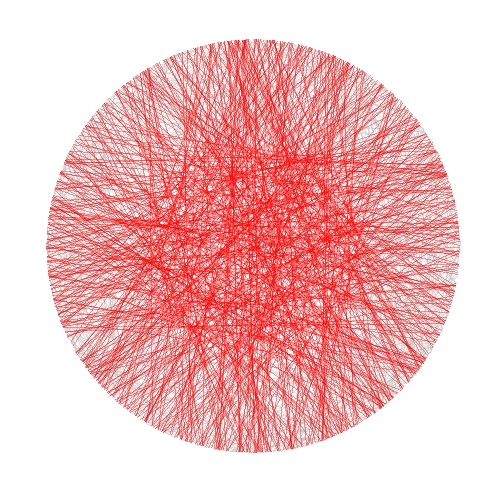
This post talks about a generative system called Physarum model, which simulates the evolution of a colony of extremely simple organisms that, under certain environmental conditions, result into complex behaviors. Apart from the scientific interest of the topic, this model produce impressive images like this one, that I call The Death of a Red Dwarf:

You can find a clear explanation of how a physarum model works in this post, by Sage Jenson. A much deeper explanation can be found in this paper by Jeff Jones, from the University of the West of England. Briefly, a physarum model evolves a set of particles (agents), making them move over a surface. Agents turn towards locations with higher concentrations of a pheromone trail. Once they move, they make a deposition of pheromone as well. These are the steps of a single iteration of the model:

  • Sensor stage: Each agent looks to three positions of the trail map (left, front and right) according a certain sensor angle
  • Motor stage: then it moves to the place with the higher concentration with some rules to deal with ties
  • Deposition stage: once in the new location, the agent deposites a certain amount of pheromone.
  • Diffuse stage: the pheromones diffusing over the surface to blur the trail array.
  • Decay stage: this make to decay the concentration of pheromone on the surface.

Sage Jenson explains the process with this illustrative diagram:

My implementation is a bit different from Jones’ one. The main difference is that I do not apply the diffuse stage after deposition: I prefer a high defined picture instead blurriyng it. I also play with the initial arrangement of agents (location and heading angle) as well with the initial configuration of environment. For example, In The Death of a Red Dwarf, agents start from a circle and the environment is initialized in a dense disc. You can find the details in the code. There you will see that the system is governed by the following parameters:

  • Front and left sensor angles from forward position
  • Agent rotation angle
  • Sensor offset distance
  • Step size (how far agent moves per step)
  • Chemoattractant deposition per step
  • Trail-map chemoattractant diffusion decay factor

In adition to them (specific of the physarum model), you also can change others like colors, noise of angles (parameter amount of jitter function), number of agents and iterations as well as the initial arrangement of the environment and the location of agents. I invite you to do it. You will discover many abstractions: butterfly wings, planets, nets, explosions, supernovas … I have spent may hours playing with it. Some examples:

You can find the code here. Please, let me know if you do something interesting with it. Share your artworks with me in Twitter or drop me an email (you can find my address here).

Reaction Diffusion

Sin patria ni banderas, ahora vivo a mi manera; y es que me siento extranjero fuera de tus agujeros (Tercer movimiento: Lo de dentro, Extremoduro)

The technique I experimented with in this post is an endless source to obtain amazing images. It is called reaction-diffusion and simulates the evolution of a system where several substances interact chemically transforming into each other (reaction) and spreading out over a surface in space (diffusion). In my case there are just two substances in a 2D space and the evolution of system is simulated using the Gray-Scott algorithm which is ruled by several parameters that, once determined, can produce images like this one:

This article by Karl Sims, is a very clear and comprehensive explanation of the Gray-Scott algorithm. Briefly, the Gray-Scott model simulates the evolution of two substances, A and B in a two dimensional grid. In each cell of the grid, the substance A is added at a given feed rate f. Then, both substances react following this rule: two particles of B convert a particle of A into a particle of B. To prevent overpopulation, B particles are killed at a given kill rate k. In the diffusion phase, both substances spread out accross the cells of the grid at a given diffusion rates Da and Db. The diffusion is performed using a 2D Lapacian operator with a 3x3 convolution matrix L.

In the article you can find the equations that rule the system, which depend on the parameters described in the previous paragraph. To obtain all the images of this post, I maintained most of them always constant and just changed the following:

  • Feed and kill rates (f and k respectively)
  • The initial proportion of both substances A and B. I always started with A=0 in each cell and B=1 in some (small) amount of them selected randomly or according to some geometrical considerations (and inner circle or square, for example). I let you to try with your own ideas.

Sometimes the system converges and remains stable after a number of iterations. For example, these images are obtained iterating 5000 times:

Before converging you can obtain also nice patterns in between:

The variety of patterns is amazing: tessellations, lattices, caleidoscopic … some more examples:

I used again Rcpp to iterate efficiently but now I tried RcppArmadillo, a C++ library for linear algebra and scientific computing because it contains a class called cube, which is a 3D matrix that fits perfectly into a 2D grid where the 3rd dimension is the amount of particles A and B.

I like to share my code because I think it may serve as a source of inspiration to someone. You can find the code here with just one of the many configurations I tried to generate the previous images. It may serve you as a good starting point to explore you own ones. Let me know if you reach interesting places.

Happy New Year 2020.

Visualizing Stirling’s Approximation With Highcharts

I said, “Wait a minute, Chester, you know I’m a peaceful man”, He said, “That’s okay, boy, won’t you feed him when you can” (The Weight, The Band)

It is quite easy to calculate the probability of obtaining the same number of heads and tails when tossing a coin N times, and N is even. There are 2^{N} possible outcomes and only C_{N/2}^{N} are favorable so the exact probability is the quotient of these numbers (# of favorable divided by # of possible).

There is another way to approximate this number incredibly well: to use the Stirling’s formula, which is 1/\sqrt{\pi\cdot N/2}

The next plot represents both calculations for N from 2 to 200. Although for small values of N, Stirling’s approximation tends to overestimate probability, you can see hoy is extremely precise as N becomes bigger:

James Stirling published this amazing formula in 1730. It simplifies the calculus to the extreme and also gives a quick way to obtain the answer to a very interesting question: how many tosses are needed to be sure that the probability of obtaining the same number of heads and tails is under any given threshold? Just solve the formula for N and you will obtain the answer. And, also, the formula is another example of the presence of pi in the most unexpected places, as happens here.

Just another thing: the more I use highcharter package the more I like it.

This is the code:

library(highcharter)
library(dplyr)
data.frame(N=seq(from=2, by=2, length.out = 100)) %>%
  mutate(Exact=choose(N,N/2)/2**N, Stirling=1/sqrt(pi*N/2))->data
hc <- highchart() %>% 
  hc_title(text = "Stirling's Approximation") %>% 
  hc_subtitle(text = "How likely is getting 50% heads and 50% tails tossing a coin N times?") %>% 
  hc_xAxis(title = list(text = "N: Number of tosses"), categories = data$N) %>% 
  hc_yAxis(title = list(text = "Probability"), labels = list(format = "{value}%", useHTML = TRUE)) %>% 
  hc_add_series(name = "Stirling", data = data$Stirling*100,  marker = list(enabled = FALSE), color="blue") %>% 
  hc_add_series(name = "Exact", data = data$Exact*100,  marker = list(enabled = FALSE), color="lightblue") %>% 
  hc_tooltip(formatter = JS("function(){return ('<b>Number of tosses: </b>'+this.x+'
<b>Probability: </b>'+Highcharts.numberFormat(this.y, 2)+'%')}")) %>%
  hc_exporting(enabled = TRUE) %>%
  hc_chart(zoomType = "xy")
hc

Amazing Things That Happen When You Toss a Coin 12 Times

If there is a God, he’s a great mathematician (Paul Dirac)

Imagine you toss a coin 12 times and you count how many heads and tails you are obtaining after each throwing (the coin is equilibrated so the probability of head or tail is the same). At some point, it can happen that number of heads and number of tails are the same. For example, if you obtain the sequence T-H-T-T-H-T-H-H-T-T-H-H, after the second throwing, number of heads is equal to number of tails (and both equal to one). It happens again after the 8th throwing and after last one. In this example, the last throwing where equallity occurs is the number 12. Obviously, equallity can only be observed in even throwings.

If you repeat the experiment 10.000 times you will find something like this if you draw the relative frequency of the last throwing where cumulated number of heads is equal to the one of tails:

Coin12Times
From my point of view there are three amazing things in this plot:

  1. It is symmetrical, so prob(n)=prob(12-n)
  2. The least likely throwing to obtain the last equality is the central one.
  3. As a corollary, the most likely is not obtaining any equality (number of heads never are the same than number of tails) or obtaining last equality in the last throwing: two extremely different scenarios with the same chances to be observed.

Behind the simplicity of tossing coins there is a beautiful universe of mathematical surprises.

library(dplyr)
library(ggplot2)
library(scales)
tosses=12
iter=10000
results=data.frame(nmax=numeric(0), count=numeric(0), iter=numeric(0))
tmp=data.frame(nmax=numeric(0))
for (j in 1:iter)
{
data.frame(x=sample(c(-1,1), size=tosses, replace=TRUE)) %>%
add_rownames(var = "n") %>%
mutate(cumsum = cumsum(x)) %>% filter(cumsum==0) %>%
summarize(nmax=max(as.numeric(n))) %>% rbind(tmp)->tmp
}
tmp %>%
group_by(nmax) %>%
summarize(count=n()) %>%
mutate(nmax=ifelse(is.finite(nmax), nmax, 0), iter=iter) %>%
rbind(results)->results
opts=theme(
panel.background = element_rect(fill="darkolivegreen1"),
panel.border = element_rect(colour="black", fill=NA),
axis.line = element_line(size = 0.5, colour = "black"),
axis.ticks = element_line(colour="black"),
panel.grid.major = element_line(colour="white", linetype = 1),
panel.grid.minor = element_blank(),
axis.text.y = element_text(colour="black"),
axis.text.x = element_text(colour="black"),
text = element_text(size=20),
legend.key = element_blank(),
plot.title = element_text(size = 30)
)
ggplot(results, aes(x=nmax, y=count/iter)) +
geom_line(size=2, color="green4")+
geom_point(size=8, fill="green4", colour="darkolivegreen1",pch=21)+
scale_x_continuous(breaks = seq(0, tosses, by=2))+
scale_y_continuous(labels=percent, limits=c(0, .25))+
labs(title="What happens when you toss a coin 12 times?",
x="Last throwing where cumulated #tails = #heads",
y="Probability (estimated)")+opts

Bertrand or (The Importance of Defining Problems Properly)

We better keep an eye on this one: she is tricky (Michael Banks, talking about Mary Poppins)

Professor Bertrand teaches Simulation and someday, ask his students:

Given a circumference, what is the probability that a chord chosen at random is longer than a side of the equilateral triangle inscribed in the circle?

Since they must reach the answer through simulation, very approximate solutions are welcome.

Some students choose chords as the line between two random points on the circumference and conclude that the asked probability is around 1/3. This is the plot of one of their simulations, where 1000 random chords are chosen according this method and those longer than the side of the equilateral triangle are red coloured (smalller in grey):

Bertrand1

Some others choose a random radius and a random point in it. The chord then is the perpendicular through this point. They calculate that the asked probability is around 1/2:

Bertrand2

And some others choose a random point inside the circle and define the chord as the only one with this point as midpoint. For them, the asked probability is around 1/4:

Bertrand3

Who is right? Professor Bertrand knows that everybody is. In fact, his main purpose was to show how important is to define problems properly. Actually, he used this to give an unforgettable lesson to his students.

library(ggplot2)
n=1000
opt=theme(legend.position="none",
          panel.background = element_rect(fill="white"),
          panel.grid = element_blank(),
          axis.ticks=element_blank(),
          axis.title=element_blank(),
          axis.text =element_blank())
#First approach
angle=runif(2*n, min = 0, max = 2*pi)
pt1=data.frame(x=cos(angle), y=sin(angle))
df1=cbind(pt1[1:n,], pt1[((n+1):(2*n)),])
colnames(df1)=c("x1", "y1", "x2", "y2")
df1$length=sqrt((df1$x1-df1$x2)^2+(df1$y1-df1$y2)^2)
p1=ggplot(df1) + geom_segment(aes(x = x1, y = y1, xend = x2, yend = y2, colour=length>sqrt(3)), alpha=.4, lwd=.6)+
  scale_colour_manual(values = c("gray75", "red"))+opt
#Second approach
angle=2*pi*runif(n)
pt2=data.frame(aa=cos(angle), bb=sin(angle))
pt2$x0=pt2$aa*runif(n)
pt2$y0=pt2$x0*(pt2$bb/pt2$aa)
pt2$a=1+(pt2$x0^2/pt2$y0^2)
pt2$b=-2*(pt2$x0/pt2$y0)*(pt2$y0+(pt2$x0^2/pt2$y0))
pt2$c=(pt2$y0+(pt2$x0^2/pt2$y0))^2-1
pt2$x1=(-pt2$b+sqrt(pt2$b^2-4*pt2$a*pt2$c))/(2*pt2$a)
pt2$y1=-pt2$x0/pt2$y0*pt2$x1+(pt2$y0+(pt2$x0^2/pt2$y0))
pt2$x2=(-pt2$b-sqrt(pt2$b^2-4*pt2$a*pt2$c))/(2*pt2$a)
pt2$y2=-pt2$x0/pt2$y0*pt2$x2+(pt2$y0+(pt2$x0^2/pt2$y0))
df2=pt2[,c(8:11)]
df2$length=sqrt((df2$x1-df2$x2)^2+(df2$y1-df2$y2)^2)
p2=ggplot(df2) + geom_segment(aes(x = x1, y = y1, xend = x2, yend = y2, colour=length>sqrt(3)), alpha=.4, lwd=.6)+
scale_colour_manual(values = c("gray75", "red"))+opt
#Third approach
angle=2*pi*runif(n)
radius=runif(n)
pt3=data.frame(x0=sqrt(radius)*cos(angle), y0=sqrt(radius)*sin(angle))
pt3$a=1+(pt3$x0^2/pt3$y0^2)
pt3$b=-2*(pt3$x0/pt3$y0)*(pt3$y0+(pt3$x0^2/pt3$y0))
pt3$c=(pt3$y0+(pt3$x0^2/pt3$y0))^2-1
pt3$x1=(-pt3$b+sqrt(pt3$b^2-4*pt3$a*pt3$c))/(2*pt3$a)
pt3$y1=-pt3$x0/pt3$y0*pt3$x1+(pt3$y0+(pt3$x0^2/pt3$y0))
pt3$x2=(-pt3$b-sqrt(pt3$b^2-4*pt3$a*pt3$c))/(2*pt3$a)
pt3$y2=-pt3$x0/pt3$y0*pt3$x2+(pt3$y0+(pt3$x0^2/pt3$y0))
df3=pt3[,c(6:9)]
df3$length=sqrt((df3$x1-df3$x2)^2+(df3$y1-df3$y2)^2)
p3=ggplot(df3) + geom_segment(aes(x = x1, y = y1, xend = x2, yend = y2, colour=length>sqrt(3)), alpha=.4, lwd=.6)+scale_colour_manual(values = c("gray75", "red"))+opt

How Big Is The Vatican City?

Dici che il fiume trova la via al mare e come il fiume giungerai a me (Miss Sarajevo, U2)

One way to calculate approximately the area of some place is to circumscribe it into a polygon of which you know its area. After that, generate coordinates inside the polygon and count how many of them fall into the place. The percentage of coordinates inside the place by the area of the polygon is an approximation of the desired area.

I applied this technique to calculate the area of the Vatican City. I generated a squared grid of coordinates around the Capella Sistina (located inside the Vatican City). To calculate the area I easily obtain the convex hull polygon of the coordinates using chull function of grDevices package. Then, I calculate the area of the polygon using areaPolygon function of geosphere package.

To obtain how many coordinates of the grid fall inside the Vatican City, I use revgeocode function of ggmap package (I love this function). For me, one coordinate is inside the Vatican City if its related address contains the words “Vatican City”.

What happens generating a grid of 20×20 coordinates? I obtain that the area of the Vatican City is about 0.32Km2 but according to Wikipedia, the area is 0.44Km2: this method underestimates the area around a 27%. But why? Look at this:

Vatican2

This plot shows which addresses of the grid fall inside the Vatican City (ones) and which of them do not fall inside (zeros). As you can see, there is a big zone in the South, and a smaller one in the North of the city where reverse geocode do not return “Vatican City” addresses.

Maybe Pope Francis should phone Larry Page and Sergey Brin to claim this 27% of his wonderful country.

I was willing to do this experiment since I wrote this post. This is the code:

require(geosphere)
require(ggmap)
require(plotGoogleMaps)
require(grDevices)
setwd("YOUR-WORKING-DIRECTORY-HERE")
#Coordinates of Capella Sistina
capella=geocode("capella sistina, Vatican City, Roma")
#20x20 grid of coordinates around the Capella
g=expand.grid(lon = seq(capella$lon-0.010, capella$lon+0.010, length.out=20),
lat = seq(capella$lat-0.005, capella$lat+0.005, length.out=20))
#Hull Polygon containing coordinates
p=g[c(chull(g),chull(g)[1]),]
#Address of each coordinate of grid
a=apply(g, 1, revgeocode)
#Estimated area of the vatican city
length(grep("Vatican City", a))/length(a)*areaPolygon(p)/1000/1000
s=cbind(g, a)
s$InOut=apply(s, 1, function(x) grepl('Vatican City', x[3]))+0
coordinates(s)=~lon+lat
proj4string(s)=CRS('+proj=longlat +datum=WGS84')
ic=iconlabels(s$InOut, height=12)
plotGoogleMaps(s, iconMarker=ic, mapTypeId="ROADMAP", legend=FALSE)

How e Can Help You To Find The Love Of Your Life

Match.com will bring more love to the planet than anything since Jesus Christ (Gary Kremen, founder of Match.com)

Sarah is a brilliant 39 years old mathematician living in Massachusetts. She lives alone and has dedicated her whole life to study. She has realized lately that theorems and books no longer satisfy her. Sarah has realized that needs to find love.

To find the love of her life, Sarah joined Match.com to try to have a date with a man every week for a year (52 dates in total). She has her own method to rate each man according his sympathy, his physical appearance, his punctuality,  his conversation and his hobbies. This method allows her to compare candidates with each other. Sarah wants to choose the top-scored man but she is afraid to waste time. If she waits until having all the dates, it could be too late to call back the best candidate, especially if he was one of the first dates. So she wants to be agile and decide inmediately. Her plan is as follows: she will start having some dates only to assess the candidates and after this period, she will try to win over the first man better than any of the first candidates, according her scoring.

But, how many men should discard to maximize the probability of choosing the top-scored one? Discarding just one, probability of having a date with a better man in the next date is very high. But probably he will not be the man she is looking for. On the other hand, discarding many men makes very probable discarding also the top-scored one.

Sarah did a simulation in R of the 52 dates to approximate the probability of choosing the best man depending on the number of discards. She obtained that the probability of choosing the top-scored man is maximal discarding the 19 first men, as can be seen in the following graph:

Prince

Why 19? Because 19 is approximately 52/e. This is one of the rare places where can found the number e. You can see an explanation of the phenomenon here.

Note: This is just a story to illustrate the secretary problem without repeating the original argument of the problem. My apologies if I cause offense to someone. This is a blog about mathematics and R and this is the way as must be understood. 

require(extrafont)
require(ggplot2)
n=52
sims=1000
results=data.frame(discards=numeric(0), triumphs=numeric(0))
for(i in 0:n)
{
  triumphs=0
  for (j in 1:sims) {
    opt=sample(seq(1:n), n, replace=FALSE)
    if (max(opt[1:i])==n)  triumphs=triumphs+0
    else triumphs=triumphs+(opt[i+1:n][min(which(opt[i+1:n] > max(opt[1:i])))]==n)}
  results=rbind(results, data.frame(discards=i, triumphs=triumphs/sims))
}
opts=theme(
  panel.background = element_rect(fill="darkolivegreen1"),
  panel.border = element_rect(colour="black", fill=NA),
  axis.line = element_line(size = 0.5, colour = "black"),
  axis.ticks = element_line(colour="black"),
  panel.grid.major = element_line(colour="white", linetype = 1),
  panel.grid.minor = element_blank(),
  axis.text.y = element_text(colour="black", size=20),
  axis.text.x = element_text(colour="black", size=20),
  text = element_text(size=25, family="xkcd"),
  legend.key = element_blank(),
  legend.background = element_blank(),
  plot.title = element_text(size = 40))
ggplot(results, aes(discards, triumphs))+
  geom_vline(xintercept = n/exp(1), size = 1, linetype=2, colour = "black", alpha=0.8)+
  geom_line(color="green4", size=1.5)+
  geom_point(color="gray92", size=8, pch=16)+
  geom_point(color="green4", size=6, pch=16)+
  ggtitle("How e can help you to find the love of your life")+
  xlab("Discards") +
  ylab("Prob. of finding the love of your life")+
  scale_x_continuous(breaks=seq(0, n, by = 2))+opts

Size Doesn’t Matter

An invisible red thread connects those destined to meet, regardless of time, place or circumstances. The thread may stretch or tangle, but never break (Ancient Chinese Legend)

I use to play once a year with my friends to Secret Santa (in Spain we call it Amigo Invisible). As you can read in Wikipedia:

Secret Santa is a Western Christmas tradition in which members of a group or community are randomly assigned a person to whom they anonymously give a gift. Often practiced in workplaces or amongst large families, participation in it is usually voluntary. It offers a way for many people to give and receive a gift at low cost, since the alternative gift tradition is for each person to buy gifts for every other person. In this way, the Secret Santa tradition also encourages gift exchange groups whose members are not close enough to participate in the alternative tradition of giving presents to everyone else.

To decide who gives whom, every year is the same: one of us introduces small papers in a bag with the names of participants (one name per paper). Then, each of us picks one paper and sees the name privately. If no one picks their own name,  the distribution is valid. If not, we have to start over. Every year we have to repeat process several times until obtaining a valid distribution. Why? Because we are victims of The Matching Problem.

Following the spirit of this talk I have done 16 simulations of the matching problem (for 10, 20, 30 … to 160 items). For example, given n items, I generate 5.000 random vectors sampling without replacement the set of natural numbers from 1 to n. Comparing these random vectors with the ordered one (1,2, …, n) I obtain number of matchings (that is, number of times where ith element of the random vector is equal to i). This is the result of the experiment:

matching

In spite of each of one represents a different number of matchings, all plots are extremely similar. All of them say that probability of not matching any two identical items is around 36% (look at the first bar of all of them). In concrete terms, this probability tends to 1/e (=36,8%) as n increases but does it very quickly.

This result is shocking. It means that if some day the 7 billion people of the world agree to play Secret Santa all together (how nice it would be!), the probability that at least one person chooses his/her own name is around 2/3. Absolutely amazing.

This is the code (note: all lines except two are for plotting):

library(ggplot2)
library(scales)
library(RColorBrewer)
library(gridExtra)
library(extrafont)
results=data.frame(size=numeric(0), x=numeric(0))
for (i in seq(10, by=10, length.out = 16)){results=rbind(results, data.frame(size=i, x=replicate(5000, {sum(seq(1:i)-sample(seq(1:i), size=i, replace=FALSE)==0)})))}
opts=theme(
  panel.background = element_rect(fill="gray98"),
  panel.border = element_rect(colour="black", fill=NA),
  axis.line = element_line(size = 0.5, colour = "black"),
  axis.ticks = element_line(colour="black"),
  panel.grid.major.y = element_line(colour="gray80"),
  panel.grid.major.x = element_blank(),
  panel.grid.minor = element_blank(),
  axis.text.y = element_text(colour="gray25", size=15),
  axis.text.x = element_text(colour="gray25", size=15),
  text = element_text(family="Humor Sans", size=15, colour="gray25"),
  legend.key = element_blank(),
  legend.position = "none",
  legend.background = element_blank(),
  plot.title = element_text(size = 18))
sizes=unique(results$size)
for (i in 1:length(sizes))
{
  data=subset(results, size==sizes[i])
  assign(paste("g", i, sep=""),
         ggplot(data, aes(x=as.factor(x), weight=1/nrow(data)))+
           geom_bar(binwidth=.5, fill=sample(brewer.pal(9,"Set1"), 1), alpha=.85, colour="gray50")+
           scale_y_continuous(limits=c(0,.4), expand = c(0, 0), "Probability", labels = percent)+
           scale_x_discrete(limit =as.factor(0:8), expand = c(0, 0), "Number of matches")+
           labs(title = paste("Matching", as.character(sizes[i]), "items ...", sep=" "))+
           opts)
}
grid.arrange(g1, g2, g3, g4, g5, g6, g7, g8, g9, g10, g11, g12, g13, g14, g15, g16, ncol=4)

Batman’s Choice

A hero can be anyone, even a man doing something as simple and reassuring as putting a coat on a young boy’s shoulders to let him know the world hadn’t ended (Batman in The Dark Knight Rises)

Joker has captured Batman and keeps him into a dark and cold dungeon of Gotham City. Showing his sadistic character, Joker proposes the following game to Batman:

This is a six shooter revolver with two bullets in the cylinder. Bullets are inside two consecutive chambers. I will spin the cylinder and will fire the gun aiming to my head. If I survive you will have to do the same but you decide if you want to spin the cylinder before firing or not. If you still keep you head over your shoulders after firing, you will be free.

Joker fires and nothing happens. He survives and passes the revolver to Batman. What should Batman do? Spinning or not? What would you do?

From my point of view, answer is quite anti-intutive because the best option is not spinning the cylinder again. Spinning case is clear: probability of losing the head is 2/6=33% but what about not spinning? Doing the next shoot directly eliminates two possibilities: the previous shot of Joker and the second bullet according to direction of cylinder rotation (remember two bullets are consecutive and Joker is unfortunately  still alive). It means there is only 1 chance to dead between 4, so probability of losing the head in this scenario is 1/4=25% which is significantly lower than the first one.

Here you can find the resulting graph of simulating the game up to 500 times:

batmans_choice2

Will it be the end of Batman? Not sure.

This is the code of this experiment:

library(ggplot2)
library(extrafont)
niter=500
results=data.frame()
for (i in 1:niter)
{
bullet1=sample(1:6,1)
Joker=sample((1:6)[-c(bullet1, bullet1%%6+1)],1)
#Option 1: Shooting
Batman1=Joker%%6+1
dead1=(Batman1 %in% c(bullet1, bullet1%%6+1))*1
#Option 2: Rolling and Shooting
Batman2=sample(1:6,1)
dead2=(Batman2 %in% c(bullet1, bullet1%%6+1))*1
results=rbind(results, c(i, dead1, dead2))
}
colnames(results)=c("iter", "dead1", "dead2")
results$csum1=cumsum(results$dead1)/as.numeric(rownames(results))
results$csum2=cumsum(results$dead2)/as.numeric(rownames(results))
theme_xkcd=theme(
panel.background = element_rect(fill="darkolivegreen1"),
panel.border = element_rect(colour="black", fill=NA),
axis.line = element_line(size = 0.5, colour = "black"),
axis.ticks = element_line(colour="black"),
panel.grid = element_line(colour="white", linetype = 2),
axis.text.y = element_text(colour="black"),
axis.text.x = element_text(colour="black"),
text = element_text(size=18, family="Humor Sans"),
plot.title = element_text(size = 50)
)
p=ggplot(data=results, aes(x=iter, y=csum1))+
geom_abline(intercept = 1/4, slope = 0, size = 0.4, linetype=2, colour = "black", alpha=0.8)+
geom_abline(intercept = 1/3, slope = 0, size = 0.4, linetype=2, colour = "black", alpha=0.8)+
geom_line(aes(y=csum2), colour="green4", size=1.5, fill=NA)+
geom_line(colour="green4", size=1.5, fill=NA)+
coord_cartesian(ylim=c(.0, 1), xlim=c(1, niter))+
scale_y_continuous(breaks = c(0,round(1/4, digits = 2),round(1/3, digits = 2),1))+
geom_text(data=results[niter*.75, ], family="Humor Sans", colour="green4", y=0.38, label="Rotating Cylinder and Shooting ...", size=4, adjust=1)+
geom_text(data=results[niter*.75, ], family="Humor Sans", colour="green4", y=0.20, label="Shooting without Rotating Cylinder ...", size=4, adjust=1)+
labs(x="Number Of Trials", y="Prob. of Losing The Head", title="Batman's Choice")+
theme_xkcd
ggsave("batmans_choice.jpg", plot=p, width=8, height=5)

How To Approximate Pi With A Short Pencil And A Big Paper

Experiment, be curious: though interfering friends may frown, get furious at each attempt to hold you down (Tony Bennett, Experiment)

Instructions:

  1. Take a pencil and measure it
  2. Take a piece of paper and draw parallel lines on it (you can use the pencil, of course); separation between lines should double the length of the pencil
  3. Toss the pencil over the paper 100 times (or more)
  4. Make note of how many times do the pencil cross some of the lines
  5. Calculate ratio between tosses and crosses: this is your approximation of Pi

Some time ago, I published a post about one of the most amazing places where PI was discovered. This is another example of the ubiquity of this mathematical constant. This experiment is based on Buffon’s needle problem, another amazing experiment of 18th century. Next plot represents ratio of tosses to crosses depending on the length of pencil. When the pencil is half the length of the separation between lines, the previous ratio is approximately PI:
Buffon
If you get very bored some afternoon you can replicate this experiment with your children. Use a short pencil. If not, you will need an extremely big piece of paper. Meanwhile here you have the code:

trials=100000
results=sapply(seq(.1, 2, by = .05), function(x)
{
  r=x #Length of pencil in relation to separation between lines
  Needles=t(sapply(1:trials, function(y) c(100*runif(1),2*pi*runif(1))))
  Needles=cbind(Needles,Needles[,1]+r*cos(Needles[,2]))
  Needles=data.frame(x1=Needles[,1], x2=Needles[,3], Cross=abs(trunc(Needles[,1])-trunc(Needles[,3])))
  c(r, trials/(trials-nrow(Needles[Needles$Cross==0,])))
})
results=data.frame(t(results))
colnames(results)=c(c("ratio", "inv.perc.crosses"))
require(ggplot2)
require(extrafont)
require(grid)
opts=theme(
  panel.background = element_rect(fill="darkolivegreen1"),
  panel.border = element_rect(colour="black", fill=NA),
  axis.line = element_line(size = 0.5, colour = "black"),
  axis.ticks = element_line(colour="black"),
  panel.grid.major = element_line(colour="white", linetype = 1),
  panel.grid.minor = element_blank(),
  axis.text.y = element_text(colour="black", size=20),
  axis.text.x = element_text(colour="black", size=20),
  text = element_text(size=25, family="xkcd"),
  legend.key = element_blank(),
  legend.position = c(.2,.75),
  legend.background = element_blank(),
  plot.title = element_text(size = 50))
c=ggplot(results, aes(ratio, inv.perc.crosses))
c +geom_abline(intercept = pi, slope = 0, size = 0.4, linetype=2, colour = "black", alpha=0.8)+
  geom_line(color="green4", size=1.5)+
  geom_point(color="gray92", size=8, pch=16)+
  geom_point(color="green4", size=6, pch=16)+
  geom_text(aes(0.55, 5), hjust=0, family="xkcd", label="PI is around here!", size=10)+
  ggtitle("Hot to approximate PI with \na short pencil and a big paper")+
  xlab("Length of pencil divided by separation between lines") +
  ylab("Number of tosses divided by number of crosses")+
  geom_segment(aes(x = .625, y = 4.6, xend = .52, yend = 3.45), size=1.5, arrow = arrow(length = unit(0.5, "cm")))+
  scale_y_continuous(breaks=c(pi, 4, 8, 12, 16), labels=c("3.141593","4","8","12","16"))+
  scale_x_continuous(breaks=seq(.1, 2, by = .1))+opts