Tag Archives: gridExtra

Visual Complexity

Oh, can it be, the voices calling me, they get lost and out of time (Little Black Submarines, The Black Keys)

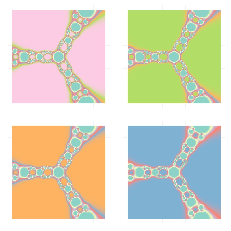
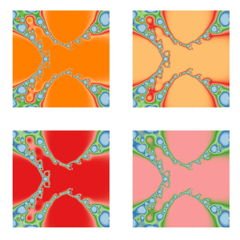
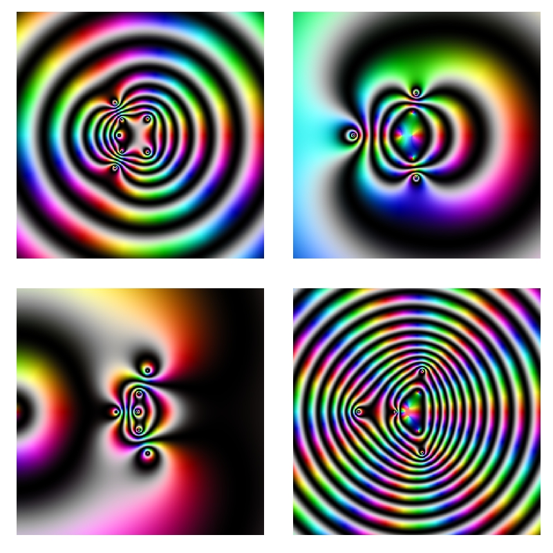
Last October I did this experiment about complex domain coloring. Since I like giving my posts a touch of randomness, I have done this experiment. I plot four random functions on the form p1(x)*p2(x)/p3(x) where pi(x) are polynomials up-to-4th-grade with random coefficients following a chi-square distribution with degrees of freedom between 2 and 5. I measure the function over the complex plane and arrange the four resulting plots into a 2×2 grid. This is an example of the output:
Surrealism Every time you run the code you will obtain a completely different output. I have run it hundreds of times because results are always surprising. Do you want to try? Do not hesitate to send me your creations. What if you change the form of the functions or the distribution of coefficients? You can find my email here.

setwd("YOUR WORKING DIRECTORY HERE")
require(polynom)
require(ggplot2)
library(gridExtra)
ncol=2
for (i in 1:(10*ncol)) {eval(parse(text=paste("p",formatC(i, width=3, flag="0"),"=as.function(polynomial(rchisq(n=sample(2:5,1), df=sample(2:5,1))))",sep="")))}
z=as.vector(outer(seq(-5, 5, by =.02),1i*seq(-5, 5, by =.02),'+'))
opt=theme(legend.position="none",
          panel.background = element_blank(),
          panel.margin = unit(0,"null"),
          panel.grid = element_blank(),
          axis.ticks= element_blank(),
          axis.title= element_blank(),
          axis.text = element_blank(),
          strip.text =element_blank(),
          axis.ticks.length = unit(0,"null"),
          axis.ticks.margin = unit(0,"null"),
          plot.margin = rep(unit(0,"null"),4))
for (i in 1:(ncol^2))
{
  pols=sample(1:(10*ncol), 3, replace=FALSE)
  p1=paste("p", formatC(pols[1], width=3, flag="0"), "(x)*", sep="")
  p2=paste("p", formatC(pols[2], width=3, flag="0"), "(x)/", sep="")
  p3=paste("p", formatC(pols[3], width=3, flag="0"), "(x)",  sep="")
  eval(parse(text=paste("p = function (x) ", p1, p2, p3, sep="")))
  df=data.frame(x=Re(z),
                y=Im(z),
                h=(Arg(p(z))<0)*1+Arg(p(z))/(2*pi),
                s=(1+sin(2*pi*log(1+Mod(p(z)))))/2,
                v=(1+cos(2*pi*log(1+Mod(p(z)))))/2)
  g=ggplot(data=df[is.finite(apply(df,1,sum)),], aes(x=x, y=y)) + geom_tile(fill=hsv(df$h,df$s,df$v))+ opt
  assign(paste("hsv_g", formatC(i, width=3, flag="0"), sep=""), g)
}
jpeg(filename = "Surrealism.jpg", width = 800, height = 800, quality = 100)
grid.arrange(hsv_g001, hsv_g002, hsv_g003, hsv_g004, ncol=ncol)
dev.off()

Silhouettes

Romeo, Juliet, balcony in silhouette, makin o’s with her cigarette, it’s juliet (Flapper Girl, The Lumineers)

Two weeks ago I published this post for which designed two different visualizations. At the end, I decided to place words on the map of the United States. The discarded visualization was this other one, where I place the words over the silhouette of each state:

States In Two Words v1

I do not want to set aside this chart because I really like it and also because I think it is a nice example of the possibilities one have working with R.

Here you have the code. It substitutes the fragment of the code headed by “Visualization” of the original post:

library(ggplot2)
library(maps)
library(gridExtra)
library(extrafont)
opt=theme(legend.position="none",
             panel.background = element_blank(),
             panel.grid = element_blank(),
             axis.ticks=element_blank(),
             axis.title=element_blank(),
             axis.text =element_blank(),
             plot.title = element_text(size = 28))
vplayout=function(x, y) viewport(layout.pos.row = x, layout.pos.col = y)
grid.newpage()
jpeg(filename = "States In Two Words.jpeg", width = 1200, height = 600, quality = 100)
pushViewport(viewport(layout = grid.layout(6, 8)))
for (i in 1:nrow(table))
{
  wd=subset(words, State==as.character(table$"State name"[i]))
  p=ggplot() + geom_polygon( data=subset(map_data("state"), region==tolower(table$"State name"[i])), aes(x=long, y=lat, group = group), colour="white", fill="gold", alpha=0.6, linetype=0 )+opt
  print(p, vp = vplayout(floor((i-1)/8)+1, i%%8+(i%%8==0)*8))
  txt=paste(as.character(table$"State name"[i]),"\n is", wd$word1,"\n and", wd$word2, sep=" ")
  grid.text(txt, gp=gpar(font=1, fontsize=16, col="midnightblue", fontfamily="Humor Sans"), vp = viewport(layout.pos.row = floor((i-1)/8)+1, layout.pos.col = i%%8+(i%%8==0)*8))
}
dev.off()

Mixing Waves

Fill a cocktail shaker with ice; add vodka, triple sec, cranberry, and lime, and shake well; strain into a chilled cocktail glass and garnish with orange twist (Cosmopolitan Cocktail Recipe)

This is a tribute to Blaise Pascal and Joseph Fourier, two of the greatest mathematicians in history. As Pascal did in his famous triangle, I generate a set of random curves (sines or cosines with random amplitudes between 1 and 50) and I arrange them over the lateral edges of the triangle. Each inner curve in the triangle is the sum of the two directly curves above it.  This is the result for a 6 rows triangle:

Adding Waves

Two comments:

  1. Inner curves are noisy. The greater is the distance from the edge, the higher the entropy. When I was a child, I used to play a game called the broken telephone; I can see some kind of connection between this graphic and the game.
  2. I have read that using eval+parse in sympton of being a bad programmer. Does anyone have an idea to do this in some other way without filling the screen of code?

This is the code:

library(ggplot2)
library(gridExtra)
nrows=6
for (i in 1:nrows){
  eval(parse(text=paste("f",i,1,"=function(x) ", sample(c("sin(","cos("),1), runif(min=1, max=50,1) ,"*x)",sep="")))
  eval(parse(text=paste("f",i,i,"=function(x) ", sample(c("sin(","cos("),1), runif(min=1, max=50,1) ,"*x)",sep="")))}
for (i in 3:nrows) {
  for (j in 2:(i-1)) eval(parse(text=paste("f",i, j, "=function(x) f",(i-1),(j-1), "(x) + f",(i-1),j,"(x)",sep="")))}
vplayout=function(x, y) viewport(layout.pos.row = x, layout.pos.col = y)
opts=theme(legend.position="none",
           panel.background = element_rect(fill="gray95"),
           plot.background = element_rect(fill="gray95", colour="gray95"),
           panel.grid = element_blank(),
           axis.ticks=element_blank(),
           axis.title=element_blank(),
           axis.text =element_blank())
setwd("YOUR WORKING DIRECTORY HERE")
grid.newpage()
jpeg(file="Adding Waves.jpeg", width=1800,height=1000, bg = "gray95", quality = 100)
pushViewport(viewport(layout = grid.layout(nrows, 2*nrows-1)))
for (i in 1:nrows) {
  for (j in 1:i) {
    print(ggplot(data.frame(x = c(0, 20)), aes(x)) + stat_function(fun = eval(parse(text=paste("f",i,j,sep=""))), colour = "black", alpha=.75)+opts, vp = vplayout(i, nrows+(2*j-(i+1))))
  }
}
dev.off()

Size Doesn’t Matter

An invisible red thread connects those destined to meet, regardless of time, place or circumstances. The thread may stretch or tangle, but never break (Ancient Chinese Legend)

I use to play once a year with my friends to Secret Santa (in Spain we call it Amigo Invisible). As you can read in Wikipedia:

Secret Santa is a Western Christmas tradition in which members of a group or community are randomly assigned a person to whom they anonymously give a gift. Often practiced in workplaces or amongst large families, participation in it is usually voluntary. It offers a way for many people to give and receive a gift at low cost, since the alternative gift tradition is for each person to buy gifts for every other person. In this way, the Secret Santa tradition also encourages gift exchange groups whose members are not close enough to participate in the alternative tradition of giving presents to everyone else.

To decide who gives whom, every year is the same: one of us introduces small papers in a bag with the names of participants (one name per paper). Then, each of us picks one paper and sees the name privately. If no one picks their own name,  the distribution is valid. If not, we have to start over. Every year we have to repeat process several times until obtaining a valid distribution. Why? Because we are victims of The Matching Problem.

Following the spirit of this talk I have done 16 simulations of the matching problem (for 10, 20, 30 … to 160 items). For example, given n items, I generate 5.000 random vectors sampling without replacement the set of natural numbers from 1 to n. Comparing these random vectors with the ordered one (1,2, …, n) I obtain number of matchings (that is, number of times where ith element of the random vector is equal to i). This is the result of the experiment:

matching

In spite of each of one represents a different number of matchings, all plots are extremely similar. All of them say that probability of not matching any two identical items is around 36% (look at the first bar of all of them). In concrete terms, this probability tends to 1/e (=36,8%) as n increases but does it very quickly.

This result is shocking. It means that if some day the 7 billion people of the world agree to play Secret Santa all together (how nice it would be!), the probability that at least one person chooses his/her own name is around 2/3. Absolutely amazing.

This is the code (note: all lines except two are for plotting):

library(ggplot2)
library(scales)
library(RColorBrewer)
library(gridExtra)
library(extrafont)
results=data.frame(size=numeric(0), x=numeric(0))
for (i in seq(10, by=10, length.out = 16)){results=rbind(results, data.frame(size=i, x=replicate(5000, {sum(seq(1:i)-sample(seq(1:i), size=i, replace=FALSE)==0)})))}
opts=theme(
  panel.background = element_rect(fill="gray98"),
  panel.border = element_rect(colour="black", fill=NA),
  axis.line = element_line(size = 0.5, colour = "black"),
  axis.ticks = element_line(colour="black"),
  panel.grid.major.y = element_line(colour="gray80"),
  panel.grid.major.x = element_blank(),
  panel.grid.minor = element_blank(),
  axis.text.y = element_text(colour="gray25", size=15),
  axis.text.x = element_text(colour="gray25", size=15),
  text = element_text(family="Humor Sans", size=15, colour="gray25"),
  legend.key = element_blank(),
  legend.position = "none",
  legend.background = element_blank(),
  plot.title = element_text(size = 18))
sizes=unique(results$size)
for (i in 1:length(sizes))
{
  data=subset(results, size==sizes[i])
  assign(paste("g", i, sep=""),
         ggplot(data, aes(x=as.factor(x), weight=1/nrow(data)))+
           geom_bar(binwidth=.5, fill=sample(brewer.pal(9,"Set1"), 1), alpha=.85, colour="gray50")+
           scale_y_continuous(limits=c(0,.4), expand = c(0, 0), "Probability", labels = percent)+
           scale_x_discrete(limit =as.factor(0:8), expand = c(0, 0), "Number of matches")+
           labs(title = paste("Matching", as.character(sizes[i]), "items ...", sep=" "))+
           opts)
}
grid.arrange(g1, g2, g3, g4, g5, g6, g7, g8, g9, g10, g11, g12, g13, g14, g15, g16, ncol=4)

Do Not Play With Mr. Penney

Facts do not speak (Henry Poincare)

Mr. Penney is my best friend. He is maths teacher and loves playing. Yesterday we were in his office at the university when he suggested me a game:

When you toss a coin three times, you can obtain eight different sequences of tails and heads: TTT, TTH, THT, HTT, THH, HTH, HHT and HHH. Using a fair coin, all sequences have the same chances to appear. Choose one sequence and I will then choose another one. I will toss a coin until either your or my sequence appears as a consecutive subsequence of the coin toss outcomes. The player whose sequence appears first wins. I will repeat this procedure 100 times. The one with more games won is the winner of the game.  Don’t worry: I will not toss the coin manually. I will simulate using my computer. What’s your bet?

Ok, my bet is THT, I said. After some seconds, Mr. Penney said: My bet is TTH.

This was the result of the first round:

Round1Another chance? told me Mr. Penney. Of course! Now my bet is TTH! I said. In fact, I was thinking Take that! Now I chose your previous bet. Do you think I am foolish?. After some seconds, Mr. Penney said: My bet now is HTT.

This was the result of the second round:

Round2

Another chance? told me Mr. Penney. At this point, I was very suspicious but I wanted the last chance so I told him Of course! Now my bet is HTT! I wanted to try my strategy one more time. After some seconds, Mr. Penney said: My bet now is HHT.

This was the result of the third round:

Round3Ok, I give it up! What’s the trick? I said. And Mr. Penney explained it to me. You can find the explanation here. This is the last time I play with you! I told him once he finished the explanation.

Here you have the code. Feel free to play:

library(gridExtra)
library(gridExtra)
Me     <- "TTH"
Penney <- "HTT"
results <- data.frame(play= numeric(0), Penney = integer(0), Me = character(0))
for (i in 1:100) {
play <- c()
repeat {play <- do.call(paste, c(play, as.list(sample(c("H","T"), 1)), sep=""))
  if (grepl(Penney, play)|grepl(Me, play)) {
    results <- rbind(results, data.frame(play= i, Penney = as.numeric(grepl(Penney, play)), Me = as.numeric(grepl(Me, play))))
    break}}}
grid.newpage()
table <- rbind(
  c("Me", Me, sum(results$Me), if(sum(results$Penney) > sum(results$Me)) "Loser" else "Winner"),
  c("Penney", Penney, sum(results$Penney), if(sum(results$Penney) > sum(results$Me)) "Winner" else "Loser"))
grid.table(table,
           cols = c("Player", "Bet", "Games Won", "Result"),
           gpar.colfill = gpar(fill="palegreen3",col="White"),
           gpar.corefill =  gpar(fill="palegreen",col="White"),
           gpar.rowfill = gpar(fill=NA, col=NA))

Blurry Fractals

Beauty is the first test; there is no permanent place in the world for ugly mathematics (G. H. Hardy)

Newton basin fractals are the result of iterating Newton’s method to find roots of a polynomial over the complex plane. It maybe sound a bit complicated but is actually quite simple to understand. Those who would like to read some more about Newton basin fractals can visit this page.

This fractals are very easy to generate in R and produce very nice images. Making a small number of iterations, resulting images seems to be blurred when are represented with tile geometry in ggplot. Combined with palettes provided by RColorBrewer give rise to very interesting images. Here you have some examples:

Result for f(z)=z3-1 and palette equal to Set3:Blurry1-Set3Result for f(z)=z4+z-1 and palette equal to Paired:Blurry2-PairedResult for f(z)=z5+z3+z-1 and palette equal to Dark2:Blurry3-Dark2Here you have the code. If you generate nice pictures I will be very grateful if you send them to me:

library(ggplot2)
library(numDeriv)
library(RColorBrewer)
library(gridExtra)
## Polynom: choose only one or try yourself
f  <- function (z) {z^3-1}        #Blurry 1
#f  <- function (z) {z^4+z-1}     #Blurry 2
#f  <- function (z) {z^5+z^3+z-1} #Blurry 3
z <- outer(seq(-2, 2, by = 0.01),1i*seq(-2, 2, by = 0.01),'+')
for (k in 1:5) z <- z-f(z)/matrix(grad(f, z), nrow=nrow(z))
## Supressing texts, titles, ticks, background and legend.
opt <- theme(legend.position="none",
             panel.background = element_blank(),
             axis.ticks=element_blank(), 
             axis.title=element_blank(), 
             axis.text =element_blank())
z <- data.frame(expand.grid(x=seq(ncol(z)), y=seq(nrow(z))), z=as.vector(exp(-Mod(f(z)))))
# Create plots. Choose a palette with display.brewer.all()
p1 <- ggplot(z, aes(x=x, y=y, color=z)) + geom_tile() + scale_colour_gradientn(colours=brewer.pal(8, "Paired")) + opt
p2 <- ggplot(z, aes(x=x, y=y, color=z)) + geom_tile() + scale_colour_gradientn(colours=brewer.pal(7, "Paired")) + opt
p3 <- ggplot(z, aes(x=x, y=y, color=z)) + geom_tile() + scale_colour_gradientn(colours=brewer.pal(6, "Paired")) + opt
p4 <- ggplot(z, aes(x=x, y=y, color=z)) + geom_tile() + scale_colour_gradientn(colours=brewer.pal(5, "Paired")) + opt
# Arrange four plots in a 2x2 grid
grid.arrange(p1, p2, p3, p4, ncol=2)