Tag Archives: Google

How Do We Draw a Line?

She dreams in colour, she dreams in red, can’t find a better man (Better Man, Pearl Jam)

Today I bring another experiment based on The Quick Draw! Data from Google, one of my most fortunate discoveries of the last times. The Quick Draw! is a web game developed by Google, that can be played on a computer, tablet or mobile phone, in which you are asked to draw something (for example, a bird). Then you have just 20 seconds to do it. You win if a machine, trained with a neural network, deduces what are you drawing. The best way to understand how it works is playing to it here. Google published data of about 50 million drawings across 345 categories, contributed by players of the game from all over the world. Datasets are in ndjson format (newline delimited JSON). In my previous post I analyzed one of these datasets, and showed a way to parse and represent the drawings in ggplot.

In this occasion I analyze the simplest drawing that Google can ask you: a line. The dataset, which is called lines.ndjson, can be found here and contains more than 143.000 lines drawn by people from about 170 countries. Most of these drawings come from The United States (45.4%), United Kingdom (7.5%), Canada (3.6%), Germany (3.5%) and Russian Federation (2.3%).

Let’s try to understand how humans draw lines. Concretely, in which direction do we draw them: horizontally? toward right o left? vertically? toward up or down? This analysis is inspired in two great articles I read recently:

There are some technical details around this experiment I would highlight:

  • I parse the dataset using fromJSON function from rjson package.
  • I use purrr package to apply a linear regression to the points defining the line for each drawing.
  • I easily convert the summary of the linear regression into a data frame using tidy function from broom package.
  • I use the slope of the regression to obtain the angle which describes the line (depending on where it is started I add pi to de arctangent of the slope)
  • I represent the frequence of angles using polar coordinates dividing circle in sections of 30 degrees in the following way: 345°- 15°, 15°- 45°, 45°-75°, 75°-105°, …, 315°-345° so for example, horizontal lines from left to right will fall into 345º- 15º category.

This is how do we draw lines analysing the entire dataset, without doing any distinction by country:

The fact seems clear: an average human who plays to the Quick Draw! game, draws a line horizontally from left to right with a probability of 59%. I have to admite that I expected a majority of horizontal-left-to-right lines, but not as crushingly as the plot shows. Maybe my a priori is far from the reality because I am lefty and I would draw it in another way. Remember as well that this mean human will probably come from The United States.

Are there differences by country? Yes, and they are very interesting. I removed all that countries with less then 150 drawings. Taking this into account, these are the four countries where more people draw vertical bottom-up lines:

And these are where more people draw horizontal right-left lines:

We’ve seen that on average, 59% of lines are drawn from left to right. This figure reaches more than 75% in the following countries:

And where do people draw more oblique lines? Here:

Surprisingly, a very small amount of lines are drawn toward down, which seems me quite intriguing.

Some thoughts (let me know yours):

  • Humans prefer doing horizontal lines from left-to-right everywhere
  • In case of drawing vertical, we clearly prefer bottom-up movement rather than the opposite; maybe the device configuration or the arrangement of the application motivates this behaviour.
  • Arab and hebrew are written from right-to-left: this fact seems to have a significant influence on the way that people draw lines.

You can find the code of this experiment here.

Exploring The Quick, Draw! Dataset With R: The Mona Lisa

All that noise, and all that sound, all those places I have found (Speed of Sound, Coldplay)

Some days ago, my friend Jorge showed me one of the coolest datasets I’ve ever seen: the Google quick draw dataset. In its Github website you can see a detailed description of the data. Briefly, it contains  around 50 million of drawings of people around the world in .ndjson format. In this experiment, I used the simplified version of drawings where strokes are simplified and resampled with a 1 pixel spacing. Drawings are also aligned to top-left corner and scaled to have a maximum value of 255. All these things make data easier to manage and to represent into a plot.

Since .ndjson files may be very large, I used LaF package to access randon lines of the file rather than reading it completely. I wrote a script to explore The Mona Lisa.ndjson file, which contains more than 120.000 drawings that the TensorFlow engine from Google recognized as being The Mona Lisa. It is quite funny to see them. Whit this script you can:

  • Reproduce a random single drawing
  • Create a 9×9 mosaic of random drawings
  • Create an animation simulating the way the drawing was created

I use ggplot2 package to render drawings and gganimate package of David Robinson to create animations.

This is an example of a single drawing:

This is an example of a 3×3 mosaic:

This is an example of animation:

If you want to try by yourself, you can find the code here.

Note: to work with gganimate, I downloaded the portable version and pointed to it with Sys.setenv command as explained here.

How Big Is The Vatican City?

Dici che il fiume trova la via al mare e come il fiume giungerai a me (Miss Sarajevo, U2)

One way to calculate approximately the area of some place is to circumscribe it into a polygon of which you know its area. After that, generate coordinates inside the polygon and count how many of them fall into the place. The percentage of coordinates inside the place by the area of the polygon is an approximation of the desired area.

I applied this technique to calculate the area of the Vatican City. I generated a squared grid of coordinates around the Capella Sistina (located inside the Vatican City). To calculate the area I easily obtain the convex hull polygon of the coordinates using chull function of grDevices package. Then, I calculate the area of the polygon using areaPolygon function of geosphere package.

To obtain how many coordinates of the grid fall inside the Vatican City, I use revgeocode function of ggmap package (I love this function). For me, one coordinate is inside the Vatican City if its related address contains the words “Vatican City”.

What happens generating a grid of 20×20 coordinates? I obtain that the area of the Vatican City is about 0.32Km2 but according to Wikipedia, the area is 0.44Km2: this method underestimates the area around a 27%. But why? Look at this:

Vatican2

This plot shows which addresses of the grid fall inside the Vatican City (ones) and which of them do not fall inside (zeros). As you can see, there is a big zone in the South, and a smaller one in the North of the city where reverse geocode do not return “Vatican City” addresses.

Maybe Pope Francis should phone Larry Page and Sergey Brin to claim this 27% of his wonderful country.

I was willing to do this experiment since I wrote this post. This is the code:

require(geosphere)
require(ggmap)
require(plotGoogleMaps)
require(grDevices)
setwd("YOUR-WORKING-DIRECTORY-HERE")
#Coordinates of Capella Sistina
capella=geocode("capella sistina, Vatican City, Roma")
#20x20 grid of coordinates around the Capella
g=expand.grid(lon = seq(capella$lon-0.010, capella$lon+0.010, length.out=20),
lat = seq(capella$lat-0.005, capella$lat+0.005, length.out=20))
#Hull Polygon containing coordinates
p=g[c(chull(g),chull(g)[1]),]
#Address of each coordinate of grid
a=apply(g, 1, revgeocode)
#Estimated area of the vatican city
length(grep("Vatican City", a))/length(a)*areaPolygon(p)/1000/1000
s=cbind(g, a)
s$InOut=apply(s, 1, function(x) grepl('Vatican City', x[3]))+0
coordinates(s)=~lon+lat
proj4string(s)=CRS('+proj=longlat +datum=WGS84')
ic=iconlabels(s$InOut, height=12)
plotGoogleMaps(s, iconMarker=ic, mapTypeId="ROADMAP", legend=FALSE)

PageRank For SQL Lovers

If you’re changing the world, you’re working on important things. You’re excited to get up in the morning (Larry Page, CEO and Co-Founder of Google)

This is my particular tribute to one of the most important, influential and life-changer R packages I have discovered in the last times: sqldf package.

Because of my job, transforming data through SQL queries is very natural for me. This, together with the power of R made this package indispensable for me since I knew of its existence.

Imagine you have a directed graph like this:PR1

Given a vertex V, these are the steps to calculate its PageRank, lets call it PR(V):

  • Initialize PR(V) to some value (I do it to 1 in my script)
  • Iterate this formula until converges: PR(V)=(1-d)+d*(PR(T1)/C(T1)+ ... +PR(Tn)/C(Tn)) where Ti are the vertex that point to V and C(Ti) is the number of edges going out of Ti

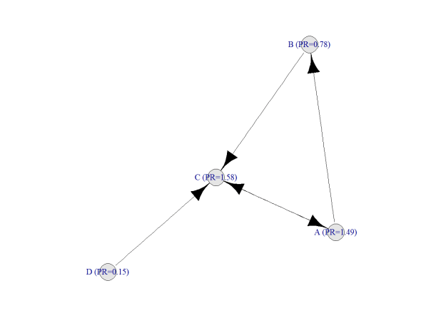
After doing this, result is:

PR2

Following you can find my code to do it with sqldf, which is quite simple from my point of view. I am pretty sure there must be some package which calculates PageRank but the main goal of this post is to show how easy is to calculate it with two simple queries, no more. The example is taken from here, where you can find a good explanation of how PageRank works:

require(sqldf)
require(igraph)
net=data.frame(origin=c("A","A","B","C","D"), end=c("C","B","C","A","C"))
par(family="serif", cex=1, ps=25, bg="white", col.lab="black", col.axis="black")
plot(graph.edgelist(as.matrix(net)), edge.arrow.size=1, vertex.color="gray90", edge.color="black")
#Initialization
netou=sqldf("SELECT origin, COUNT(*) outs FROM net GROUP BY 1")
netpr=sqldf("SELECT origin vertex, 1.0 pagerank FROM net UNION SELECT end, 1.0 FROM net")
for (i in 1:50)
{
netx1=sqldf("SELECT vertex, pagerank/outs factor FROM netou a INNER JOIN netpr b ON (a.origin = b.vertex)")
netpr=sqldf("SELECT a.vertex, 0.15+SUM(0.85*COALESCE(factor,0)) AS pagerank
FROM netpr a LEFT OUTER JOIN net b ON (a.vertex = b.end) LEFT OUTER JOIN netx1 c
ON (b.origin = c.vertex) GROUP BY 1")
}
g=graph.edgelist(as.matrix(net))
names=data.frame(vertex=V(g)$name)
V(g)$name=sqldf("SELECT a.vertex||' (PR='||ROUND(b.pagerank,2)||')' as name from names a inner join netpr b ON (a.vertex=b.vertex)")$name
plot(g, edge.arrow.size=1, vertex.color="gray90", edge.color="black")