Tag Archives: UNdata

The World We Live In #4: Marriage Ages

It is time for women to stop being politely angry (Leymah Gbowee, Nobel Prize Peace Winner)

Sometimes very simple plots give insight into we live in a world of differences. This plot shows the mean age at marriage for men and women across countries:

Marriage Ages

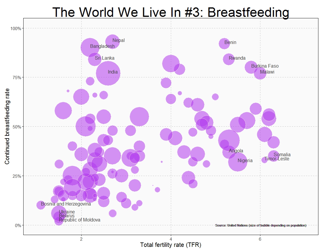
Being a woman in some countries of this world must be a hard experience:

#Singulate mean age at marriage: http://data.un.org/Data.aspx?d=GenderStat&f=inID%3a20
#Population: http://data.un.org/Data.aspx?d=SOWC&f=inID%3a105
require("sqldf")
require("ggplot2")
setwd("YOUR WORKING DIRECTORY HERE")
mar=read.csv("UNdata_Export_20150309_171525152.csv", nrows=321, header=T, row.names=NULL)
pop=read.csv("UNdata_Export_20150309_172046384.csv", nrows=999, header=T, row.names=NULL)
colnames(mar)[1]="Country"
colnames(pop)[1]="Country"
data=sqldf("SELECT
  a.Country,
  a.Value as Pop,
  b.Value as Female,
  c.Value as Male
FROM
  pop a INNER JOIN mar b
  ON (a.Country=b.Country AND b.Subgroup='Female') INNER JOIN mar c
  ON (a.Country=c.Country AND c.Subgroup='Male')
WHERE a.Subgroup = 'Total'")
opts=theme(
  panel.background = element_rect(fill="gray98"),
  panel.border = element_rect(colour="black", fill=NA),
  axis.line = element_line(size = 0.5, colour = "black"),
  axis.ticks = element_line(colour="black"),
  panel.grid.major = element_line(colour="gray75", linetype = 2),
  panel.grid.minor = element_blank(),
  axis.text = element_text(colour="gray25", size=15),
  axis.title = element_text(size=18, colour="gray10"),
  legend.key = element_blank(),
  legend.position = "none",
  legend.background = element_blank(),
  plot.title = element_text(size = 40, colour="gray10"))
ggplot(data, aes(x=Female, y=Male, size=log(Pop), label=Country), guide=FALSE)+
  geom_point(colour="white", fill="chartreuse3", shape=21, alpha=.55)+
  scale_size_continuous(range=c(2,36))+
  scale_x_continuous(limits=c(16,36), breaks=seq(16, 36, by = 2), expand = c(0, 0))+
  scale_y_continuous(limits=c(16,36), breaks=seq(16, 36, by = 2), expand = c(0, 0))+
  geom_abline(intercept = 0, slope = 1, colour = "gray10", linetype=2)+
  labs(title="The World We Live In #4: Marriage Ages",
       x="Females mean age at marriage",
       y="Males mean age at marriage")+
  geom_text(data=subset(data, abs(Female-Male)>7), size=5.5, colour="gray25", hjust=0, vjust=0)+
  geom_text(data=subset(data, Female>=32|Female<=18), size=5.5, colour="gray25", hjust=0, vjust=0)+
  geom_text(aes(24, 17), colour="gray25", hjust=0, label="Source: United Nations (size of bubble depending on population)", size=5)+opts

The World We Live In #3: Breastfeeding

Facts are stubborn, but statistics are more pliable (Mark Twain)

According to World Health Organization, exclusive breastfeeding is recommended up to 6 months of age, with continued breastfeeding along with appropriate complementary foods up to two years of age or beyond. Thus, the defining characteristic of continued breastfeeding is that the infant between 6 months and 2 years of age receives at least some breast milk regardless of the quantity or the presence of other foods or liquids in the diet.

On the other hand, as can be read in The World Factbook of Central Intelligence Agency, the Total Fertility Rate (TFR) is the average number of children that would be born to a woman over her lifetime if she were to experience the exact current age-specific fertility rates through her lifetime and she were to survive from birth through the end of her reproductive life. It is obtained by summing the single-year age-specific rates at a given time.

This is how the world is arranged according to these two rates:

#Rstats #R There are many differences between countries. Both rates are very low in some east European countries like Ukraine, Bosnia, Belarus and Moldova. On the other hand both of them are very high in Benin, Rwanda, Burkina Faso and Malawi, all of them African. Also African countries are Angola, Nigeria and Somalia where fertility rate is very high but breastfeeding is not very established (Timor-Leste in Asia belongs to this segment as well); and women in Nepal, Bangladesh, Sri-Lanka and India feed their moderate number of descendants with their own milk.

We live in a complex and beautiful world which cannot be measured only with averages nor standard deviations:

#Continued breastfeeding rate: http://data.un.org/Data.aspx?d=SOWC&f=inID%3a89
#Total fertility rate (TFR): http://data.un.org/Data.aspx?d=SOWC&f=inID%3a127
#Population: http://data.un.org/Data.aspx?d=SOWC&f=inID%3a105
require("sqldf")
require("ggplot2")
require("scales")
breastfeeding=read.csv("UNdata_Export_20141122_122134175.csv", nrows=124, header=T, row.names=NULL)
fertility=read.csv("UNdata_Export_20141122_122330581.csv", nrows=570, header=T, row.names=NULL)
population=read.csv("UNdata_Export_20141122_142359579.csv", nrows=999, header=T, row.names=NULL)
colnames(breastfeeding)[1]="Country"
colnames(fertility)[1]="Country"
colnames(population)[1]="Country"
data=sqldf("SELECT a.Country, a.Value as Pop, b.Value as Fertility, c.Value as Breastfeeding
           FROM population a inner join fertility b
           on (a.Country=b.Country) INNER JOIN breastfeeding c
           on (a.Country=c.Country)
           where a.Subgroup = 'Total' AND b.Year = 2011
           AND a.Country NOT IN ('World', 'South Asia',
           'Sub-Saharan Africa', 'Least Developed Countries/Territories', 'Eastern and Southern Africa',
           'East Asia and Pacific')")
opts=theme(
  panel.background = element_rect(fill="gray98"),
  panel.border = element_rect(colour="black", fill=NA),
  axis.line = element_line(size = 0.5, colour = "black"),
  axis.ticks = element_line(colour="black"),
  panel.grid.major = element_line(colour="gray75", linetype = 2),
  panel.grid.minor = element_blank(),
  axis.text.y = element_text(colour="gray25", size=15),
  axis.text.x = element_text(colour="gray25", size=15),
  text = element_text(size=20),
  legend.key = element_blank(),
  legend.position = "none",
  legend.background = element_blank(),
  plot.title = element_text(size = 45))
ggplot(data, aes(x=Fertility, y=Breastfeeding/100, size=log(Pop), label=Country), guide=FALSE)+
  geom_point(colour="white", fill="darkorchid2", shape=21, alpha=.55)+
  scale_size_continuous(range=c(2,40))+
  scale_x_continuous(limits=c(1,7))+
  scale_y_continuous(limits=c(0,1), labels = percent)+
  labs(title="The World We Live In #3: Breastfeeding",
       x="Total fertility rate (TFR)",
       y="Continued breastfeeding rate")+
  geom_text(data=subset(data, Fertility>5 & (Breastfeeding>75|Breastfeeding<40)), size=5.5, colour="gray25", hjust=0, vjust=0)+
  geom_text(data=subset(data, Fertility<3 & Breastfeeding>75), size=5.5, colour="gray25", hjust=0, vjust=0)+
  geom_text(data=subset(data, Fertility<2 & Breastfeeding<12), size=5.5, colour="gray25", hjust=0, vjust=0)+
  geom_text(aes(5, 0), colour="gray25", hjust=0, label="Source: United Nations (size of bubble depending on population)", size=4)+opts

The World We Live In #2: To Study Or To Work

I was getting ready for school and about to wear my uniform when I remembered that our principal had told us not to wear uniforms. So I decided to wear my favorite pink dress (Malala Yousafzai)

After reading the diary of a Pakistani schoolgirl and Malala’s history, there is no doubt of being in front of a brave girl. A girl that will fight against monsters who deprive children of their childhood. A girl who knows that one book, one pen, one child and one teacher can change this unfair world. A girl who knew she had won the Nobel Prize of Peace in her chemistry lesson and finished the school time before making her first statement. A girl for whom the prize is just the beginning: a girl that gives us hope. Long live Malala:
TWWLI2
To know where to obtain data for this plot, check out this post. This is the code:

require("sqldf")
require("plyr")
require("stringdist")
childlabour=read.csv("UNdata_Export_20141013_ChildLabour.csv", nrows=335, header=T, row.names=NULL)
education=read.csv("UNdata_Export_20141013_Education.csv", nrows=2994, header=T, row.names=NULL)
population =read.csv("UNdata_Export_20140930_Population.csv",  nrows=12846, header=T, row.names=NULL)
population=rename(population, replace = c("Country.or.Area" = "Country"))
education=rename(education, replace = c("Reference.Area" = "Country"))
education=rename(education, replace = c("Time.Period" = "Year"))
childlabour=rename(childlabour, replace = c("Country.or.Area" = "Country"))
population=sqldf("SELECT a.Country, a.Year, a.Value as Pop
FROM population a INNER JOIN (SELECT Country, MAX(Year) AS Year FROM population GROUP BY 1) b
ON (a.Country=b.Country AND a.Year=b.Year)
WHERE (a.Country NOT LIKE '%INCOME%')
AND (a.Country NOT LIKE '%WORLD%')
AND (a.Country NOT LIKE '%developing%')
AND (a.Country NOT LIKE '%OECD%')
AND (a.Country NOT LIKE '%countries%')
AND (a.Country NOT LIKE '%South Asia%')
AND (a.Country NOT LIKE '%Small states%')
AND (a.Country NOT LIKE '%Euro area%')
AND (a.Country NOT LIKE '%European Union%')
AND (a.Country NOT LIKE '%North America%')")
childlabour=sqldf("SELECT * FROM childlabour WHERE Subgroup='Total 5-14 yr'")
education=sqldf("SELECT a.* FROM education a INNER JOIN (SELECT Country, MAX(Year) AS Year FROM education GROUP BY 1) b
ON (a.Country=b.Country AND a.Year=b.Year)")
data=sqldf("SELECT a.Country, a.Pop, b.Value as ChildLabour, c.Observation_Value as Education
FROM
population a INNER JOIN childlabour b
ON (a.Country=b.Country) INNER JOIN education c
ON (a.Country=c.Country)")
require(ggplot2)
require(scales)
opts=theme(
panel.background = element_rect(fill="gray98"),
panel.border = element_rect(colour="black", fill=NA),
axis.line = element_line(size = 0.5, colour = "black"),
axis.ticks = element_line(colour="black"),
panel.grid.major = element_line(colour="gray75", linetype = 2),
panel.grid.minor = element_blank(),
axis.text.y = element_text(colour="gray25", size=15),
axis.text.x = element_text(colour="gray25", size=15),
text = element_text(size=20),
legend.key = element_blank(),
legend.position = "none",
legend.background = element_blank(),
plot.title = element_text(size = 45)
)
ggplot(data, aes(x=ChildLabour/100, y=Education/100, size=log(Pop), label=Country), guide=FALSE)+
geom_point(colour="white", fill="red", shape=21, alpha=.55)+
scale_size_continuous(range=c(2,40))+
scale_x_continuous(limits=c(0,.5), labels = percent)+
scale_y_continuous(limits=c(0,.12), labels = percent)+
labs(title="The World We Live In #2: To Study Or To Work",
x="% of Child Workers between 5-14 years old",
y="Public Expenditure on Education as % of GNI")+
geom_text(data=subset(data, ChildLabour/100>.3 | Education/100>.07| Education/10<.022), size=5.5, colour="gray25", hjust=0, vjust=0)+
geom_text(aes(.2, .0), colour="gray25", hjust=0, label="Countries of the world (Source: United Nations Statistics Division) Size of bubble depending on population", size=5)+
opts

The World We Live In #1: Obesity And Cells

Lesson learned, and the wheels keep turning (The Killers – The world we live in)

I discovered this site with a huge amount of data waiting to be analyzed. The first thing I’ve done is this simple graph, where you can see relationship between cellular subscribers and obese people. Bubbles are countries and its size depends on the population:
TWWLI1
Some quick conclusions:

  • The more cellular subscribers, the more obese people
  • Pacific islands such as Kiribati, Palau and Tonga are plenty of happy people
  • Singapore people are thinner than they should be
  • How do Saudi Arabian and Panamanian manage two cellulars?

This is the world we live in.

cellular  =read.csv("UNdata_Export_20140930_cellular.csv",   nrows=193,   header=T, row.names=NULL)
obese     =read.csv("UNdata_Export_20140930_obese.csv",      nrows=567,   header=T, row.names=NULL)
population=read.csv("UNdata_Export_20140930_population.csv", nrows=12846, header=T, row.names=NULL)
require("sqldf")
require("plyr")
population=rename(population, replace = c("Country.or.Area" = "Country"))
population=sqldf("SELECT a.Country, a.Year, a.Value as Population
FROM population a INNER JOIN (SELECT Country, MAX(Year) AS Year FROM population GROUP BY 1) b
      ON (a.Country=b.Country AND a.Year=b.Year)")
cellular=rename(cellular, replace = c("Country.or.Area" = "Country"))
cellular=rename(cellular, replace = c("Value" = "Cellular"))
obese=rename(obese, replace = c("Country.or.Area" = "Country"))
obese=rename(obese, replace = c("Year.s." = "Year"))
obese=sqldf("SELECT a.Country, a.Year, SUBSTR(TRIM(Value), 1, CHARINDEX(' [', TRIM(Value))) as Obeses
FROM obese a INNER JOIN (SELECT Country, MAX(Year) AS Year FROM obese WHERE GENDER='Both sexes' GROUP BY 1) b
ON (a.Country=b.Country AND a.Year=b.Year AND a.GENDER='Both sexes')")
obese$Obeses=as.numeric(obese$Obeses)
data=sqldf("SELECT a.Country, a.Cellular, c.Obeses, b.Population FROM cellular a inner join population b on a.Country = b.Country
      inner join obese c on (a.Country = c.Country) WHERE a.Country NOT IN ('World', 'South Asia')")
require(ggplot2)
require(scales)
opts=theme(
  panel.background = element_rect(fill="gray98"),
  panel.border = element_rect(colour="black", fill=NA),
  axis.line = element_line(size = 0.5, colour = "black"),
  axis.ticks = element_line(colour="black"),
  panel.grid.major = element_line(colour="gray75", linetype = 2),
  panel.grid.minor = element_blank(),
  axis.text.y = element_text(colour="gray25", size=15),
  axis.text.x = element_text(colour="gray25", size=15),
  text = element_text(size=20),
  legend.key = element_blank(),
  legend.position = "none",
  legend.background = element_blank(),
  plot.title = element_text(size = 45)
    )
ggplot(data, aes(x=Cellular/100, y=Obeses/100, size=Population, label=Country), guide=FALSE)+
  geom_point(colour="white", fill="red", shape=21, alpha=.65)+
  scale_size_continuous(range=c(3,35))+
  scale_x_continuous(limits=c(0,2.1), labels = percent)+
  scale_y_continuous(limits=c(0,.6), labels = percent)+
  labs(title="The World We Live In #1: Obesity And Cells",
       x="Cellular Subscribers (per 100 population)",
       y="Adults aged >= 20 years who are obese (%)")+
  geom_text(data=subset(data, Cellular/100 > 1.9 | Obeses/100 > .4 | (Cellular/100 > 1.4 & Obeses/100 < .15)), size=5, colour="gray25", hjust=0, vjust=0)+
  geom_text(aes(.9, .0), colour="blue", hjust=0, label="World's Countries (Source: United Nations Statistics Division. Size of bubble depending on population", size=4)+
  opts