Someday you will find me
caught beneath the landslide
(Champagne Supernova, Oasis)
I recently read a book called Snowflake Seashell Star: Colouring Adventures in Numberland by Alex Bellos and Edmund Harris which is full of mathematical patterns to be coloured. All images are truly appealing and cause attraction to anyone who look at them, independently of their age, gender, education or political orientation. This book demonstrates how maths are an astonishing way to reach beauty.
One of my favourite patterns are tridokus, a sophisticated colored version of sudokus. Coloring a sudoku is simple: once that is solved it is enough to assign a color to each number (from 1 to 9). If you superimpose three colored sudokus with no cells at the same position sharing the same color, and using again nine colors, the resulting image is a tridoku:
There is something attractive in a tridoku due to the balance of colors but also they seem a quite messy: they are a charmingly unbalanced. I wrote a script to generalize the concept to n-dokus. The idea is the same: superimpose n sudokus without cells sharing color and position (I call them disjoint sudokus) using just nine different colors. I did’n’t prove it, but I think the maximum amount of sudokus can be overimposed with these constrains is 9. This is a complete series from 1-doku to 9-doku (click on any image to enlarge):
I am a big fan of colourlovers package. These tridokus are colored with some of my favourite palettes from there:
Just two technical things to highlight:
There is a package called sudoku that generates sudokus (of course!). I use it to obtain the first solved sudoku which forms the base.
Subsequent sudokus are obtained from this one doing two operations: interchanging groups of columns first (there are three groups: columns 1 to 3, 4 to 6 and 7 to 9) and interchanging columns within each group then.
You can find the code here: do you own colored n-dokus!
Bach, the epitome of a musician who strove all life long and finally acquired the ‘Habit of Perfection’, was a thoroughly imperfect human being (John Eliot Gardiner, Bach: Music in the Castle of Heaven)
Sometimes I dream awake and imagine I am a famous musician. I fantasize being Paco de Lucía playing Mi niño Curro alone on the stage, Thom Yorke singing Fake plastic trees at Glastombury or Noel Gallagher singing Don’t look back in anger for a devoted crowd.
My parents gave me the opportunity to learn music, and this has been one of the best gifts I have received ever. I played the cello intensively until I had children but I still have enough skills to play some pieces. One of that is the Prelude of Suite No. 1 of J. S. Bach. It is very close to the limit of my possibilities but I love it. It is timeless, thrilling, provocative and elegant: an absolute masterpiece. I also imagine myself often playing it as well as my admired Yo-Yo Ma does.
The aim of this experiment is to discern first 4 beats of the prelude using a genetic algorithm. First of all, let’s listen our goal melody, created with tuneR package (sorry for the sound, Mr. Bach):
The frequency range of cello goes from 65.41 Hz to 987.77 Hz. Using the basic formula for the frequency of the notes, it means that a cello can produce 48 different notes. I generated the next codification for the 48 notes of the cello:
I start with a population of 500 random melodies. All of them have 64 notes, the same length as the goal melody has. Given a melody, the algorithm compares it with the goal melody to calculate its fitness, with the following formula:
For example, a melody with 5 correct notes has a fitness of 32. Being correct means being the right note in the right place. After measuring fitness of all melodies, I select 250 couples of individuals depending of its fitness (the more fitness, the more probability of being selected). Each couple generates two children for the next generation depending on certain probability, called crossover rate. Crossing operation is not always applied. Once two parents are selected, a random crossover point is chosen. At that point in both strings the genetic material from the left side of one parent is spliced to the material from the right side of other parent. The next figure illustrates the idea:
So two parents give birth to two children for the next generation. The last thing to do is mutate children. Once again, mutation is not always applied since it depends on a rate, usually small. Mutation introduces some new notes (new genetic material) to the next population. It increases convergence speed and reduces the probability to obtain a local optimum.
How many 32 -length melodies can be written with 48 notes? The answer is 4832, which is this extremely big number:
To understand how enormous is, let’s suppose we could work with Sunway TaihuLight, the fastest supercomputer in the world nowadays. This monster can do 93.000.000.000.000.000 floating-point operations per second so it will expend more than 214.995.831.974.513.789.322.026.202.008 years to calculate the fitness of all possible melodies: brute force is not an option.
A genetic algorithm does the job in just a few iterations. Best melodies introduce innovations which increase the average fitness of the whole population as well as its maximum fitness. Next table shows the evolution of an execution of the algorithm for a crossover rate equal of 75% and a mutation rate of 1% (not exhaustive):
The optimum is reached in just 125 iterations. It is funny to merge the best melodies of some iterations. This sample blends four of them. The first one comes from the first initial population (the Schoenberg flavored) and the last one is our goal melody. The other two were randomly picked from the rest iterations. It is nice to hear how the genetic algorithm turns randomness into the wonderful Bach’s melody:
The fourth, the fifth, the minor fall and the major lift (Hallelujah, Leonard Cohen)
Next problem is extracted from MacKay’s Information Theory, Inference and Learning Algorithms:
Two people have left traces of their own blood at the scene of a crime. A suspect, Oliver, is tested and found to have type ‘O’ blood. The blood groups of the two traces are found to be of type ‘O’ (a common type in the local population, having frequency 60%) and of type ‘AB’ (a rare type, with frequency 1%). Do these data give evidence in favor of the proposition that Oliver was one of the people who left blood at the scene?
To answer the question, let’s first remember the probability form of Bayes theorem:
where:
p(H) is the probability of the hypothesis H before we see the data, called the prior
p(H|D) is the probablity of the hyothesis after we see the data, called the posterior
p(D|H) is the probability of the data under the hypothesis, called the likelihood
p(D)is the probability of the data under any hypothesis, called the normalizing constant
If we have two hypothesis, A and B, we can write the ratio of posterior probabilities like this:
If p(A)=1-p(B) (what means that A and B are mutually exclusive and collective exhaustive), then we can rewrite the ratio of the priors and the ratio of the posteriors as odds. Writing o(A) for odds in favor of A, we get the odds form of Bayes theorem:
Dividing through by o(A) we have:
The term on the left is the ratio of the posteriors and prior odds. The term on the right is the likelihood ratio, also called the Bayes factor. If it is greater than 1, that means that the data were more likely under A than under B. And since the odds ratio is also greater than 1, that means that the odds are greater, in light of the data, than they were before. If the Bayes factor is less than 1, that means the data were less likely under A than under B, so th odds in favor of A go down.
Let’s go back to our initial problem. If Oliver left his blood at the crime scene, the probability of the data is just the probability that a random member of the population has type ‘AB’ blood, which is 1%. If Oliver did not leave blood at the scene, what is the the chance of finding two people, one with type ‘O’ and one with type ‘AB’? There are two ways it might happen: the first person we choose might have type ‘O’ and the second ‘AB’, or the other way around. So the probability in this case is 2(0.6)(0.01)=1.2%. Dividing probabilities of both scenarios we obtain a Bayes factor of 0.83, and we conclude that the blood data is evidence against Oliver’s guilt.
Once I read this example, I decided to replicate it using real data of blood type distribution by country from here. After cleaning data, I have this nice data set to work with:
For each country, I get the most common blood type (the one which the suspect has) and the least common and replicate the previous calculations. For example, in the case of Spain, the most common type is ‘O+’ with 36% and the least one is ‘AB-‘ with 0.5%. The Bayes factor is 0.005/(2(0.36)(0.005))=1.39 so data support the hypothesis of guilt in this case. Next chart shows Bayes factor accross countries:
Just some comments:
Sometimes data consistent with a hypothesis are not necessarily in favor of the hypothesis
How different is the distribution of blood types between countries!
If you are a estonian ‘A+’ murderer, choose carefully your accomplice
This is the code of the experiment:
library(rvest)
library(dplyr)
library(stringr)
library(DT)
library(highcharter)

# Webscapring of the table with the distribution of blood types
url <- "http://www.rhesusnegative.net/themission/bloodtypefrequencies/"
blood <- url %>%
   read_html() %>%
   html_node(xpath='/html/body/center/table') %>%
   html_table(fill=TRUE)

# Some data cleansing
blood %>% slice(-c(66:68)) -> blood

blood[,-c(1:2)] %>%
  sapply(gsub, pattern=",", replacement=".") %>%
  as.data.frame %>%
  sapply(gsub, pattern=".79.2", replacement=".79") %>%
  as.data.frame-> blood[,-c(1:2)]

blood %>%
  sapply(gsub, pattern="%|,", replacement="") %>%
  as.data.frame -> blood

blood[,-1] = apply(blood[,-1], 2, function(x) as.numeric(as.character(x)))


blood[,-c(1:2)] %>% mutate_all(funs( . / 100)) -> blood[,-c(1:2)]

# And finally, we have a nice data set
datatable(blood,
          rownames = FALSE,
          options = list(
          searching = FALSE,
          pageLength = 10)) %>%
  formatPercentage(3:10, 2)

# Calculate the Bayes factor
blood %>%
  mutate(factor=apply(blood[,-c(1,2)], 1, function(x) {min(x)/(2*min(x)*max(x))})) %>%
  arrange(factor)-> blood

# Data Visualization
highchart() %>%
     hc_chart(type = "column") %>%
     hc_title(text = "Bayesian Blood") %>%
     hc_subtitle(text = "An experiment about the Bayes Factor") %>%
     hc_xAxis(categories = blood$Country,
             labels = list(rotation=-90, style = list(fontSize = "12px")))  %>%
     hc_yAxis(plotBands = list(list(from = 0, to = 1, color = "rgba(255,215,0, 0.8)"))) %>%
     hc_add_series(data = blood$factor,
                   color = "rgba(255, 0, 0, 0.5)",
                   name = "Bayes Factor")%>%
  hc_yAxis(min=0.5) %>%
  hc_tooltip(pointFormat = "{point.y:.2f}") %>%
  hc_legend(enabled = FALSE) %>%
  hc_exporting(enabled = TRUE) %>%
  hc_chart(zoomType = "xy")
I said, “Wait a minute, Chester, you know I’m a peaceful man”, He said, “That’s okay, boy, won’t you feed him when you can” (The Weight, The Band)
It is quite easy to calculate the probability of obtaining the same number of heads and tails when tossing a coin N times, and N is even. There are possible outcomes and only are favorable so the exact probability is the quotient of these numbers (# of favorable divided by # of possible).
There is another way to approximate this number incredibly well: to use the Stirling’s formula, which is
The next plot represents both calculations for N from 2 to 200. Although for small values of N, Stirling’s approximation tends to overestimate probability, you can see hoy is extremely precise as N becomes bigger:
James Stirling published this amazing formula in 1730. It simplifies the calculus to the extreme and also gives a quick way to obtain the answer to a very interesting question: how many tosses are needed to be sure that the probability of obtaining the same number of heads and tails is under any given threshold? Just solve the formula for N and you will obtain the answer. And, also, the formula is another example of the presence of in the most unexpected places, as happens here.
Just another thing: the more I use highcharter package the more I like it.
This is the code:
library(highcharter)
library(dplyr)
data.frame(N=seq(from=2, by=2, length.out = 100)) %>%
  mutate(Exact=choose(N,N/2)/2**N, Stirling=1/sqrt(pi*N/2))->data
hc <- highchart() %>%
  hc_title(text = "Stirling's Approximation") %>%
  hc_subtitle(text = "How likely is getting 50% heads and 50% tails tossing a coin N times?") %>%
  hc_xAxis(title = list(text = "N: Number of tosses"), categories = data$N) %>%
  hc_yAxis(title = list(text = "Probability"), labels = list(format = "{value}%", useHTML = TRUE)) %>%
  hc_add_series(name = "Stirling", data = data$Stirling*100,  marker = list(enabled = FALSE), color="blue") %>%
  hc_add_series(name = "Exact", data = data$Exact*100,  marker = list(enabled = FALSE), color="lightblue") %>%
  hc_tooltip(formatter = JS("function(){return ('<b>Number of tosses: </b>'+this.x+'
<b>Probability: </b>'+Highcharts.numberFormat(this.y, 2)+'%')}")) %>%
  hc_exporting(enabled = TRUE) %>%
  hc_chart(zoomType = "xy")
hc
If there is a God, he’s a great mathematician (Paul Dirac)
Imagine you toss a coin 12 times and you count how many heads and tails you are obtaining after each throwing (the coin is equilibrated so the probability of head or tail is the same). At some point, it can happen that number of heads and number of tails are the same. For example, if you obtain the sequence T-H-T-T-H-T-H-H-T-T-H-H, after the second throwing, number of heads is equal to number of tails (and both equal to one). It happens again after the 8th throwing and after last one. In this example, the last throwing where equallity occurs is the number 12. Obviously, equallity can only be observed in even throwings.
If you repeat the experiment 10.000 times you will find something like this if you draw the relative frequency of the last throwing where cumulated number of heads is equal to the one of tails:
From my point of view there are three amazing things in this plot:
It is symmetrical, so prob(n)=prob(12-n)
The least likely throwing to obtain the last equality is the central one.
As a corollary, the most likely is not obtaining any equality (number of heads never are the same than number of tails) or obtaining last equality in the last throwing: two extremely different scenarios with the same chances to be observed.
Behind the simplicity of tossing coins there is a beautiful universe of mathematical surprises.
So rock me mama like a wagon wheel, rock me mama anyway you feel (Wagon Wheel, Old Crow Medicine Show)
This is the third iteration of Hilbert curve. I placed points in its corners. Since the curve has beginning and ending, I labeled each vertex with the order it occupies:Dark green vertex are those labeled with prime numbers and light ones with non-prime. This is the sixth iteration colored as I described before (I removed lines and labels):
Previous plot has 4.096 points. There are 564 primes lower than 4.096. What If I color 564 points randomly instead coloring primes? This is an example:
Do you see any difference? I do. Let me place both images together (on the left, the one with primes colored):
The dark points are much more ordered in the first plot. The second one is more noisy. This is my particular tribute to Stanislaw Ulam and its spiral: one of the most amazing fruits of boredom in the history of mathematics.
Every finite game has an equilibrium point (John Nash, Non-Cooperative Games, 1950)
I read recently this amazing book, where I discovered that we (humans) are not capable of generating random sequences of numbers by ourselves when we play lottery. John Haigh demonstrates this fact analyzing a sample of 282 raffles of 6/49 UK Lotto. Once I read this, I decided to prove if this disability is property only of British population or if it is shared with Spanish people as well. I am Spanish, so this experiment can bring painful results to myself, but here I come.
The Spanish equivalent of 6/40 UK Lotto is called “Lotería Primitiva” (or “Primitiva”, to abbreviate). This is a ticket of Primitiva lotto:
As you can see, one ticket gives the chance to do 8 bets. Each bet consists on 6 numbers between 1 and 49 to be chosen in a grid of 10 rows by 5 columns. People tend to choose separate numbers because we think that they are more likely to come up than combinations with some consecutive numbers. We think we have more chances to get rich choosing 4-12-23-25-31-43 rather than 3-17-18-19-32-33, for instance. To be honest, I should recognize I am one of these persons.
Primitiva lotto is managed by Sociedad Estatal Loterías y Apuestas del Estado, a public business entity belonging to the Spanish Ministry of Finance and Public Administrations. They know what people choose and they could do this experiment more exactly than me. They could analyze just human bets (those made by players by themselves) and discard machine ones (those made automatically by vending machines) but anyway it is possible to confirm the previous thesis with some public data.
I analysed 432 raffles of Primitiva carried out between 2011 and 2015; for each raffle I have this information:
The six numbers that form the winning combination
Total number of bets
Number of bets which hit the six numbers (Observed Winners)
The idea is to compare observed winners of raffles with the expected number of them, estimated as follows:
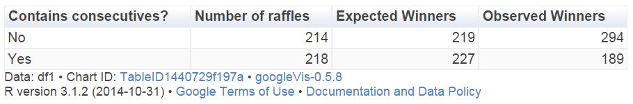
This table compare the number of expected and observed winners between raffles which contain consecutive and raffles which not:
There are 214 raffles without consecutive with 294 winners while the expected number of them was 219. In other words, a winner of a non-consecutive-raffle must share the prize with a 33% of some other person. On the other hand, the number of observed winners of a raffle with consecutive numbers 17% lower than the expected one. Simple and conclusive. Spanish are like British, at least in what concerns to this particular issue.
Let’s go further. I can do the same for any particular number. For example, there were 63 raffles containing number 45 in the winning combination and 57 (observed) winners, although 66 were expected. After doing this for every number, I can draw this plot, where I paint in blue those which ratio of observed winners between expected is lower than 0.9:
It seems that blue numbers are concentrated on the right side of the grid. Do we prefer small numbers rather than big ones? There are 15 primes between 1 and 49 (rate: 30%) but only 3 primes between blue numbers (rate: 23%). Are we attracted by primes?
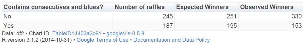
Let’s combine both previous results. This table compares the number of expected and observed winners between raffles which contain consecutive and blues (at least one) and raffles which not:
Now, winning combinations with some consecutive and some blue numbers present 20% less of observed winners than expected. After this, which combination would you choose for your next bet? 27-35-36-41-44-45 or 2-6-13-15-26-28? I would choose the first one. Both of them have the same probability to come up, but probably you will become richer with the first one if it happens.
This is the code of this experiment. If someone need the dataset set to do their own experiments, feel free to ask me (you can find my email here):
library("xlsx")
library("sqldf")
library("Hmisc")
library("lubridate")
library("ggplot2")
library("extrafont")
library("googleVis")
windowsFonts(Garamond=windowsFont("Garamond"))
setwd("YOUR WORKING DIRECTORY HERE")
file = "SORTEOS_PRIMITIVA_2011_2015.xls"
data=read.xlsx(file, sheetName="ALL", colClasses=c("numeric", "Date", rep("numeric", 21)))
#Impute null values to zero
data$C1_EUROS=with(data, impute(C1_EUROS, 0))
data$CE_WINNERS=with(data, impute(CE_WINNERS, 0))
#Expected winners for each raffle
data$EXPECTED=data$BETS/(factorial(49)/(factorial(49-6)*factorial(6)))
#Consecutives indicator
data$DIFFMIN=apply(data[,3:8], 1, function (x) min(diff(sort(x))))
#Consecutives vs non-consecutives comparison
df1=sqldf("SELECT CASE WHEN DIFFMIN=1 THEN 'Yes' ELSE 'No' END AS CONS,
      COUNT(*) AS RAFFLES,
      SUM(EXPECTED) AS EXP_WINNERS,
      SUM(CE_WINNERS+C1_WINNERS) AS OBS_WINNERS
      FROM data GROUP BY CONS")
colnames(df1)=c("Contains consecutives?", "Number of  raffles", "Expected Winners", "Observed Winners")
Table1=gvisTable(df1, formats=list('Expected Winners'='#,###'))
plot(Table1)
#Heat map of each number
results=data.frame(BALL=numeric(0), EXP_WINNER=numeric(0), OBS_WINNERS=numeric(0))
for (i in 1:49)
{
  data$TF=apply(data[,3:8], 1, function (x) i %in% x + 0)
  v=data.frame(BALL=i, sqldf("SELECT SUM(EXPECTED) AS EXP_WINNERS, SUM(CE_WINNERS+C1_WINNERS) AS OBS_WINNERS FROM data WHERE TF = 1"))
  results=rbind(results, v)
}
results$ObsByExp=results$OBS_WINNERS/results$EXP_WINNERS
results$ROW=results$BALL%%10+1
results$COL=floor(results$BALL/10)+1
results$ObsByExp2=with(results, cut(ObsByExp, breaks=c(-Inf,.9,Inf), right = FALSE))
opt=theme(legend.position="none",
          panel.background = element_blank(),
          panel.grid = element_blank(),
          axis.ticks=element_blank(),
          axis.title=element_blank(),
          axis.text =element_blank())
ggplot(results, aes(y=ROW, x=COL)) +
  geom_tile(aes(fill = ObsByExp2), colour="gray85", lwd=2) +
  geom_text(aes(family="Garamond"), label=results$BALL, color="gray10", size=12)+
  scale_fill_manual(values = c("dodgerblue", "gray98"))+
  scale_y_reverse()+opt
#Blue numbers
Bl=subset(results, ObsByExp2=="[-Inf,0.9)")[,1]
data$BLUES=apply(data[,3:8], 1, function (x) length(intersect(x,Bl)))
#Combination of consecutives and blues
df2=sqldf("SELECT CASE WHEN DIFFMIN=1 AND BLUES>0 THEN 'Yes' ELSE 'No' END AS IND,
      COUNT(*) AS RAFFLES,
      SUM(EXPECTED) AS EXP_WINNERS,
      SUM(CE_WINNERS+C1_WINNERS) AS OBS_WINNERS
      FROM data GROUP BY IND")
colnames(df2)=c("Contains consecutives and blues?", "Number of  raffles", "Expected Winners", "Observed Winners")
Table2=gvisTable(df2, formats=list('Expected Winners'='#,###'))
plot(Table2)
Dici che il fiume trova la via al mare e come il fiume giungerai a me (Miss Sarajevo, U2)
One way to calculate approximately the area of some place is to circumscribe it into a polygon of which you know its area. After that, generate coordinates inside the polygon and count how many of them fall into the place. The percentage of coordinates inside the place by the area of the polygon is an approximation of the desired area.
I applied this technique to calculate the area of the Vatican City. I generated a squared grid of coordinates around the Capella Sistina (located inside the Vatican City). To calculate the area I easily obtain the convex hull polygon of the coordinates using chull function of grDevices package. Then, I calculate the area of the polygon using areaPolygon function of geosphere package.
To obtain how many coordinates of the grid fall inside the Vatican City, I use revgeocode function of ggmap package (I love this function). For me, one coordinate is inside the Vatican City if its related address contains the words “Vatican City”.
What happens generating a grid of 20×20 coordinates? I obtain that the area of the Vatican City is about 0.32Km2 but according to Wikipedia, the area is 0.44Km2: this method underestimates the area around a 27%. But why? Look at this:
This plot shows which addresses of the grid fall inside the Vatican City (ones) and which of them do not fall inside (zeros). As you can see, there is a big zone in the South, and a smaller one in the North of the city where reverse geocode do not return “Vatican City” addresses.
Maybe Pope Francis should phone Larry Page and Sergey Brin to claim this 27% of his wonderful country.
I was willing to do this experiment since I wrote this post. This is the code:
require(geosphere)
require(ggmap)
require(plotGoogleMaps)
require(grDevices)
setwd("YOUR-WORKING-DIRECTORY-HERE")
#Coordinates of Capella Sistina
capella=geocode("capella sistina, Vatican City, Roma")
#20x20 grid of coordinates around the Capella
g=expand.grid(lon = seq(capella$lon-0.010, capella$lon+0.010, length.out=20),
lat = seq(capella$lat-0.005, capella$lat+0.005, length.out=20))
#Hull Polygon containing coordinates
p=g[c(chull(g),chull(g)[1]),]
#Address of each coordinate of grid
a=apply(g, 1, revgeocode)
#Estimated area of the vatican city
length(grep("Vatican City", a))/length(a)*areaPolygon(p)/1000/1000
s=cbind(g, a)
s$InOut=apply(s, 1, function(x) grepl('Vatican City', x[3]))+0
coordinates(s)=~lon+lat
proj4string(s)=CRS('+proj=longlat +datum=WGS84')
ic=iconlabels(s$InOut, height=12)
plotGoogleMaps(s, iconMarker=ic, mapTypeId="ROADMAP", legend=FALSE)
Fill a cocktail shaker with ice; add vodka, triple sec, cranberry, and lime, and shake well; strain into a chilled cocktail glass and garnish with orange twist (Cosmopolitan Cocktail Recipe)
This is a tribute to Blaise Pascal and Joseph Fourier, two of the greatest mathematicians in history. As Pascal did in his famous triangle, I generate a set of random curves (sines or cosines with random amplitudes between 1 and 50) and I arrange them over the lateral edges of the triangle. Each inner curve in the triangle is the sum of the two directly curves above it. This is the result for a 6 rows triangle:
Two comments:
Inner curves are noisy. The greater is the distance from the edge, the higher the entropy. When I was a child, I used to play a game called the broken telephone; I can see some kind of connection between this graphic and the game.
I have read that using eval+parse in sympton of being a bad programmer. Does anyone have an idea to do this in some other way without filling the screen of code?
This is the code:
library(ggplot2)
library(gridExtra)
nrows=6
for (i in 1:nrows){
  eval(parse(text=paste("f",i,1,"=function(x) ", sample(c("sin(","cos("),1), runif(min=1, max=50,1) ,"*x)",sep="")))
  eval(parse(text=paste("f",i,i,"=function(x) ", sample(c("sin(","cos("),1), runif(min=1, max=50,1) ,"*x)",sep="")))}
for (i in 3:nrows) {
  for (j in 2:(i-1)) eval(parse(text=paste("f",i, j, "=function(x) f",(i-1),(j-1), "(x) + f",(i-1),j,"(x)",sep="")))}
vplayout=function(x, y) viewport(layout.pos.row = x, layout.pos.col = y)
opts=theme(legend.position="none",
           panel.background = element_rect(fill="gray95"),
           plot.background = element_rect(fill="gray95", colour="gray95"),
           panel.grid = element_blank(),
           axis.ticks=element_blank(),
           axis.title=element_blank(),
           axis.text =element_blank())
setwd("YOUR WORKING DIRECTORY HERE")
grid.newpage()
jpeg(file="Adding Waves.jpeg", width=1800,height=1000, bg = "gray95", quality = 100)
pushViewport(viewport(layout = grid.layout(nrows, 2*nrows-1)))
for (i in 1:nrows) {
  for (j in 1:i) {
    print(ggplot(data.frame(x = c(0, 20)), aes(x)) + stat_function(fun = eval(parse(text=paste("f",i,j,sep=""))), colour = "black", alpha=.75)+opts, vp = vplayout(i, nrows+(2*j-(i+1))))
  }
}
dev.off()
Match.com will bring more love to the planet than anything since Jesus Christ (Gary Kremen, founder of Match.com)
Sarah is a brilliant 39 years old mathematician living in Massachusetts. She lives alone and has dedicated her whole life to study. She has realized lately that theorems and books no longer satisfy her. Sarah has realized that needs to find love.
To find the love of her life, Sarah joined Match.com to try to have a date with a man every week for a year (52 dates in total). She has her own method to rate each man according his sympathy, his physical appearance, his punctuality, his conversation and his hobbies. This method allows her to compare candidates with each other. Sarah wants to choose the top-scored man but she is afraid to waste time. If she waits until having all the dates, it could be too late to call back the best candidate, especially if he was one of the first dates. So she wants to be agile and decide inmediately. Her plan is as follows: she will start having some dates only to assess the candidates and after this period, she will try to win over the first man better than any of the first candidates, according her scoring.
But, how many men should discard to maximize the probability of choosing the top-scored one? Discarding just one, probability of having a date with a better man in the next date is very high. But probably he will not be the man she is looking for. On the other hand, discarding many men makes very probable discarding also the top-scored one.
Sarah did a simulation in R of the 52 dates to approximate the probability of choosing the best man depending on the number of discards. She obtained that the probability of choosing the top-scored man is maximal discarding the 19 first men, as can be seen in the following graph:
Why 19? Because 19 is approximately 52/e. This is one of the rare places where can found the number e. You can see an explanation of the phenomenon here.
Note: This is just a story to illustrate the secretary problem without repeating the original argument of the problem. My apologies if I cause offense to someone. This is a blog about mathematics and R and this is the way as must be understood.
require(extrafont)
require(ggplot2)
n=52
sims=1000
results=data.frame(discards=numeric(0), triumphs=numeric(0))
for(i in 0:n)
{
  triumphs=0
  for (j in 1:sims) {
    opt=sample(seq(1:n), n, replace=FALSE)
    if (max(opt[1:i])==n)  triumphs=triumphs+0
    else triumphs=triumphs+(opt[i+1:n][min(which(opt[i+1:n] > max(opt[1:i])))]==n)}
  results=rbind(results, data.frame(discards=i, triumphs=triumphs/sims))
}
opts=theme(
  panel.background = element_rect(fill="darkolivegreen1"),
  panel.border = element_rect(colour="black", fill=NA),
  axis.line = element_line(size = 0.5, colour = "black"),
  axis.ticks = element_line(colour="black"),
  panel.grid.major = element_line(colour="white", linetype = 1),
  panel.grid.minor = element_blank(),
  axis.text.y = element_text(colour="black", size=20),
  axis.text.x = element_text(colour="black", size=20),
  text = element_text(size=25, family="xkcd"),
  legend.key = element_blank(),
  legend.background = element_blank(),
  plot.title = element_text(size = 40))
ggplot(results, aes(discards, triumphs))+
  geom_vline(xintercept = n/exp(1), size = 1, linetype=2, colour = "black", alpha=0.8)+
  geom_line(color="green4", size=1.5)+
  geom_point(color="gray92", size=8, pch=16)+
  geom_point(color="green4", size=6, pch=16)+
  ggtitle("How e can help you to find the love of your life")+
  xlab("Discards") +
  ylab("Prob. of finding the love of your life")+
  scale_x_continuous(breaks=seq(0, n, by = 2))+opts


 possible outcomes and only
  are favorable so the exact probability is the quotient of these numbers (# of favorable divided by # of possible).
 in the most unexpected places, as happens
 Dark green vertex are those labeled with prime numbers and light ones with non-prime. This is the sixth iteration colored as I described before (I removed lines and labels):