Distinguishing the signal from the noise requires both scientific knowledge and self-knowledge (Nate Silver, author of The Signal and the Noise)
Analyzing the evolution of NASDAQ-100 stock prices can discover some interesting couples of companies which share a strong common trend despite of belonging to very different sectors. The NASDAQ-100 is made up of 107 equity securities issued by 100 of the largest non-financial companies listed on the NASDAQ. On the other side, Yahoo! Finance is one of the most popular services to consult financial news, data and commentary including stock quotes, press releases, financial reports, and original programming. Using R is possible to download the evolution of NASDAQ-100 symbols from Yahoo! Finance. There is a R package called quantmod which makes this issue quite simple with the function getSymbols. Daily series are long enough to do a wide range of analysis, since most of them start in 2007.
One robust way to determine if two times series, xt and yt, are related is to analyze if there exists an equation like yt=βxt+ut such us residuals (ut) are stationary (its mean and variance does not change when shifted in time). If this happens, it is said that both series are cointegrated. The way to measure it in R is running the Augmented Dickey-Fuller test, available in tseries package. Cointegration analysis help traders to design products such spreads and hedges.
There are 5.671 different couples between the 107 stocks of NASDAQ-100. After computing the Augmented Dickey-Fuller test to each of them, the resulting data frame can be converted into a distance matrix. A nice way to visualize distances between stocks is to do a hierarchical clustering. This is the resulting dendogram of the clustering:
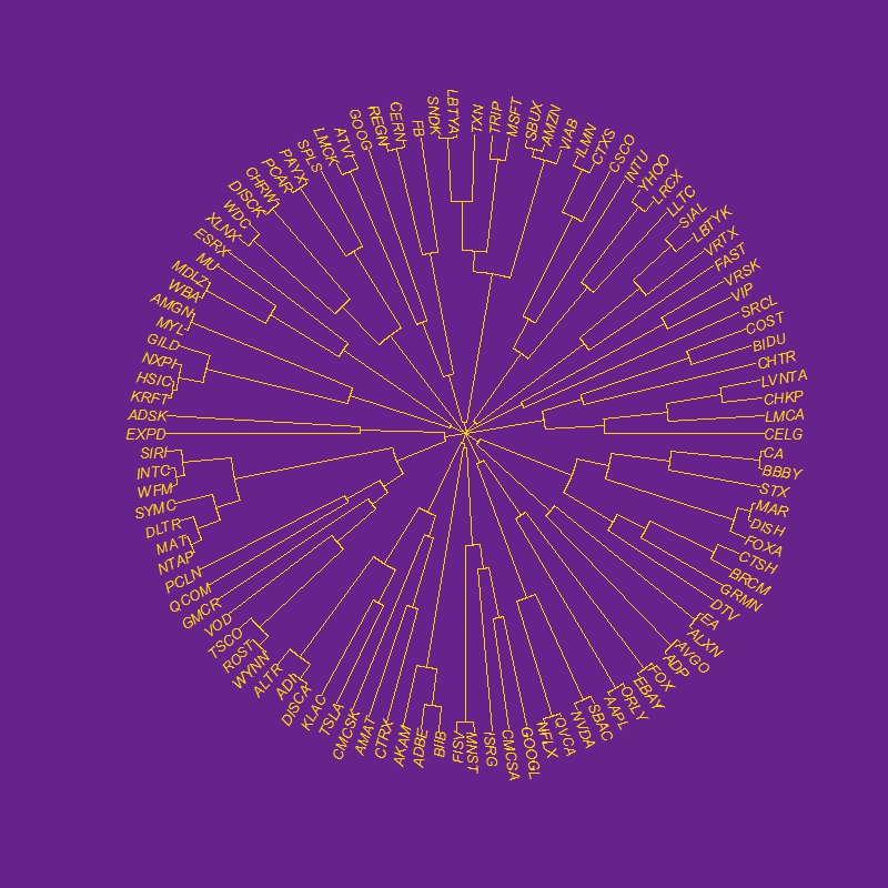
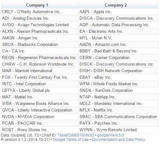
Close stocks such as Ca Inc. (CA) and Bed Bath & Beyond Inc. (BBBY) are joined with short links. A quick way to extract close couples is to cut this dendogram in a big number of clusters and keep those with two elements. Following is the list of the most related stock couples cutting dendogram in 85 clusters:
Most of them are strange neighbors. Next plot shows the evolution closing price evolution of four of these couples:

Analog Devices Inc. (ADI) makes semiconductors and Discovery Communications Inc. (DISCA) is a mass media company. PACCAR Inc. (PCAR) manufactures trucks and Paychex Inc. (PAYX) provides HR outsourcing. CA Inc. (CA) creates software and Bed Bath & Beyond Inc. (BBBY) sells goods for home. Twenty-First Century Fox Inc. (FOX) is a mass media company as well and EBAY Inc. (EBAY) does online auctions. All of them are odd connections.
This is the code of the experiment:
library("quantmod")
library("TSdist")
library("ade4")
library("ggplot2")
library("Hmisc")
library("zoo")
library("scales")
library("reshape2")
library("tseries")
library("RColorBrewer")
library("ape")
library("sqldf")
library("googleVis")
library("gridExtra")
setwd("YOUR-WORKING-DIRECTORY-HERE")
temp=tempfile()
download.file("http://www.nasdaq.com/quotes/nasdaq-100-stocks.aspx?render=download",temp)
data=read.csv(temp, header=TRUE)
for (i in 1:nrow(data)) getSymbols(as.character(data[i,1]))
results=t(apply(combn(sort(as.character(data[,1]), decreasing = TRUE), 2), 2,
function(x) {
ts1=drop(Cl(eval(parse(text=x[1]))))
ts2=drop(Cl(eval(parse(text=x[2]))))
t.zoo=merge(ts1, ts2, all=FALSE)
t=as.data.frame(t.zoo)
m=lm(ts2 ~ ts1 + 0, data=t)
beta=coef(m)[1]
sprd=t$ts1 - beta*t$ts2
ht=adf.test(sprd, alternative="stationary", k=0)$p.value
c(symbol1=x[1], symbol2=x[2], (1-ht))}))
results=as.data.frame(results)
colnames(results)=c("Sym1", "Sym2", "TSdist")
results$TSdist=as.numeric(as.character(results$TSdist))
save(results, file="results.RData")
load("results.RData")
m=as.dist(acast(results, Sym1~Sym2, value.var="TSdist"))
hc = hclust(m)
# vector of colors
op = par(bg = "darkorchid4")
plot(as.phylo(hc), type = "fan", tip.color = "gold", edge.color ="gold", cex=.8)
# cutting dendrogram in 85 clusters
clusdf=data.frame(Symbol=names(cutree(hc, 85)), clus=cutree(hc, 85))
clusdf2=merge(clusdf, data[,c(1,2)], by="Symbol")
sizes=sqldf("SELECT * FROM (SELECT clus, count(*) as size FROM clusdf GROUP BY 1) as T00 WHERE size>=2")
sizes2=merge(subset(sizes, size==2), clusdf2, by="clus")
sizes2$id=sequence(rle(sizes2$clus)$lengths)
couples=merge(subset(sizes2, id==1)[,c(1,3,4)], subset(sizes2, id==2)[,c(1,3,4)], by="clus")
couples$"Company 1"=apply(couples[ , c(2,3) ] , 1 , paste , collapse = " -" )
couples$"Company 2"=apply(couples[ , c(4,5) ] , 1 , paste , collapse = " -" )
CouplesTable=gvisTable(couples[,c(6,7)])
plot(CouplesTable)
# Plots
opts2=theme(
panel.background = element_rect(fill="gray98"),
panel.border = element_rect(colour="black", fill=NA),
axis.line = element_line(size = 0.5, colour = "black"),
axis.ticks = element_line(colour="black"),
panel.grid.major = element_line(colour="gray75", linetype = 2),
panel.grid.minor = element_blank(),
axis.text = element_text(colour="gray25", size=12),
axis.title = element_text(size=18, colour="gray10"),
legend.key = element_rect(fill = "white"),
legend.text = element_text(size = 14),
legend.background = element_rect(),
plot.title = element_text(size = 35, colour="gray10"))
plotPair = function(Symbol1, Symbol2)
{
getSymbols(Symbol1)
getSymbols(Symbol2)
close1=Cl(eval(parse(text=Symbol1)))
close2=Cl(eval(parse(text=Symbol2)))
cls=merge(close1, close2, all = FALSE)
df=data.frame(date = time(cls), coredata(cls))
names(df)[-1]=c(Symbol1, Symbol2)
df1=melt(df, id.vars = "date", measure.vars = c(Symbol1, Symbol2))
ggplot(df1, aes(x = date, y = value, color = variable))+
geom_line(size = I(1.2))+
scale_color_discrete(name = "")+
scale_x_date(labels = date_format("%Y-%m-%d"))+
labs(x="Date", y="Closing Price")+
opts2
}
p1=plotPair("ADI", "DISCA")
p2=plotPair("PCAR", "PAYX")
p3=plotPair("CA", "BBBY")
p4=plotPair("FOX", "EBAY")
grid.arrange(p1, p2, p3, p4, ncol=2)

