Chaos is not a pit: chaos is a ladder (Littlefinger in Game of Thrones)
Some time ago I wrote this post to show how my colleague Vu Anh translated into Shiny one of my experiments, opening my eyes to an amazing new world. I am very proud to present you the first Shiny experiment entirely written by me.
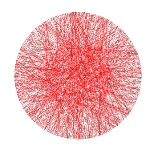
In this case I took inspiration from another previous experiment to draw some kind of wool skeins. The shiny app creates a plot consisting of chords inside a circle. There are to kind of chords:
- Those which form a track because they are a set of glued chords; number of tracks and number of chords per track can be selected using Number of track chords and Number of scrawls per track sliders of the app respectively.
- Those forming the background, randomly allocated inside the circle. Number of background chords can be chosen as well in the app
There is also the possibility to change colors of chords. This are the main steps I followed to build this Shiny app:
- Write a simple R program
- Decide which variables to parametrize
- Open a new Shiny project in RStudio
- Analize the sample UI.R and server.R files generated by default
- Adapt sample code to my particular code (some iterations are needed here)
- Deploy my app in the Shiny Apps free server
Number 1 is the most difficult step, but it does not depends on Shiny: rest of them are easier, specially if you have help as I had from my colleague Jorge. I encourage you to try. This is an snapshot of the app:

You can play with the app here.
Some things I thought while developing this experiment:
- Shiny gives you a lot with a minimal effort
- Shiny can be a very interesting tool to teach maths and programming to kids
- I have to translate to Shiny some other experiment
- I will try to use it for my job
Try Shiny: is very entertaining. A typical Shiny project consists on two files, one to define the user interface (UI.R) and the other to define the back end side (server.R).
This is the code of UI.R:
# This is the user-interface definition of a Shiny web application.
# You can find out more about building applications with Shiny here:
#
# http://shiny.rstudio.com
#

library(shiny)

shinyUI(fluidPage(

  # Application title
  titlePanel("Shiny Wool Skeins"),
  HTML("

This experiment is based on <a href=\"https://aschinchon.wordpress.com/2015/05/13/bertrand-or-the-importance-of-defining-problems-properly/\">this previous one</a> I did some time ago. It is my second approach to the wonderful world of Shiny.

"),
  # Sidebar with a slider input for number of bins
  sidebarLayout(
    sidebarPanel(
      inputPanel(
        sliderInput("lin", label = "Number of track chords:",
                    min = 1, max = 20, value = 5, step = 1),
        sliderInput("rep", label = "Number of scrawls per track:",
                    min = 1, max = 50, value = 10, step = 1),
        sliderInput("nbc", label = "Number of background chords:",
                    min = 0, max = 2000, value = 500, step = 2),
        selectInput("col1", label = "Track colour:",
                    choices = colors(), selected = "darkmagenta"),
        selectInput("col2", label = "Background chords colour:",
                    choices = colors(), selected = "gold")
      )

    ),

    # Show a plot of the generated distribution
    mainPanel(
      plotOutput("chordplot")
    )
  )
))
And this is the code of server.R:
# This is the server logic for a Shiny web application.
# You can find out more about building applications with Shiny here:
#
# http://shiny.rstudio.com
#
library(ggplot2)
library(magrittr)
library(grDevices)
library(shiny)

shinyServer(function(input, output) {

  df<-reactive({ ini=runif(n=input$lin, min=0,max=2*pi)

  data.frame(ini=runif(n=input$lin, min=0,max=2*pi),
             end=runif(n=input$lin, min=pi/2,max=3*pi/2))  -> Sub1

    Sub1=Sub1[rep(seq_len(nrow(Sub1)), input$rep),]
    Sub1 %>% apply(c(1, 2), jitter) %>% as.data.frame() -> Sub1
    Sub1=with(Sub1, data.frame(col=input$col1, x1=cos(ini), y1=sin(ini), x2=cos(end), y2=sin(end)))
    Sub2=runif(input$nbc, min = 0, max = 2*pi)
    Sub2=data.frame(x=cos(Sub2), y=sin(Sub2))
    Sub2=cbind(input$col2, Sub2[(1:(input$nbc/2)),], Sub2[(((input$nbc/2)+1):input$nbc),])
    colnames(Sub2)=c("col", "x1", "y1", "x2", "y2")
    rbind(Sub1, Sub2)
  })

  opts=theme(legend.position="none",
             panel.background = element_rect(fill="white"),
             panel.grid = element_blank(),
             axis.ticks=element_blank(),
             axis.title=element_blank(),
             axis.text =element_blank())

  output$chordplot<-renderPlot({
    p=ggplot(df())+geom_segment(aes(x=x1, y=y1, xend=x2, yend=y2), colour=df()$col, alpha=runif(nrow(df()), min=.1, max=.3), lwd=1)+opts;print(p)
  }, height = 600, width = 600 )
})