The Collatz Fractal

It seems to me that the poet has only to perceive that which others do not perceive, to look deeper than others look. And the mathematician must do the same thing (Sofia Kovalevskaya)

How beautiful is this fractal! In previous posts I colored plots using module of complex numbers generated after some iterations. In this occasion I have used the escape-time algorithm, a very well known coloring algorithm which is very easy to implement in R.
Collatz07
Those who want to know more about this fractal can go here. For coloring, I chose a simple scale from red to yellow resulting a fractal interpretation of my country’s flag. You can choose another scale or use a RColorBrewer palette as I did in this previous post. Choosing another x or y ranges you can zoom particular areas of the fractal.

Try yourself and send me your pictures!

library(ggplot2)
xrange <- seq(-8, 8, by = 0.01)
yrange <- seq(-3, 3, by = 0.01)
f  <- function (z) {1/4*(2+7*z-(2+5*z)*cos(pi*z))}
z <- outer(xrange, 1i*yrange,'+')
t <- mat.or.vec(nrow(z), ncol(z))
for (k in 1:10)
{
  z <- f(z)
  t <- t + (is.finite(z)+0)
}
## Supressing texts, titles, ticks, background and legend.
opt <- theme(legend.position="none",
             panel.background = element_blank(),
             axis.ticks=element_blank(),
             axis.title=element_blank(),
             axis.text =element_blank())
z <- data.frame(expand.grid(x=xrange, y=yrange), z=as.vector(t))
ggplot(z, aes(x=x, y=y, color=z)) + geom_tile() + scale_colour_gradient(low="red", high="yellow") + opt

Do Not Play With Mr. Penney

Facts do not speak (Henry Poincare)

Mr. Penney is my best friend. He is maths teacher and loves playing. Yesterday we were in his office at the university when he suggested me a game:

When you toss a coin three times, you can obtain eight different sequences of tails and heads: TTT, TTH, THT, HTT, THH, HTH, HHT and HHH. Using a fair coin, all sequences have the same chances to appear. Choose one sequence and I will then choose another one. I will toss a coin until either your or my sequence appears as a consecutive subsequence of the coin toss outcomes. The player whose sequence appears first wins. I will repeat this procedure 100 times. The one with more games won is the winner of the game.  Don’t worry: I will not toss the coin manually. I will simulate using my computer. What’s your bet?

Ok, my bet is THT, I said. After some seconds, Mr. Penney said: My bet is TTH.

This was the result of the first round:

Round1Another chance? told me Mr. Penney. Of course! Now my bet is TTH! I said. In fact, I was thinking Take that! Now I chose your previous bet. Do you think I am foolish?. After some seconds, Mr. Penney said: My bet now is HTT.

This was the result of the second round:

Round2

Another chance? told me Mr. Penney. At this point, I was very suspicious but I wanted the last chance so I told him Of course! Now my bet is HTT! I wanted to try my strategy one more time. After some seconds, Mr. Penney said: My bet now is HHT.

This was the result of the third round:

Round3Ok, I give it up! What’s the trick? I said. And Mr. Penney explained it to me. You can find the explanation here. This is the last time I play with you! I told him once he finished the explanation.

Here you have the code. Feel free to play:

library(gridExtra)
library(gridExtra)
Me     <- "TTH"
Penney <- "HTT"
results <- data.frame(play= numeric(0), Penney = integer(0), Me = character(0))
for (i in 1:100) {
play <- c()
repeat {play <- do.call(paste, c(play, as.list(sample(c("H","T"), 1)), sep=""))
  if (grepl(Penney, play)|grepl(Me, play)) {
    results <- rbind(results, data.frame(play= i, Penney = as.numeric(grepl(Penney, play)), Me = as.numeric(grepl(Me, play))))
    break}}}
grid.newpage()
table <- rbind(
  c("Me", Me, sum(results$Me), if(sum(results$Penney) > sum(results$Me)) "Loser" else "Winner"),
  c("Penney", Penney, sum(results$Penney), if(sum(results$Penney) > sum(results$Me)) "Winner" else "Loser"))
grid.table(table,
           cols = c("Player", "Bet", "Games Won", "Result"),
           gpar.colfill = gpar(fill="palegreen3",col="White"),
           gpar.corefill =  gpar(fill="palegreen",col="White"),
           gpar.rowfill = gpar(fill=NA, col=NA))

Blurry Fractals

Beauty is the first test; there is no permanent place in the world for ugly mathematics (G. H. Hardy)

Newton basin fractals are the result of iterating Newton’s method to find roots of a polynomial over the complex plane. It maybe sound a bit complicated but is actually quite simple to understand. Those who would like to read some more about Newton basin fractals can visit this page.

This fractals are very easy to generate in R and produce very nice images. Making a small number of iterations, resulting images seems to be blurred when are represented with tile geometry in ggplot. Combined with palettes provided by RColorBrewer give rise to very interesting images. Here you have some examples:

Result for f(z)=z3-1 and palette equal to Set3:Blurry1-Set3Result for f(z)=z4+z-1 and palette equal to Paired:Blurry2-PairedResult for f(z)=z5+z3+z-1 and palette equal to Dark2:Blurry3-Dark2Here you have the code. If you generate nice pictures I will be very grateful if you send them to me:

library(ggplot2)
library(numDeriv)
library(RColorBrewer)
library(gridExtra)
## Polynom: choose only one or try yourself
f  <- function (z) {z^3-1}        #Blurry 1
#f  <- function (z) {z^4+z-1}     #Blurry 2
#f  <- function (z) {z^5+z^3+z-1} #Blurry 3
z <- outer(seq(-2, 2, by = 0.01),1i*seq(-2, 2, by = 0.01),'+')
for (k in 1:5) z <- z-f(z)/matrix(grad(f, z), nrow=nrow(z))
## Supressing texts, titles, ticks, background and legend.
opt <- theme(legend.position="none",
             panel.background = element_blank(),
             axis.ticks=element_blank(), 
             axis.title=element_blank(), 
             axis.text =element_blank())
z <- data.frame(expand.grid(x=seq(ncol(z)), y=seq(nrow(z))), z=as.vector(exp(-Mod(f(z)))))
# Create plots. Choose a palette with display.brewer.all()
p1 <- ggplot(z, aes(x=x, y=y, color=z)) + geom_tile() + scale_colour_gradientn(colours=brewer.pal(8, "Paired")) + opt
p2 <- ggplot(z, aes(x=x, y=y, color=z)) + geom_tile() + scale_colour_gradientn(colours=brewer.pal(7, "Paired")) + opt
p3 <- ggplot(z, aes(x=x, y=y, color=z)) + geom_tile() + scale_colour_gradientn(colours=brewer.pal(6, "Paired")) + opt
p4 <- ggplot(z, aes(x=x, y=y, color=z)) + geom_tile() + scale_colour_gradientn(colours=brewer.pal(5, "Paired")) + opt
# Arrange four plots in a 2x2 grid
grid.arrange(p1, p2, p3, p4, ncol=2)

Random Love

Anyone who considers arithmetical methods of producing random digits is, of course, in a state of sin (John von Newman)

Ms. Positive and Mr. Negative live in a one-dimensional world and are falling in love. But beginnings are not always easy. They have a big problem: none of them like the other’s neighborhood. Ms. Positive only wants to walk around Positive Integer Numbers Neighborhood and Mr. Negative around Negative Integers Numbers one. This is a prickly problem they need to deal with as soon as possible. But they have a good idea. They will start their walks from Zero, an impartial place between both neighborhoods and will let fate to guide their feet. They will toss a coin to decide every step: if result is head, they will advance 1 step toward positive numbers neighborhood; if tail, they will advance 1 step toward negative numbers one. For example, if the first 5 tosses are face, face, tail, tail and tail, the their first 5 steps will be +1, +2, +1, 0 and -1. It seems to be a fair agreement for both. Maybe is not the most pleasant way to take a walk but It is well known that lovers use to do silly things constantly, especially at the beginnings. They always walk for two hours, so they toss the coin 7.200 times every walk (these lovers are absolutely crazy as you can see). This was their first walk:

plot1

After this first walk, Mr Negative was really upset. Ms. Positive, watching his face fell, ask him: What’s the matter, honey? and Mr. Negative replied: What’s the matter? What’s the matter? The matter is that we spent almost all the time walking around your horrible neighborhood! What comes next is too hard to be reproduced here. Anyway, they agreed to give a chance to the method they designed. How can one imagine that a coin can produce such a strange walk! There must be an error! After 90 walks, the situation of our lovers was extremely delicate. A 57% of the walks were absolutely awful for one of them since more than 80% of the steps were around the same neighborhood. Another 32% were a bit uncomfortable for one of them since between 60% and 80% of the steps were around the same neighborhood. Only 11% of the walks were gratifying. How is it possible?, said Mr. Negative. How is it possible?, said Ms. Positive.

hist2

But here comes Ms. Positive, who always looks on the brigth side of life: Don’t worry, darling. In fact, we don’t have to be sad. We get angry the same amount of times! For me is enough. What about you?, said her. For me is perfect as well!, said Mr. Negative. In that moment, they realise they were made for each other and started another random walk with a big smile on their faces.

water2

This is the code:

library(ggplot2)
steps   <- 2*60*60 #Number of steps
results <- data.frame()
walks<-90 #Number of walks
for (i in 1:walks)
{
  state <- cumsum(sample(c(-1,1), steps, replace = TRUE))
  results <- rbind(results, c(sum(state<0), sum(state>0), sum(state==0), 
                              if (sum(state<0) >= sum(state>0)) 1 else 0))
}
colnames(results) <- c("neg.steps", "pos.steps", "zero.steps", "ind.neg")
results$max.steps <- apply(results, 1, max)/apply(results, 1, sum)
#Plot of one of these walks
mfar=max(abs(max(state)),abs(min(state)))
plot1 <- qplot(seq_along(state), 
      state, 
      geom="path")+ 
  xlab("Step") + 
  ylab("Location") +
  labs(title = "The First Walk Of Ms. Positive And Mr. Negative")+
  theme(plot.title = element_text(size = 35))+
  theme(axis.title.y = element_text(size = 20))+
  theme(axis.title.x = element_text(size = 20))+
  scale_x_continuous(limits=c(0, length(state)),breaks=c(1,steps/4,steps/2,3*steps/4,steps))+
  scale_y_continuous(limits=c(-mfar, mfar), breaks=c(-mfar,-mfar/2, 0, mfar/2,mfar))+
  geom_hline(yintercept=0)
ggsave(plot1, file="plot1.png", width = 12, height = 10)
#Summary of all walks
hist1 <- ggplot(results, aes(x = max.steps))+
  geom_histogram(colour = "white",breaks=seq(.4,1,by=.2),fill=c("blue", "orange", "red"))+
  theme_bw()+
  labs(title = paste("What Happened After ", toString(walks), " Walks?",sep = ""))+
  scale_y_continuous(breaks=seq(0,(nrow(results[results$max.steps>.8,])+10),by=10))+
  theme(plot.title = element_text(size = 40))+  
  xlab("Maximum Steps In The Same Location (%)") + 
  ylab("Number of Walks")
ggsave(hist1, file="hist1.png", width = 10, height = 8)
#Data for waterfall chart
waterfall <- as.data.frame(cbind(
  c("Total Walks", "Satisfactory Walks", "Uncomfortable Walks", "Awful Walks for Mr. +", "Awful Walks for Ms. -"),
  c("a", "b", "c", "d", "d"),
  c(0, 
    nrow(results),
    nrow(results)-nrow(results[results$max.steps<.6,]),
    nrow(results)-nrow(results[results$max.steps<.6,])-nrow(results[results$max.steps>=.6 & results$max.steps<.8,]),
    nrow(results)-nrow(results[results$max.steps<.6,])-nrow(results[results$max.steps>=.6 & results$max.steps<.8,])-nrow(results[results$max.steps>=.8 & results$ind.neg==1,])
    ),
  c(nrow(results),
    nrow(results)-nrow(results[results$max.steps<.6,]),
    nrow(results)-nrow(results[results$max.steps<.6,])-nrow(results[results$max.steps>=.6 & results$max.steps<.8,]),
    nrow(results)-nrow(results[results$max.steps<.6,])-nrow(results[results$max.steps>=.6 & results$max.steps<.8,])-nrow(results[results$max.steps>=.8 & results$ind.neg==1,]),
    0
    ),
  c(nrow(results), 
    nrow(results[results$max.steps<.6,]), 
    nrow(results[results$max.steps>=.6 & results$max.steps<.8,]), 
    nrow(results[results$max.steps>=.8 & results$ind.neg==1,]), 
    nrow(results[results$max.steps>=.8 & results$ind.neg==0,]))
))
colnames(waterfall) <-c("desc", "type", "start", "end", "amount")
waterfall$id <- seq_along(waterfall$amount)
waterfall$desc <- factor(waterfall$desc, levels = waterfall$desc)
#Waterfall chart
water1 <- ggplot(waterfall, aes(desc, fill = type)) + 
  geom_rect(aes(x = desc, xmin = id-0.45, xmax = id+0.45, ymin = end, ymax = start))+ 
  xlab("Kind of Walk") + 
  ylab("Number of Walks") +
  labs(title = "The Ultimate Proof (After 90 Walks)")+
  theme(plot.title = element_text(size = 35))+
  theme(axis.title.y = element_text(size = 20))+
  theme(axis.title.x = element_text(size = 20))+
  theme(legend.position = "none")

The Lonely Acacia Is Rocked By The Wind Of The African Night

If you can walk you can dance. If you can talk you can sing (Zimbabwe Proverb)

There are two things in this picture I would like to emphasise. First one is that everything is made using points and lines. The moon is an enormous point, stars are three small nested points and the tree is a set of straight lines. Points and lines over a simple cartesian graph, no more. Second one is that the tree is a jittered fractal. In particular, is a jittered L-system fractal, a formalism invented in 1968 by a biologist (Aristid Lindemayer) that yields a mathematical description of plan growth. Why jittered? Because I add some positive noise to the angle in which branches are divided by two iteratively. It gives to the tree the sense to be rocked by the wind. This is the picture:

image1

I generated 120 images and gathered in this video to make the wind happen. The stunning song is called Kothbiro performed by Ayub Ogada.

Here you have the code:

depth <- 9
angle<-30 #Between branches division
L <- 0.90 #Decreasing rate of branches by depth
nstars <- 300 #Number of stars to draw
mstars <- matrix(runif(2*nstars), ncol=2)
branches <- rbind(c(1,0,0,abs(jitter(0)),1,jitter(5, amount = 5)), data.frame())
colnames(branches) <- c("depth", "x1", "y1", "x2", "y2", "inertia")
for(i in 1:depth)
{
  df <- branches[branches$depth==i,]
  for(j in 1:nrow(df))
  {
    branches <- rbind(branches, c(df[j,1]+1, df[j,4], df[j,5], df[j,4]+L^(2*i+1)*sin(pi*(df[j,6]+angle)/180), df[j,5]+L^(2*i+1)*cos(pi*(df[j,6]+angle)/180), df[j,6]+angle+jitter(10, amount = 8)))
    branches <- rbind(branches, c(df[j,1]+1, df[j,4], df[j,5], df[j,4]+L^(2*i+1)*sin(pi*(df[j,6]-angle)/180), df[j,5]+L^(2*i+1)*cos(pi*(df[j,6]-angle)/180), df[j,6]-angle+jitter(10, amount = 8)))
  }
}
nodes <- rbind(as.matrix(branches[,2:3]), as.matrix(branches[,4:5]))
png("image.png", width = 1200, height = 600)
plot.new()
par(mai = rep(0, 4), bg = "gray12")
plot(nodes, type="n", xlim=c(-7, 3), ylim=c(0, 5))
for (i in 1:nrow(mstars)) 
{
  points(x=10*mstars[i,1]-7, y=5*mstars[i,2], col = "blue4", cex=.7, pch=16)
  points(x=10*mstars[i,1]-7, y=5*mstars[i,2], col = "blue",  cex=.3, pch=16)
  points(x=10*mstars[i,1]-7, y=5*mstars[i,2], col = "white", cex=.1, pch=16)
}
# The moon
points(x=-5, y=3.5, cex=40, pch=16, col="lightyellow")
# The tree
for (i in 1:nrow(branches)) {lines(x=branches[i,c(2,4)], y=branches[i,c(3,5)], col = paste("gray", as.character(sample(seq(from=50, to=round(50+5*branches[i,1]), by=1), 1)), sep = ""), lwd=(65/(1+3*branches[i,1])))}
rm(branches)
dev.off()

Dora’s Choice

Arithmetic is being able to count up to twenty without taking off your shoes (Mickey Mouse)

Dora-1

On her last mission, Dora The Explorer sails down the Amazon river to save her friend Isa The Iguana from Swiper The Fox claws. After some hours of navigation, Dora sees how the river divides into 3 branches and has to choose which one to follow. Before leaving, her friend Map told her that just one of these branches is safe. Two others end in terrible waterfalls, both impossible to escape alive. Although Dora does not know which one is the good one, she decides to take the branch number 1. Suddenly, her friend Boots The Monkey yells from the top of a palm tree:

Dora, do not take branch number 3! I can see from here that it ends in a horrible waterfall!

After listening to Boots, Dora changes her mind and decides to take branch number 2. Why Dora switches? Because she knows that this change has significantly increased her probability of ending the mission alive.

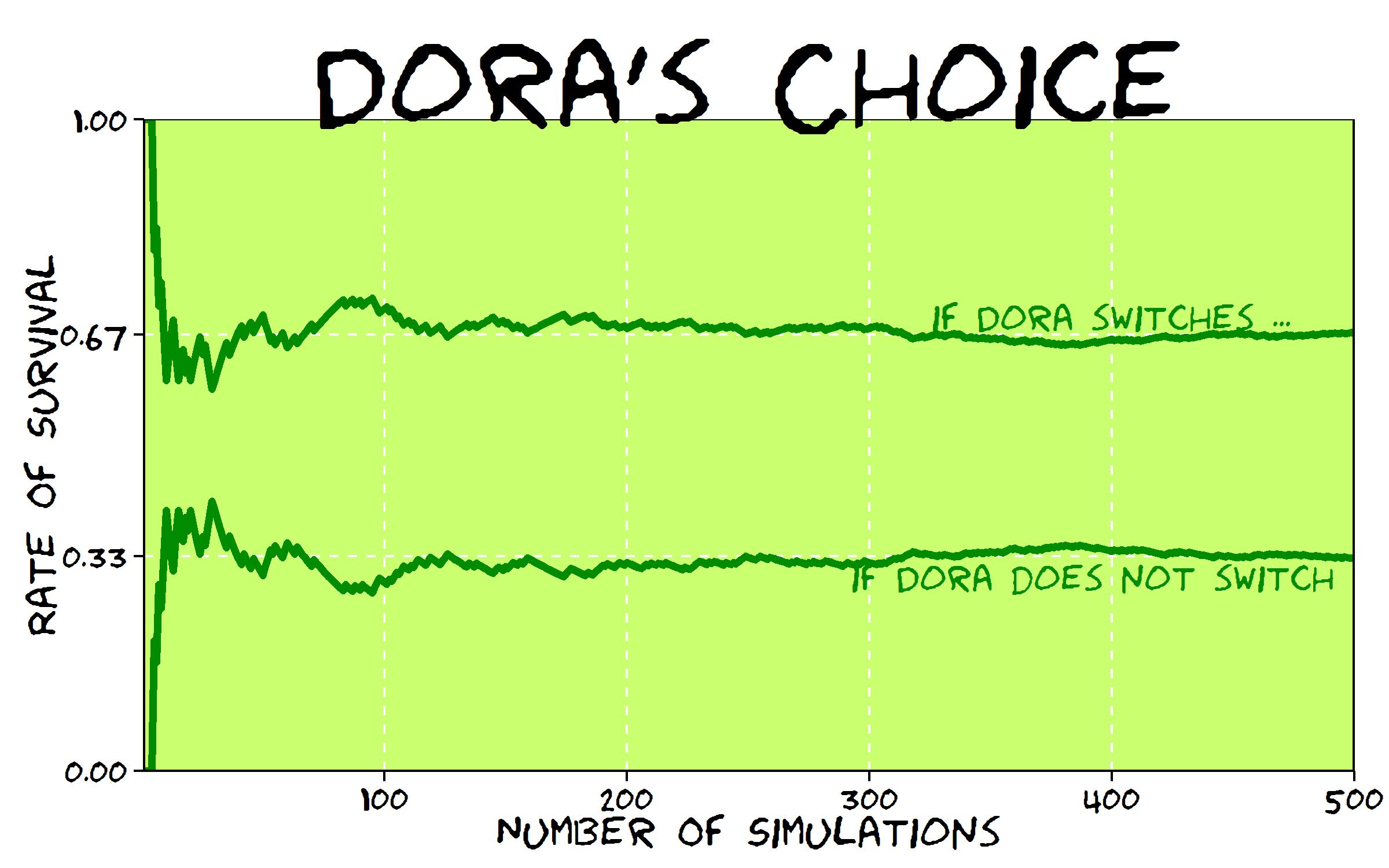
There are several ways to convince yourself of this. One is to simulate the situation that has faced Dora and compare results of switching and not switching . Switching, Dora saves her life 2 of each 3 simulations while if she does not, Dora only saves 1 of each 3 simulations. Changing her mind, Dora doubles her chances of survival!

Carefully considering what happens, you can see that switching Dora saves herself when her first choice is erroneus, which occurs with probability 2/3. On the other hand, if Dora remains faithful to her first choice, obviously only saves herself with probability 1/3.

This is an example on my own of the famous Monty Hall Problem. You can see a nice explanation of it in a chapter of Numb3rs or in the film 21 Black Jack. Not long ago I exposed the problem in a family meeting. Only my mum said she would switch (we were 6 people in the meeting). It is fun to share this experiment and ask what people would do. Do it with your friends and family. First time I knew the problem I thought there were no difference between switching and not since I gave both possibilities 1/2 of probability. If I had been Dora, pretty sure I would tumbled over a terrible waterfall. What about yo?

Note: this is an update of the post, which was not a correct formulation of Monty Hall Problem. Thanks to David Robinson and Scott Kostyshak for showing me my error. A correct formulation of the problem may be this:

On her last mission, Dora The Explorer sails down the Amazon river to meet her cousin Diego. After some hours of navigation, Dora sees how the river divides into 3 branches and has to choose which one to follow. Before leaving, her friend Map told her that just one of these branches is safe. Two others end in terrible waterfalls, both impossible to escape alive. Although Dora does not know which one is the good one, she decides to take the branch number 1. After putting the bow towards branch number one, Dora sees Swiper The Fox smiling from the shore, in a high place where obviously can see the end of all three branches. Dora yells him:

– Help me Swiper! Which one should I take?

Swiper replies:

– I am the villain of this story so I will give you only an advice: do not take branch number 3. It ends into a terrible waterfall.

Dora, who has a sixth sense to notice when Swiper is lying, knows he is telling the truth and immediately changes her mind and decides to take branch number 2. Why Dora switches? Because she knows that this change has significantly increased her probability of ending the mission alive.

doras_choice

Here you have the code:

library(ggplot2)
library(extrafont)
nchoices <- 3
nsims <- 500
choices <- seq(from=1, to=nchoices, by=1)
good.choice <- sample(choices, nsims, replace=TRUE)
choice1 <- sample(choices, nsims, replace=TRUE)
dfsims <- as.data.frame(cbind(good.choice, choice1))
dfsims$advice <- apply(dfsims, 1, function(x) choices[!choices %in% as.vector(x)][sample(1:length(choices[!choices %in% as.vector(x)]), 1)])
dfsims$choice2 <- apply(dfsims, 1, function(x) choices[!choices %in% as.vector(c(x[2], x[3]))][sample(1:length(choices[!choices %in% as.vector(c(x[2], x[3]))]), 1)])
dfsims$win1 <- apply(dfsims, 1, function(x) (x[1]==x[2])*1)
dfsims$win2 <- apply(dfsims, 1, function(x) (x[1]==x[4])*1)
dfsims$csumwin1 <- cumsum(dfsims$win1)/as.numeric(rownames(dfsims))
dfsims$csumwin2 <- cumsum(dfsims$win2)/as.numeric(rownames(dfsims))
dfsims$nsims <- as.numeric(rownames(dfsims))
dfsims$xaxis <- 0
### XKCD theme
theme_xkcd <- theme(
panel.background = element_rect(fill="darkolivegreen1"),
panel.border = element_rect(colour="black", fill=NA),
axis.line = element_line(size = 0.5, colour = "black"),
axis.ticks = element_line(colour="black"),
panel.grid = element_line(colour="white", linetype = 2),
axis.text.y = element_text(colour="black"),
axis.text.x = element_text(colour="black"),
text = element_text(size=18, family="Humor Sans"),
plot.title = element_text(size = 50)
)
### Plot the chart
p <- ggplot(data=dfsims, aes(x=nsims, y=csumwin1))+
geom_line(aes(y=csumwin2), colour="green4", size=1.5, fill=NA)+
geom_line(colour="green4", size=1.5, fill=NA)+
geom_text(data=dfsims[400, ], family="Humor Sans", aes(x=nsims), colour="green4", y=0.7, label="if Dora switches ...", size=5.5, adjust=1)+
geom_text(data=dfsims[400, ], family="Humor Sans", aes(x=nsims), colour="green4", y=0.3, label="if Dora does not switch ...", size=5.5, adjust=1)+
coord_cartesian(ylim=c(0, 1), xlim=c(1, nsims))+
scale_y_continuous(breaks = c(0,round(1/3, digits = 2),round(2/3, digits = 2),1), minor_breaks = c(round(1/3, digits = 2),round(2/3, digits = 2)))+
scale_x_continuous(minor_breaks = seq(100, 400, 100))+
labs(x="Number Of Simulations", y="Rate Of Survival", title="Dora's Choice")+
theme_xkcd
ggsave("doras_choice.jpg", plot=p, width=8, height=5)

Warholing Grace With Clara

Do not believe anything: what artists really do is to hang around all day (Paco de Lucia)

Andy Warhol was mathematician. At least, he knew how clustering algorithms work. I am pretty sure of this after doing this experiment.  First of all, let me introduce you to the breathtaking Grace Kelly:

936full-grace-kelly

In my previous post I worked also with images showing how simple is to operate with them since they are represented by matrices. This is another example of this. Third dimension of an image matrix is an 3D array representing color of pixels in (r, g, b) format. Applying a cluster algorithm over this information generates groups of pixels with similar color. I used cluster package and because of the high size of picture I decided to use clara algorithm which is extremely fast. Apart of its high speed, another advantage of clara is that clusters are represented by real elements of the population, called medoids, instead of being by average individuals as k-means do. It fits very well with my purposes because once clusters are calculated I only have to change each pixel by its medoid and plot it. Setting clara to divide pixels into 2 groups, generates a 2 colored image. Setting it to 3 groups, generates a 3 colored one and so on. Following, you can find results from 2 to 7 groups:

Warholing2 Warholing3 Warholing4
Warholing5 Warholing6 Warholing7

Working with samples can be a handicap, maybe less important than the speed it produces. Sometimes images generated by n groups seems to be worse fitted than the one generated by n-1 groups. You can see it in this video, where results from 1 to 60 groups are presented sequentially. It only takes 42 seconds.

Here you have the code. Feel free to warholing:

library("biOps")
library("abind")
library("reshape")
library("reshape2")
library("cluster")
library("sp")
#######################################################################################################
#Initialization
#######################################################################################################
x     <- readJpeg("936full-grace-kelly.jpg")
plot(x)
#######################################################################################################
#Data
#######################################################################################################
data <- merge(merge(melt(x[,,1]), melt(x[,,2]), by=c("X1", "X2")), melt(x[,,3]), by=c("X1", "X2"))
colnames(data) <- c("X1", "X2", "r", "g", "b")
#######################################################################################################
#Clustering
#######################################################################################################
colors <- 5
clarax <- clara(data[,3:5], colors)
datacl   <- data.frame(data, clarax$cluster)
claradf2 <- as.data.frame(clarax$medoids)
claradf2$id <- as.numeric(rownames(claradf2))
colnames(claradf2) <- c("r", "g", "b", "clarax.cluster")
claradf <- merge(datacl, claradf2, by=c("clarax.cluster"))
colnames(claradf) <-c("clarax.cluster", "X1", "X2", "r.x", "g.x", "b.x", "r.y", "g.y", "b.y")
datac <- claradf[do.call("order", claradf[c("X1", "X2")]), ]
x1<-acast(datac[,c(2,3,7)], X1~X2, value.var="r.y") 
x2<-acast(datac[,c(2,3,8)], X1~X2, value.var="g.y") 
x3<-acast(datac[,c(2,3,9)], X1~X2, value.var="b.y") 
warhol <- do.call(abind, c(list(x1,x2,x3), along = 3))
plot(imagedata(warhol))
writeJpeg(paste("Warholing", as.character(colors), ".jpg", sep=""), imagedata(warhol))

Face To Face With Marilyn Monroe

Symmetry is what we see at a glance (Blaise Pascal)

Ladies and gentlement, the beautiful Marilyn Monroe:

marilyn-monroe3

There are several image processing packages in R. In this experiment I used biOps, which turns images into 3D matrices. The third dimension is a 3-array corresponding to (r, g, b) color of pixel defined by two other dimensions. Since images are defined by matrices, you can do simple operations to produce interesting images from the original one. For example, this is what happens swaping last half of columns by first one and preserving its order:

IMG01-Interchange

It is also very simple to generate two artificial symmetrical faces matching each half with itself as a mirror. By the way, I prefer the first one: maybe two sexy moles are better than just one.

IMG03-Symmetric2 IMG02-Symmetric1

Let’s introduce a bit of randomness. This is what happens when you take an uniform sample of rows and columns (first image) or an uniform sample of pixels of the image (second one):

IMG04-Uniform1 IMG05-Uniform2

And this is what happens when you divide image into blocks and mix them randomly:

IMG07-Mosaic

There is a funny and useful function called jitter which adds a small amount of noise to a numeric vector. What happens when you jitter every pixel of the image? As you can see, It becomes very vintage:

IMG06-Jitter

What if you transpose matrix? What if you change every color by another one? What if you change only a small range of them? What if you sum two images? What if you translate rgb colors into a grey scale? What if …? I answered some of these questions already and results are nice as well. After all, Marilyn can be represented as a simple matrix. Or maybe not.

Make your own experiments:

library("biOps")
library("abind")
#############################################################
#Read Original Image
#############################################################
x     <- readJpeg("marilyn-monroe3.jpg")
plot(x)
#############################################################
#1. Swap
#############################################################
plot(imagedata(abind(x[,(ncol(x)/2):ncol(x),], x[,1:(ncol(x)/2),] , along=2)))
dev.copy(jpeg,filename="IMG01-Swap.jpg");
dev.off ();
#############################################################
#2. Artificial Symmetrical faces
#############################################################
plot(imagedata(abind(x[,1:(ncol(x)/2),], x[,(ncol(x)/2):1,] , along=2)))
dev.copy(jpeg,filename="IMG02-Symmetric1.jpg");
dev.off ();
plot(imagedata(abind(x[,ncol(x):(ncol(x)/2),], x[,(ncol(x)/2):ncol(x),] , along=2)))
dev.copy(jpeg,filename="IMG03-Symmetric2.jpg");
dev.off ();
#############################################################
#3. Uniform sampling over axis points
#############################################################
x2   <- aperm(array(255, dim = c(3, ncol(x), nrow(x))))
rows <- sample(1:nrow(x), round(nrow(x)*0.80), replace = FALSE)
cols <- sample(1:ncol(x), round(ncol(x)*0.80), replace = FALSE)
for (i in 1:length(rows)) 
{
  for (j in 1: length(cols)) 
    {
    x2[rows[i], cols[j],1]<-x[rows[i], cols[j],1] 
    x2[rows[i], cols[j],2]<-x[rows[i], cols[j],2] 
    x2[rows[i], cols[j],3]<-x[rows[i], cols[j],3] 
  }
}
plot(imagedata(x2))
dev.copy(jpeg,filename="IMG04-Uniform1.jpg");
dev.off ();
#############################################################
#4. Uniform sampling over pixels
#############################################################
m2 <- matrix(rbinom(nrow(x)*ncol(x),1,0.5),nrow(x),ncol(x))
x4<- do.call(abind, c(list(x[,,1]*m2+(m2==0)*255,x[,,2]*m2+(m2==0)*255,x[,,3]*m2+(m2==0)*255), along = 3))
plot(imagedata(x4))
dev.copy(jpeg,filename="IMG05-Uniform2.jpg");
dev.off ();
#############################################################
#6. Jittering
#############################################################
x1<-mapply(as.matrix(x[,,1]), FUN=function(x) 
  {z<-round(x+jitter(0, amount=50)) 
  if(z<0|z>255) x else z})
x1 <- matrix(x1, nrow = nrow(x),ncol = ncol(x))
x2<-mapply(as.matrix(x[,,2]), FUN=function(x) 
{z<-round(x+jitter(0, amount=50)) 
 if(z<0|z>255) x else z})
x2 <- matrix(x2, nrow = nrow(x),ncol = ncol(x))
x3<-mapply(as.matrix(x[,,3]), FUN=function(x) 
{z<-round(x+jitter(0, amount=50)) 
 if(z<0|z>255) x else z})
x3 <- matrix(x3, nrow = nrow(x),ncol = ncol(x))
x4<- do.call(abind, c(list(x1,x2,x3), along = 3))
plot(imagedata(x4))
dev.copy(jpeg,filename="IMG06-Jitter.jpg");
dev.off ();
#############################################################
#7. Mosaic
#############################################################
sptr <- 6 #Row splits
rnkr <- sample(1:sptr, size = sptr, replace = FALSE)
wthr <- floor(nrow(x)/sptr) #Splits width (row)
rnkr <- as.vector(sapply(rnkr, function (x) rep(x,wthr)))
rnkr <- rnkr*10E6+seq(1, length(rnkr), by=1)
rnkr <- rank(rnkr)
sptc <- round(ncol(x)/wthr)
rnkc <- sample(1:sptc, size = sptc, replace = FALSE)
wthc <- floor(ncol(x)/sptc) #Splits width (row)
rnkc <- as.vector(sapply(rnkc, function (x) rep(x,wthc)))
rnkc <- rnkc*10E6+seq(1, length(rnkc), by=1)
rnkc <- rank(rnkc)
x2<-x[1:length(rnkr),1:length(rnkc),]
x2<-x[rank(rnkr),rank(rnkc),]
plot(imagedata(x2))
dev.copy(jpeg,filename="IMG07-Mosaic.jpg");
dev.off ();

The Sound Of Mandelbrot Set

Music is the pleasure the human soul experiences from counting without being aware that it is counting (Gottfried Leibniz)

I like the concept of sonification: translating data into sounds. There is a huge amount of contents in the Internet about this technique and there are several packages in R to help you to sonificate your data. Maybe one of the most accessible is tuneR, the one I choosed for this experiment. Do not forget to have a look to playitbyr: a package that allows you to listen to a data.frame in R by mapping columns onto sonic parameters, creating an auditory graph, as you can find in its website. It has a very similar syntaxis to ggplot. I will try to post something about playitbyr in the future.

Let me start plotting the Mandelbrot Set. I know you have seen it lot of times but it is very easy to plot in with R and result is extremely beautiful. Here you have four images corresponding to 12, 13, 14 and 15 iterations of the set’s generator. I like a lot how the dark blue halo around the Set evaporates as number of iterations increases.

Mandelbrot12Mandelbrot13Mandelbrot14Mandelbrot15

And here you have the Set generated by 50 iterations. This is the main ingredient of the experiment:Mandelbrot50

Mandelbrot Set is generated by the recursive formula xt+1=xt2+c, with x0=0. A complex number c belongs to the Mandelbrot Set if its module after infinite iterations is finite. It is not possible to iterate a infinite number of times so every representation of Mandelbrot Set is just an approximation for a usually big amount of iterations. First image of Mandelbrot Set was generated in 1978 by Robert W. Brooks and Peter Matelski. You can find it here. I do not know how long it took to obtain it but you will spend only a couple of minutes to generate the ones you have seen before. It is amazing how computers have changed in this time!

This iterative equation is diabolical. To see just how pathological is, I transformed the succession of modules of xt generated by a given c in a succession of sounds. Since it is known that if one of this iterated complex numbers exceeds 2 in module then it is not in the Mandelbrot Set, frequencies of these sounds are bounded between 280 Hz (when module is equal to zero) and 1046 Hz (when module is equal or greater to 2). I called this function CreateSound. Besides the initial complex, you can choose how many notes and how long you want for your composition.

I tried with lot of numbers and results are funny. I want to stand out three examples from the rest:

  • -1+0i gives the sequence 0, −1, 0, −1, 0 … which is bounded. Translated into music it sounds like an ambulance siren.
  • -0.1528+1.0397i that is one of the generalized Feigenbaum points, around the Mandelbrot Set is conjetured to be self-similar. It sounds as a kind of Greek tonoi.
  • -3/4+0.01i which presents a crazy slow divergence. I wrote a post some weeks ago about this special numbers around the neck of Mandelbrot Set and its relationship with PI.

All examples are ten seconds length. Take care with the size of the WAV file when you increase duration. You can create your own music files with the code below. If you want to download my example files, you can do it here. If you discover something interesting, please let me know.

Enjoy the music of Mandelbrot:

# Load Libraries
library(ggplot2)
library(reshape)
library(tuneR)
rm(list=ls())
# Create a grid of complex numbers
c.points <- outer(seq(-2.5, 1, by = 0.002),1i*seq(-1.5, 1.5, by = 0.002),'+')
z <- 0
for (k in 1:50) z <- z^2+c.points # Iterations of fractal's formula
c.points <- data.frame(melt(c.points))
colnames(c.points) <- c("r.id", "c.id", "point")
z.points <- data.frame(melt(z))
colnames(z.points) <- c("r.id", "c.id", "z.point")
mandelbrot <- merge(c.points, z.points, by=c("r.id","c.id")) # Mandelbrot Set
# Plotting only finite-module numbers
ggplot(mandelbrot[is.finite(-abs(mandelbrot$z.point)), ], aes(Re(point), Im(point), fill=exp(-abs(z.point))))+
geom_tile()+theme(legend.position="none", axis.title.x = element_blank(), axis.title.y = element_blank())
#####################################################################################
# Function to translate numbers (complex modules) into sounds between 2 frequencies
#   the higher the module is, the lower the frequencie is
#   modules greater than 2 all have same frequencie equal to low.freq
#   module equal to 0 have high.freq
#####################################################################################
Module2Sound <- function (x, low.freq, high.freq)
  {
    if(x>2 | is.nan(x)) {low.freq} else {x*(low.freq-high.freq)/2+high.freq}
  } 
#####################################################################################
# Function to create wave. Parameters:
#    complex     : complex number to test
#    number.notes: number of notes to create (notes = iterations)
#    tot.duration.secs: Duration of the wave in seconds
#####################################################################################
CreateSound <- function(complex, number.notes, tot.duration.secs)
{
  dur <- tot.duration.secs/number.notes
  sep1 <- paste(", bit = 16, duration= ",dur, ", xunit = 'time'),sine(")
  sep2 <- paste(", bit = 16, duration =",dur,",  xunit = 'time'))")
  v.sounds <- c()
  z <- 0
  for (k in 1:number.notes) 
  {
    z <- z^2+complex
    v.sounds <- c(v.sounds, abs(z))
  }
  v.freqs <- as.vector(apply(data.frame(v.sounds), 1, FUN=Module2Sound, low.freq=280, high.freq=1046))
  eval(parse(text=paste("bind(sine(", paste(as.vector(v.freqs), collapse = sep1), sep2)))
}
sound1 <- CreateSound(-3/4+0.01i     , 400 , 10) # Slow Divergence
sound2 <- CreateSound(-0.1528+1.0397i, 30  , 10) # Feigenbaum Point
sound3 <- CreateSound(-1+0i          , 20  , 10) # Ambulance Siren
writeWave(sound1, 'SlowDivergence.wav')
writeWave(sound2, 'FeigenbaumPoint.wav')
writeWave(sound3, 'AmbulanceSiren.wav')

Shoot The Heart With Monte Carlo

The heart has its reasons which reason knows not (Blaise Pascal)

You only need two functions to draw a heart mathematically. The upper part is generated by (1-(|x|-1)2)1/2 and the lower one by acos(1-|x|)-PI. Here is how this heart is:

heart
Whats the area of this heart? It’s easy: integrating heart.up(x)-heart.dw(x) between -2 and 2 and you will obtain that heart measures 9.424778, but there is a simple and nice way to approximate to this value: shoot the heart.

The idea is very simple. Heart is delimited by a square with vertex in (-2, heart.dw(0)), (-2, 1), (2, heart.dw(0)) and (2, 1). Generating a set of points uniformly distributed inside the square and counting how many of them fall into the heart in relation to the area of the square gives a very good approximation of the exact area of the heart. This is a plot representing a simulation of 2.000 shots (hits in red, fails in blue):

heart2000
Given a simulation of n points, the estimated area of the heart is the area of the square by percentage of points that falls inside the heart. And of course, precision increases with the number of shots you make, as you can see in the following plot, where exact area is represented by the red horizontal line:

Rplot09

Here you have the code:

library("ggplot2")
heart.up <- function(x) {sqrt(1-(abs(x)-1)^2)} #Upper part of the heart
heart.dw <- function(x) {acos(1-abs(x))-pi}    #Lower part of the heart
#Plot of the heart
ggplot(data.frame(x=c(-2,2)), aes(x)) +
  stat_function(fun=heart.up, geom="line", aes(colour="heart.up")) +
  stat_function(fun=heart.dw, geom="line", aes(colour="heart.dw")) +
  scale_colour_manual("Function", values=c("blue","red"), breaks=c("heart.up","heart.dw"))+
  labs(x = "", y = "")+
  theme(legend.position = c(.85, .15))
sims <- 2000 #Number of simulations
rlts <- data.frame()
for (i in 1:sims) 
  {
  msm <- cbind(as.matrix(runif(i, min=-2, max=2)), as.matrix(runif(i, min=heart.dw(0), max=1)))
  nin <- 0
  for (j in 1:nrow(msm)) {if (msm[j,2]<=heart.up(msm[j,1]) & msm[j,2]>=heart.dw(msm[j,1])) nin=nin+1}
  rlts <- rbind(c(i, 4*(1-heart.dw(0))*nin/i), rlts)
  }
colnames(rlts) <- c("no.simulations","heart.area")
exact.area <- integrate(function(x) {heart.up(x)-heart.dw(x)},-2,2)$value
mean.area <- mean(rlts$heart.area) #Mean of All Estimated Areas
ggplot(data = rlts, aes(x = no.simulations, y = heart.area))+ 
  geom_point(size = 0.5, colour = "black", alpha=0.4)+
  geom_abline(intercept = exact.area, slope = 0, size = 1, linetype=1, colour = "red", aes(color="My Line"), alpha=0.8, show_guide = TRUE)+
  labs(list(x = "Number of Shots", y = "Estimated Area"))+
  ggtitle("Shot The Heart With Monte Carlo") +
  theme(plot.title = element_text(size=20, face="bold"))+
  scale_x_continuous(limits = c(0, sims), expand = c(0, 0))+
  expand_limits(x = 0, y = 0)+
  scale_y_continuous(limits = c(0, 2*exact.area), expand = c(0, 0), breaks=c(0, exact.area/4, exact.area/2, 3*exact.area/4, exact.area, 5*exact.area/4, 3*exact.area/2, 7*exact.area/4, 2*exact.area))+
  geom_text(x = 1000, y = exact.area/2, label=paste("Exact Area =", sprintf("%7.6f", exact.area)), vjust=-1, colour="red", size=5)+
  geom_text(x = 1000, y = exact.area/2, label=paste("Mean of All Estimated Areas=", sprintf("%7.6f", mean.area)), vjust=+1, colour="red", size=5)