Category Archives: Drawings

Shiny Wool Skeins

Chaos is not a pit: chaos is a ladder (Littlefinger in Game of Thrones)

Some time ago I wrote this post to show how my colleague Vu Anh translated into Shiny one of my experiments, opening my eyes to an amazing new world. I am very proud to present you the first Shiny experiment entirely written by me.

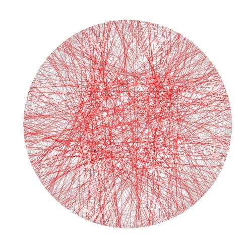
In this case I took inspiration from another previous experiment to draw some kind of wool skeins. The shiny app creates a plot consisting of chords inside a circle. There are to kind of chords:

  • Those which form a track because they are a set of glued chords; number of tracks and number of chords per track can be selected using Number of track chords and Number of scrawls per track sliders of the app respectively.
  • Those forming the background, randomly allocated inside the circle. Number of background chords can be chosen as well in the app

There is also the possibility to change colors of chords. This are the main steps I followed to build this Shiny app:

  1. Write a simple R program
  2. Decide which variables to parametrize
  3. Open a new Shiny project in RStudio
  4. Analize the sample UI.R and server.R files generated by default
  5. Adapt sample code to my particular code (some iterations are needed here)
  6. Deploy my app in the Shiny Apps free server

Number 1 is the most difficult step, but it does not depends on Shiny: rest of them are easier, specially if you have help as I had from my colleague Jorge. I encourage you to try. This is an snapshot of the app:

Skeins2

You can play with the app here.

Some things I thought while developing this experiment:

  • Shiny gives you a lot with a minimal effort
  • Shiny can be a very interesting tool to teach maths and programming to kids
  • I have to translate to Shiny some other experiment
  • I will try to use it for my job

Try Shiny: is very entertaining. A typical Shiny project consists on two files, one to define the user interface (UI.R) and the other to define the back end side (server.R).

This is the code of UI.R:

# This is the user-interface definition of a Shiny web application.
# You can find out more about building applications with Shiny here:
#
# http://shiny.rstudio.com
#
 
library(shiny)
 
shinyUI(fluidPage(
 
  # Application title
  titlePanel("Shiny Wool Skeins"),
  HTML("

This experiment is based on <a href=\"https://aschinchon.wordpress.com/2015/05/13/bertrand-or-the-importance-of-defining-problems-properly/\">this previous one</a> I did some time ago. It is my second approach to the wonderful world of Shiny.

"),
  # Sidebar with a slider input for number of bins
  sidebarLayout(
    sidebarPanel(
      inputPanel(
        sliderInput("lin", label = "Number of track chords:",
                    min = 1, max = 20, value = 5, step = 1),
        sliderInput("rep", label = "Number of scrawls per track:",
                    min = 1, max = 50, value = 10, step = 1),
        sliderInput("nbc", label = "Number of background chords:",
                    min = 0, max = 2000, value = 500, step = 2),
        selectInput("col1", label = "Track colour:",
                    choices = colors(), selected = "darkmagenta"),
        selectInput("col2", label = "Background chords colour:",
                    choices = colors(), selected = "gold")
      )
       
    ),
 
    # Show a plot of the generated distribution
    mainPanel(
      plotOutput("chordplot")
    )
  )
))

And this is the code of server.R:

# This is the server logic for a Shiny web application.
# You can find out more about building applications with Shiny here:
#
# http://shiny.rstudio.com
#
library(ggplot2)
library(magrittr)
library(grDevices)
library(shiny)
 
shinyServer(function(input, output) {
 
  df<-reactive({ ini=runif(n=input$lin, min=0,max=2*pi) 

  data.frame(ini=runif(n=input$lin, min=0,max=2*pi), 
             end=runif(n=input$lin, min=pi/2,max=3*pi/2))  -> Sub1

    Sub1=Sub1[rep(seq_len(nrow(Sub1)), input$rep),]
    Sub1 %>% apply(c(1, 2), jitter) %>% as.data.frame() -> Sub1
    Sub1=with(Sub1, data.frame(col=input$col1, x1=cos(ini), y1=sin(ini), x2=cos(end), y2=sin(end)))
    Sub2=runif(input$nbc, min = 0, max = 2*pi)
    Sub2=data.frame(x=cos(Sub2), y=sin(Sub2))
    Sub2=cbind(input$col2, Sub2[(1:(input$nbc/2)),], Sub2[(((input$nbc/2)+1):input$nbc),])
    colnames(Sub2)=c("col", "x1", "y1", "x2", "y2")
    rbind(Sub1, Sub2)
  })
   
  opts=theme(legend.position="none",
             panel.background = element_rect(fill="white"),
             panel.grid = element_blank(),
             axis.ticks=element_blank(),
             axis.title=element_blank(),
             axis.text =element_blank())
   
  output$chordplot<-renderPlot({
    p=ggplot(df())+geom_segment(aes(x=x1, y=y1, xend=x2, yend=y2), colour=df()$col, alpha=runif(nrow(df()), min=.1, max=.3), lwd=1)+opts;print(p)
  }, height = 600, width = 600 )
})

Bertrand or (The Importance of Defining Problems Properly)

We better keep an eye on this one: she is tricky (Michael Banks, talking about Mary Poppins)

Professor Bertrand teaches Simulation and someday, ask his students:

Given a circumference, what is the probability that a chord chosen at random is longer than a side of the equilateral triangle inscribed in the circle?

Since they must reach the answer through simulation, very approximate solutions are welcome.

Some students choose chords as the line between two random points on the circumference and conclude that the asked probability is around 1/3. This is the plot of one of their simulations, where 1000 random chords are chosen according this method and those longer than the side of the equilateral triangle are red coloured (smalller in grey):

Bertrand1

Some others choose a random radius and a random point in it. The chord then is the perpendicular through this point. They calculate that the asked probability is around 1/2:

Bertrand2

And some others choose a random point inside the circle and define the chord as the only one with this point as midpoint. For them, the asked probability is around 1/4:

Bertrand3

Who is right? Professor Bertrand knows that everybody is. In fact, his main purpose was to show how important is to define problems properly. Actually, he used this to give an unforgettable lesson to his students.

library(ggplot2)
n=1000
opt=theme(legend.position="none",
          panel.background = element_rect(fill="white"),
          panel.grid = element_blank(),
          axis.ticks=element_blank(),
          axis.title=element_blank(),
          axis.text =element_blank())
#First approach
angle=runif(2*n, min = 0, max = 2*pi)
pt1=data.frame(x=cos(angle), y=sin(angle))
df1=cbind(pt1[1:n,], pt1[((n+1):(2*n)),])
colnames(df1)=c("x1", "y1", "x2", "y2")
df1$length=sqrt((df1$x1-df1$x2)^2+(df1$y1-df1$y2)^2)
p1=ggplot(df1) + geom_segment(aes(x = x1, y = y1, xend = x2, yend = y2, colour=length>sqrt(3)), alpha=.4, lwd=.6)+
  scale_colour_manual(values = c("gray75", "red"))+opt
#Second approach
angle=2*pi*runif(n)
pt2=data.frame(aa=cos(angle), bb=sin(angle))
pt2$x0=pt2$aa*runif(n)
pt2$y0=pt2$x0*(pt2$bb/pt2$aa)
pt2$a=1+(pt2$x0^2/pt2$y0^2)
pt2$b=-2*(pt2$x0/pt2$y0)*(pt2$y0+(pt2$x0^2/pt2$y0))
pt2$c=(pt2$y0+(pt2$x0^2/pt2$y0))^2-1
pt2$x1=(-pt2$b+sqrt(pt2$b^2-4*pt2$a*pt2$c))/(2*pt2$a)
pt2$y1=-pt2$x0/pt2$y0*pt2$x1+(pt2$y0+(pt2$x0^2/pt2$y0))
pt2$x2=(-pt2$b-sqrt(pt2$b^2-4*pt2$a*pt2$c))/(2*pt2$a)
pt2$y2=-pt2$x0/pt2$y0*pt2$x2+(pt2$y0+(pt2$x0^2/pt2$y0))
df2=pt2[,c(8:11)]
df2$length=sqrt((df2$x1-df2$x2)^2+(df2$y1-df2$y2)^2)
p2=ggplot(df2) + geom_segment(aes(x = x1, y = y1, xend = x2, yend = y2, colour=length>sqrt(3)), alpha=.4, lwd=.6)+
scale_colour_manual(values = c("gray75", "red"))+opt
#Third approach
angle=2*pi*runif(n)
radius=runif(n)
pt3=data.frame(x0=sqrt(radius)*cos(angle), y0=sqrt(radius)*sin(angle))
pt3$a=1+(pt3$x0^2/pt3$y0^2)
pt3$b=-2*(pt3$x0/pt3$y0)*(pt3$y0+(pt3$x0^2/pt3$y0))
pt3$c=(pt3$y0+(pt3$x0^2/pt3$y0))^2-1
pt3$x1=(-pt3$b+sqrt(pt3$b^2-4*pt3$a*pt3$c))/(2*pt3$a)
pt3$y1=-pt3$x0/pt3$y0*pt3$x1+(pt3$y0+(pt3$x0^2/pt3$y0))
pt3$x2=(-pt3$b-sqrt(pt3$b^2-4*pt3$a*pt3$c))/(2*pt3$a)
pt3$y2=-pt3$x0/pt3$y0*pt3$x2+(pt3$y0+(pt3$x0^2/pt3$y0))
df3=pt3[,c(6:9)]
df3$length=sqrt((df3$x1-df3$x2)^2+(df3$y1-df3$y2)^2)
p3=ggplot(df3) + geom_segment(aes(x = x1, y = y1, xend = x2, yend = y2, colour=length>sqrt(3)), alpha=.4, lwd=.6)+scale_colour_manual(values = c("gray75", "red"))+opt

Odd Connections Inside The NASDAQ-100

Distinguishing the signal from the noise requires both scientific knowledge and self-knowledge (Nate Silver, author of The Signal and the Noise)

Analyzing the evolution of NASDAQ-100 stock prices can discover some interesting couples of companies which share a strong common trend despite of belonging to very different sectors. The NASDAQ-100 is made up of 107 equity securities issued by 100 of the largest non-financial companies listed on the NASDAQ. On the other side, Yahoo! Finance is one of the most popular services to consult financial news, data and commentary including stock quotes, press releases, financial reports, and original programming. Using R is possible to download the evolution of NASDAQ-100 symbols from Yahoo! Finance. There is a R package called quantmod which makes this issue quite simple with the function getSymbols. Daily series are long enough to do a wide range of analysis, since most of them start in 2007.

One robust way to determine if two times series, xt and yt, are related is to analyze if there exists an equation like yt=βxt+ut such us residuals (ut) are stationary (its mean and variance does not change when shifted in time). If this happens, it is said that both series are cointegrated. The way to measure it in R is running the Augmented Dickey-Fuller test, available in tseries package. Cointegration analysis help traders to design products such spreads and hedges.

There are 5.671 different couples between the 107 stocks of NASDAQ-100. After computing the Augmented Dickey-Fuller test to each of them, the resulting data frame can be converted into a distance matrix. A nice way to visualize distances between stocks is to do a hierarchical clustering. This is the resulting dendogram of the clustering:

Dendogram

Close stocks such as Ca Inc. (CA) and Bed Bath & Beyond Inc. (BBBY) are joined with short links. A quick way to extract close couples is to cut this dendogram in a big number of clusters and keep those with two elements. Following is the list of the most related stock couples cutting dendogram in 85 clusters:

Couples

Most of them are strange neighbors. Next plot shows the evolution closing price evolution of four of these couples:

examples

Analog Devices Inc. (ADI) makes semiconductors and Discovery Communications Inc. (DISCA) is a mass media company. PACCAR Inc. (PCAR) manufactures trucks and Paychex Inc. (PAYX) provides HR outsourcing. CA Inc. (CA) creates software and Bed Bath & Beyond Inc. (BBBY) sells goods for home. Twenty-First Century Fox Inc. (FOX) is a mass media company as well and EBAY Inc. (EBAY) does online auctions‎. All of them are odd connections.

This is the code of the experiment:

library("quantmod")
library("TSdist")
library("ade4")
library("ggplot2")
library("Hmisc")
library("zoo")
library("scales")
library("reshape2")
library("tseries")
library("RColorBrewer")
library("ape")
library("sqldf")
library("googleVis")
library("gridExtra")
setwd("YOUR-WORKING-DIRECTORY-HERE")
temp=tempfile()
download.file("http://www.nasdaq.com/quotes/nasdaq-100-stocks.aspx?render=download",temp)
data=read.csv(temp, header=TRUE)
for (i in 1:nrow(data)) getSymbols(as.character(data[i,1]))
results=t(apply(combn(sort(as.character(data[,1]), decreasing = TRUE), 2), 2,
function(x) {
ts1=drop(Cl(eval(parse(text=x[1]))))
ts2=drop(Cl(eval(parse(text=x[2]))))
t.zoo=merge(ts1, ts2, all=FALSE)
t=as.data.frame(t.zoo)
m=lm(ts2 ~ ts1 + 0, data=t)
beta=coef(m)[1]
sprd=t$ts1 - beta*t$ts2
ht=adf.test(sprd, alternative="stationary", k=0)$p.value
c(symbol1=x[1], symbol2=x[2], (1-ht))}))
results=as.data.frame(results)
colnames(results)=c("Sym1", "Sym2", "TSdist")
results$TSdist=as.numeric(as.character(results$TSdist))
save(results, file="results.RData")
load("results.RData")
m=as.dist(acast(results, Sym1~Sym2, value.var="TSdist"))
hc = hclust(m)
# vector of colors
op = par(bg = "darkorchid4")
plot(as.phylo(hc), type = "fan", tip.color = "gold", edge.color ="gold", cex=.8)
# cutting dendrogram in 85 clusters
clusdf=data.frame(Symbol=names(cutree(hc, 85)), clus=cutree(hc, 85))
clusdf2=merge(clusdf, data[,c(1,2)], by="Symbol")
sizes=sqldf("SELECT * FROM (SELECT clus, count(*) as size FROM clusdf GROUP BY 1) as T00 WHERE size>=2")
sizes2=merge(subset(sizes, size==2), clusdf2, by="clus")
sizes2$id=sequence(rle(sizes2$clus)$lengths)
couples=merge(subset(sizes2, id==1)[,c(1,3,4)], subset(sizes2, id==2)[,c(1,3,4)], by="clus")
couples$"Company 1"=apply(couples[ , c(2,3) ] , 1 , paste , collapse = " -" )
couples$"Company 2"=apply(couples[ , c(4,5) ] , 1 , paste , collapse = " -" )
CouplesTable=gvisTable(couples[,c(6,7)])
plot(CouplesTable)
# Plots
opts2=theme(
panel.background = element_rect(fill="gray98"),
panel.border = element_rect(colour="black", fill=NA),
axis.line = element_line(size = 0.5, colour = "black"),
axis.ticks = element_line(colour="black"),
panel.grid.major = element_line(colour="gray75", linetype = 2),
panel.grid.minor = element_blank(),
axis.text = element_text(colour="gray25", size=12),
axis.title = element_text(size=18, colour="gray10"),
legend.key = element_rect(fill = "white"),
legend.text = element_text(size = 14),
legend.background = element_rect(),
plot.title = element_text(size = 35, colour="gray10"))
plotPair = function(Symbol1, Symbol2)
{
getSymbols(Symbol1)
getSymbols(Symbol2)
close1=Cl(eval(parse(text=Symbol1)))
close2=Cl(eval(parse(text=Symbol2)))
cls=merge(close1, close2, all = FALSE)
df=data.frame(date = time(cls), coredata(cls))
names(df)[-1]=c(Symbol1, Symbol2)
df1=melt(df, id.vars = "date", measure.vars = c(Symbol1, Symbol2))
ggplot(df1, aes(x = date, y = value, color = variable))+
geom_line(size = I(1.2))+
scale_color_discrete(name = "")+
scale_x_date(labels = date_format("%Y-%m-%d"))+
labs(x="Date", y="Closing Price")+
opts2
}
p1=plotPair("ADI", "DISCA")
p2=plotPair("PCAR", "PAYX")
p3=plotPair("CA", "BBBY")
p4=plotPair("FOX", "EBAY")
grid.arrange(p1, p2, p3, p4, ncol=2)

Discovering Shiny

It is not an experiment if you know it is going to work (Jeff Bezos)

From time to time, I discover some of my experiments translated into Shiny Apps, like this one. Some days ago, I discovered one of these translations and I contacted the author, who was a guy from Vietnam called Vu Anh. I asked him to do a Shiny App from this experiment. Vu was enthusiastic with the idea. We defined some parameters to play with shape, number, width and alpha of lines as well as background color and I received a perfect release of the application in just a few hours. With just a handful of parameters, possible outputs are almost infinite. Following you can find some of them:

SinyCollageI think the code is a nice example to take the first steps in Shiny. If you are not used to Markdown files, you can follow this instructions to run the code.

Vu is a talented guy, who loves maths and programming. He represents the future of our nice profession and I predict a successful future for him. Do not miss his brand new blog. I am sure you will find amazing things there.

This is the code of the app:

---
title: "Maths, Music and Merkbar"
author: "Brother Rain"
date: "18/03/2015"
output: html_document
runtime: shiny
---
 
## Load Data
 
```{r}
library(circlize)
library(scales)
factors = as.factor(0:9)
lines = 2000 #Number of lines to plot in the graph
alpha = 0.4  #Alpha for color lines
colors0=c(
    rgb(239,143,121, max=255),
    rgb(126,240,188, max=255),
    rgb(111,228,235, max=255),
    rgb(127,209,249, max=255),
    rgb( 74,106,181, max=255),
    rgb(114,100,188, max=255),
    rgb(181,116,234, max=255),
    rgb(226,135,228, max=255),
    rgb(239,136,192, max=255),
    rgb(233,134,152, max=255)
)
# You can find the txt file here:
# http://www.goldennumber.net/wp-content/uploads/2012/06/Phi-To-100000-Places.txt
phi=readLines("data/Phi-To-100000-Places.txt")[5]
```
 
## Visualization
 
```{r, echo=FALSE}
fluidPage(
  fluidRow(
    column(width = 4,
        sidebarPanel(
            sliderInput("lines", "Number of lines:", min=100, max=100000, step=100, value=500), 
            sliderInput("alpha", "Alpha:", min=0.01, max=1, step=0.01, value=0.4),
            sliderInput("lwd", "Line width", min=0, max=1, step=0.05, value=0.2),
            selectInput("background", "Background:",
                c("Purple" = "mediumpurple4", "Gray" = "gray25", "Orange"="orangered4", 
                  "Red" = "red4", "Brown"="saddlebrown", "Blue"="slateblue4", 
                  "Violet"="palevioletred4", "Green"="forestgreen", "Pink"="deeppink"), selected="Purple"),
            sliderInput("h0", "h0:", min=0, max=0.4,
                    step=0.0005, value=0.1375),
           sliderInput("h1", "h1:", min=0, max=0.4,
                step=0.0005, value=0.1125),
            width=12
        )
    ),
    column(width = 8,
        renderPlot({
            # get data
            phi=gsub("\\.","", substr(phi,1,input$lines))
            phi=gsub("\\.","", phi)
            position=1/(nchar(phi)-1)
             
            # create circos
            circos.clear()
            par(mar = c(1, 1, 1, 1), lwd = 0.1,
                cex = 0.7, bg=alpha(input$background, 1))
            circos.par(
                "cell.padding"=c(0.01,0.01),
                "track.height" = 0.025,
                "gap.degree" = 3
            )
            circos.initialize(factors = factors, xlim = c(0, 1))
            circos.trackPlotRegion(factors = factors, ylim = c(0, 1))
            ## create first region
            for (i in 0:9) {
                circos.updatePlotRegion(
                    sector.index = as.character(i),
                    bg.col = alpha(input$background, 1),
                    bg.border=alpha(colors0[i+1], 1)
                )
            }
            for (i in 1:(nchar(phi)-1)) {
                m=min(as.numeric(substr(phi, i, i)), as.numeric(substr(phi, i+1, i+1)))
                M=max(as.numeric(substr(phi, i, i)), as.numeric(substr(phi, i+1, i+1)))
                d=min((M-m),((m+10)-M))
                col=t(col2rgb(colors0[(as.numeric(substr(phi, i, i))+1)]))
                for(index in 1:3){
                    col[index] = max(min(255, col[index]), 0)
                }
                if (d>0) {
                    circos.link(
                        substr(phi, i, i), position*(i-1),
                        substr(phi, i+1, i+1), position*i,
                        h = input$h0 * d + input$h1,
                        lwd=input$lwd,
                        col=alpha(rgb(col, max=255), input$alpha), rou = 0.92
                    )
                }
            }
            }, width=600, height=600, res=192)
    )
  )
)
 
 
```

Visual Complexity

Oh, can it be, the voices calling me, they get lost and out of time (Little Black Submarines, The Black Keys)

Last October I did this experiment about complex domain coloring. Since I like giving my posts a touch of randomness, I have done this experiment. I plot four random functions on the form p1(x)*p2(x)/p3(x) where pi(x) are polynomials up-to-4th-grade with random coefficients following a chi-square distribution with degrees of freedom between 2 and 5. I measure the function over the complex plane and arrange the four resulting plots into a 2×2 grid. This is an example of the output:
Surrealism Every time you run the code you will obtain a completely different output. I have run it hundreds of times because results are always surprising. Do you want to try? Do not hesitate to send me your creations. What if you change the form of the functions or the distribution of coefficients? You can find my email here.

setwd("YOUR WORKING DIRECTORY HERE")
require(polynom)
require(ggplot2)
library(gridExtra)
ncol=2
for (i in 1:(10*ncol)) {eval(parse(text=paste("p",formatC(i, width=3, flag="0"),"=as.function(polynomial(rchisq(n=sample(2:5,1), df=sample(2:5,1))))",sep="")))}
z=as.vector(outer(seq(-5, 5, by =.02),1i*seq(-5, 5, by =.02),'+'))
opt=theme(legend.position="none",
          panel.background = element_blank(),
          panel.margin = unit(0,"null"),
          panel.grid = element_blank(),
          axis.ticks= element_blank(),
          axis.title= element_blank(),
          axis.text = element_blank(),
          strip.text =element_blank(),
          axis.ticks.length = unit(0,"null"),
          axis.ticks.margin = unit(0,"null"),
          plot.margin = rep(unit(0,"null"),4))
for (i in 1:(ncol^2))
{
  pols=sample(1:(10*ncol), 3, replace=FALSE)
  p1=paste("p", formatC(pols[1], width=3, flag="0"), "(x)*", sep="")
  p2=paste("p", formatC(pols[2], width=3, flag="0"), "(x)/", sep="")
  p3=paste("p", formatC(pols[3], width=3, flag="0"), "(x)",  sep="")
  eval(parse(text=paste("p = function (x) ", p1, p2, p3, sep="")))
  df=data.frame(x=Re(z),
                y=Im(z),
                h=(Arg(p(z))<0)*1+Arg(p(z))/(2*pi),
                s=(1+sin(2*pi*log(1+Mod(p(z)))))/2,
                v=(1+cos(2*pi*log(1+Mod(p(z)))))/2)
  g=ggplot(data=df[is.finite(apply(df,1,sum)),], aes(x=x, y=y)) + geom_tile(fill=hsv(df$h,df$s,df$v))+ opt
  assign(paste("hsv_g", formatC(i, width=3, flag="0"), sep=""), g)
}
jpeg(filename = "Surrealism.jpg", width = 800, height = 800, quality = 100)
grid.arrange(hsv_g001, hsv_g002, hsv_g003, hsv_g004, ncol=ncol)
dev.off()

Mixing Waves

Fill a cocktail shaker with ice; add vodka, triple sec, cranberry, and lime, and shake well; strain into a chilled cocktail glass and garnish with orange twist (Cosmopolitan Cocktail Recipe)

This is a tribute to Blaise Pascal and Joseph Fourier, two of the greatest mathematicians in history. As Pascal did in his famous triangle, I generate a set of random curves (sines or cosines with random amplitudes between 1 and 50) and I arrange them over the lateral edges of the triangle. Each inner curve in the triangle is the sum of the two directly curves above it.  This is the result for a 6 rows triangle:

Adding Waves

Two comments:

  1. Inner curves are noisy. The greater is the distance from the edge, the higher the entropy. When I was a child, I used to play a game called the broken telephone; I can see some kind of connection between this graphic and the game.
  2. I have read that using eval+parse in sympton of being a bad programmer. Does anyone have an idea to do this in some other way without filling the screen of code?

This is the code:

library(ggplot2)
library(gridExtra)
nrows=6
for (i in 1:nrows){
  eval(parse(text=paste("f",i,1,"=function(x) ", sample(c("sin(","cos("),1), runif(min=1, max=50,1) ,"*x)",sep="")))
  eval(parse(text=paste("f",i,i,"=function(x) ", sample(c("sin(","cos("),1), runif(min=1, max=50,1) ,"*x)",sep="")))}
for (i in 3:nrows) {
  for (j in 2:(i-1)) eval(parse(text=paste("f",i, j, "=function(x) f",(i-1),(j-1), "(x) + f",(i-1),j,"(x)",sep="")))}
vplayout=function(x, y) viewport(layout.pos.row = x, layout.pos.col = y)
opts=theme(legend.position="none",
           panel.background = element_rect(fill="gray95"),
           plot.background = element_rect(fill="gray95", colour="gray95"),
           panel.grid = element_blank(),
           axis.ticks=element_blank(),
           axis.title=element_blank(),
           axis.text =element_blank())
setwd("YOUR WORKING DIRECTORY HERE")
grid.newpage()
jpeg(file="Adding Waves.jpeg", width=1800,height=1000, bg = "gray95", quality = 100)
pushViewport(viewport(layout = grid.layout(nrows, 2*nrows-1)))
for (i in 1:nrows) {
  for (j in 1:i) {
    print(ggplot(data.frame(x = c(0, 20)), aes(x)) + stat_function(fun = eval(parse(text=paste("f",i,j,sep=""))), colour = "black", alpha=.75)+opts, vp = vplayout(i, nrows+(2*j-(i+1))))
  }
}
dev.off()

Maths, Music and Merkbar

Control is what we already know. Control is where we have already ventured. Control is what helps us predict the future. (Merkbar)

Maths and music get along very well. Last December I received a mail from a guy called Jesper. He is one of the two members of Merkbar: a electronic music band from Denmark. As can be read in their website:

Merkbar is Jesper and David who are both interested in the psychedelic worlds and oriental spiritualism. They both studied Computer Music, where they’ve done research in sound synthesis, generative composition and the design of new digital instrument.

They asked me a front cover for their new album which will be released at the beginning of 2015. Why? Because they liked this post I did about circlizing numbers.  To do this plot I circlized the Golden Ratio number (Phi). But in this case I changed ribbons (all equal pairs of consecutive numbers gather together) by lines (every pair of consecutive numbers form a different line). As I did before, I used circlize package, which implements in R the features of Circos, a software to create stunning circular visualizations.

The final plot represents the first 2.000 digits of Phi:

Merkbar Cover2

You can hear an advancement of their new album here, which is called “Phi”. Enjoy their sensitive and full-of-shades music: you will be delightfully surprised as I was.

This is the code to circlize Phi:

library(circlize)
library(scales)
factors = as.factor(0:9)
lines = 2000 #Number of lines to plot in the graph
alpha = 0.4  #Alpha for color lines
colors0=c(rgb(239,143,121, max=255), rgb(126,240,188, max=255), rgb(111,228,235, max=255),
          rgb(127,209,249, max=255), rgb( 74,106,181, max=255), rgb(114,100,188, max=255),
          rgb(181,116,234, max=255), rgb(226,135,228, max=255), rgb(239,136,192, max=255),
          rgb(233,134,152, max=255))
#You can find the txt file here: http://www.goldennumber.net/wp-content/uploads/2012/06/Phi-To-100000-Places.txt
phi=readLines("Phi-To-100000-Places.txt")[5]
phi=gsub("\\.","", substr(phi,1,lines))
phi=gsub("\\.","", phi)
position=1/(nchar(phi)-1)
#This code generates a pdf file in your working directory
pdf(file="CirclizePhi.pdf", width=25, height=25)
circos.clear()
par(mar = c(1, 1, 1, 1), lwd = 0.1, cex = 0.7, bg=alpha("black", 1))
circos.par("cell.padding"=c(0.01,0.01), "track.height" = 0.025, "gap.degree" = 3)
circos.initialize(factors = factors, xlim = c(0, 1))
circos.trackPlotRegion(factors = factors, ylim = c(0, 1))
for (i in 0:9) {circos.updatePlotRegion(sector.index = as.character(i), bg.col = alpha("black", 1), bg.border=alpha(colors0[i+1], 1))}
for (i in 1:(nchar(phi)-1)) {
  m=min(as.numeric(substr(phi, i, i)), as.numeric(substr(phi, i+1, i+1)))
  M=max(as.numeric(substr(phi, i, i)), as.numeric(substr(phi, i+1, i+1)))
  d=min((M-m),((m+10)-M))
  col=t(col2rgb(colors0[(as.numeric(substr(phi, i, i))+1)]))
  if (col[1]>255) col[1]=255;if (col[2]>255) col[2]=255;if (col[3]>255) col[3]=255
  if (col[1]<0) col[1]=0;if (col[2]<0) col[2]=0;if (col[3]<0) col[3]=0 if (d>0) circos.link(substr(phi, i, i), position*(i-1), substr(phi, i+1, i+1), position*i, h = 0.1375*d+0.1125, lwd=0, col=alpha(rgb(col, max=255), alpha), rou = 0.92)
}
dev.off()

Circlizing Numbers

She makes the sound the sea makes to calm me down (Dissolve Me, Alt-J)

Searching how to do draw chord diagrams in the Internet with ggplot2 I found a very-easy-to-use package called circlize which does exactly that. A chord diagram shows relationships between things so the input to draw it is simply a matrix with the intensity of these relations. In this experiment I use this package to circlize numbers in this way:

  • I take a number with many digits (Rmpfr package is very useful to obtain large numbers), I convert it to text and remove punctuation characters (necessary if number has decimals)
  • Function CreateAdjacencyMatrix creates a 10×10 matrix where the element [i,j] contains the number of times that number “i” precedes to number “j” in the previous string (i and j from 0 to 9); this is the input to create diagram.

These diagrams are the result of circlizing four famous constants: Pi (green), Gamma (purple), Catalan (blue) and Logarithm constants (red):

Chords

Just two conclusions of my own to end:

  • Circlize package is very easy to use and generates very nice diagrams
  • Chord diagrams remember me to dreamcatchers
  • The more I use RColorBrewer package the more I like it

This is the code to circlize numbers:

library(Rmpfr)
library(circlize)
library(RColorBrewer)
CreateAdjacencyMatrix = function(x) {
 s=gsub("\\.", "", x)
 m=matrix(0, 10, 10)
 for (i in 1:(nchar(s)-1)) m[as.numeric(substr(s, i, i))+1, as.numeric(substr(s, i+1, i+1))+1]=m[as.numeric(substr(s, i, i))+1, as.numeric(substr(s, i+1, i+1))+1]+1
 rownames(m) = 0:9;colnames(m) = 0:9
 m}
m1=CreateAdjacencyMatrix(formatMpfr(Const("pi",2000)))
m2=CreateAdjacencyMatrix(formatMpfr(Const("gamma",2000)))
m3=CreateAdjacencyMatrix(formatMpfr(Const("catalan",2000)))
m4=CreateAdjacencyMatrix(formatMpfr(Const("log2",2000)))
jpeg(filename = "Chords.jpg", width = 800, height = 800, quality = 100)
par(mfrow=c(2,2), mar = c(1, 1, 1, 1))
chordDiagram(m1, grid.col = "darkgreen",
 col = colorRamp2(quantile(m1, seq(0, 1, by = 0.25)), brewer.pal(5,"Greens")),
 transparency = 0.4, annotationTrack = c("name", "grid"))
chordDiagram(m2, grid.col = "mediumpurple4",
 col = colorRamp2(quantile(m2, seq(0, 1, by = 0.25)), brewer.pal(5,"Purples")),
 transparency = 0.4, annotationTrack = c("name", "grid"))
chordDiagram(m3, grid.col = "midnightblue",
 col = colorRamp2(quantile(m3, seq(0, 1, by = 0.25)), brewer.pal(5,"Blues")),
 transparency = 0.4, annotationTrack = c("name", "grid"))
chordDiagram(m4, grid.col = "red3",
 col = colorRamp2(quantile(m4, seq(0, 1, by = 0.25)), brewer.pal(5,"Reds")),
 transparency = 0.4, annotationTrack = c("name", "grid"))
dev.off()

Hi

Why do some mathematicians wear a white coat? Are they afraid to be splashed by an integral? (Read on Twitter)

If you run into someone wearing a white coat who tells you something like

e raised to minus 3 by zero point five plus x squared plus y squared between two plus e raised to minus x squared minus y squared between two by cosine of four by x

do not be afraid: is just a harmless mathematician waving to you. Look at this:

HI2

This is the code to draw these mathematical greetings:

levelpersp=function(x, y, z, colors=heat.colors, ...) {
  ## getting the value of the midpoint
  zz=(z[-1,-1] + z[-1,-ncol(z)] + z[-nrow(z),-1] + z[-nrow(z),-ncol(z)])/4
  ## calculating the breaks
  breaks=hist(zz, plot=FALSE)$breaks
  ## cutting up zz
  cols=colors(length(breaks)-1)
  zzz=cut(zz, breaks=breaks, labels=cols)
  ## plotting
  persp(x, y, z, col=as.character(zzz), ...)
}
x=seq(-5, 5, length= 30);y=x
f=function(x,y) {exp(-3*((0.5+x)^2+y^2/2))+exp(-x^2-y^2/2)*cos(4*x)}
z=outer(x, y, f)
z[z>.001]=.001;z[z<0]=z[1,1]
levelpersp(x, y, z, theta = 30, phi = 55, expand = 0.5, axes=FALSE, box=FALSE, shade=.25)

3D-Harmonographs In Motion

I would be delighted to co write a post (Andrew Wyer)

One of the best things about writing a blog is that occasionally you get to know very interesting people. Last October 13th I published this post about the harmonograph, a machine driven by pendulums which creates amazing curves. Two days later someone called Andrew Wyer made this comment about the post:

Hi, I was fascinated by the harmonographs – I remember seeing similar things done on paper on kids tv in the seventies. I took your code and extended it into 3d so I could experiment with the rgl package. I created some beautiful figures (which I would attach if this would let me). In lieu of that here is the code:

I ran his code and I was instantly fascinated: resulting curves were really beautiful. I suggested that we co-write a post and he was delighted with the idea. He proposed to me the following improvement of his own code:

I will try to create an animated gif of one figure

Such a good idea! And no sooner said than done: Andrew rewrote his own code to create stunning animated images of 3D-Harmonograph curves like these:

movie

5hd

6hd

Some keys about the code:

  • Andrew creates 3D curves by adding a third oscillation z generated in the same way as x and y and adds a little colour by setting the colour of each point to a colour in the RGB scale related to its point in 3d space
  • Function spheres3d to produce an interactive plot that you can drag around to view from different angles; function spin3d will rotate the figure around the z axis and at 5 rpm in this case and function movie3d renders each frame in a temporary png file and then calls ImageMagick to stitch them into an animated gif file. It is necessary to install ImageMagick separately to create the movie.
  • Giving it a duration of 12 seconds at 5 rpm is one rotation which at 12 frames per second results in 144 individual png files but these (by default) are temporary and deleted when the gif is produced.

Although I don’t know Andrew personally, I know he is a good partner to work with. Thanks a lot for sharing this work of art with me and allowing me to share it in Ripples as well.

Here you have the code. I like to imagine these curves as orbits of unexplored planets in a galaxy far, far away …

library(rgl)
library(scatterplot3d)
#Extending the harmonograph into 3d
#Antonio's functions creating the oscillations
xt = function(t) exp(-d1*t)*sin(t*f1+p1)+exp(-d2*t)*sin(t*f2+p2)
yt = function(t) exp(-d3*t)*sin(t*f3+p3)+exp(-d4*t)*sin(t*f4+p4)
#Plus one more
zt = function(t) exp(-d5*t)*sin(t*f5+p5)+exp(-d6*t)*sin(t*f6+p6)
#Sequence to plot over
t=seq(1, 100, by=.001)
#generate some random inputs
f1=jitter(sample(c(2,3),1))
f2=jitter(sample(c(2,3),1))
f3=jitter(sample(c(2,3),1))
f4=jitter(sample(c(2,3),1))
f5=jitter(sample(c(2,3),1))
f6=jitter(sample(c(2,3),1))
d1=runif(1,0,1e-02)
d2=runif(1,0,1e-02)
d3=runif(1,0,1e-02)
d4=runif(1,0,1e-02)
d5=runif(1,0,1e-02)
d6=runif(1,0,1e-02)
p1=runif(1,0,pi)
p2=runif(1,0,pi)
p3=runif(1,0,pi)
p4=runif(1,0,pi)
p5=runif(1,0,pi)
p6=runif(1,0,pi)
#and turn them into oscillations
x = xt(t)
y = yt(t)
z = zt(t)
#create values for colours normalised and related to x,y,z coordinates
cr = abs(z)/max(abs(z))
cg = abs(x)/max(abs(x))
cb = abs(y)/max(abs(y))
dat=data.frame(t, x, y, z, cr, cg ,cb)
#plot the black and white version
with(dat, scatterplot3d(x,y,z, pch=16,cex.symbols=0.25, axis=FALSE ))
with(dat, scatterplot3d(x,y,z, pch=16, color=rgb(cr,cg,cb),cex.symbols=0.25, axis=FALSE ))
#Set the stage for 3d plots
# clear scene:
clear3d("all")
# white background
bg3d(color="white")
#lights...camera...
light3d()
#action
# draw shperes in an rgl window
spheres3d(x, y, z, radius=0.025, color=rgb(cr,cg,cb))
#create animated gif (call to ImageMagic is automatic)
movie3d( spin3d(axis=c(0,0,1),rpm=5),fps=12, duration=12 )
#2d plots to give plan and elevation shots
plot(x,y,col=rgb(cr,cg,cb),cex=.05)
plot(y,z,col=rgb(cr,cg,cb),cex=.05)
plot(x,z,col=rgb(cr,cg,cb),cex=.05)