Agarrada a mis costillas le cuelgan las piernas (Godzilla, Leiva)
Penrose tilings are amazing. Apart of the inner beauty of tesselations, they have two interesting properties: they are non-periodic (they lack any translational symmetry) and self-similar (any finite region appears an infinite number of times in the tiling). Both characteristics make them a kind of chaotical as well as ordered mathematical object that make them really appealing.
In this experiment I create Penrose tilings. Concretely, the P2 tiling, according to this article from Simon Tatham, that I will follow and provides a perfect explanation of how these tessellations can be constructed. The code is available here, and you can use it to create Penrose tilings like this one:
I will not explain in depth how to build the P2 tiling, since the article I mentioned before does it perfectly. Instead of that, I will give some highlights of the process together with a brief explanation of the code involved in it.
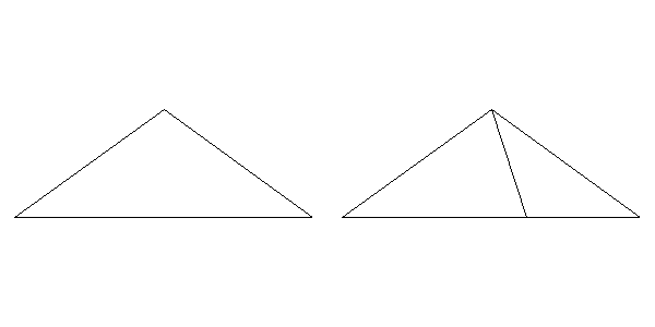
Everything has to do with triangles. Concretely, everything has to do with two types of triangles. To differenciate them I name their sides with numbers. The first triangle has labels 1, 2 and 3 and the other one has labels 1, 2 and 4. Two triangles of type 123 forms a kyte like this:
On the other hand, two triangles of type 124 forms a dart like this:
Actually, kites and darts don’t contain their inner segments so both of them are polygons of 4 sides. The building of a Penrose tiling is an iterative process that begins with 5 kites (i.e. 10 triangles of type 123) gathered like this:
You can start with many other patterns but this one will result in a round shape tiling and I like it. I build the tiling by subdividing triangles as Simon describes in his article. A triangle of type 123 is subdivided into three triangles: two of type 123 and one of type 124. The following image shows a 123 triangle (left) and the result after its division (right):
A triangle of type 124 is subdivided into two triangles: one of type 123 and one of type 124. The following image shows a 124 triangle (left) and the result after its division (right):
In each iteration, all triangles are subdivided according its type. After 5 iterations, the resulting pattern is like this:
To make calculations easier I arranged the data frame following a segment structure, in which the sides of triangles are defined by two coordinates: (x, y) and (xend, yend). The bad side of it is that I have rounding problems after making some iterations. It makes the points that would be the same differs slightly because they come from different triangles. I fix it using a hierarchical clustering and substituting points by its centroids after cutting up the dendogram using a very low thresold. Once this problem is solved I can remove the inner segments of all kites and darts, which are segments of type 3 or 4. Apart of removing them, I join the xx triengles to form 4-sides polygons. All these tasks are done with the function Arrange_df (remember that the code is here). This is the result:
This pattern is quite similar to its previous one but now the data frame is ready to be arranged as a polygon using the function Create_Polygon. At least, I calculate the area of each polygon with the Shoelace formula to create a columns called area which I use to fill polygons with two nice colors.
I hope that these explanations will help you to understand and improve the code as well as to invite you to create your own Penrose tilings.
La luna es un pozo chico las flores no valen nada lo que valen son tus brazos cuando de noche me abrazan (Zorongo Gitano, Carmen Linares)
When I publish a post showing my drawings, I use to place some outputs, give some highlights about the techniques involved as well as a link to the R code that I write to generate them. That’s my typical generative-art post (here you have an example of it). I think that my audience knows to program in R and is curious enough to run and modify the code by themselves to generate their own outputs. Today I will try to be more educational and will explain step by step how you can obtain drawings like these:
There are two reasons for this decision:
It can illustrate quite well my mental journey from a simple idea to what I think is a interesting enough experiment to publish.
I think that this experiment is a good example of the use of accumulate, a very useful function from the life-changingpurrr package.
Here we go: there are many ways of drawing a pentagon in R. Following you will find a piece of code that does it using accumulate function from purrr package. I will use only two libraries for this experiment: ggplot2 and purrr so I will just load in the tidyverse (both libraries take part of it):
The function accumulate applies sequentially some function a number of times storing all the intermediate results. When I say sequentially I mean that the input of any step is the output of the prevoius one. The accumulate function uses internally two important arguments called .x and .y: my own way to understand its significance is that .x is the previous value of the output vector and .y is the previous value of the one which controls the iteration. Let’s see a example: imagine that I want to create a vector with the first 10 natural numbers. This is an option:
> accumulate(1:10, ~.y)
 [1]  1  2  3  4  5  6  7  8  9 10
The vector which controls the iteration in this case is 1:10 and .y are the values of it so I just have to define a function wich returns that values and this is as simple as ~.y. The first iteration takes the first element of that vector. This is another way to do it:
To replicate the same output with .x I have to change a bit the function to ~.x+1 because if not, it will always return 1. Remember that .x is the previous output of the function and it is initialized with 1 (the first value of the vector 1:10). Intead of initializing .x with the first value of the vector of the first argument of accumulate, you can define exactly its first value using .init:
Note that using .init I have to change the vector to reproduce the same output as before. I hope now you will understand how I generated the initial and ending points of the previous pentagon. Some points to help you if not:
I generate a tibble with 5 rows, each of one defines a different segment of the pentagon
First segments starts at (0,0)
The rotating angle is equal to 2*pi/5
The ending point of each segment becomes the starting point of the following one
The next step is to encapsulate this into a function to draw regular polygons with any given number of edges. I only have to generalize the number of steps and the rotating angle of accumulate:
Now, let’s place another segment in the middle of each edge, perpendicular to it towards its centre. To do it I mutate de data frame to add those segments using simple trigonometry: I just have to add pi/2 to the angle wich forms the edge, obtained with atan2 function:
These new segments have longitude equal to 0.2, smaller than the original edges of the pentagon. Now, let’s connect the ending points of these perpendicular segments. It is easy using mutate and first functions. Another smaller pentagon appears:
Since we are repeating these steps many times, I will write two functions: one to generate perpendicular segments to the edges called mid_points and another one to connect its ending points called con_points. The next code creates both funtions and uses them to add another level to our previous drawing:
This pattern is called Sutcliffe pentagon. In the previous step, I did iterations manually. The function accumulate can help us to do it automatically. This code reproduces exactly the previous plot:
Substituting edges by 7 and niter by 6 as well in the first two rows of the previous code, generates a different pattern, in this case heptagonal:
Let’s start to play with the parameters to change the appearance of the drawings. What if we do not start the perpendicular segments from the midpoints of the edges? It’s easy: we just need to add a parameter that will name p to the function mid_points (p=0.5 means starting from the middle). This is our heptagon pattern when p is equal to 0.3:
Another simple modification is to allow any angle between edges and next iteration segments (perpendicular until now ) so let’s add another parameter, called a, to themid_points function:
That’s nice! It looks like a shutter. Now it’s time to change the longitude of the segments starting from the edges (those perpendicular in our first drawings). Now all them measure 0.2. I will take advantage of the parameter y of accumulate and apply a user defined function to modify that longitude each iteration. This example uses the identity function (FUN = function(x) x) to increase longitude step by step:
mid_points <- function(d, p, a, i, FUN = function(x) x) {
  d %>% mutate(
    angle=atan2(yend-y, xend-x) + a,
    radius=FUN(i),
    x=p*x+(1-p)*xend,
    y=p*y+(1-p)*yend,
    xend=x+radius*cos(angle),
    yend=y+radius*sin(angle)) %>%
    select(x, y, xend, yend)
}

edges <- 7
niter <- 18
polygon(edges) -> df1
accumulate(.f = function(old, y) {
  if (y%%2!=0) mid_points(old, 0.3, pi/5, y) else con_points(old)
},
1:niter,
.init=df1) %>%
  bind_rows() -> df
ggplot(df)+
  geom_segment(aes(x=x, y=y, xend=xend, yend=yend))+
  coord_equal()+
  theme_void()
Not bad, but we can do it better. First of all, note that appart of adding transparency with the parameter alpha inside the ggplot function, I changed the geometry of the plot from geom_segment to geom_curve. Setting curvature = 0 as I did generates straight lines so the result is the same as geom_segment but it will give us an additional degree of freedom to do our plots. I also changed the theme_void by an explicit customization some of the elements of the plot. Concretely, I want to be able to change the background color. This is the definitive code explained:
library(tidyverse)

# This function creates the segments of the original polygon
polygon <- function(n) {
  tibble(
    x    = accumulate(1:(n-1), ~.x+cos(.y*2*pi/n), .init = 0),
    y    = accumulate(1:(n-1), ~.x+sin(.y*2*pi/n), .init = 0),
    xend = accumulate(2:n,     ~.x+cos(.y*2*pi/n), .init = cos(2*pi/n)),
    yend = accumulate(2:n,     ~.x+sin(.y*2*pi/n), .init = sin(2*pi/n)))
}

# This function creates segments from some mid-point of the edges
mid_points <- function(d, p, a, i, FUN = ratio_f) {
  d %>% mutate(
    angle=atan2(yend-y, xend-x) + a,
    radius=FUN(i),
    x=p*x+(1-p)*xend,
    y=p*y+(1-p)*yend,
    xend=x+radius*cos(angle),
    yend=y+radius*sin(angle)) %>%
    select(x, y, xend, yend)
}

# This function connect the ending points of mid-segments
con_points <- function(d) {
  d %>% mutate(
    x=xend,
    y=yend,
    xend=lead(x, default=first(x)),
    yend=lead(y, default=first(y))) %>%
    select(x, y, xend, yend)
}

edges <- 3   # Number of edges of the original polygon
niter <- 250 # Number of iterations
pond <- 0.24  # Weight to calculate the point on the middle of each edge
step  <- 13  # No of times to draw mid-segments before connect ending points
alph  <- 0.25 # transparency of curves in geom_curve
angle <- 0.6 # angle of mid-segment with the edge
curv <- 0.1   # Curvature of curves
line_color <- "black" # Color of curves in geom_curve
back_color <- "white" # Background of the ggplot
ratio_f <- function(x) {sin(x)} # To calculate the longitude of mid-segments

# Generation on the fly of the dataset
accumulate(.f = function(old, y) {
  if (y%%step!=0) mid_points(old, pond, angle, y) else con_points(old)
  }, 1:niter,
.init=polygon(edges)) %>% bind_rows() -> df

# Plot
ggplot(df)+
  geom_curve(aes(x=x, y=y, xend=xend, yend=yend),
             curvature = curv,
             color=line_color,
             alpha=alph)+
  coord_equal()+
  theme(legend.position  = "none",
        panel.background = element_rect(fill=back_color),
        plot.background  = element_rect(fill=back_color),
        axis.ticks       = element_blank(),
        panel.grid       = element_blank(),
        axis.title       = element_blank(),
        axis.text        = element_blank())
The next table shows the parameters of each of the previous drawings (from left to right and top to bottom):
edges
niter
pond
step
alph
angle
curv
line_color
back_color
ratio_f
1
4
200
0.92
9
0.50
6.12
0.0
black
white
function (x) { x }
2
5
150
0.72
13
0.35
2.96
0.0
black
white
function (x) { sqrt(x) }
3
15
250
0.67
9
0.15
1.27
1.0
black
white
function (x) { sin(x) }
4
9
150
0.89
14
0.35
3.23
0.0
black
white
function (x) { sin(x) }
5
5
150
0.27
17
0.35
4.62
0.0
black
white
function (x) { log(x + 1) }
6
14
100
0.87
14
0.15
0.57
-2.0
black
white
function (x) { 1 – cos(x)^2 }
7
7
150
0.19
6
0.45
3.59
0.0
black
white
function (x) { 1 – cos(x)^2 }
8
4
150
0.22
10
0.45
4.78
0.0
black
white
function (x) { 1/x }
9
3
250
0.24
13
0.25
0.60
0.1
black
white
function (x) { sin(x) }
You can also play with colors. By the way: this document will help you to choose them by their name. Some examples:
I will not unveil the parameters of the previous drawings. Maybe it can encourage you to try by yourself and find your own patterns. If you do, I will love to see them. I hope you enjoy this reading. The code is also available here.
One cannot escape the feeling that these mathematical formulas have an independent existence and an intelligence of their own, that they are wiser than we are, wiser even than their discoverers (Heinrich Hertz)
I love spending my time doing mathematics: transforming formulas into drawings, experimenting with paradoxes, learning new techniques … and R is a perfect tool for doing it. Maths are for me a the best way of escape and evasion from reality. At least, doing maths is a stylish way of wasting my time.
When I read something interesting, many times I feel the desire to try it by myself. That’s what happened to me when I discovered this fabolous book by Julien C. Sprott. I cannot stop doing images with the formulas that contains. Today I present you a mix of mandalas and galaxies that I called Mandalaxies:
This time, the equation that drives these drawings is this one:
where
The equation depends on six parameters (from a1 to a6). Searching randomly for values between -1.2 and 1.3 to each of them, you can generate an infinite number of beautiful images:
Here you can find the code to do your own images. Once again, Rcpp is key to generate the set of points to plot quickly since each of the previous plots contains 4 million points.
Sin ese peso ya no hay gravedad
Sin gravedad ya no hay anzuelo
(Mira cómo vuelo, Miss Caffeina)
I love messing around with R to generate mathematical patterns. I always get surprised doing it and gives me lot of satisfaction. I also learn lot of things doing it: not only about R, but also about mathematics. It is one of my favourite hobbies. Some time ago, I published this post showing some drawings, each of them generated with less than 280 characters of code, to be shared on Twitter. This post came to appear in Hacker News, which provoked an incredible peak on visits to my blog. Some comments in the Hacker News entry are very interesting.
This Summer I delved into this concept of Tweetable Art publishing several drawings together with the R code to generate them. In this post I will show some.
Vertiginous Spiral
I came up with this image inspired by this nice pattern. It is a turtle graphic inspired pattern but instead of drawing lines I use geom_polygon to colour the resulting image in black and white:
Code:
library(tidyverse)
df <- data.frame(x=0, y=0)
for (i in 2:500){
  df[i,1] <- df[i-1,1]+((0.98)^i)*cos(i)
  df[i,2] <- df[i-1,2]+((0.98)^i)*sin(i)
}
ggplot(df, aes(x,y)) +
  geom_polygon()+
  theme_void()
Slight modifications of the code can generate appealing patterns like this:
Marine Creature
A combination of sines and cosines. It reminds me a jellyfish:
Sunflowers arrange their seeds according a mathematical pattern called phyllotaxis, whic inspires this image. If you want to create your own flowers, you can do this Datacamp’s project. It’s free and will introduce you to the amazing world of ggplot2, my favourite package to create images:
It is inspired by this other pattern. A lot of almost transparent white points ondulating according to sines and cosines on a dark coloured background:
Try to modify them and generate your own patterns: it is a very funny way to learn R.
Note: in order to make them better readable, some of the pieces of code below may have more than 280 characters but removing unnecessary characters (blanks or carriage return) you can reduce them to make them tweetable.
She dreams in colour, she dreams in red, can’t find a better man (Better Man, Pearl Jam)
Today I bring another experiment based on The Quick Draw! Data from Google, one of my most fortunate discoveries of the last times. The Quick Draw! is a web game developed by Google, that can be played on a computer, tablet or mobile phone, in which you are asked to draw something (for example, a bird). Then you have just 20 seconds to do it. You win if a machine, trained with a neural network, deduces what are you drawing. The best way to understand how it works is playing to it here. Google published data of about 50 million drawings across 345 categories, contributed by players of the game from all over the world. Datasets are in ndjson format (newline delimited JSON). In my previous post I analyzed one of these datasets, and showed a way to parse and represent the drawings in ggplot.
In this occasion I analyze the simplest drawing that Google can ask you: a line. The dataset, which is called lines.ndjson, can be found here and contains more than 143.000 lines drawn by people from about 170 countries. Most of these drawings come from The United States (45.4%), United Kingdom (7.5%), Canada (3.6%), Germany (3.5%) and Russian Federation (2.3%).
Let’s try to understand how humans draw lines. Concretely, in which direction do we draw them: horizontally? toward right o left? vertically? toward up or down? This analysis is inspired in two great articles I read recently:
How do you draw a circle? by Quartz, an amazing analysis which shows how cultural circumstances strongly determine the way in which we draw circles.
There are some technical details around this experiment I would highlight:
I parse the dataset using fromJSON function from rjson package.
I use purrr package to apply a linear regression to the points defining the line for each drawing.
I easily convert the summary of the linear regression into a data frame using tidy function from broom package.
I use the slope of the regression to obtain the angle which describes the line (depending on where it is started I add pi to de arctangent of the slope)
I represent the frequence of angles using polar coordinates dividing circle in sections of 30 degrees in the following way: 345°- 15°, 15°- 45°, 45°-75°, 75°-105°, …, 315°-345° so for example, horizontal lines from left to right will fall into 345º- 15º category.
This is how do we draw lines analysing the entire dataset, without doing any distinction by country:
The fact seems clear: an average human who plays to the Quick Draw! game, draws a line horizontally from left to right with a probability of 59%. I have to admite that I expected a majority of horizontal-left-to-right lines, but not as crushingly as the plot shows. Maybe my a priori is far from the reality because I am lefty and I would draw it in another way. Remember as well that this mean human will probably come from The United States.
Are there differences by country? Yes, and they are very interesting. I removed all that countries with less then 150 drawings. Taking this into account, these are the four countries where more people draw vertical bottom-up lines:
And these are where more people draw horizontal right-left lines:
We’ve seen that on average, 59% of lines are drawn from left to right. This figure reaches more than 75% in the following countries:
And where do people draw more oblique lines? Here:
Surprisingly, a very small amount of lines are drawn toward down, which seems me quite intriguing.
Some thoughts (let me know yours):
Humans prefer doing horizontal lines from left-to-right everywhere
In case of drawing vertical, we clearly prefer bottom-up movement rather than the opposite; maybe the device configuration or the arrangement of the application motivates this behaviour.
Arab and hebrew are written from right-to-left: this fact seems to have a significant influence on the way that people draw lines.
All that noise, and all that sound, all those places I have found (Speed of Sound, Coldplay)
Some days ago, my friend Jorge showed me one of the coolest datasets I’ve ever seen: the Google quick draw dataset. In its Github website you can see a detailed description of the data. Briefly, it contains around 50 million of drawings of people around the world in .ndjson format. In this experiment, I used the simplified version of drawings where strokes are simplified and resampled with a 1 pixel spacing. Drawings are also aligned to top-left corner and scaled to have a maximum value of 255. All these things make data easier to manage and to represent into a plot.
Since .ndjson files may be very large, I used LaF package to access randon lines of the file rather than reading it completely. I wrote a script to explore The Mona Lisa.ndjson file, which contains more than 120.000 drawings that the TensorFlow engine from Google recognized as being The Mona Lisa. It is quite funny to see them. Whit this script you can:
Reproduce a random single drawing
Create a 9×9 mosaic of random drawings
Create an animation simulating the way the drawing was created
I use ggplot2 package to render drawings and gganimate package of David Robinson to create animations.
This is an example of a single drawing:
This is an example of a 3×3 mosaic:
This is an example of animation:
If you want to try by yourself, you can find the code here.
Note: to work with gganimate, I downloaded the portable version and pointed to it with Sys.setenv command as explained here.
Someday you will find me
caught beneath the landslide
(Champagne Supernova, Oasis)
I recently read a book called Snowflake Seashell Star: Colouring Adventures in Numberland by Alex Bellos and Edmund Harris which is full of mathematical patterns to be coloured. All images are truly appealing and cause attraction to anyone who look at them, independently of their age, gender, education or political orientation. This book demonstrates how maths are an astonishing way to reach beauty.
One of my favourite patterns are tridokus, a sophisticated colored version of sudokus. Coloring a sudoku is simple: once that is solved it is enough to assign a color to each number (from 1 to 9). If you superimpose three colored sudokus with no cells at the same position sharing the same color, and using again nine colors, the resulting image is a tridoku:
There is something attractive in a tridoku due to the balance of colors but also they seem a quite messy: they are a charmingly unbalanced. I wrote a script to generalize the concept to n-dokus. The idea is the same: superimpose n sudokus without cells sharing color and position (I call them disjoint sudokus) using just nine different colors. I did’n’t prove it, but I think the maximum amount of sudokus can be overimposed with these constrains is 9. This is a complete series from 1-doku to 9-doku (click on any image to enlarge):
I am a big fan of colourlovers package. These tridokus are colored with some of my favourite palettes from there:
Just two technical things to highlight:
There is a package called sudoku that generates sudokus (of course!). I use it to obtain the first solved sudoku which forms the base.
Subsequent sudokus are obtained from this one doing two operations: interchanging groups of columns first (there are three groups: columns 1 to 3, 4 to 6 and 7 to 9) and interchanging columns within each group then.
You can find the code here: do you own colored n-dokus!
Con las bombas que tiran los fanfarrones, se hacen las gaditanas tirabuzones (Palma y corona, Carmen Linares)
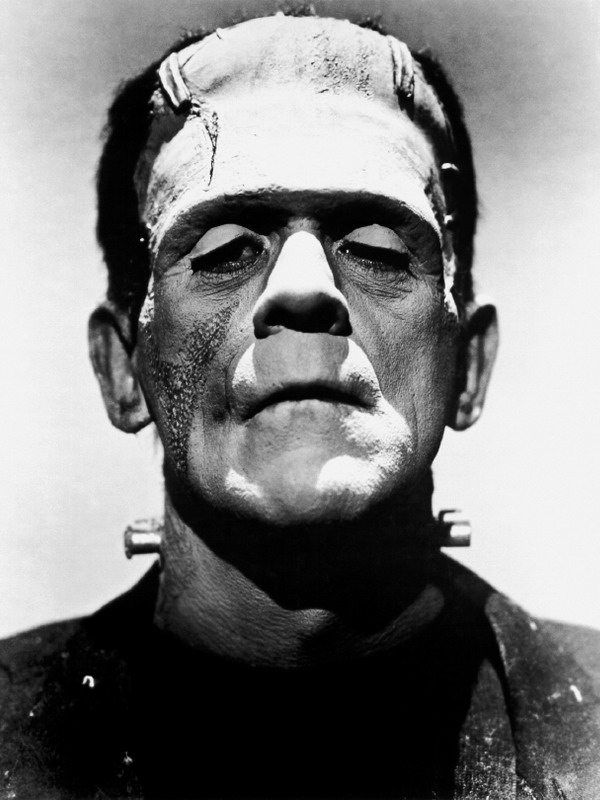
This time I draw Franky again using an algorithm to solve the Travelling Salesman Problem as I did in my last post. On this occasion, instead of doing just one single line drawing, I overlap many of them (250 concretely), each of them sampling 400 points on the original image (in my previous post I sampled 8.000 points). Last difference is that I don’t convert the image to pure black and white with threshold function: now I use the gray scale number of each pixel to weight the sample.
Once again, I use ggplot2 package, and its magical geom_path, to generate the image. The pencil effect is obtained giving a very high transparency to the lines. This is the result:
I love when someone else experiment with my experiments as Mara Averick did:
You can do it as well with this one, since you will find the code here. Please, let me know your own creations if you do. You can find me on twitter or by email.
P.S.: Although it may seems otherwise, I’m not obsessed with Frankenstein 🙂
I have noticed even people who claim everything is predestined, and that we can do nothing to change it, look before they cross the road (Stephen Hawking)
Imagine a salesman and a set of cities. The salesman has to visit each one of the cities starting from a certain one and returning to the same city. The challenge is finding the route which minimizes the total length of the trip. This is the Travelling Salesman Problem (TSP): one of the most profoundly studied questions in computational mathematics. Since you can find a huge amount of articles about the TSP in the Internet, I will not give more details about it here.
In this experiment I apply an heuristic algorithm to solve the TSP to draw a portrait. The idea is pretty simple:
Load a photo
Convert it to black and white
Choose a sample of black points
Solve the TSP to calculate a route among the points
Plot the route
The result is a single line drawing of the image that you loaded. To solve the TSP I used the arbitrary insertion heuristic algorithm (Rosenkrantz et al. 1977), which is quite efficient.
To illustrate the idea, I have used again this image of Frankenstein (I used it before in this other experiment). This is the result:
Apriétame bien la mano, que un lucero se me escapa entre los dedos (Coda Flamenca, Extremoduro)
I have the privilege of being teacher at ESTALMAT, a project run by Spanish Royal Academy of Sciences that tries to detect, guide and stimulate in a continuous way, along two courses, the exceptional mathematical talent of students of 12-13 years old. Some weeks ago I gave a class there about the importance of programming. I tried to convince them that learning R or Python is a good investment that always pays off; It will make them enjoy more of mathematics as well as to see things with their own eyes. The main part of my class was a workshop about Voronoi tesselations in R. We started drawing points on a circle and we finished drawing mandalas like these ones. You can find the details of the workshop here (in Spanish). It was a wonderful experience to see the faces of the students while generating their own mandalas.
In that case all mandalas were empty, ready to be printed and coloured as my 7 years old daughter does. In this experiment I colour them. These are the changes I have done to my previous code:
Remove external segments which intersects the boundary of the enclosing
rectangle
Convert the tesselation into a list of polygons with tile.list function
Use colourlovers package to fill the polygons with beautiful colour palettes
This is an example of the result:
Changing three simple parameters (iter, points and radius) you can obtain completely different images (clicking on any image you can see its full size version):
You can find details of these parameters in my previous post. I cannot resist to place more examples:


