Tag Archives: ggplot

A Little Present For Coldplay

Gravity, release me, and don’t ever hold me down, now my feet won’t touch the ground (Coldplay, Life In Technicolor II)

Inspired by this nice post and by this cover of a Coldplay’s album:

20090515-coldplay1

I have dared to do this using ggplot, polar coordinates and Google Fonts:

coldplay

Coldplay: feel free to use it for some future album.

library(ggplot2)
library(extrafont)
windowsFonts(Monoton=windowsFont("Monoton"))
butterfly=function(x) 8-sin(x)+2*sin(3*x)+2*sin(5*x)-sin(7*x)+3*cos(2*x)-2*cos(4*x)
opt=theme(legend.position="none",
          panel.background = element_rect(fill="black"),
          panel.grid = element_blank(),
          axis.ticks=element_blank(),
          axis.title=element_blank(),
          axis.text =element_blank())
ggplot(data.frame(x = c(0, 2*pi)), aes(x)) +
  stat_function(fun=butterfly, geom="density", fill="#FC0C54", colour="#FC0C54") +
  coord_polar(start=-pi)+
  geom_text(x=.5, y=-14, colour="turquoise2", family="Monoton", label="COLDPLAY", size=12)+
  geom_text(x=1.5, y=14, colour="turquoise2", family="Monoton", angle=90, label="Up Down Up Down Up Down", size=6)+
  opt

Size Doesn’t Matter

An invisible red thread connects those destined to meet, regardless of time, place or circumstances. The thread may stretch or tangle, but never break (Ancient Chinese Legend)

I use to play once a year with my friends to Secret Santa (in Spain we call it Amigo Invisible). As you can read in Wikipedia:

Secret Santa is a Western Christmas tradition in which members of a group or community are randomly assigned a person to whom they anonymously give a gift. Often practiced in workplaces or amongst large families, participation in it is usually voluntary. It offers a way for many people to give and receive a gift at low cost, since the alternative gift tradition is for each person to buy gifts for every other person. In this way, the Secret Santa tradition also encourages gift exchange groups whose members are not close enough to participate in the alternative tradition of giving presents to everyone else.

To decide who gives whom, every year is the same: one of us introduces small papers in a bag with the names of participants (one name per paper). Then, each of us picks one paper and sees the name privately. If no one picks their own name,  the distribution is valid. If not, we have to start over. Every year we have to repeat process several times until obtaining a valid distribution. Why? Because we are victims of The Matching Problem.

Following the spirit of this talk I have done 16 simulations of the matching problem (for 10, 20, 30 … to 160 items). For example, given n items, I generate 5.000 random vectors sampling without replacement the set of natural numbers from 1 to n. Comparing these random vectors with the ordered one (1,2, …, n) I obtain number of matchings (that is, number of times where ith element of the random vector is equal to i). This is the result of the experiment:

matching

In spite of each of one represents a different number of matchings, all plots are extremely similar. All of them say that probability of not matching any two identical items is around 36% (look at the first bar of all of them). In concrete terms, this probability tends to 1/e (=36,8%) as n increases but does it very quickly.

This result is shocking. It means that if some day the 7 billion people of the world agree to play Secret Santa all together (how nice it would be!), the probability that at least one person chooses his/her own name is around 2/3. Absolutely amazing.

This is the code (note: all lines except two are for plotting):

library(ggplot2)
library(scales)
library(RColorBrewer)
library(gridExtra)
library(extrafont)
results=data.frame(size=numeric(0), x=numeric(0))
for (i in seq(10, by=10, length.out = 16)){results=rbind(results, data.frame(size=i, x=replicate(5000, {sum(seq(1:i)-sample(seq(1:i), size=i, replace=FALSE)==0)})))}
opts=theme(
  panel.background = element_rect(fill="gray98"),
  panel.border = element_rect(colour="black", fill=NA),
  axis.line = element_line(size = 0.5, colour = "black"),
  axis.ticks = element_line(colour="black"),
  panel.grid.major.y = element_line(colour="gray80"),
  panel.grid.major.x = element_blank(),
  panel.grid.minor = element_blank(),
  axis.text.y = element_text(colour="gray25", size=15),
  axis.text.x = element_text(colour="gray25", size=15),
  text = element_text(family="Humor Sans", size=15, colour="gray25"),
  legend.key = element_blank(),
  legend.position = "none",
  legend.background = element_blank(),
  plot.title = element_text(size = 18))
sizes=unique(results$size)
for (i in 1:length(sizes))
{
  data=subset(results, size==sizes[i])
  assign(paste("g", i, sep=""),
         ggplot(data, aes(x=as.factor(x), weight=1/nrow(data)))+
           geom_bar(binwidth=.5, fill=sample(brewer.pal(9,"Set1"), 1), alpha=.85, colour="gray50")+
           scale_y_continuous(limits=c(0,.4), expand = c(0, 0), "Probability", labels = percent)+
           scale_x_discrete(limit =as.factor(0:8), expand = c(0, 0), "Number of matches")+
           labs(title = paste("Matching", as.character(sizes[i]), "items ...", sep=" "))+
           opts)
}
grid.arrange(g1, g2, g3, g4, g5, g6, g7, g8, g9, g10, g11, g12, g13, g14, g15, g16, ncol=4)

Space Invaders

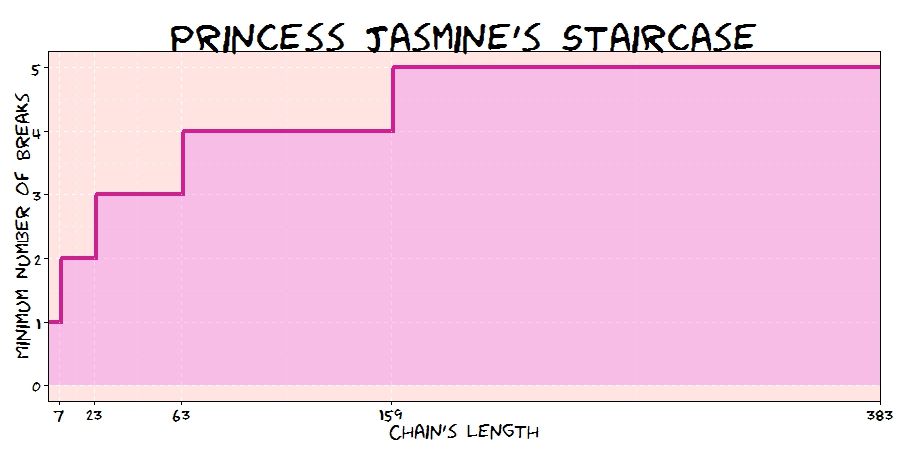
I burned through all of my extra lives in a matter of minutes, and my two least-favorite words appeared on the screen: GAME OVER (Ernest Cline, Ready Player One)

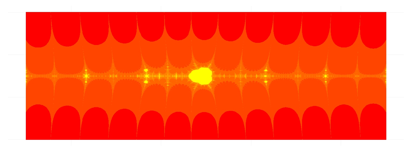
Inspired by the book I read this summer and by this previous post, I decided to draw these aliens:

Invader1 Invader3
Invader4Invader2

Do not miss to check this indispensable document to choose your favorite colors:

require("ggplot2")
require("reshape")
mars1=matrix(c(0,0,0,0,0,0,0,0,0,0,0,0,
0,0,0,1,0,0,0,0,1,0,0,0,
0,0,0,0,1,0,0,1,0,0,0,0,
0,0,0,1,1,1,1,1,1,0,0,0,
0,0,1,1,0,1,1,0,1,1,0,0,
0,1,1,1,1,1,1,1,1,1,1,0,
0,1,1,1,1,1,1,1,1,1,1,0,
0,1,1,1,1,1,1,1,1,1,1,0,
0,1,1,1,1,1,1,1,1,1,1,0,
0,1,0,1,0,0,0,0,1,0,1,0,
0,1,0,0,1,0,0,1,0,0,1,0,
0,0,0,0,0,0,0,0,0,0,0,0), nrow=12, byrow = TRUE)
mars2=matrix(c(0,0,0,0,0,0,0,0,0,0,0,0,
0,0,0,0,0,1,1,0,0,0,0,0,
0,0,0,0,1,1,1,1,0,0,0,0,
0,0,0,1,1,1,1,1,1,0,0,0,
0,0,1,1,0,1,1,0,1,1,0,0,
0,1,1,1,1,1,1,1,1,1,1,0,
0,1,1,1,1,1,1,1,1,1,1,0,
0,0,0,0,1,0,0,1,0,0,0,0,
0,0,0,1,0,1,1,0,1,0,0,0,
0,0,1,0,1,0,0,1,0,1,0,0,
0,1,0,1,0,0,0,0,1,0,1,0,
0,0,0,0,0,0,0,0,0,0,0,0), nrow=12, byrow = TRUE)
mars3=matrix(c(0,0,0,0,0,0,0,0,0,0,0,0,
0,0,0,0,1,0,0,1,0,0,0,0,
0,0,0,1,0,0,0,0,1,0,0,0,
0,0,0,1,1,1,1,1,1,0,0,0,
0,0,1,1,0,1,1,0,1,1,0,0,
0,1,1,1,1,1,1,1,1,1,1,0,
0,1,1,1,1,1,1,1,1,1,1,0,
0,1,1,1,1,1,1,1,1,1,1,0,
0,1,0,1,0,0,0,0,1,0,1,0,
0,1,0,0,1,1,1,1,0,0,1,0,
0,0,0,0,1,0,0,1,0,0,0,0,
0,0,0,0,0,0,0,0,0,0,0,0), nrow=12, byrow = TRUE)
mars4=matrix(c(0,0,0,0,0,0,0,0,0,0,0,0,
0,0,0,0,0,1,1,0,0,0,0,0,
0,0,0,0,1,1,1,1,0,0,0,0,
0,0,0,1,1,1,1,1,1,0,0,0,
0,0,1,1,0,1,1,0,1,1,0,0,
0,1,1,1,1,1,1,1,1,1,1,0,
0,1,1,1,1,1,1,1,1,1,1,0,
0,1,0,0,1,0,0,1,0,0,1,0,
0,0,0,1,0,0,0,0,1,0,0,0,
0,0,0,0,1,0,0,1,0,0,0,0,
0,0,0,1,0,0,0,0,1,0,0,0,
0,0,0,0,0,0,0,0,0,0,0,0), nrow=12, byrow = TRUE)
opt=theme(legend.position="none",
panel.background = element_blank(),
panel.grid = element_blank(),
axis.ticks = element_blank(),
axis.title = element_blank(),
axis.text = element_blank())
p1=ggplot(melt(mars1), aes(x=X2, y=X1))+geom_tile(aes(fill=jitter(value, amount=.1)), colour="gray65", lwd=.025)+
scale_fill_gradientn(colours = c("chartreuse", "navy"))+scale_y_reverse()+opt
p2=ggplot(melt(mars2), aes(x=X2, y=X1))+geom_tile(aes(fill=jitter(value, amount=.1)), colour="gray65", lwd=.025)+
scale_fill_gradientn(colours = c("olivedrab1", "magenta4"))+scale_y_reverse()+opt
p3=ggplot(melt(mars3), aes(x=X2, y=X1))+geom_tile(aes(fill=jitter(value, amount=.1)), colour="gray65", lwd=.025)+
scale_fill_gradientn(colours = c("violetred4", "yellow"))+scale_y_reverse()+opt
p4=ggplot(melt(mars4), aes(x=X2, y=X1))+geom_tile(aes(fill=jitter(value, amount=.1)), colour="gray65", lwd=.025)+
scale_fill_gradientn(colours = c("tomato4", "lawngreen"))+scale_y_reverse()+opt

Princess Jasmine’s Trick

I’m history! No, I’m mythology! Nah, I don’t care what I am; I’m free hee! (Genie, when he is released from the magical oil lamp by Aladdin)

Princess JasmineA long time ago, in a kingdom far away, lived a beautiful princess named Jasmine. There also lived a very rich and evil wizard named Jafar, who was in love with the princess. In order to married with Jasmine, Jafar bought  her father’s will with treasures, but the princess was harder to convince. One day Jafar told the princess: Request me whatever you want and if  I am able to bring it to you, you will become my wife. The princess, tired of the insistence of Jafar, answered: I only want a gold chain, but I want you to give it to me as follows: the first day I should have just one link of the chain. The second day I should have two links. The third day, three … and so on. When you give me all the links of the chain I will marry you. Jafar, intrigued, asked: But how many links should have the chain?  And Jasmine replied: I want you to give me the longest chain that allows you to pay me breaking only 30 links. Jafar began to laugh out loud as he walked away and said to the princess: Tomorrow I’ll bring you such chain!. But as he went to his palace, his happiness turned into anger: he realized that there was not enough gold in the world to build the chain that asked Jasmine.

This is my own version of one of my favorite anti-common-sense mathematical curiosities. To explain it, let me start with an example. Imagine a simple chain with 7 links. If you open the 3rd link, the you split the chain into 3 pieces: a single link (the one you opened), a piece of 2 links and another one of 4 links. You could pay to Jasmine during seven days combining these 3 pieces:

  • Day 1: Give her the single link
  • Day 2: Give her the 2-links piece and take the single link, leaving her with 2 links
  • Day 3: Give her the single link again, leaving her with 3 links
  • Day 4: Give her the 4-links piece and take all pieces she has, leaving her with 4 links
  • Day 5: Give her the single link again, leaving her with 5 links
  • Day 6: Give her the 2-links piece and take 2-links piece, leaving her with 6 links
  • Day 7: Give her the single link piece, leaving her with all links

Is easy to see that having a chain with 63 links, you could pay Jasmine breaking only 3 links (positions 5th, 14th and 31st). It easy to prove that the length of the biggest chain you can manage breaking only n links is (2n+1-1)*(n+1)+n

Next plot represents the minimum number of breaks to pay Jasmine daily for a given chain’s length. I call it the Jasmine’s Staircase:

Generated With R #rstats

Some curiosities around chains:

  • Jasmine asked Jafar a chain of 66.571.993.087 links
  • Supposing one link weights 4 grams, the chain of Jasmine would weight around 266 tons. It is supposed to be around 171 tons of gold in the world
  • If you spend 1 second to climb the first step of the staircase, you will spend 302 years to climb the step number 100

Jafar was right. Jasmine was clever:

library(sqldf)
library(ggplot2)
library(extrafont)
max.breaks=5
CalculateLength = function(n) {n+sum(sapply(0:n, function(x) 2^x*(n+1)))}
results=data.frame(breaks=1:max.breaks, length=sapply(1:max.breaks, CalculateLength))
links=data.frame(links=2:CalculateLength(max.breaks))
results=sqldf("SELECT links.links, min(results.breaks) as minbreaks FROM links, results WHERE links.links <= results.length GROUP BY 1")
opts=theme(
panel.background = element_rect(fill="mistyrose"),
panel.border = element_rect(colour="black", fill=NA),
axis.line = element_line(size = 0.5, colour = "black"),
axis.ticks = element_line(colour="black"),
panel.grid = element_line(colour="white", linetype = 2),
axis.text.y = element_text(colour="black"),
axis.text.x = element_text(colour="black"),
text = element_text(size=20, family="Humor Sans"),
plot.title = element_text(size = 40)
)
ggplot(results, aes(links,minbreaks))+
geom_area(fill="violet", alpha=.4)+
geom_step(color="violetred", lwd=1.5)+
labs(x="Chain's Length", y="Minimum Number of Breaks", title="Princess Jasmine's Staircase")+
scale_x_continuous(expand = c(0, 0), breaks = sapply(1:max.breaks, CalculateLength))+
opts

The Andrica’s Conjecture

Things should be as simple as possible, but not simpler (Albert Einstein)

Following with conjectures about primes, it is time for Andrica’s conjecture. The great mathematician Leonhard Euler (1707-1783) pointed: “Mathematicians have tried with no success to find some kind of order in the sequence of prime numbers and today we have reasons to believe that this is a mystery that human mind will never understand”.

In 1985, the Romanian mathematician Dorin Andrica published his conjecture, still unproved, which makes reference to gap between consecutive prime numbers. In concrete, his conjecture establishes that difference between square roots between two consecutive prime numbers is always less than 1. The highest difference encountered until now is 0.67087, located between p4=7 and p5=11.

Following you can find the plot of these differences for first 400 prime numbers:

andricaIt is very interesting how dots form hyperbolic patterns. Does not seem similar in some sense to the Ulam spiral? Primes: how challenging you are!

Two more comments:

  • It is better to find primes using matlab package than doing with schoolmath one. Reason is simple: for schoolmath package, 133 is prime!
  • Why did Andrica formulated his conjecture as √pn+1-√pn < 1 instead of √pn+1-√pn < 3/4? In terms of statistical error, the second formulation is more accurate. Maybe the charisma of number 1 is hard to avoid.

This is the code. I learned how to insert mathematical expressions inside a ggplot chart:

library(matlab)
library(ggplot2)
ubound=2800
primes=primes(ubound)
andrica=data.frame(X=seq(1:(length(primes)-1)), Y=diff(sqrt(primes)))
opt=theme(panel.background = element_rect(fill="gray92"),
panel.grid.minor = element_blank(),
panel.grid.major.x = element_blank(),
panel.grid.major.y = element_line(color="white", size=1.5),
plot.title = element_text(size = 45),
axis.title = element_text(size = 28, color="gray35"),
axis.text = element_text(size=16),
axis.ticks = element_blank(),
axis.line = element_line(colour = "white"))
ggplot(andrica, aes(X, Y, colour=Y))+geom_point(size=5, alpha=.75)+
scale_colour_continuous(guide = FALSE)+
scale_x_continuous("n", limits=c(0, length(primes)-1), breaks = seq(0,length(primes)-1,50))+
scale_y_continuous(expression(A[n]==sqrt(p[n+1])-sqrt(p[n])), limits=c(0, .75), breaks = seq(0,.75,.05))+
labs(title = "The Andrica's Conjecture")+
opt

butteRfly

Float like a butterfly, sting like a bee (Muhammad Ali)

The Butterfly Curve was discovered by Temple H. Fay when he was in Southern University, Mississippi, and rapidly gained the attention of students and mathematicians because of its beautiful simmetry. Small dots of this plot are generated according to parametric equations of the Butterfly Curve. Big dots are randomdly distributed over the canvas:

butterfly4

This is the code to create butterflies:

library(ggplot2)
npoints=500
npointsb=1200
opt=theme(legend.position="none",
panel.background = element_blank(),
panel.grid = element_blank(),
axis.ticks=element_blank(),
axis.title=element_blank(),
axis.text =element_blank())
t=seq(0,10*pi,length=npointsb)
butterfly=data.frame(x=sin(t)*(exp(1)^cos(t)-2*cos(4*t)-(sin(t/12))^5), y=cos(t)*(exp(1)^cos(t)-2*cos(4*t)-(sin(t/12))^5), s=runif(npointsb, min=.1, max=10), f=factor(sample(1:10,npointsb,TRUE)), a=runif(npointsb,min=.1, max=.4))
points=data.frame(x=runif(npoints,-4,4), y=runif(npoints,-3,5), s=runif(npoints,min=30, max=50), f=factor(sample(1:10,npoints,TRUE)), a=runif(npoints,min=.05, max=.15))
data=rbind(butterfly, points)
ggplot(data, aes(x, y, colour=f))+geom_point(alpha=data$a,size=data$s)+opt

Batman’s Choice

A hero can be anyone, even a man doing something as simple and reassuring as putting a coat on a young boy’s shoulders to let him know the world hadn’t ended (Batman in The Dark Knight Rises)

Joker has captured Batman and keeps him into a dark and cold dungeon of Gotham City. Showing his sadistic character, Joker proposes the following game to Batman:

This is a six shooter revolver with two bullets in the cylinder. Bullets are inside two consecutive chambers. I will spin the cylinder and will fire the gun aiming to my head. If I survive you will have to do the same but you decide if you want to spin the cylinder before firing or not. If you still keep you head over your shoulders after firing, you will be free.

Joker fires and nothing happens. He survives and passes the revolver to Batman. What should Batman do? Spinning or not? What would you do?

From my point of view, answer is quite anti-intutive because the best option is not spinning the cylinder again. Spinning case is clear: probability of losing the head is 2/6=33% but what about not spinning? Doing the next shoot directly eliminates two possibilities: the previous shot of Joker and the second bullet according to direction of cylinder rotation (remember two bullets are consecutive and Joker is unfortunately  still alive). It means there is only 1 chance to dead between 4, so probability of losing the head in this scenario is 1/4=25% which is significantly lower than the first one.

Here you can find the resulting graph of simulating the game up to 500 times:

batmans_choice2

Will it be the end of Batman? Not sure.

This is the code of this experiment:

library(ggplot2)
library(extrafont)
niter=500
results=data.frame()
for (i in 1:niter)
{
bullet1=sample(1:6,1)
Joker=sample((1:6)[-c(bullet1, bullet1%%6+1)],1)
#Option 1: Shooting
Batman1=Joker%%6+1
dead1=(Batman1 %in% c(bullet1, bullet1%%6+1))*1
#Option 2: Rolling and Shooting
Batman2=sample(1:6,1)
dead2=(Batman2 %in% c(bullet1, bullet1%%6+1))*1
results=rbind(results, c(i, dead1, dead2))
}
colnames(results)=c("iter", "dead1", "dead2")
results$csum1=cumsum(results$dead1)/as.numeric(rownames(results))
results$csum2=cumsum(results$dead2)/as.numeric(rownames(results))
theme_xkcd=theme(
panel.background = element_rect(fill="darkolivegreen1"),
panel.border = element_rect(colour="black", fill=NA),
axis.line = element_line(size = 0.5, colour = "black"),
axis.ticks = element_line(colour="black"),
panel.grid = element_line(colour="white", linetype = 2),
axis.text.y = element_text(colour="black"),
axis.text.x = element_text(colour="black"),
text = element_text(size=18, family="Humor Sans"),
plot.title = element_text(size = 50)
)
p=ggplot(data=results, aes(x=iter, y=csum1))+
geom_abline(intercept = 1/4, slope = 0, size = 0.4, linetype=2, colour = "black", alpha=0.8)+
geom_abline(intercept = 1/3, slope = 0, size = 0.4, linetype=2, colour = "black", alpha=0.8)+
geom_line(aes(y=csum2), colour="green4", size=1.5, fill=NA)+
geom_line(colour="green4", size=1.5, fill=NA)+
coord_cartesian(ylim=c(.0, 1), xlim=c(1, niter))+
scale_y_continuous(breaks = c(0,round(1/4, digits = 2),round(1/3, digits = 2),1))+
geom_text(data=results[niter*.75, ], family="Humor Sans", colour="green4", y=0.38, label="Rotating Cylinder and Shooting ...", size=4, adjust=1)+
geom_text(data=results[niter*.75, ], family="Humor Sans", colour="green4", y=0.20, label="Shooting without Rotating Cylinder ...", size=4, adjust=1)+
labs(x="Number Of Trials", y="Prob. of Losing The Head", title="Batman's Choice")+
theme_xkcd
ggsave("batmans_choice.jpg", plot=p, width=8, height=5)

The Collatz Fractal

It seems to me that the poet has only to perceive that which others do not perceive, to look deeper than others look. And the mathematician must do the same thing (Sofia Kovalevskaya)

How beautiful is this fractal! In previous posts I colored plots using module of complex numbers generated after some iterations. In this occasion I have used the escape-time algorithm, a very well known coloring algorithm which is very easy to implement in R.
Collatz07
Those who want to know more about this fractal can go here. For coloring, I chose a simple scale from red to yellow resulting a fractal interpretation of my country’s flag. You can choose another scale or use a RColorBrewer palette as I did in this previous post. Choosing another x or y ranges you can zoom particular areas of the fractal.

Try yourself and send me your pictures!

library(ggplot2)
xrange <- seq(-8, 8, by = 0.01)
yrange <- seq(-3, 3, by = 0.01)
f  <- function (z) {1/4*(2+7*z-(2+5*z)*cos(pi*z))}
z <- outer(xrange, 1i*yrange,'+')
t <- mat.or.vec(nrow(z), ncol(z))
for (k in 1:10)
{
  z <- f(z)
  t <- t + (is.finite(z)+0)
}
## Supressing texts, titles, ticks, background and legend.
opt <- theme(legend.position="none",
             panel.background = element_blank(),
             axis.ticks=element_blank(),
             axis.title=element_blank(),
             axis.text =element_blank())
z <- data.frame(expand.grid(x=xrange, y=yrange), z=as.vector(t))
ggplot(z, aes(x=x, y=y, color=z)) + geom_tile() + scale_colour_gradient(low="red", high="yellow") + opt

Random Love

Anyone who considers arithmetical methods of producing random digits is, of course, in a state of sin (John von Newman)

Ms. Positive and Mr. Negative live in a one-dimensional world and are falling in love. But beginnings are not always easy. They have a big problem: none of them like the other’s neighborhood. Ms. Positive only wants to walk around Positive Integer Numbers Neighborhood and Mr. Negative around Negative Integers Numbers one. This is a prickly problem they need to deal with as soon as possible. But they have a good idea. They will start their walks from Zero, an impartial place between both neighborhoods and will let fate to guide their feet. They will toss a coin to decide every step: if result is head, they will advance 1 step toward positive numbers neighborhood; if tail, they will advance 1 step toward negative numbers one. For example, if the first 5 tosses are face, face, tail, tail and tail, the their first 5 steps will be +1, +2, +1, 0 and -1. It seems to be a fair agreement for both. Maybe is not the most pleasant way to take a walk but It is well known that lovers use to do silly things constantly, especially at the beginnings. They always walk for two hours, so they toss the coin 7.200 times every walk (these lovers are absolutely crazy as you can see). This was their first walk:

plot1

After this first walk, Mr Negative was really upset. Ms. Positive, watching his face fell, ask him: What’s the matter, honey? and Mr. Negative replied: What’s the matter? What’s the matter? The matter is that we spent almost all the time walking around your horrible neighborhood! What comes next is too hard to be reproduced here. Anyway, they agreed to give a chance to the method they designed. How can one imagine that a coin can produce such a strange walk! There must be an error! After 90 walks, the situation of our lovers was extremely delicate. A 57% of the walks were absolutely awful for one of them since more than 80% of the steps were around the same neighborhood. Another 32% were a bit uncomfortable for one of them since between 60% and 80% of the steps were around the same neighborhood. Only 11% of the walks were gratifying. How is it possible?, said Mr. Negative. How is it possible?, said Ms. Positive.

hist2

But here comes Ms. Positive, who always looks on the brigth side of life: Don’t worry, darling. In fact, we don’t have to be sad. We get angry the same amount of times! For me is enough. What about you?, said her. For me is perfect as well!, said Mr. Negative. In that moment, they realise they were made for each other and started another random walk with a big smile on their faces.

water2

This is the code:

library(ggplot2)
steps   <- 2*60*60 #Number of steps
results <- data.frame()
walks<-90 #Number of walks
for (i in 1:walks)
{
  state <- cumsum(sample(c(-1,1), steps, replace = TRUE))
  results <- rbind(results, c(sum(state<0), sum(state>0), sum(state==0), 
                              if (sum(state<0) >= sum(state>0)) 1 else 0))
}
colnames(results) <- c("neg.steps", "pos.steps", "zero.steps", "ind.neg")
results$max.steps <- apply(results, 1, max)/apply(results, 1, sum)
#Plot of one of these walks
mfar=max(abs(max(state)),abs(min(state)))
plot1 <- qplot(seq_along(state), 
      state, 
      geom="path")+ 
  xlab("Step") + 
  ylab("Location") +
  labs(title = "The First Walk Of Ms. Positive And Mr. Negative")+
  theme(plot.title = element_text(size = 35))+
  theme(axis.title.y = element_text(size = 20))+
  theme(axis.title.x = element_text(size = 20))+
  scale_x_continuous(limits=c(0, length(state)),breaks=c(1,steps/4,steps/2,3*steps/4,steps))+
  scale_y_continuous(limits=c(-mfar, mfar), breaks=c(-mfar,-mfar/2, 0, mfar/2,mfar))+
  geom_hline(yintercept=0)
ggsave(plot1, file="plot1.png", width = 12, height = 10)
#Summary of all walks
hist1 <- ggplot(results, aes(x = max.steps))+
  geom_histogram(colour = "white",breaks=seq(.4,1,by=.2),fill=c("blue", "orange", "red"))+
  theme_bw()+
  labs(title = paste("What Happened After ", toString(walks), " Walks?",sep = ""))+
  scale_y_continuous(breaks=seq(0,(nrow(results[results$max.steps>.8,])+10),by=10))+
  theme(plot.title = element_text(size = 40))+  
  xlab("Maximum Steps In The Same Location (%)") + 
  ylab("Number of Walks")
ggsave(hist1, file="hist1.png", width = 10, height = 8)
#Data for waterfall chart
waterfall <- as.data.frame(cbind(
  c("Total Walks", "Satisfactory Walks", "Uncomfortable Walks", "Awful Walks for Mr. +", "Awful Walks for Ms. -"),
  c("a", "b", "c", "d", "d"),
  c(0, 
    nrow(results),
    nrow(results)-nrow(results[results$max.steps<.6,]),
    nrow(results)-nrow(results[results$max.steps<.6,])-nrow(results[results$max.steps>=.6 & results$max.steps<.8,]),
    nrow(results)-nrow(results[results$max.steps<.6,])-nrow(results[results$max.steps>=.6 & results$max.steps<.8,])-nrow(results[results$max.steps>=.8 & results$ind.neg==1,])
    ),
  c(nrow(results),
    nrow(results)-nrow(results[results$max.steps<.6,]),
    nrow(results)-nrow(results[results$max.steps<.6,])-nrow(results[results$max.steps>=.6 & results$max.steps<.8,]),
    nrow(results)-nrow(results[results$max.steps<.6,])-nrow(results[results$max.steps>=.6 & results$max.steps<.8,])-nrow(results[results$max.steps>=.8 & results$ind.neg==1,]),
    0
    ),
  c(nrow(results), 
    nrow(results[results$max.steps<.6,]), 
    nrow(results[results$max.steps>=.6 & results$max.steps<.8,]), 
    nrow(results[results$max.steps>=.8 & results$ind.neg==1,]), 
    nrow(results[results$max.steps>=.8 & results$ind.neg==0,]))
))
colnames(waterfall) <-c("desc", "type", "start", "end", "amount")
waterfall$id <- seq_along(waterfall$amount)
waterfall$desc <- factor(waterfall$desc, levels = waterfall$desc)
#Waterfall chart
water1 <- ggplot(waterfall, aes(desc, fill = type)) + 
  geom_rect(aes(x = desc, xmin = id-0.45, xmax = id+0.45, ymin = end, ymax = start))+ 
  xlab("Kind of Walk") + 
  ylab("Number of Walks") +
  labs(title = "The Ultimate Proof (After 90 Walks)")+
  theme(plot.title = element_text(size = 35))+
  theme(axis.title.y = element_text(size = 20))+
  theme(axis.title.x = element_text(size = 20))+
  theme(legend.position = "none")

Dora’s Choice

Arithmetic is being able to count up to twenty without taking off your shoes (Mickey Mouse)

Dora-1

On her last mission, Dora The Explorer sails down the Amazon river to save her friend Isa The Iguana from Swiper The Fox claws. After some hours of navigation, Dora sees how the river divides into 3 branches and has to choose which one to follow. Before leaving, her friend Map told her that just one of these branches is safe. Two others end in terrible waterfalls, both impossible to escape alive. Although Dora does not know which one is the good one, she decides to take the branch number 1. Suddenly, her friend Boots The Monkey yells from the top of a palm tree:

Dora, do not take branch number 3! I can see from here that it ends in a horrible waterfall!

After listening to Boots, Dora changes her mind and decides to take branch number 2. Why Dora switches? Because she knows that this change has significantly increased her probability of ending the mission alive.

There are several ways to convince yourself of this. One is to simulate the situation that has faced Dora and compare results of switching and not switching . Switching, Dora saves her life 2 of each 3 simulations while if she does not, Dora only saves 1 of each 3 simulations. Changing her mind, Dora doubles her chances of survival!

Carefully considering what happens, you can see that switching Dora saves herself when her first choice is erroneus, which occurs with probability 2/3. On the other hand, if Dora remains faithful to her first choice, obviously only saves herself with probability 1/3.

This is an example on my own of the famous Monty Hall Problem. You can see a nice explanation of it in a chapter of Numb3rs or in the film 21 Black Jack. Not long ago I exposed the problem in a family meeting. Only my mum said she would switch (we were 6 people in the meeting). It is fun to share this experiment and ask what people would do. Do it with your friends and family. First time I knew the problem I thought there were no difference between switching and not since I gave both possibilities 1/2 of probability. If I had been Dora, pretty sure I would tumbled over a terrible waterfall. What about yo?

Note: this is an update of the post, which was not a correct formulation of Monty Hall Problem. Thanks to David Robinson and Scott Kostyshak for showing me my error. A correct formulation of the problem may be this:

On her last mission, Dora The Explorer sails down the Amazon river to meet her cousin Diego. After some hours of navigation, Dora sees how the river divides into 3 branches and has to choose which one to follow. Before leaving, her friend Map told her that just one of these branches is safe. Two others end in terrible waterfalls, both impossible to escape alive. Although Dora does not know which one is the good one, she decides to take the branch number 1. After putting the bow towards branch number one, Dora sees Swiper The Fox smiling from the shore, in a high place where obviously can see the end of all three branches. Dora yells him:

– Help me Swiper! Which one should I take?

Swiper replies:

– I am the villain of this story so I will give you only an advice: do not take branch number 3. It ends into a terrible waterfall.

Dora, who has a sixth sense to notice when Swiper is lying, knows he is telling the truth and immediately changes her mind and decides to take branch number 2. Why Dora switches? Because she knows that this change has significantly increased her probability of ending the mission alive.

doras_choice

Here you have the code:

library(ggplot2)
library(extrafont)
nchoices <- 3
nsims <- 500
choices <- seq(from=1, to=nchoices, by=1)
good.choice <- sample(choices, nsims, replace=TRUE)
choice1 <- sample(choices, nsims, replace=TRUE)
dfsims <- as.data.frame(cbind(good.choice, choice1))
dfsims$advice <- apply(dfsims, 1, function(x) choices[!choices %in% as.vector(x)][sample(1:length(choices[!choices %in% as.vector(x)]), 1)])
dfsims$choice2 <- apply(dfsims, 1, function(x) choices[!choices %in% as.vector(c(x[2], x[3]))][sample(1:length(choices[!choices %in% as.vector(c(x[2], x[3]))]), 1)])
dfsims$win1 <- apply(dfsims, 1, function(x) (x[1]==x[2])*1)
dfsims$win2 <- apply(dfsims, 1, function(x) (x[1]==x[4])*1)
dfsims$csumwin1 <- cumsum(dfsims$win1)/as.numeric(rownames(dfsims))
dfsims$csumwin2 <- cumsum(dfsims$win2)/as.numeric(rownames(dfsims))
dfsims$nsims <- as.numeric(rownames(dfsims))
dfsims$xaxis <- 0
### XKCD theme
theme_xkcd <- theme(
panel.background = element_rect(fill="darkolivegreen1"),
panel.border = element_rect(colour="black", fill=NA),
axis.line = element_line(size = 0.5, colour = "black"),
axis.ticks = element_line(colour="black"),
panel.grid = element_line(colour="white", linetype = 2),
axis.text.y = element_text(colour="black"),
axis.text.x = element_text(colour="black"),
text = element_text(size=18, family="Humor Sans"),
plot.title = element_text(size = 50)
)
### Plot the chart
p <- ggplot(data=dfsims, aes(x=nsims, y=csumwin1))+
geom_line(aes(y=csumwin2), colour="green4", size=1.5, fill=NA)+
geom_line(colour="green4", size=1.5, fill=NA)+
geom_text(data=dfsims[400, ], family="Humor Sans", aes(x=nsims), colour="green4", y=0.7, label="if Dora switches ...", size=5.5, adjust=1)+
geom_text(data=dfsims[400, ], family="Humor Sans", aes(x=nsims), colour="green4", y=0.3, label="if Dora does not switch ...", size=5.5, adjust=1)+
coord_cartesian(ylim=c(0, 1), xlim=c(1, nsims))+
scale_y_continuous(breaks = c(0,round(1/3, digits = 2),round(2/3, digits = 2),1), minor_breaks = c(round(1/3, digits = 2),round(2/3, digits = 2)))+
scale_x_continuous(minor_breaks = seq(100, 400, 100))+
labs(x="Number Of Simulations", y="Rate Of Survival", title="Dora's Choice")+
theme_xkcd
ggsave("doras_choice.jpg", plot=p, width=8, height=5)