Tag Archives: primes

The Unbereable Insolence of Prime Numbers or (Playing to be Ulam)

So rock me mama like a wagon wheel, rock me mama anyway you feel (Wagon Wheel, Old Crow Medicine Show)

This is the third iteration of Hilbert curve. I placed points in its corners. Since the curve has beginning and ending, I labeled each vertex with the order it occupies:hilbert_primes3_1Dark green vertex are those labeled with prime numbers and light ones with non-prime. This is the sixth iteration colored as I described before (I removed lines and labels):hilbert_primes6_2

Previous plot has 4.096 points. There are 564 primes lower than 4.096. What If I color 564 points randomly instead coloring primes? This is an example:
hilbert_primes6_2rand
Do you see any difference? I do. Let me place both images together (on the left, the one with primes colored):
hilbert_primes6_3

The dark points are much more ordered in the first plot. The second one is more noisy. This is my particular tribute to Stanislaw Ulam and its spiral: one of the most amazing fruits of boredom in the history of mathematics.

This is the code:

library(reshape2)
library(dplyr)
library(ggplot2)
library(pracma)
opt=theme(legend.position="none",
          panel.background = element_rect(fill="white"),
          panel.grid=element_blank(),
          axis.ticks=element_blank(),
          axis.title=element_blank(),
          axis.text=element_blank())
hilbert = function(m,n,r) {
  for (i in 1:n)
  {
    tmp=cbind(t(m), m+nrow(m)^2)
    m=rbind(tmp, (2*nrow(m))^r-tmp[nrow(m):1,]+1)
  }
  melt(m) %>% plyr::rename(c("Var1" = "x", "Var2" = "y", "value"="order")) %>% arrange(order)}
iter=3 #Number of iterations
df=hilbert(m=matrix(1), n=iter, r=2)
subprimes=primes(nrow(df))
df %>%  mutate(prime=order %in% subprimes,
               random=sample(x=c(TRUE, FALSE), size=nrow(df), prob=c(length(subprimes),(nrow(df)-length(subprimes))), replace = TRUE)) -> df
#Labeled (primes colored)
ggplot(df, aes(x, y, colour=prime)) +
  geom_path(color="gray75", size=3)+
  geom_point(size=28)+
  scale_colour_manual(values = c("olivedrab1", "olivedrab"))+
  scale_x_continuous(expand=c(0,0), limits=c(0,2^iter+1))+
  scale_y_continuous(expand=c(0,0), limits=c(0,2^iter+1))+
  geom_text(aes(label=order), size=8, color="white")+
  opt
#Non labeled (primes colored)
ggplot(df, aes(x, y, colour=prime)) +
  geom_point(size=5)+
  scale_colour_manual(values = c("olivedrab1", "olivedrab"))+
  scale_x_continuous(expand=c(0,0), limits=c(0,2^iter+1))+
  scale_y_continuous(expand=c(0,0), limits=c(0,2^iter+1))+
  opt
#Non labeled (random colored)
ggplot(df, aes(x, y, colour=random)) +
  geom_point(size=5)+
  scale_colour_manual(values = c("olivedrab1", "olivedrab"))+
  scale_x_continuous(expand=c(0,0), limits=c(0,2^iter+1))+
  scale_y_continuous(expand=c(0,0), limits=c(0,2^iter+1))+
  opt

Simple Data Science To Maximize Return On Lottery Investment

Every finite game has an equilibrium point (John Nash, Non-Cooperative Games, 1950)

I read recently this amazing book, where I discovered that we (humans) are not capable of generating random sequences of numbers by ourselves when we play lottery. John Haigh demonstrates this fact analyzing a sample of 282 raffles of 6/49 UK Lotto. Once I read this, I decided to prove if this disability is property only of British population or if it is shared with Spanish people as well. I am Spanish, so this experiment can bring painful results to myself, but here I come.

The Spanish equivalent of 6/40 UK Lotto is called “Lotería Primitiva” (or “Primitiva”, to abbreviate). This is a ticket of Primitiva lotto:

JugarPrimitiva

As you can see, one ticket gives the chance to do 8 bets. Each bet consists on 6 numbers between 1 and 49 to be chosen in a grid of 10 rows by 5 columns. People tend to choose separate numbers because we think that they are more likely to come up than combinations with some consecutive numbers. We think we have more chances to get rich choosing 4-12-23-25-31-43 rather than 3-17-18-19-32-33, for instance. To be honest, I should recognize I am one of these persons.

Primitiva lotto is managed by Sociedad Estatal Loterías y Apuestas del Estado, a public business entity belonging to the Spanish Ministry of Finance and Public Administrations. They know what people choose and they could do this experiment more exactly than me. They could analyze just human bets (those made by players by themselves) and discard machine ones (those made automatically by vending machines) but anyway it is possible to confirm the previous thesis with some public data.

I analysed 432 raffles of Primitiva carried out between 2011 and 2015; for each raffle I have this information:

  • The six numbers that form the winning combination
  • Total number of bets
  • Number of bets which hit the six numbers (Observed Winners)

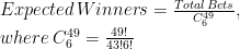
The idea is to compare observed winners of raffles with the expected number of them, estimated as follows:

Expected\, Winners=\frac{Total\, Bets}{C_{6}^{49}},\\ where\: C_{6}^{49}=\frac{49!}{43!6!}\\

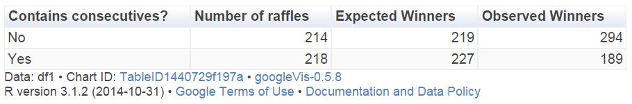
This table compare the number of expected and observed winners between raffles which contain consecutive and raffles which not:

Table1

There are 214 raffles without consecutive with 294 winners while the expected number of them was 219. In other words, a winner of a non-consecutive-raffle must share the prize with a 33% of some other person. On the other hand, the number of observed winners of a raffle with consecutive numbers 17% lower than the expected one. Simple and conclusive. Spanish are like British, at least in what concerns to this particular issue.

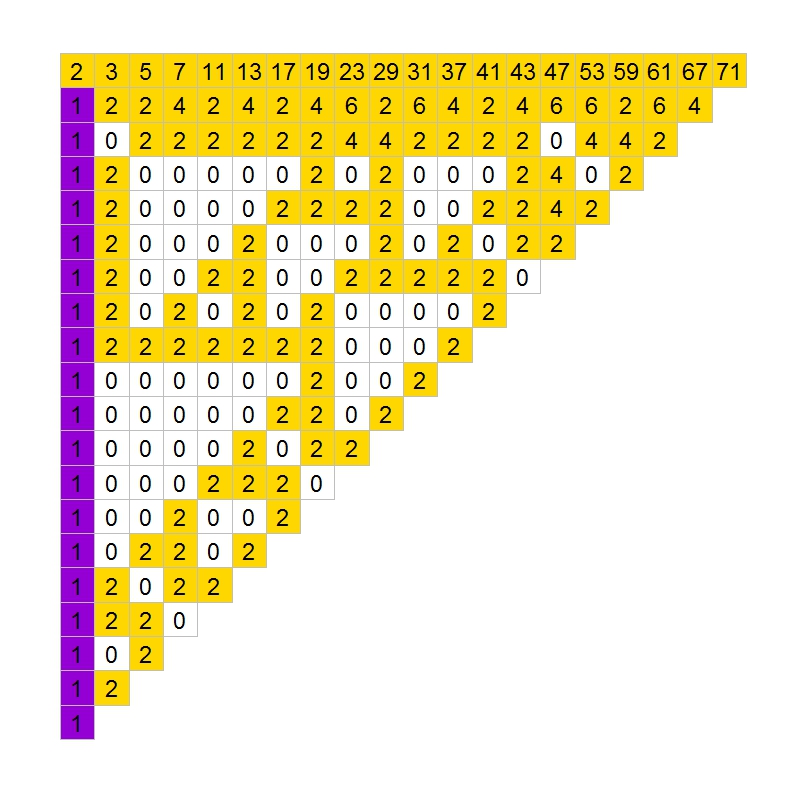
Let’s go further. I can do the same for any particular number. For example, there were 63 raffles containing number 45 in the winning combination and 57 (observed) winners, although 66 were expected. After doing this for every number, I can draw this plot, where I paint in blue those which ratio of observed winners between expected is lower than 0.9:

LotteryBlues

It seems that blue numbers are concentrated on the right side of the grid. Do we prefer small numbers rather than big ones? There are 15 primes between 1 and 49 (rate: 30%) but only 3 primes between blue numbers (rate: 23%). Are we attracted by primes?

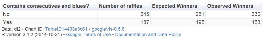
Let’s combine both previous results. This table compares the number of expected and observed winners between raffles which contain consecutive and blues (at least one) and raffles which not:

Table2

Now, winning combinations with some consecutive and some blue numbers present 20% less of observed winners than expected. After this, which combination would you choose for your next bet? 27-35-36-41-44-45 or 2-6-13-15-26-28? I would choose the first one. Both of them have the same probability to come up, but probably you will become richer with the first one if it happens.

This is the code of this experiment. If someone need the dataset set to do their own experiments, feel free to ask me (you can find my email here):

library("xlsx")  
library("sqldf")
library("Hmisc")
library("lubridate")
library("ggplot2")
library("extrafont")
library("googleVis")
windowsFonts(Garamond=windowsFont("Garamond"))
setwd("YOUR WORKING DIRECTORY HERE")
file = "SORTEOS_PRIMITIVA_2011_2015.xls"
data=read.xlsx(file, sheetName="ALL", colClasses=c("numeric", "Date", rep("numeric", 21)))  
#Impute null values to zero
data$C1_EUROS=with(data, impute(C1_EUROS, 0))
data$CE_WINNERS=with(data, impute(CE_WINNERS, 0))
#Expected winners for each raffle
data$EXPECTED=data$BETS/(factorial(49)/(factorial(49-6)*factorial(6)))
#Consecutives indicator
data$DIFFMIN=apply(data[,3:8], 1, function (x) min(diff(sort(x))))
#Consecutives vs non-consecutives comparison
df1=sqldf("SELECT CASE WHEN DIFFMIN=1 THEN 'Yes' ELSE 'No' END AS CONS, 
      COUNT(*) AS RAFFLES,
      SUM(EXPECTED) AS EXP_WINNERS, 
      SUM(CE_WINNERS+C1_WINNERS) AS OBS_WINNERS
      FROM data GROUP BY CONS")
colnames(df1)=c("Contains consecutives?", "Number of  raffles", "Expected Winners", "Observed Winners")
Table1=gvisTable(df1, formats=list('Expected Winners'='#,###'))
plot(Table1)
#Heat map of each number
results=data.frame(BALL=numeric(0), EXP_WINNER=numeric(0), OBS_WINNERS=numeric(0))
for (i in 1:49)
{
  data$TF=apply(data[,3:8], 1, function (x) i %in% x + 0)
  v=data.frame(BALL=i, sqldf("SELECT SUM(EXPECTED) AS EXP_WINNERS, SUM(CE_WINNERS+C1_WINNERS) AS OBS_WINNERS FROM data WHERE TF = 1"))
  results=rbind(results, v)
}
results$ObsByExp=results$OBS_WINNERS/results$EXP_WINNERS
results$ROW=results$BALL%%10+1
results$COL=floor(results$BALL/10)+1
results$ObsByExp2=with(results, cut(ObsByExp, breaks=c(-Inf,.9,Inf), right = FALSE))
opt=theme(legend.position="none",
          panel.background = element_blank(),
          panel.grid = element_blank(),
          axis.ticks=element_blank(),
          axis.title=element_blank(),
          axis.text =element_blank())
ggplot(results, aes(y=ROW, x=COL)) +
  geom_tile(aes(fill = ObsByExp2), colour="gray85", lwd=2) +
  geom_text(aes(family="Garamond"), label=results$BALL, color="gray10", size=12)+
  scale_fill_manual(values = c("dodgerblue", "gray98"))+
  scale_y_reverse()+opt
#Blue numbers
Bl=subset(results, ObsByExp2=="[-Inf,0.9)")[,1]
data$BLUES=apply(data[,3:8], 1, function (x) length(intersect(x,Bl)))
#Combination of consecutives and blues
df2=sqldf("SELECT CASE WHEN DIFFMIN=1 AND BLUES>0 THEN 'Yes' ELSE 'No' END AS IND, 
      COUNT(*) AS RAFFLES,
      SUM(EXPECTED) AS EXP_WINNERS, 
      SUM(CE_WINNERS+C1_WINNERS) AS OBS_WINNERS
      FROM data GROUP BY IND")
colnames(df2)=c("Contains consecutives and blues?", "Number of  raffles", "Expected Winners", "Observed Winners")
Table2=gvisTable(df2, formats=list('Expected Winners'='#,###'))
plot(Table2)

The Andrica’s Conjecture

Things should be as simple as possible, but not simpler (Albert Einstein)

Following with conjectures about primes, it is time for Andrica’s conjecture. The great mathematician Leonhard Euler (1707-1783) pointed: “Mathematicians have tried with no success to find some kind of order in the sequence of prime numbers and today we have reasons to believe that this is a mystery that human mind will never understand”.

In 1985, the Romanian mathematician Dorin Andrica published his conjecture, still unproved, which makes reference to gap between consecutive prime numbers. In concrete, his conjecture establishes that difference between square roots between two consecutive prime numbers is always less than 1. The highest difference encountered until now is 0.67087, located between p4=7 and p5=11.

Following you can find the plot of these differences for first 400 prime numbers:

andricaIt is very interesting how dots form hyperbolic patterns. Does not seem similar in some sense to the Ulam spiral? Primes: how challenging you are!

Two more comments:

  • It is better to find primes using matlab package than doing with schoolmath one. Reason is simple: for schoolmath package, 133 is prime!
  • Why did Andrica formulated his conjecture as √pn+1-√pn < 1 instead of √pn+1-√pn < 3/4? In terms of statistical error, the second formulation is more accurate. Maybe the charisma of number 1 is hard to avoid.

This is the code. I learned how to insert mathematical expressions inside a ggplot chart:

library(matlab)
library(ggplot2)
ubound=2800
primes=primes(ubound)
andrica=data.frame(X=seq(1:(length(primes)-1)), Y=diff(sqrt(primes)))
opt=theme(panel.background = element_rect(fill="gray92"),
panel.grid.minor = element_blank(),
panel.grid.major.x = element_blank(),
panel.grid.major.y = element_line(color="white", size=1.5),
plot.title = element_text(size = 45),
axis.title = element_text(size = 28, color="gray35"),
axis.text = element_text(size=16),
axis.ticks = element_blank(),
axis.line = element_line(colour = "white"))
ggplot(andrica, aes(X, Y, colour=Y))+geom_point(size=5, alpha=.75)+
scale_colour_continuous(guide = FALSE)+
scale_x_continuous("n", limits=c(0, length(primes)-1), breaks = seq(0,length(primes)-1,50))+
scale_y_continuous(expression(A[n]==sqrt(p[n+1])-sqrt(p[n])), limits=c(0, .75), breaks = seq(0,.75,.05))+
labs(title = "The Andrica's Conjecture")+
opt

The Goldbach’s Comet

Every even integer greater than 2 can be expressed as the sum of two primes (Christian Goldbach, 1742)

The point cloud known as Goldbach’s Comet represents the amount of different ways (y axis) an even number (x axis) can be writen as sum of two prime numbers. In this plot, x axis is between 2 and 50.000 (stars are just ornaments):

Goldbach

Mathematicians are still waiting for a proof of this conjecture. This is the code for drawing this plot:

require(schoolmath)
require(utils)
library(plyr)
n=50000
data(primlist)
primes=as.data.frame(t(combn(primlist[primlist>2 & primlist<n-2], 2)))
primes$V3=primes$V1+primes$V2
primes2=count(primes, "V3")
primes2=primes2[primes2$V3<=n,]
stars=cbind(runif(50, min=-n*0.05, max=n), runif(200, min=-n*0.001, max=max(primes2$freq)))
plot.new()
par(mai = rep(0, 4), bg = "gray12")
plot(NA,type="n", xlim=c(-n*0.05,n), xaxs="i", ylim=c(-n*0.001,max(primes2$freq)))
points(stars, col = "blue4", cex=.7, pch=16)
points(stars, col = "blue", cex=.3, pch=16)
points(stars, col = "gray75", cex=.1, pch=16)
apply(primes2, 1, function(x) points(x=x[1],y=x[2], col = if (runif(1)&gt;x[1]/n) {"white"} else {sample(colours(),1)}, cex=.1, pch=16))

The Gilbreath’s Conjecture

317 is a prime, not because we think so, or because our minds are shaped in one way rather than another, but because it is so, because mathematical reality is built that way (G.H. Hardy)

In 1958, the mathematician and magician Norman L. Gilbreath presented a disconcerting hypothesis conceived in the back of a napkin. Gilbreath wrote first prime numbers in a row. In the next rows, he wrote the difference  in absolute value of consecutive values of previous row. Beginning with first 20 primes in the first row, he obtained something like this:Gilbreath01

The conjecture is easy: except for the first one, all elements of the first column are 1. So far, no one has demonstrated this hypothesis. In fact, according to mathematician Richard Guy, it seems unlikely that we will see a demonstration of Gilbreath’s conjecture in the near future, though probably this conjecture is true.

In the previous chart, I coloured zeros in white, ones in violet and rest of numbers in gold. The conjecture says that except for the first element, the first column is entirely violet. Following you can see the coloured chart for first 20, 40, 60 and 80 prime numbers:

Gilbreath02

It is nice how zeros create triangular patterns similar to patterns created by cellular automata. This is the chart for first 200 primes:Gilbreath03

How much time will it take to demonstrate this simple conjecture? Who knows. Meanwhile, you can draw triangles with this code:

library(ggplot2)
create.gilbreath=function(n)
{
require(reshape)
require(schoolmath)
data(primlist)
gilbreath=t(matrix(primlist[2:(n+1)], n, n))
for (i in 2:n) {gilbreath[i,]=c(eval(parse(text=paste(c(paste("abs(diff(",collapse=""), "gilbreath[i-1,]", paste("))",collapse="")),collapse=""))),rep(NA,1))}
na.omit(melt(t(gilbreath)))
}
opt=theme(legend.position="none",
panel.background = element_blank(),
panel.grid = element_blank(),
axis.ticks=element_blank(),
axis.title=element_blank(),
axis.text =element_blank())
gilbreath=create.gilbreath(20)
gilbreath$value1=cut(gilbreath$value, breaks=c(-Inf,1:2,Inf), right = FALSE)
ggplot(gilbreath, aes(x=X1, y=X2)) +
geom_tile(aes(fill = value1), colour="grey") +
scale_fill_manual(values = c("white", "darkviolet", "gold"))+
geom_text(label=gilbreath$value, size=8)+
scale_y_reverse()+opt