Tag Archives: ggplot

The Sound Of Mandelbrot Set

Music is the pleasure the human soul experiences from counting without being aware that it is counting (Gottfried Leibniz)

I like the concept of sonification: translating data into sounds. There is a huge amount of contents in the Internet about this technique and there are several packages in R to help you to sonificate your data. Maybe one of the most accessible is tuneR, the one I choosed for this experiment. Do not forget to have a look to playitbyr: a package that allows you to listen to a data.frame in R by mapping columns onto sonic parameters, creating an auditory graph, as you can find in its website. It has a very similar syntaxis to ggplot. I will try to post something about playitbyr in the future.

Let me start plotting the Mandelbrot Set. I know you have seen it lot of times but it is very easy to plot in with R and result is extremely beautiful. Here you have four images corresponding to 12, 13, 14 and 15 iterations of the set’s generator. I like a lot how the dark blue halo around the Set evaporates as number of iterations increases.

Mandelbrot12Mandelbrot13Mandelbrot14Mandelbrot15

And here you have the Set generated by 50 iterations. This is the main ingredient of the experiment:Mandelbrot50

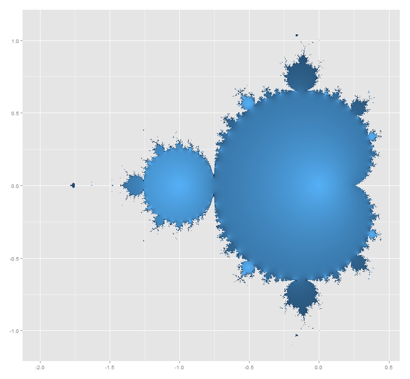
Mandelbrot Set is generated by the recursive formula xt+1=xt2+c, with x0=0. A complex number c belongs to the Mandelbrot Set if its module after infinite iterations is finite. It is not possible to iterate a infinite number of times so every representation of Mandelbrot Set is just an approximation for a usually big amount of iterations. First image of Mandelbrot Set was generated in 1978 by Robert W. Brooks and Peter Matelski. You can find it here. I do not know how long it took to obtain it but you will spend only a couple of minutes to generate the ones you have seen before. It is amazing how computers have changed in this time!

This iterative equation is diabolical. To see just how pathological is, I transformed the succession of modules of xt generated by a given c in a succession of sounds. Since it is known that if one of this iterated complex numbers exceeds 2 in module then it is not in the Mandelbrot Set, frequencies of these sounds are bounded between 280 Hz (when module is equal to zero) and 1046 Hz (when module is equal or greater to 2). I called this function CreateSound. Besides the initial complex, you can choose how many notes and how long you want for your composition.

I tried with lot of numbers and results are funny. I want to stand out three examples from the rest:

  • -1+0i gives the sequence 0, −1, 0, −1, 0 … which is bounded. Translated into music it sounds like an ambulance siren.
  • -0.1528+1.0397i that is one of the generalized Feigenbaum points, around the Mandelbrot Set is conjetured to be self-similar. It sounds as a kind of Greek tonoi.
  • -3/4+0.01i which presents a crazy slow divergence. I wrote a post some weeks ago about this special numbers around the neck of Mandelbrot Set and its relationship with PI.

All examples are ten seconds length. Take care with the size of the WAV file when you increase duration. You can create your own music files with the code below. If you want to download my example files, you can do it here. If you discover something interesting, please let me know.

Enjoy the music of Mandelbrot:

# Load Libraries
library(ggplot2)
library(reshape)
library(tuneR)
rm(list=ls())
# Create a grid of complex numbers
c.points <- outer(seq(-2.5, 1, by = 0.002),1i*seq(-1.5, 1.5, by = 0.002),'+')
z <- 0
for (k in 1:50) z <- z^2+c.points # Iterations of fractal's formula
c.points <- data.frame(melt(c.points))
colnames(c.points) <- c("r.id", "c.id", "point")
z.points <- data.frame(melt(z))
colnames(z.points) <- c("r.id", "c.id", "z.point")
mandelbrot <- merge(c.points, z.points, by=c("r.id","c.id")) # Mandelbrot Set
# Plotting only finite-module numbers
ggplot(mandelbrot[is.finite(-abs(mandelbrot$z.point)), ], aes(Re(point), Im(point), fill=exp(-abs(z.point))))+
geom_tile()+theme(legend.position="none", axis.title.x = element_blank(), axis.title.y = element_blank())
#####################################################################################
# Function to translate numbers (complex modules) into sounds between 2 frequencies
#   the higher the module is, the lower the frequencie is
#   modules greater than 2 all have same frequencie equal to low.freq
#   module equal to 0 have high.freq
#####################################################################################
Module2Sound <- function (x, low.freq, high.freq)
  {
    if(x>2 | is.nan(x)) {low.freq} else {x*(low.freq-high.freq)/2+high.freq}
  } 
#####################################################################################
# Function to create wave. Parameters:
#    complex     : complex number to test
#    number.notes: number of notes to create (notes = iterations)
#    tot.duration.secs: Duration of the wave in seconds
#####################################################################################
CreateSound <- function(complex, number.notes, tot.duration.secs)
{
  dur <- tot.duration.secs/number.notes
  sep1 <- paste(", bit = 16, duration= ",dur, ", xunit = 'time'),sine(")
  sep2 <- paste(", bit = 16, duration =",dur,",  xunit = 'time'))")
  v.sounds <- c()
  z <- 0
  for (k in 1:number.notes) 
  {
    z <- z^2+complex
    v.sounds <- c(v.sounds, abs(z))
  }
  v.freqs <- as.vector(apply(data.frame(v.sounds), 1, FUN=Module2Sound, low.freq=280, high.freq=1046))
  eval(parse(text=paste("bind(sine(", paste(as.vector(v.freqs), collapse = sep1), sep2)))
}
sound1 <- CreateSound(-3/4+0.01i     , 400 , 10) # Slow Divergence
sound2 <- CreateSound(-0.1528+1.0397i, 30  , 10) # Feigenbaum Point
sound3 <- CreateSound(-1+0i          , 20  , 10) # Ambulance Siren
writeWave(sound1, 'SlowDivergence.wav')
writeWave(sound2, 'FeigenbaumPoint.wav')
writeWave(sound3, 'AmbulanceSiren.wav')

Shoot The Heart With Monte Carlo

The heart has its reasons which reason knows not (Blaise Pascal)

You only need two functions to draw a heart mathematically. The upper part is generated by (1-(|x|-1)2)1/2 and the lower one by acos(1-|x|)-PI. Here is how this heart is:

heart
Whats the area of this heart? It’s easy: integrating heart.up(x)-heart.dw(x) between -2 and 2 and you will obtain that heart measures 9.424778, but there is a simple and nice way to approximate to this value: shoot the heart.

The idea is very simple. Heart is delimited by a square with vertex in (-2, heart.dw(0)), (-2, 1), (2, heart.dw(0)) and (2, 1). Generating a set of points uniformly distributed inside the square and counting how many of them fall into the heart in relation to the area of the square gives a very good approximation of the exact area of the heart. This is a plot representing a simulation of 2.000 shots (hits in red, fails in blue):

heart2000
Given a simulation of n points, the estimated area of the heart is the area of the square by percentage of points that falls inside the heart. And of course, precision increases with the number of shots you make, as you can see in the following plot, where exact area is represented by the red horizontal line:

Rplot09

Here you have the code:

library("ggplot2")
heart.up <- function(x) {sqrt(1-(abs(x)-1)^2)} #Upper part of the heart
heart.dw <- function(x) {acos(1-abs(x))-pi}    #Lower part of the heart
#Plot of the heart
ggplot(data.frame(x=c(-2,2)), aes(x)) +
  stat_function(fun=heart.up, geom="line", aes(colour="heart.up")) +
  stat_function(fun=heart.dw, geom="line", aes(colour="heart.dw")) +
  scale_colour_manual("Function", values=c("blue","red"), breaks=c("heart.up","heart.dw"))+
  labs(x = "", y = "")+
  theme(legend.position = c(.85, .15))
sims <- 2000 #Number of simulations
rlts <- data.frame()
for (i in 1:sims) 
  {
  msm <- cbind(as.matrix(runif(i, min=-2, max=2)), as.matrix(runif(i, min=heart.dw(0), max=1)))
  nin <- 0
  for (j in 1:nrow(msm)) {if (msm[j,2]<=heart.up(msm[j,1]) & msm[j,2]>=heart.dw(msm[j,1])) nin=nin+1}
  rlts <- rbind(c(i, 4*(1-heart.dw(0))*nin/i), rlts)
  }
colnames(rlts) <- c("no.simulations","heart.area")
exact.area <- integrate(function(x) {heart.up(x)-heart.dw(x)},-2,2)$value
mean.area <- mean(rlts$heart.area) #Mean of All Estimated Areas
ggplot(data = rlts, aes(x = no.simulations, y = heart.area))+ 
  geom_point(size = 0.5, colour = "black", alpha=0.4)+
  geom_abline(intercept = exact.area, slope = 0, size = 1, linetype=1, colour = "red", aes(color="My Line"), alpha=0.8, show_guide = TRUE)+
  labs(list(x = "Number of Shots", y = "Estimated Area"))+
  ggtitle("Shot The Heart With Monte Carlo") +
  theme(plot.title = element_text(size=20, face="bold"))+
  scale_x_continuous(limits = c(0, sims), expand = c(0, 0))+
  expand_limits(x = 0, y = 0)+
  scale_y_continuous(limits = c(0, 2*exact.area), expand = c(0, 0), breaks=c(0, exact.area/4, exact.area/2, 3*exact.area/4, exact.area, 5*exact.area/4, 3*exact.area/2, 7*exact.area/4, 2*exact.area))+
  geom_text(x = 1000, y = exact.area/2, label=paste("Exact Area =", sprintf("%7.6f", exact.area)), vjust=-1, colour="red", size=5)+
  geom_text(x = 1000, y = exact.area/2, label=paste("Mean of All Estimated Areas=", sprintf("%7.6f", mean.area)), vjust=+1, colour="red", size=5)

Why I Think Atletico De Madrid Will Win 2013/14 Spanish Liga Of Football

Prediction is difficult, especially of the future (Mark Twain)

Let me start with two important premises. First of all, I am not into football so I do not support any team. Second, this post is just an opinion based on mathematics but football, as all of you know, is not an exact science. Football is football.

This is a good moment to analyse Spanish Liga of football. F. C. Barcelona and Atletico de Madrid share first place of the championship followed closely by Real Madrid. But analysing results over the time can give us an interesting insight about capabilities of top three teams.

I have run a Bradley-Terry model for pairwise comparisons. The Bradley-Terry model deals with a situation in which n individuals or items are compared to one another in paired contests. In my case the model uses confrontations and its results as input. The Bradley-Terry model (Bradley and Terry 1952) assumes that in a contest between any two players, say player i and player j, the odds that i beats j are xi/xj, where xi and xj are positive-valued parameters which might be thought of as representing ability.

Time plays a key role in my analysis. This is what happens when you estimate abilities of top three teams over the time:

abilities

After 20 rounds, Atletico de Madrid and Barcelona have the same estimated ability but while Barcelona is continuosly losing ability since the beginning, Atletico de Madrid presents a robust or even growing evolution. Of course, it depends on how both teams begun the championship. The higher you start, the more you can lose; but watching this graph I can not help feeling that Atletico de Madrid keep their morale higher than Barcelona.

Another interesting output of  the Bradley-Terry model are estimated probabilites of beating teams each others. Since these probabilities depends on previous abilities, Barcelona and Atletico de Madrid have same chances of winning a hypothetical match. But once again, evolution of these probabilities can change our perception:

probabilities

As you can see, Atletico de Madrid has increased the probability of beating Barcelona from 0.25 to 0.50 in just one round and Barcelona has lost more than this probability in the same time. Once again, it seems that Atletico de Madrid is increasingly confidence time by time. And confidence is important in this game. Luckily, football is unpredictable but after taking time into account I dare to say that Atletico de Madrid will win the championship. I am pretty sure.

Here you have the code I wrote for the analysis. Maybe you would like to make your own predictions:

library("BradleyTerry2")
library("xlsx")
library("ggplot2")
library("reshape")
football <-read.xlsx("CalendarioLiga2013-14 2.xls", sheetName= "results", header=TRUE)
inv_logit <- function(p) {exp(p) / (1 + exp(p))}
prob_BT   <- function(ability_1, ability_2) {inv_logit(ability_1 - ability_2)}
rounds <- sort(unique(football$round))
# Initialization
football.pts.ev <- as.data.frame(c())
football.abl.ev <- as.data.frame(c())
football.prb.ev <- as.data.frame(c())
# Points evolution: football.pts.ev
for (i in 1:length(rounds))
{
  football.home <-aggregate( home.wins ~ home.team, data=football[football$round<=rounds[i],], FUN=sum)
  colnames(football.home) <- c('Team', 'Points')
  football.away <-aggregate( away.wins ~ away.team, data=football[football$round<=rounds[i],], FUN=sum)
  colnames(football.away) <- c('Team', 'Points')
  football.all <-rbind(football.home,football.away)
  football.points <-aggregate( Points ~ Team, data=football.all, FUN=sum)
  football.points$round<-rounds[i]
  football.pts.ev <- rbind(football.points, football.pts.ev)
}
# BT Models 
# Abilities and probabilities evolution: football.abl.ev and football.prb.ev
# We start from 6th. round to have good information
for (i in 6:length(rounds))
{
  footballBTModel      <- BTm(cbind(home.wins, away.wins), home.team, away.team, data = football[football$round<=rounds[i],], id = "team")
  team_abilities       <- data.frame(BTabilities(footballBTModel))$ability 
  names(team_abilities) <-unlist(attr(BTabilities(footballBTModel), "dimnames")[1][1])
  team_probs           <- outer(team_abilities, team_abilities, prob_BT) 
  diag(team_probs)     <- 0 
  team_probs           <- melt(team_probs)
  colnames(team_probs) <- c('team', 'adversary', 'probability')
  team_probs$round<-rounds[i]
  football.prb.ev <- rbind(team_probs, football.prb.ev)
  football.abl.ev.df <- data.frame(rownames(data.frame(BTabilities(footballBTModel))),BTabilities(footballBTModel))
  football.abl.ev.df$round<-rounds[i]
  colnames(football.abl.ev.df) <- c('team', 'ability', 's.e.', 'round')
  football.abl.ev <- rbind(football.abl.ev.df, football.abl.ev)
}
# Probabilities of top 3 teams
football.prb.ev.3 <- football.prb.ev[
    ((football.prb.ev$team == "At. Madrid" & football.prb.ev$adversary == "R. Madrid")|
     (football.prb.ev$team == "At. Madrid" & football.prb.ev$adversary == "Barcelona")|
     (football.prb.ev$team == "Barcelona"  & football.prb.ev$adversary == "R. Madrid"))&
      football.prb.ev$round>=10, ]
football.prb.ev.3$teambyadver <- interaction(football.prb.ev.3$team, football.prb.ev.3$adversary, sep = " Beating ")
# Abilities of top 3 teams
football.abl.ev.3 <- football.abl.ev[(football.abl.ev$team == "At. Madrid" | 
                                     football.abl.ev$team == "R. Madrid"  | 
                                     football.abl.ev$team == "Barcelona")&
                                     football.abl.ev$round>=10, ]
ggplot(data = football.prb.ev.3, aes(x = round, y = probability, colour = teambyadver)) +  
  stat_smooth(method = "loess", formula = y ~ x, size = 1, alpha = 0.25)+
  geom_point(size = 4) +
  theme(legend.position = c(.75, .15))+
  labs(list(x = "Round", y = "Probability"))+
  labs(colour = "Probability of ...")+
  ggtitle("Evolution Of Beating Probabilities \nAmong Top 3 First-Team") + 
  theme(plot.title = element_text(size=25, face="bold"))+
  scale_x_continuous(breaks = c(10,11,12,13,14,15,16,17,18,19,20))
ggplot(data = football.abl.ev.3, aes(x = round, y = ability, colour = team)) +  
  stat_smooth(method = "loess", formula = y ~ x, size = 1, alpha = 0.25)+
  geom_point(size = 4) +
  theme(legend.position = c(.75, .75))+
  labs(list(x = "Round", y = "Ability"))+
  labs(colour = "Ability of ...")+
  ggtitle("Evolution Of Abilities \nOf Top 3 First-Team") + 
  theme(plot.title = element_text(size=25, face="bold"))+
  scale_x_continuous(breaks = c(10,11,12,13,14,15,16,17,18,19,20))