Things should be as simple as possible, but not simpler (Albert Einstein)
Following with conjectures about primes, it is time for Andrica’s conjecture. The great mathematician Leonhard Euler (1707-1783) pointed: “Mathematicians have tried with no success to find some kind of order in the sequence of prime numbers and today we have reasons to believe that this is a mystery that human mind will never understand”.
In 1985, the Romanian mathematician Dorin Andrica published his conjecture, still unproved, which makes reference to gap between consecutive prime numbers. In concrete, his conjecture establishes that difference between square roots between two consecutive prime numbers is always less than 1. The highest difference encountered until now is 0.67087, located between p4=7 and p5=11.
Following you can find the plot of these differences for first 400 prime numbers:
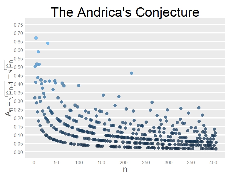 It is very interesting how dots form hyperbolic patterns. Does not seem similar in some sense to the Ulam spiral? Primes: how challenging you are!
Two more comments:
- It is better to find primes using
matlabpackage than doing withschoolmathone. Reason is simple: forschoolmathpackage, 133 is prime! - Why did Andrica formulated his conjecture as √pn+1-√pn < 1 instead of √pn+1-√pn < 3/4? In terms of statistical error, the second formulation is more accurate. Maybe the charisma of number 1 is hard to avoid.
This is the code. I learned how to insert mathematical expressions inside a ggplot chart:
library(matlab)
library(ggplot2)
ubound=2800
primes=primes(ubound)
andrica=data.frame(X=seq(1:(length(primes)-1)), Y=diff(sqrt(primes)))
opt=theme(panel.background = element_rect(fill="gray92"),
panel.grid.minor = element_blank(),
panel.grid.major.x = element_blank(),
panel.grid.major.y = element_line(color="white", size=1.5),
plot.title = element_text(size = 45),
axis.title = element_text(size = 28, color="gray35"),
axis.text = element_text(size=16),
axis.ticks = element_blank(),
axis.line = element_line(colour = "white"))
ggplot(andrica, aes(X, Y, colour=Y))+geom_point(size=5, alpha=.75)+
scale_colour_continuous(guide = FALSE)+
scale_x_continuous("n", limits=c(0, length(primes)-1), breaks = seq(0,length(primes)-1,50))+
scale_y_continuous(expression(A[n]==sqrt(p[n+1])-sqrt(p[n])), limits=c(0, .75), breaks = seq(0,.75,.05))+
labs(title = "The Andrica's Conjecture")+
opt