Tag Archives: ggplot

The Mondrianomies

The Moonies are up on their mountain, the lunatics have taken over the asylum, waiting on the rapture (The Daily Mail, Radiohead)

I have not write any post lately, maybe because I have been quite busy with other unexpected project or maybe because I am going through a deep creative crisis. Whatever the reason, I have decided to resume my activity with Fronkonstin. Paraphrasing Picasso, inspiration will find me working when it comes.

Mondrianomies are the evolution of this previous project. To adapt outputs to neoplasticism assumptions I only use right angles and primary colors. This is why they remind the work of the founder of neoplasticism: Piet Mondrian. This is an example:

Mondrianomies are based on L-systems, a formalism invented in 1968 by the biologist Aristid Lindenmayer that yields a mathematical description of plant growth. Concretely, Mondrianomies have the following characeristics:

  • Use these five actions: F (draw a segment), + (turn right), - (turn left), [ (save the current position and angle for later use onto a stack of saved states) and ] (remove the last saved state from the stack and use it to restore the last saved position and angle).
  • Start with the axiom F-F-F-F (i.e. draw a segment, turn left, draw a segment, turn left, draw a segment, turn left and draw a segment).
  • Only have a rule, randomly generated from the actions. The rule is applied a number of times (3 or 4) to substitute the action F (starting from the axiom) and therefore expanding the list of actions to generate the drawing.
  • Turning angle is 90 degrees.
  • Longitude of segments depends on how many segments have been drawn previously.

Here you have four more outputs of this system. Do not hesitate to modify its parameters to obtain quite diverse images like these:

The code is available at github. There are many parts to play with: the axiom, the angle, the colors … you can even invent new actions to sofisticate the output. Create your own artworks and enjoy the journey.

Chaotic Galaxies

Tell me, which side of the earth does this nose come from? Ha! (ALF)

Reading about strange attractors I came across with this book, where I discovered a way to generate two dimensional chaotic maps. The generic equation is pretty simple:

x_{n+1}= a_{1}+a_{2}x_{n}+a_{3}x_{n}^{2}+a_{4}x_{n}y_{n}+a_{5}y_{n}+a_{6}y_{n}^{2}
y_{n+1}= a_{7}+a_{8}x_{n}+a_{9}x_{n}^{2}+a_{10}x_{n}y_{n}+a_{11}y_{n}+a_{12}y_{n}^{2}

I used it to generate these chaotic galaxies:

Changing the vector of parameters you can obtain other galaxies. Do you want to try?

library(ggplot2)
library(dplyr)
#Generic function
attractor = function(x, y, z)
{
  c(z[1]+z[2]*x+z[3]*x^2+ z[4]*x*y+ z[5]*y+ z[6]*y^2, 
    z[7]+z[8]*x+z[9]*x^2+z[10]*x*y+z[11]*y+z[12]*y^2)
}
#Function to iterate the generic function over the initial point c(0,0)
galaxy= function(iter, z)
{
  df=data.frame(x=0,y=0)
  for (i in 2:iter) df[i,]=attractor(df[i-1, 1], df[i-1, 2], z)
  df %>% rbind(data.frame(x=runif(iter/10, min(df$x), max(df$x)), 
                          y=runif(iter/10, min(df$y), max(df$y))))-> df
  return(df)
}
opt=theme(legend.position="none",
          panel.background = element_rect(fill="#00000c"),
          plot.background = element_rect(fill="#00000c"),
          panel.grid=element_blank(),
          axis.ticks=element_blank(),
          axis.title=element_blank(),
          axis.text=element_blank(),
          plot.margin=unit(c(-0.1,-0.1,-0.1,-0.1), "cm"))
#First galaxy
z1=c(1.0, -0.1, -0.2,  1.0,  0.3,  0.6,  0.0,  0.2, -0.6, -0.4, -0.6,  0.6)
galaxy1=galaxy(iter=2400, z=z1) %>% ggplot(aes(x,y))+
  geom_point(shape= 8, size=jitter(12, factor=4), color="#ffff99", alpha=jitter(.05, factor=2))+
  geom_point(shape=16, size= jitter(4, factor=2), color="#ffff99", alpha=jitter(.05, factor=2))+
  geom_point(shape=46, size= 0, color="#ffff00")+opt
#Second galaxy
z2=c(-1.1, -1.0,  0.4, -1.2, -0.7,  0.0, -0.7,  0.9,  0.3,  1.1, -0.2,  0.4)
galaxy2=galaxy(iter=2400, z=z2) %>% ggplot(aes(x,y))+
  geom_point(shape= 8, size=jitter(12, factor=4), color="#ffff99", alpha=jitter(.05, factor=2))+
  geom_point(shape=16, size= jitter(4, factor=2), color="#ffff99", alpha=jitter(.05, factor=2))+
  geom_point(shape=46, size= 0, color="#ffff00")+opt
#Third galaxy
z3=c(-0.3,  0.7,  0.7,  0.6,  0.0, -1.1,  0.2, -0.6, -0.1, -0.1,  0.4, -0.7)
galaxy3=galaxy(iter=2400, z=z3) %>% ggplot(aes(x,y))+
  geom_point(shape= 8, size=jitter(12, factor=4), color="#ffff99", alpha=jitter(.05, factor=2))+
  geom_point(shape=16, size= jitter(4, factor=2), color="#ffff99", alpha=jitter(.05, factor=2))+
  geom_point(shape=46, size= 0, color="#ffff00")+opt
#Fourth galaxy
z4=c(-1.2, -0.6, -0.5,  0.1, -0.7,  0.2, -0.9,  0.9,  0.1, -0.3, -0.9,  0.3)
galaxy4=galaxy(iter=2400, z=z4) %>% ggplot(aes(x,y))+
  geom_point(shape= 8, size=jitter(12, factor=4), color="#ffff99", alpha=jitter(.05, factor=2))+
  geom_point(shape=16, size= jitter(4, factor=2), color="#ffff99", alpha=jitter(.05, factor=2))+
  geom_point(shape=46, size= 0, color="#ffff00")+opt

Sunflowers

The world is full of wonderful things, like sunflowers (Machanguito, my islander friend)

Sunflower seeds are arranged following a mathematical pattern where golden ratio plays a starring role. There are tons of web sites explaining this amazing fact. In general, the arrangement of leaves on a plant stem are ruled by spirals. This fact is called phyllotaxis, and I did this experiment about it some time ago. Voronoi tessellation originated by points arranged according the golden angle spiral give rise to this sunflowers:sunflowers

I know this drawing will like to my friend Machanguito because he loves sunflowers. He also loves dancing, chocolate cookies, music and swimming in the sea. Machanguito loves life, it is just that simple. He is also a big defender of renewable energy and writes down his thoughts on recycled papers. You can follow his adventures here.

This is the code:

library(deldir)
library(ggplot2)
library(dplyr)
opt = theme(legend.position  = "none",
            panel.background = element_rect(fill="red4"),
            axis.ticks       = element_blank(),
            panel.grid       = element_blank(),
            axis.title       = element_blank(),
            axis.text        = element_blank())
CreateSunFlower <- function(nob=500, dx=0, dy=0) {   data.frame(r=sqrt(1:nob), t=(1:nob)*(3-sqrt(5))*pi) %>%
    mutate(x=r*cos(t)+dx, y=r*sin(t)+dy)
}
g=seq(from=0, by = 45, length.out = 4)
jitter(g, amount=2) %>%
  expand.grid(jitter(g, amount=2)) %>%
  apply(1, function(x) CreateSunFlower(nob=round(jitter(220, factor=15)), dx=x[1], dy=x[2])) %>%
  do.call("rbind", .) %>% deldir() %>% .$dirsgs -> sunflowers
ggplot(sunflowers) +
  geom_segment(aes(x = x1, y = y1, xend = x2, yend = y2), color="greenyellow") +
  scale_x_continuous(expand=c(0,0))+
  scale_y_continuous(expand=c(0,0))+
  opt

The World We Live In #5: Calories And Kilograms

I enjoy doing new tunes; it gives me a little bit to perk up, to pay a little bit more attention (Earl Scruggs, American musician)

I recently finished reading The Signal and the Noise, a book by Nate Silver, creator of the also famous FiveThirtyEight blog. The book is a very good reading for all data science professionals, and is a must in particular for all those who work trying to predict the future. The book praises the bayesian way of thinking as the best way to face and modify predictions and criticizes rigid ways of thinking with many examples of disastrous predictions. I enjoyed a lot the chapter dedicated to chess and how Deep Blue finally took over Kasparov. In a nutshell: I strongly recommend it.
One of the plots of Silver’s book present a case of false negative showing the relationship between obesity and calorie consumption across the world countries. The plot shows that there is no evidence of a connection between both variables. Since it seemed very strange to me, I decided to reproduce the plot by myself.

I compared these two variables:

  • Dietary Energy Consumption (kcal/person/day) estimated by the FAO Food Balance Sheets.
  • Prevalence of Obesity as percentage of defined population with a body mass index (BMI) of 30 kg/m2 or higher estimated by the World Health Organization

And this is the resulting plot:

Calories And KilogramsAs you can see there is a strong correlation between two variables. Why the experiment of Nate Silver shows the opposite? Obviously we did not plot the same data (although, in principle, both of us went to the same source). Anyway: to be honest, I prefer my plot because shows what all of we know: the more calories you eat, the more weight you will see in your bathroom scale. Some final thoughts seeing the plot:

  • I would like to be Japanese: they don’t gain weight!
  • Why US people are fatter than Austrian?
  • What happens in Samoa?

Here you have the code to do the plot:

library(xlsx)
library(dplyr)
library(ggplot2)
library(scales)
setwd("YOUR WORKING DIRECTORY HERE")
url_calories = "http://www.fao.org/fileadmin/templates/ess/documents/food_security_statistics/FoodConsumptionNutrients_en.xls"
download.file(url_calories, method="internal", destfile = "FoodConsumptionNutrients_en.xls", mode = "ab")
calories = read.xlsx(file="FoodConsumptionNutrients_en.xls", startRow = 4, colIndex = c(2,6), colClasses = c("character", "numeric"), sheetName="Dietary Energy Cons. Countries", stringsAsFactors=FALSE) 
colnames(calories)=c("Country", "Kcal")
url_population = "http://esa.un.org/unpd/wpp/DVD/Files/1_Excel%20(Standard)/EXCEL_FILES/1_Population/WPP2015_POP_F01_1_TOTAL_POPULATION_BOTH_SEXES.XLS"
download.file(url_population, method="internal", destfile = "Population.xls", mode = "ab")
population = read.xlsx(file="Population.xls", startRow = 17, colIndex = c(3,71), colClasses = c("character", "numeric"), sheetName="ESTIMATES", stringsAsFactors=FALSE) 
colnames(population)=c("Country", "Population")
# http://apps.who.int/gho/data/node.main.A900A?lang=en
url_obesity = "http://apps.who.int/gho/athena/data/xmart.csv?target=GHO/NCD_BMI_30A&profile=crosstable&filter=AGEGROUP:*;COUNTRY:*;SEX:*&x-sideaxis=COUNTRY&x-topaxis=GHO;YEAR;AGEGROUP;SEX&x-collapse=true"
obesity = read.csv(file=url_obesity, stringsAsFactors=FALSE)
obesity %>% select(matches("Country|2014.*Both")) -> obesity
colnames(obesity)=c("Country", "Obesity")
obesity %>% filter(Obesity!="No data") -> obesity
obesity %>% mutate(Obesity=as.numeric(substr(Obesity, 1, regexpr(pattern = "[[]", obesity$Obesity)-1))) -> obesity
population %>% inner_join(calories,by = "Country") %>% inner_join(obesity,by = "Country") -> data
opts=theme(
  panel.background = element_rect(fill="gray98"),
  panel.border = element_rect(colour="black", fill=NA),
  axis.line = element_line(size = 0.5, colour = "black"),
  axis.ticks = element_line(colour="black"),
  panel.grid.major = element_line(colour="gray75", linetype = 2),
  panel.grid.minor = element_blank(),
  axis.text = element_text(colour="gray25", size=15),
  axis.title = element_text(size=18, colour="gray10"),
  legend.key = element_blank(),
  legend.position = "none",
  legend.background = element_blank(),
  plot.title = element_text(size = 40, colour="gray10"))
ggplot(data, aes(x=Kcal, y=Obesity/100, size=log(Population), label=Country), guide=FALSE)+
  geom_point(colour="white", fill="sandybrown", shape=21, alpha=.55)+
  scale_size_continuous(range=c(2,40))+
  scale_x_continuous(limits=c(1500,4100))+
  scale_y_continuous(labels = percent)+
  labs(title="The World We Live In #5: Calories And Kilograms",
       x="Dietary Energy Consumption (kcal/person/day)",
       y="% population with body mass index >= 30 kg/m2")+
  geom_text(data=subset(data, Obesity>35|Kcal>3700), size=5.5, colour="gray25", hjust=0, vjust=0)+
  geom_text(data=subset(data, Kcal<2000), size=5.5, colour="gray25", hjust=0, vjust=0)+
  geom_text(data=subset(data, Obesity<10 & Kcal>2600), size=5.5, colour="gray25", hjust=0, vjust=0)+
  geom_text(aes(3100, .01), colour="gray25", hjust=0, label="Source: United Nations (size of bubble depending on population)", size=4.5)+opts

The Moon And The Sun

Do not swear by the moon, for she changes constantly. Then your love would also change (William Shakespeare, Romeo and Juliet)

The sun is a big point ant the moon is a cardioid:

Moon&Sun

Here you have the code. It is a simple example of how to use ggplot:

library(ggplot2)
n=160
t1=1:n
t0=seq(from=3, to=2*n+1, by=2) %% n
t2=t0+(t0==0)*n
df=data.frame(x1=cos((t1-1)*2*pi/n), y1=sin((t1-1)*2*pi/n), x2=cos((t2-1)*2*pi/n), y2=sin((t2-1)*2*pi/n))
opt=theme(legend.position="none",
panel.background = element_rect(fill="white"),
panel.grid = element_blank(),
axis.ticks=element_blank(),
axis.title=element_blank(),
axis.text =element_blank())
ggplot(df, aes(x = x1, y = y1, xend = x2, yend = y2)) +
geom_point(x=0, y=0, size=245, color="gold")+
geom_segment(color="white", alpha=.5)+opt

Shiny Wool Skeins

Chaos is not a pit: chaos is a ladder (Littlefinger in Game of Thrones)

Some time ago I wrote this post to show how my colleague Vu Anh translated into Shiny one of my experiments, opening my eyes to an amazing new world. I am very proud to present you the first Shiny experiment entirely written by me.

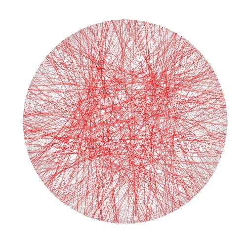
In this case I took inspiration from another previous experiment to draw some kind of wool skeins. The shiny app creates a plot consisting of chords inside a circle. There are to kind of chords:

  • Those which form a track because they are a set of glued chords; number of tracks and number of chords per track can be selected using Number of track chords and Number of scrawls per track sliders of the app respectively.
  • Those forming the background, randomly allocated inside the circle. Number of background chords can be chosen as well in the app

There is also the possibility to change colors of chords. This are the main steps I followed to build this Shiny app:

  1. Write a simple R program
  2. Decide which variables to parametrize
  3. Open a new Shiny project in RStudio
  4. Analize the sample UI.R and server.R files generated by default
  5. Adapt sample code to my particular code (some iterations are needed here)
  6. Deploy my app in the Shiny Apps free server

Number 1 is the most difficult step, but it does not depends on Shiny: rest of them are easier, specially if you have help as I had from my colleague Jorge. I encourage you to try. This is an snapshot of the app:

Skeins2

You can play with the app here.

Some things I thought while developing this experiment:

  • Shiny gives you a lot with a minimal effort
  • Shiny can be a very interesting tool to teach maths and programming to kids
  • I have to translate to Shiny some other experiment
  • I will try to use it for my job

Try Shiny: is very entertaining. A typical Shiny project consists on two files, one to define the user interface (UI.R) and the other to define the back end side (server.R).

This is the code of UI.R:

# This is the user-interface definition of a Shiny web application.
# You can find out more about building applications with Shiny here:
#
# http://shiny.rstudio.com
#
 
library(shiny)
 
shinyUI(fluidPage(
 
  # Application title
  titlePanel("Shiny Wool Skeins"),
  HTML("

This experiment is based on <a href=\"https://aschinchon.wordpress.com/2015/05/13/bertrand-or-the-importance-of-defining-problems-properly/\">this previous one</a> I did some time ago. It is my second approach to the wonderful world of Shiny.

"),
  # Sidebar with a slider input for number of bins
  sidebarLayout(
    sidebarPanel(
      inputPanel(
        sliderInput("lin", label = "Number of track chords:",
                    min = 1, max = 20, value = 5, step = 1),
        sliderInput("rep", label = "Number of scrawls per track:",
                    min = 1, max = 50, value = 10, step = 1),
        sliderInput("nbc", label = "Number of background chords:",
                    min = 0, max = 2000, value = 500, step = 2),
        selectInput("col1", label = "Track colour:",
                    choices = colors(), selected = "darkmagenta"),
        selectInput("col2", label = "Background chords colour:",
                    choices = colors(), selected = "gold")
      )
       
    ),
 
    # Show a plot of the generated distribution
    mainPanel(
      plotOutput("chordplot")
    )
  )
))

And this is the code of server.R:

# This is the server logic for a Shiny web application.
# You can find out more about building applications with Shiny here:
#
# http://shiny.rstudio.com
#
library(ggplot2)
library(magrittr)
library(grDevices)
library(shiny)
 
shinyServer(function(input, output) {
 
  df<-reactive({ ini=runif(n=input$lin, min=0,max=2*pi) 

  data.frame(ini=runif(n=input$lin, min=0,max=2*pi), 
             end=runif(n=input$lin, min=pi/2,max=3*pi/2))  -> Sub1

    Sub1=Sub1[rep(seq_len(nrow(Sub1)), input$rep),]
    Sub1 %>% apply(c(1, 2), jitter) %>% as.data.frame() -> Sub1
    Sub1=with(Sub1, data.frame(col=input$col1, x1=cos(ini), y1=sin(ini), x2=cos(end), y2=sin(end)))
    Sub2=runif(input$nbc, min = 0, max = 2*pi)
    Sub2=data.frame(x=cos(Sub2), y=sin(Sub2))
    Sub2=cbind(input$col2, Sub2[(1:(input$nbc/2)),], Sub2[(((input$nbc/2)+1):input$nbc),])
    colnames(Sub2)=c("col", "x1", "y1", "x2", "y2")
    rbind(Sub1, Sub2)
  })
   
  opts=theme(legend.position="none",
             panel.background = element_rect(fill="white"),
             panel.grid = element_blank(),
             axis.ticks=element_blank(),
             axis.title=element_blank(),
             axis.text =element_blank())
   
  output$chordplot<-renderPlot({
    p=ggplot(df())+geom_segment(aes(x=x1, y=y1, xend=x2, yend=y2), colour=df()$col, alpha=runif(nrow(df()), min=.1, max=.3), lwd=1)+opts;print(p)
  }, height = 600, width = 600 )
})

Bertrand or (The Importance of Defining Problems Properly)

We better keep an eye on this one: she is tricky (Michael Banks, talking about Mary Poppins)

Professor Bertrand teaches Simulation and someday, ask his students:

Given a circumference, what is the probability that a chord chosen at random is longer than a side of the equilateral triangle inscribed in the circle?

Since they must reach the answer through simulation, very approximate solutions are welcome.

Some students choose chords as the line between two random points on the circumference and conclude that the asked probability is around 1/3. This is the plot of one of their simulations, where 1000 random chords are chosen according this method and those longer than the side of the equilateral triangle are red coloured (smalller in grey):

Bertrand1

Some others choose a random radius and a random point in it. The chord then is the perpendicular through this point. They calculate that the asked probability is around 1/2:

Bertrand2

And some others choose a random point inside the circle and define the chord as the only one with this point as midpoint. For them, the asked probability is around 1/4:

Bertrand3

Who is right? Professor Bertrand knows that everybody is. In fact, his main purpose was to show how important is to define problems properly. Actually, he used this to give an unforgettable lesson to his students.

library(ggplot2)
n=1000
opt=theme(legend.position="none",
          panel.background = element_rect(fill="white"),
          panel.grid = element_blank(),
          axis.ticks=element_blank(),
          axis.title=element_blank(),
          axis.text =element_blank())
#First approach
angle=runif(2*n, min = 0, max = 2*pi)
pt1=data.frame(x=cos(angle), y=sin(angle))
df1=cbind(pt1[1:n,], pt1[((n+1):(2*n)),])
colnames(df1)=c("x1", "y1", "x2", "y2")
df1$length=sqrt((df1$x1-df1$x2)^2+(df1$y1-df1$y2)^2)
p1=ggplot(df1) + geom_segment(aes(x = x1, y = y1, xend = x2, yend = y2, colour=length>sqrt(3)), alpha=.4, lwd=.6)+
  scale_colour_manual(values = c("gray75", "red"))+opt
#Second approach
angle=2*pi*runif(n)
pt2=data.frame(aa=cos(angle), bb=sin(angle))
pt2$x0=pt2$aa*runif(n)
pt2$y0=pt2$x0*(pt2$bb/pt2$aa)
pt2$a=1+(pt2$x0^2/pt2$y0^2)
pt2$b=-2*(pt2$x0/pt2$y0)*(pt2$y0+(pt2$x0^2/pt2$y0))
pt2$c=(pt2$y0+(pt2$x0^2/pt2$y0))^2-1
pt2$x1=(-pt2$b+sqrt(pt2$b^2-4*pt2$a*pt2$c))/(2*pt2$a)
pt2$y1=-pt2$x0/pt2$y0*pt2$x1+(pt2$y0+(pt2$x0^2/pt2$y0))
pt2$x2=(-pt2$b-sqrt(pt2$b^2-4*pt2$a*pt2$c))/(2*pt2$a)
pt2$y2=-pt2$x0/pt2$y0*pt2$x2+(pt2$y0+(pt2$x0^2/pt2$y0))
df2=pt2[,c(8:11)]
df2$length=sqrt((df2$x1-df2$x2)^2+(df2$y1-df2$y2)^2)
p2=ggplot(df2) + geom_segment(aes(x = x1, y = y1, xend = x2, yend = y2, colour=length>sqrt(3)), alpha=.4, lwd=.6)+
scale_colour_manual(values = c("gray75", "red"))+opt
#Third approach
angle=2*pi*runif(n)
radius=runif(n)
pt3=data.frame(x0=sqrt(radius)*cos(angle), y0=sqrt(radius)*sin(angle))
pt3$a=1+(pt3$x0^2/pt3$y0^2)
pt3$b=-2*(pt3$x0/pt3$y0)*(pt3$y0+(pt3$x0^2/pt3$y0))
pt3$c=(pt3$y0+(pt3$x0^2/pt3$y0))^2-1
pt3$x1=(-pt3$b+sqrt(pt3$b^2-4*pt3$a*pt3$c))/(2*pt3$a)
pt3$y1=-pt3$x0/pt3$y0*pt3$x1+(pt3$y0+(pt3$x0^2/pt3$y0))
pt3$x2=(-pt3$b-sqrt(pt3$b^2-4*pt3$a*pt3$c))/(2*pt3$a)
pt3$y2=-pt3$x0/pt3$y0*pt3$x2+(pt3$y0+(pt3$x0^2/pt3$y0))
df3=pt3[,c(6:9)]
df3$length=sqrt((df3$x1-df3$x2)^2+(df3$y1-df3$y2)^2)
p3=ggplot(df3) + geom_segment(aes(x = x1, y = y1, xend = x2, yend = y2, colour=length>sqrt(3)), alpha=.4, lwd=.6)+scale_colour_manual(values = c("gray75", "red"))+opt

Odd Connections Inside The NASDAQ-100

Distinguishing the signal from the noise requires both scientific knowledge and self-knowledge (Nate Silver, author of The Signal and the Noise)

Analyzing the evolution of NASDAQ-100 stock prices can discover some interesting couples of companies which share a strong common trend despite of belonging to very different sectors. The NASDAQ-100 is made up of 107 equity securities issued by 100 of the largest non-financial companies listed on the NASDAQ. On the other side, Yahoo! Finance is one of the most popular services to consult financial news, data and commentary including stock quotes, press releases, financial reports, and original programming. Using R is possible to download the evolution of NASDAQ-100 symbols from Yahoo! Finance. There is a R package called quantmod which makes this issue quite simple with the function getSymbols. Daily series are long enough to do a wide range of analysis, since most of them start in 2007.

One robust way to determine if two times series, xt and yt, are related is to analyze if there exists an equation like yt=βxt+ut such us residuals (ut) are stationary (its mean and variance does not change when shifted in time). If this happens, it is said that both series are cointegrated. The way to measure it in R is running the Augmented Dickey-Fuller test, available in tseries package. Cointegration analysis help traders to design products such spreads and hedges.

There are 5.671 different couples between the 107 stocks of NASDAQ-100. After computing the Augmented Dickey-Fuller test to each of them, the resulting data frame can be converted into a distance matrix. A nice way to visualize distances between stocks is to do a hierarchical clustering. This is the resulting dendogram of the clustering:

Dendogram

Close stocks such as Ca Inc. (CA) and Bed Bath & Beyond Inc. (BBBY) are joined with short links. A quick way to extract close couples is to cut this dendogram in a big number of clusters and keep those with two elements. Following is the list of the most related stock couples cutting dendogram in 85 clusters:

Couples

Most of them are strange neighbors. Next plot shows the evolution closing price evolution of four of these couples:

examples

Analog Devices Inc. (ADI) makes semiconductors and Discovery Communications Inc. (DISCA) is a mass media company. PACCAR Inc. (PCAR) manufactures trucks and Paychex Inc. (PAYX) provides HR outsourcing. CA Inc. (CA) creates software and Bed Bath & Beyond Inc. (BBBY) sells goods for home. Twenty-First Century Fox Inc. (FOX) is a mass media company as well and EBAY Inc. (EBAY) does online auctions‎. All of them are odd connections.

This is the code of the experiment:

library("quantmod")
library("TSdist")
library("ade4")
library("ggplot2")
library("Hmisc")
library("zoo")
library("scales")
library("reshape2")
library("tseries")
library("RColorBrewer")
library("ape")
library("sqldf")
library("googleVis")
library("gridExtra")
setwd("YOUR-WORKING-DIRECTORY-HERE")
temp=tempfile()
download.file("http://www.nasdaq.com/quotes/nasdaq-100-stocks.aspx?render=download",temp)
data=read.csv(temp, header=TRUE)
for (i in 1:nrow(data)) getSymbols(as.character(data[i,1]))
results=t(apply(combn(sort(as.character(data[,1]), decreasing = TRUE), 2), 2,
function(x) {
ts1=drop(Cl(eval(parse(text=x[1]))))
ts2=drop(Cl(eval(parse(text=x[2]))))
t.zoo=merge(ts1, ts2, all=FALSE)
t=as.data.frame(t.zoo)
m=lm(ts2 ~ ts1 + 0, data=t)
beta=coef(m)[1]
sprd=t$ts1 - beta*t$ts2
ht=adf.test(sprd, alternative="stationary", k=0)$p.value
c(symbol1=x[1], symbol2=x[2], (1-ht))}))
results=as.data.frame(results)
colnames(results)=c("Sym1", "Sym2", "TSdist")
results$TSdist=as.numeric(as.character(results$TSdist))
save(results, file="results.RData")
load("results.RData")
m=as.dist(acast(results, Sym1~Sym2, value.var="TSdist"))
hc = hclust(m)
# vector of colors
op = par(bg = "darkorchid4")
plot(as.phylo(hc), type = "fan", tip.color = "gold", edge.color ="gold", cex=.8)
# cutting dendrogram in 85 clusters
clusdf=data.frame(Symbol=names(cutree(hc, 85)), clus=cutree(hc, 85))
clusdf2=merge(clusdf, data[,c(1,2)], by="Symbol")
sizes=sqldf("SELECT * FROM (SELECT clus, count(*) as size FROM clusdf GROUP BY 1) as T00 WHERE size>=2")
sizes2=merge(subset(sizes, size==2), clusdf2, by="clus")
sizes2$id=sequence(rle(sizes2$clus)$lengths)
couples=merge(subset(sizes2, id==1)[,c(1,3,4)], subset(sizes2, id==2)[,c(1,3,4)], by="clus")
couples$"Company 1"=apply(couples[ , c(2,3) ] , 1 , paste , collapse = " -" )
couples$"Company 2"=apply(couples[ , c(4,5) ] , 1 , paste , collapse = " -" )
CouplesTable=gvisTable(couples[,c(6,7)])
plot(CouplesTable)
# Plots
opts2=theme(
panel.background = element_rect(fill="gray98"),
panel.border = element_rect(colour="black", fill=NA),
axis.line = element_line(size = 0.5, colour = "black"),
axis.ticks = element_line(colour="black"),
panel.grid.major = element_line(colour="gray75", linetype = 2),
panel.grid.minor = element_blank(),
axis.text = element_text(colour="gray25", size=12),
axis.title = element_text(size=18, colour="gray10"),
legend.key = element_rect(fill = "white"),
legend.text = element_text(size = 14),
legend.background = element_rect(),
plot.title = element_text(size = 35, colour="gray10"))
plotPair = function(Symbol1, Symbol2)
{
getSymbols(Symbol1)
getSymbols(Symbol2)
close1=Cl(eval(parse(text=Symbol1)))
close2=Cl(eval(parse(text=Symbol2)))
cls=merge(close1, close2, all = FALSE)
df=data.frame(date = time(cls), coredata(cls))
names(df)[-1]=c(Symbol1, Symbol2)
df1=melt(df, id.vars = "date", measure.vars = c(Symbol1, Symbol2))
ggplot(df1, aes(x = date, y = value, color = variable))+
geom_line(size = I(1.2))+
scale_color_discrete(name = "")+
scale_x_date(labels = date_format("%Y-%m-%d"))+
labs(x="Date", y="Closing Price")+
opts2
}
p1=plotPair("ADI", "DISCA")
p2=plotPair("PCAR", "PAYX")
p3=plotPair("CA", "BBBY")
p4=plotPair("FOX", "EBAY")
grid.arrange(p1, p2, p3, p4, ncol=2)

The Awesome Parrondo’s Paradox

A technique succeeds in mathematical physics, not by a clever trick, or a happy accident, but because it expresses some aspect of physical truth (O. G. Sutton)

Imagine three unbalanced coins:

  • Coin 1: Probability of head=0.495 and probability of tail=0.505
  • Coin 2: Probability of head=0.745 and probability of tail=0.255
  • Coin 3: Probability of head=0.095 and probability of tail=0.905

Now let’s define two games using these coins:

  • Game A: You toss coin 1 and if it comes up head you receive 1€ but if not, you lose 1€
  • Game B: If your present capital is a multiple of 3, you toss coin 2. If not, you toss coin 3. In both cases, you receive 1€ if coin comes up head and lose 1€ if not.

Played separately, both games are quite unfavorable. Now let’s define Game A+B in which you toss a balanced coin and if it comes up head, you play Game A and play Game B otherwise. In other words, in Game A+B you decide between playing Game A or Game B randomly.

Starting with 0€, it is easy to simulate the three games along 500 plays. This is an example of one of these simulations:#Rstats #R

Resulting profit of Game A+B after 500 plays  is +52€ and is -9€ and -3€ for Games A and B respectively. Let’s do some more simulations (I removed legends and titles but colors of games are the same):

#Rstats #R

As you can see, Game A+B is the most profitable in almost all the previous simulations. Coincidence? Not at all. This is a consequence of the stunning Parrondo’s Paradox which states that two losing games can combine into a winning one.

If you still don’t believe in this brain-crashing paradox, following you can see the empirical distributions of final profits of three games after 1.000 plays:#Rstats #R

After 1000 plays, mean profit of Game A is -13€, is -7€ for Game B and 17€ for Game A+B.

This paradox was discovered in the last nineties by the Spanish physicist Juan Parrondo and can help to explain, among other things, why investing in losing shares can result in obtaining big profits. Amazing:

require(ggplot2)
require(scales)
library(gridExtra)
opts=theme(
  legend.position = "bottom",
  legend.background = element_rect(colour = "black"),
  panel.background = element_rect(fill="gray98"),
  panel.border = element_rect(colour="black", fill=NA),
  axis.line = element_line(size = 0.5, colour = "black"),
  axis.ticks = element_line(colour="black"),
  panel.grid.major = element_line(colour="gray75", linetype = 2),
  panel.grid.minor = element_blank(),
  axis.text.y = element_text(colour="gray25", size=15),
  axis.text.x = element_text(colour="gray25", size=15),
  text = element_text(size=20),
  plot.title = element_text(size = 35))
PlayGameA = function(profit, x, c) {if (runif(1) < c-x) profit+1 else profit-1}
PlayGameB = function(profit, x1, c1, x2, c2) {if (profit%%3>0) PlayGameA(profit, x=x1, c=c1) else PlayGameA(profit, x=x2, c=c2)}
####################################################################
#EVOLUTION
####################################################################
noplays=500
alpha=0.005
profit0=0
results=data.frame(Play=0, ProfitA=profit0, ProfitB=profit0, ProfitAB=profit0)
for (i in 1:noplays) {results=rbind(results, c(i,
    PlayGameA(profit=results[results$Play==(i-1),2], x =alpha, c =0.5),
    PlayGameB(profit=results[results$Play==(i-1),3], x1=alpha, c1=0.75, x2=alpha, c2=0.1),
    if (runif(1)<0.5) PlayGameA(profit=results[results$Play==(i-1),4], x =alpha, c =0.5) else PlayGameB(profit=results[results$Play==(i-1),4], x1=alpha, c1=0.75, x2=alpha, c2=0.1)
    ))}
results=rbind(data.frame(Play=results$Play, Game="A",   Profit=results$ProfitA),
              data.frame(Play=results$Play, Game="B",   Profit=results$ProfitB),
              data.frame(Play=results$Play, Game="A+B", Profit=results$ProfitAB))
ggplot(results, aes(Profit, x=Play, y=Profit, color = Game)) +
  scale_x_continuous(limits=c(0,noplays), "Plays")+
  scale_y_continuous(limits=c(-75,75), expand = c(0, 0), "Profit")+
  labs(title="Evolution of profit games along 500 plays")+
  geom_line(size=3)+opts
####################################################################
#DISTRIBUTION
####################################################################
noplays=1000
alpha=0.005
profit0=0
results2=data.frame(Play=numeric(0), ProfitA=numeric(0), ProfitB=numeric(0), ProfitAB=numeric(0))
for (j in 1:100) {results=data.frame(Play=0, ProfitA=profit0, ProfitB=profit0, ProfitAB=profit0)
  for (i in 1:noplays) {results=rbind(results, c(i,
      PlayGameA(profit=results[results$Play==(i-1),2], x =alpha, c =0.5),
      PlayGameB(profit=results[results$Play==(i-1),3], x1=alpha, c1=0.75, x2=alpha, c2=0.1),
      if (runif(1)<0.5) PlayGameA(profit=results[results$Play==(i-1),4], x =alpha, c =0.5)
      else PlayGameB(profit=results[results$Play==(i-1),4], x1=alpha, c1=0.75, x2=alpha, c2=0.1)))}
      results2=rbind(results2, results[results$Play==noplays, ])}
results2=rbind(data.frame(Game="A", Profit=results2$ProfitA),
data.frame(Game="B", Profit=results2$ProfitB),
data.frame(Game="A+B", Profit=results2$ProfitAB))
ggplot(results2, aes(Profit, fill = Game)) +
  scale_x_continuous(limits=c(-150,150), "Profit")+
  scale_y_continuous(limits=c(0,0.02), expand = c(0, 0), "Density", labels = percent)+
  labs(title=paste("Parrondo's Paradox (",as.character(noplays)," plays)",sep=""))+
  geom_density(alpha=.75)+opts

The World We Live In #3: Breastfeeding

Facts are stubborn, but statistics are more pliable (Mark Twain)

According to World Health Organization, exclusive breastfeeding is recommended up to 6 months of age, with continued breastfeeding along with appropriate complementary foods up to two years of age or beyond. Thus, the defining characteristic of continued breastfeeding is that the infant between 6 months and 2 years of age receives at least some breast milk regardless of the quantity or the presence of other foods or liquids in the diet.

On the other hand, as can be read in The World Factbook of Central Intelligence Agency, the Total Fertility Rate (TFR) is the average number of children that would be born to a woman over her lifetime if she were to experience the exact current age-specific fertility rates through her lifetime and she were to survive from birth through the end of her reproductive life. It is obtained by summing the single-year age-specific rates at a given time.

This is how the world is arranged according to these two rates:

#Rstats #R There are many differences between countries. Both rates are very low in some east European countries like Ukraine, Bosnia, Belarus and Moldova. On the other hand both of them are very high in Benin, Rwanda, Burkina Faso and Malawi, all of them African. Also African countries are Angola, Nigeria and Somalia where fertility rate is very high but breastfeeding is not very established (Timor-Leste in Asia belongs to this segment as well); and women in Nepal, Bangladesh, Sri-Lanka and India feed their moderate number of descendants with their own milk.

We live in a complex and beautiful world which cannot be measured only with averages nor standard deviations:

#Continued breastfeeding rate: http://data.un.org/Data.aspx?d=SOWC&f=inID%3a89
#Total fertility rate (TFR): http://data.un.org/Data.aspx?d=SOWC&f=inID%3a127
#Population: http://data.un.org/Data.aspx?d=SOWC&f=inID%3a105
require("sqldf")
require("ggplot2")
require("scales")
breastfeeding=read.csv("UNdata_Export_20141122_122134175.csv", nrows=124, header=T, row.names=NULL)
fertility=read.csv("UNdata_Export_20141122_122330581.csv", nrows=570, header=T, row.names=NULL)
population=read.csv("UNdata_Export_20141122_142359579.csv", nrows=999, header=T, row.names=NULL)
colnames(breastfeeding)[1]="Country"
colnames(fertility)[1]="Country"
colnames(population)[1]="Country"
data=sqldf("SELECT a.Country, a.Value as Pop, b.Value as Fertility, c.Value as Breastfeeding
           FROM population a inner join fertility b
           on (a.Country=b.Country) INNER JOIN breastfeeding c
           on (a.Country=c.Country)
           where a.Subgroup = 'Total' AND b.Year = 2011
           AND a.Country NOT IN ('World', 'South Asia',
           'Sub-Saharan Africa', 'Least Developed Countries/Territories', 'Eastern and Southern Africa',
           'East Asia and Pacific')")
opts=theme(
  panel.background = element_rect(fill="gray98"),
  panel.border = element_rect(colour="black", fill=NA),
  axis.line = element_line(size = 0.5, colour = "black"),
  axis.ticks = element_line(colour="black"),
  panel.grid.major = element_line(colour="gray75", linetype = 2),
  panel.grid.minor = element_blank(),
  axis.text.y = element_text(colour="gray25", size=15),
  axis.text.x = element_text(colour="gray25", size=15),
  text = element_text(size=20),
  legend.key = element_blank(),
  legend.position = "none",
  legend.background = element_blank(),
  plot.title = element_text(size = 45))
ggplot(data, aes(x=Fertility, y=Breastfeeding/100, size=log(Pop), label=Country), guide=FALSE)+
  geom_point(colour="white", fill="darkorchid2", shape=21, alpha=.55)+
  scale_size_continuous(range=c(2,40))+
  scale_x_continuous(limits=c(1,7))+
  scale_y_continuous(limits=c(0,1), labels = percent)+
  labs(title="The World We Live In #3: Breastfeeding",
       x="Total fertility rate (TFR)",
       y="Continued breastfeeding rate")+
  geom_text(data=subset(data, Fertility>5 & (Breastfeeding>75|Breastfeeding<40)), size=5.5, colour="gray25", hjust=0, vjust=0)+
  geom_text(data=subset(data, Fertility<3 & Breastfeeding>75), size=5.5, colour="gray25", hjust=0, vjust=0)+
  geom_text(data=subset(data, Fertility<2 & Breastfeeding<12), size=5.5, colour="gray25", hjust=0, vjust=0)+
  geom_text(aes(5, 0), colour="gray25", hjust=0, label="Source: United Nations (size of bubble depending on population)", size=4)+opts