Tag Archives: Rstats

The World We Live In #5: Calories And Kilograms

I enjoy doing new tunes; it gives me a little bit to perk up, to pay a little bit more attention (Earl Scruggs, American musician)

I recently finished reading The Signal and the Noise, a book by Nate Silver, creator of the also famous FiveThirtyEight blog. The book is a very good reading for all data science professionals, and is a must in particular for all those who work trying to predict the future. The book praises the bayesian way of thinking as the best way to face and modify predictions and criticizes rigid ways of thinking with many examples of disastrous predictions. I enjoyed a lot the chapter dedicated to chess and how Deep Blue finally took over Kasparov. In a nutshell: I strongly recommend it.
One of the plots of Silver’s book present a case of false negative showing the relationship between obesity and calorie consumption across the world countries. The plot shows that there is no evidence of a connection between both variables. Since it seemed very strange to me, I decided to reproduce the plot by myself.

I compared these two variables:

  • Dietary Energy Consumption (kcal/person/day) estimated by the FAO Food Balance Sheets.
  • Prevalence of Obesity as percentage of defined population with a body mass index (BMI) of 30 kg/m2 or higher estimated by the World Health Organization

And this is the resulting plot:

Calories And KilogramsAs you can see there is a strong correlation between two variables. Why the experiment of Nate Silver shows the opposite? Obviously we did not plot the same data (although, in principle, both of us went to the same source). Anyway: to be honest, I prefer my plot because shows what all of we know: the more calories you eat, the more weight you will see in your bathroom scale. Some final thoughts seeing the plot:

  • I would like to be Japanese: they don’t gain weight!
  • Why US people are fatter than Austrian?
  • What happens in Samoa?

Here you have the code to do the plot:

library(xlsx)
library(dplyr)
library(ggplot2)
library(scales)
setwd("YOUR WORKING DIRECTORY HERE")
url_calories = "http://www.fao.org/fileadmin/templates/ess/documents/food_security_statistics/FoodConsumptionNutrients_en.xls"
download.file(url_calories, method="internal", destfile = "FoodConsumptionNutrients_en.xls", mode = "ab")
calories = read.xlsx(file="FoodConsumptionNutrients_en.xls", startRow = 4, colIndex = c(2,6), colClasses = c("character", "numeric"), sheetName="Dietary Energy Cons. Countries", stringsAsFactors=FALSE) 
colnames(calories)=c("Country", "Kcal")
url_population = "http://esa.un.org/unpd/wpp/DVD/Files/1_Excel%20(Standard)/EXCEL_FILES/1_Population/WPP2015_POP_F01_1_TOTAL_POPULATION_BOTH_SEXES.XLS"
download.file(url_population, method="internal", destfile = "Population.xls", mode = "ab")
population = read.xlsx(file="Population.xls", startRow = 17, colIndex = c(3,71), colClasses = c("character", "numeric"), sheetName="ESTIMATES", stringsAsFactors=FALSE) 
colnames(population)=c("Country", "Population")
# http://apps.who.int/gho/data/node.main.A900A?lang=en
url_obesity = "http://apps.who.int/gho/athena/data/xmart.csv?target=GHO/NCD_BMI_30A&profile=crosstable&filter=AGEGROUP:*;COUNTRY:*;SEX:*&x-sideaxis=COUNTRY&x-topaxis=GHO;YEAR;AGEGROUP;SEX&x-collapse=true"
obesity = read.csv(file=url_obesity, stringsAsFactors=FALSE)
obesity %>% select(matches("Country|2014.*Both")) -> obesity
colnames(obesity)=c("Country", "Obesity")
obesity %>% filter(Obesity!="No data") -> obesity
obesity %>% mutate(Obesity=as.numeric(substr(Obesity, 1, regexpr(pattern = "[[]", obesity$Obesity)-1))) -> obesity
population %>% inner_join(calories,by = "Country") %>% inner_join(obesity,by = "Country") -> data
opts=theme(
  panel.background = element_rect(fill="gray98"),
  panel.border = element_rect(colour="black", fill=NA),
  axis.line = element_line(size = 0.5, colour = "black"),
  axis.ticks = element_line(colour="black"),
  panel.grid.major = element_line(colour="gray75", linetype = 2),
  panel.grid.minor = element_blank(),
  axis.text = element_text(colour="gray25", size=15),
  axis.title = element_text(size=18, colour="gray10"),
  legend.key = element_blank(),
  legend.position = "none",
  legend.background = element_blank(),
  plot.title = element_text(size = 40, colour="gray10"))
ggplot(data, aes(x=Kcal, y=Obesity/100, size=log(Population), label=Country), guide=FALSE)+
  geom_point(colour="white", fill="sandybrown", shape=21, alpha=.55)+
  scale_size_continuous(range=c(2,40))+
  scale_x_continuous(limits=c(1500,4100))+
  scale_y_continuous(labels = percent)+
  labs(title="The World We Live In #5: Calories And Kilograms",
       x="Dietary Energy Consumption (kcal/person/day)",
       y="% population with body mass index >= 30 kg/m2")+
  geom_text(data=subset(data, Obesity>35|Kcal>3700), size=5.5, colour="gray25", hjust=0, vjust=0)+
  geom_text(data=subset(data, Kcal<2000), size=5.5, colour="gray25", hjust=0, vjust=0)+
  geom_text(data=subset(data, Obesity<10 & Kcal>2600), size=5.5, colour="gray25", hjust=0, vjust=0)+
  geom_text(aes(3100, .01), colour="gray25", hjust=0, label="Source: United Nations (size of bubble depending on population)", size=4.5)+opts

Going Bananas #2: A Needle In A Haystack

Now I’m gonna tell my momma that I’m a traveller, I’m gonna follow the sun (The Sun, Parov Stelar)

Inspired by this book I read recently, I decided to do this experiment. The idea is comparing how easy is to find sequences of numbers inside Pi, e, Golden Ratio (Phi) and a randomly generated number. For example, since Pi is 3.1415926535897932384… the 4-size sequence 5358 can be easily found at the begining as well as the 5-size sequence 79323. I considered interesting comparing Pi with a random generated number. What I though before doing the experiment is that it would be easier finding sequences inside the andom one. Why? Because despite of being irrational and transcendental I thought there should be some kind of residual pattern in Pi that should make more difficult to find random sequences inside it than do it inside a randomly generated number.

  • I downloaded Pi, e and Phi from the Internet and extract first 100.000 digits of all of them. I generate a random 100.000 number on the fly.
  • I generate a representative sample of 4-size sequences
  • I look for each of these sequences inside first 5.000 digits of Pi, e, Phi and the randomly generated one. I repeat searching for first 10.000, first 15.000 and so on until I search into the whole 100.000 -size number
  • I store how many sequences I find for each searching
  • I repeat this for 5 and 6-size sequences.

At first sight, is equally easy (or difficult), to find random sequences inside all numbers: my hypothesis was wrong.

As you can see here, 100.000 digits is more than enough to find 4-size sequences. In fact, from 45.000 digits I reach 100% of successful matches:

Rplot4_2pp

I only find 60% of 5-size sequences inside 100.000 digits of numbers:

Rplot5_2pp

And only 10% of 6-size sequences:

Rplot06_1pp

Why these four numbers are so equal in order to find random sequences inside them? I don’t know. What I know is that if you want to find your telephone number inside Pi, you will probably need an enormous number of digits.

library(rvest)
library(stringr)
library(reshape2)
library(ggplot2)
library(extrafont);windowsFonts(Comic=windowsFont("Comic Sans MS"))
library(dplyr)
library(magrittr)
library(scales)
p = html("http://www.geom.uiuc.edu/~huberty/math5337/groupe/digits.html")
f = html("http://www.goldennumber.net/wp-content/uploads/2012/06/Phi-To-100000-Places.txt")
e = html("http://apod.nasa.gov/htmltest/gifcity/e.2mil")
p %>%  
  html_text() %>% 
  substr(., regexpr("3.14",.), regexpr("Go to Historical",.)) %>% 
  gsub("[^0-9]", "", .)  %>% 
  substr(., 1, 100000) -> p
f %>%  
  html_text() %>% 
  substr(., regexpr("1.61",.), nchar(.)) %>% 
  gsub("[^0-9]", "", .) %>%  
  substr(., 1, 100000) -> f
e %>%  
  html_text() %>% 
  substr(., regexpr("2.71",.), nchar(.)) %>% 
  gsub("[^0-9]", "", .) %>% 
  substr(., 1, 100000) -> e
r = paste0(sample(0:9, 100000, replace = TRUE), collapse = "")
results=data.frame(Cut=numeric(0), Pi=numeric(0), Phi=numeric(0), e=numeric(0), Random=numeric(0))
bins=20
dgts=6
samp=min(10^dgts*2/100, 10000)
for (i in 1:bins) {
  cut=100000/bins*i
  p0=substr(p, start=0, stop=cut)
  f0=substr(f, start=0, stop=cut)
  e0=substr(e, start=0, stop=cut)
  r0=substr(r, start=0, stop=cut)
  sample(0:(10^dgts-1), samp, replace = FALSE) %>% str_pad(dgts, pad = "0") -> comb
  comb %>% sapply(function(x) grepl(x, p0)) %>% sum() -> p1
  comb %>% sapply(function(x) grepl(x, f0)) %>% sum() -> f1
  comb %>% sapply(function(x) grepl(x, e0)) %>% sum() -> e1
  comb %>% sapply(function(x) grepl(x, r0)) %>% sum() -> r1
  results=rbind(results, data.frame(Cut=cut, Pi=p1, Phi=f1, e=e1, Random=r1))
}
results=melt(results, id.vars=c("Cut") , variable.name="number", value.name="matches")
opts=theme(
  panel.background = element_rect(fill="darkolivegreen1"),
  panel.border = element_rect(colour="black", fill=NA),
  axis.line = element_line(size = 0.5, colour = "black"),
  axis.ticks = element_line(colour="black"),
  panel.grid.major = element_line(colour="white", linetype = 1),
  panel.grid.minor = element_blank(),
  axis.text.y = element_text(colour="black"),
  axis.text.x = element_text(colour="black"),
  text = element_text(size=20, family="Comic"),
  legend.text = element_text(size=25),
  legend.key = element_blank(),
  legend.position = c(.75,.2),
  legend.background = element_blank(),
  plot.title = element_text(size = 30))
ggplot(results, aes(x = Cut, y = matches/samp, color = number))+
  geom_line(size=1.5, alpha=.8)+
  scale_color_discrete(name = "")+
  scale_x_continuous(breaks=seq(100000/bins, 100000, by=100000/bins))+
  scale_y_continuous(labels = percent)+
  theme(axis.text.x = element_text(angle = 90, vjust=.5, hjust = 1))+
  labs(title=paste0("Finding ",dgts, "-size strings into 100.000-digit numbers"), 
       x="Cut Position", 
       y="% of Matches")+opts

The Moon And The Sun

Do not swear by the moon, for she changes constantly. Then your love would also change (William Shakespeare, Romeo and Juliet)

The sun is a big point ant the moon is a cardioid:

Moon&Sun

Here you have the code. It is a simple example of how to use ggplot:

library(ggplot2)
n=160
t1=1:n
t0=seq(from=3, to=2*n+1, by=2) %% n
t2=t0+(t0==0)*n
df=data.frame(x1=cos((t1-1)*2*pi/n), y1=sin((t1-1)*2*pi/n), x2=cos((t2-1)*2*pi/n), y2=sin((t2-1)*2*pi/n))
opt=theme(legend.position="none",
panel.background = element_rect(fill="white"),
panel.grid = element_blank(),
axis.ticks=element_blank(),
axis.title=element_blank(),
axis.text =element_blank())
ggplot(df, aes(x = x1, y = y1, xend = x2, yend = y2)) +
geom_point(x=0, y=0, size=245, color="gold")+
geom_segment(color="white", alpha=.5)+opt

Trigonometric Pattern Design

Triangles are my favorite shape, three points where two lines meet (Tessellate, Alt-J)

Inspired by recurrence plots and by the Gauss error function, I have done the following plots. The first one represents the recurrence plot of f\left ( x \right )= sec\left ( x \right ) where distance between points is measured by Gauss error function:

sec1This one is the same for f\left ( x \right )= tag\left ( x \right )

tan1And this one represents latex f\left ( x \right )= sin\left ( x \right )

sin1I like them: they are elegant, attractive and easy to make. Try your own functions. One final though: the more I use magrittr package, the more I like it. This is the code for the first plot.

library("magrittr")
library("ggplot2")
library("pracma")
RecurrencePlot = function(from, to, col1, col2) {
  opt = theme(legend.position  = "none",
              panel.background = element_blank(),
              axis.ticks       = element_blank(),
              panel.grid       = element_blank(),
              axis.title       = element_blank(),
              axis.text        = element_blank()) 
  seq(from, to, by = .1) %>% expand.grid(x=., y=.) %>% 
    ggplot( ., aes(x=x, y=y, fill=erf(sec(x)-sec(y)))) + geom_tile() + 
    scale_fill_gradientn(colours=colorRampPalette(c(col1, col2))(2)) + opt}
RecurrencePlot(from = -5*pi, to = 5*pi, col1 = "black", col2= "white")

The 2D-Harmonograph In Shiny

If you wish to make an apple pie from scratch, you must first invent the universe (Carl Sagan)

I like Shiny and I can’t stop converting into apps some of my previous experiments: today is the turn of the harmonograph. This is a simple application since you only can press a button to generate a random harmonograph-simulated curve. I love how easy is to create a nice interactive app to play with from an existing code. The only trick in this case in to add a rerun button in the UI side and transfer the interaction to the server side using a simple if. Very easy. This is a screenshot of the application:

Shiny_2DHarmonograph

Press the button and you will get a new drawing. Most of them are nice scrawls and from time to time you will obtain beautiful shapely curves.

And no more candy words: It is time to complain. I say to RStudio with all due respect, you are very cruel. You let me to deploy my previous app to your server but you suspended it almost immediately for fifteen days due to “exceeded usage hours”. My only option is paying at least $440 per year to upgrade my current plan. I tried the ambrosia for an extremely short time. RStudio: Why don’t you launch a cheaper account? Why don’t you launch a free account with just one perpetual alive app at a time? Why don’t you increase the usage hours threshold? I can help you to calculate the return on investment of these scenarios.

Or, Why don’t you make me a gift for my next birthday? I promise to upload a new app per month to promote your stunning tool. Think about it and please let me know your conclusions.

Meanwhile I will run the app privately. This is the code to do it:

UI.R

# This is the user-interface definition of a Shiny web application.
# You can find out more about building applications with Shiny here:
# 
# http://www.rstudio.com/shiny/
 
library(shiny)
 
shinyUI(fluidPage(
  titlePanel("Mathematical Beauties: The Harmonograph"),
  sidebarLayout(
    sidebarPanel(
      #helpText(),
 
      # adding the new div tag to the sidebar            
      tags$div(class="header", checked=NA,
               tags$p("A harmonograph is a mechanical apparatus that employs pendulums to create a 
                       geometric image. The drawings created typically are Lissajous curves, or 
                       related drawings of greater complexity. The devices, which began to appear 
                       in the mid-19th century and peaked in popularity in the 1890s, cannot be 
                       conclusively attributed to a single person, although Hugh Blackburn, a professor 
                       of mathematics at the University of Glasgow, is commonly believed to be the official 
                       inventor. A simple, so-called \"lateral\" harmonograph uses two pendulums to control the movement 
                       of a pen relative to a drawing surface. One pendulum moves the pen back and forth along 
                       one axis and the other pendulum moves the drawing surface back and forth along a 
                       perpendicular axis. By varying the frequency and phase of the pendulums relative to 
                       one another, different patterns are created. Even a simple harmonograph as described 
                       can create ellipses, spirals, figure eights and other Lissajous figures (Source: Wikipedia)")),
               tags$div(class="header", checked=NA,
                       HTML("

Click <a href=\"http://paulbourke.net/geometry/harmonograph/harmonograph3.html\">here</a> to see an image of a real harmonograph

")
               ),
        actionButton('rerun','Launch the harmonograph!')
    ),
    mainPanel(
      plotOutput("HarmPlot")
    )
  )
))

server.R

# This is the server logic for a Shiny web application.
# You can find out more about building applications with Shiny here:
# 
# http://www.rstudio.com/shiny/
# 
 
library(shiny)
 
CreateDS = function () 
  {
   
  f=jitter(sample(c(2,3),4, replace = TRUE))
  d=runif(4,0,1e-02)
  p=runif(4,0,pi)
  xt = function(t) exp(-d[1]*t)*sin(t*f[1]+p[1])+exp(-d[2]*t)*sin(t*f[2]+p[2])
  yt = function(t) exp(-d[3]*t)*sin(t*f[3]+p[3])+exp(-d[4]*t)*sin(t*f[4]+p[4])
  t=seq(1, 200, by=.0005)
  data.frame(t=t, x=xt(t), y=yt(t))}
 
shinyServer(function(input, output) {
    dat<-reactive({if (input$rerun) dat=CreateDS() else dat=CreateDS()})
 output$HarmPlot<-renderPlot({
   plot(rnorm(1000),xlim =c(-2,2), ylim =c(-2,2), type="n")
   with(dat(), plot(x,y, type="l", xlim =c(-2,2), ylim =c(-2,2), xlab = "", ylab = "", xaxt='n', yaxt='n', col="gray10", bty="n"))
  }, height = 650, width = 650)
})

Shiny Wool Skeins

Chaos is not a pit: chaos is a ladder (Littlefinger in Game of Thrones)

Some time ago I wrote this post to show how my colleague Vu Anh translated into Shiny one of my experiments, opening my eyes to an amazing new world. I am very proud to present you the first Shiny experiment entirely written by me.

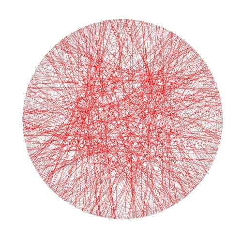
In this case I took inspiration from another previous experiment to draw some kind of wool skeins. The shiny app creates a plot consisting of chords inside a circle. There are to kind of chords:

  • Those which form a track because they are a set of glued chords; number of tracks and number of chords per track can be selected using Number of track chords and Number of scrawls per track sliders of the app respectively.
  • Those forming the background, randomly allocated inside the circle. Number of background chords can be chosen as well in the app

There is also the possibility to change colors of chords. This are the main steps I followed to build this Shiny app:

  1. Write a simple R program
  2. Decide which variables to parametrize
  3. Open a new Shiny project in RStudio
  4. Analize the sample UI.R and server.R files generated by default
  5. Adapt sample code to my particular code (some iterations are needed here)
  6. Deploy my app in the Shiny Apps free server

Number 1 is the most difficult step, but it does not depends on Shiny: rest of them are easier, specially if you have help as I had from my colleague Jorge. I encourage you to try. This is an snapshot of the app:

Skeins2

You can play with the app here.

Some things I thought while developing this experiment:

  • Shiny gives you a lot with a minimal effort
  • Shiny can be a very interesting tool to teach maths and programming to kids
  • I have to translate to Shiny some other experiment
  • I will try to use it for my job

Try Shiny: is very entertaining. A typical Shiny project consists on two files, one to define the user interface (UI.R) and the other to define the back end side (server.R).

This is the code of UI.R:

# This is the user-interface definition of a Shiny web application.
# You can find out more about building applications with Shiny here:
#
# http://shiny.rstudio.com
#
 
library(shiny)
 
shinyUI(fluidPage(
 
  # Application title
  titlePanel("Shiny Wool Skeins"),
  HTML("

This experiment is based on <a href=\"https://aschinchon.wordpress.com/2015/05/13/bertrand-or-the-importance-of-defining-problems-properly/\">this previous one</a> I did some time ago. It is my second approach to the wonderful world of Shiny.

"),
  # Sidebar with a slider input for number of bins
  sidebarLayout(
    sidebarPanel(
      inputPanel(
        sliderInput("lin", label = "Number of track chords:",
                    min = 1, max = 20, value = 5, step = 1),
        sliderInput("rep", label = "Number of scrawls per track:",
                    min = 1, max = 50, value = 10, step = 1),
        sliderInput("nbc", label = "Number of background chords:",
                    min = 0, max = 2000, value = 500, step = 2),
        selectInput("col1", label = "Track colour:",
                    choices = colors(), selected = "darkmagenta"),
        selectInput("col2", label = "Background chords colour:",
                    choices = colors(), selected = "gold")
      )
       
    ),
 
    # Show a plot of the generated distribution
    mainPanel(
      plotOutput("chordplot")
    )
  )
))

And this is the code of server.R:

# This is the server logic for a Shiny web application.
# You can find out more about building applications with Shiny here:
#
# http://shiny.rstudio.com
#
library(ggplot2)
library(magrittr)
library(grDevices)
library(shiny)
 
shinyServer(function(input, output) {
 
  df<-reactive({ ini=runif(n=input$lin, min=0,max=2*pi) 

  data.frame(ini=runif(n=input$lin, min=0,max=2*pi), 
             end=runif(n=input$lin, min=pi/2,max=3*pi/2))  -> Sub1

    Sub1=Sub1[rep(seq_len(nrow(Sub1)), input$rep),]
    Sub1 %>% apply(c(1, 2), jitter) %>% as.data.frame() -> Sub1
    Sub1=with(Sub1, data.frame(col=input$col1, x1=cos(ini), y1=sin(ini), x2=cos(end), y2=sin(end)))
    Sub2=runif(input$nbc, min = 0, max = 2*pi)
    Sub2=data.frame(x=cos(Sub2), y=sin(Sub2))
    Sub2=cbind(input$col2, Sub2[(1:(input$nbc/2)),], Sub2[(((input$nbc/2)+1):input$nbc),])
    colnames(Sub2)=c("col", "x1", "y1", "x2", "y2")
    rbind(Sub1, Sub2)
  })
   
  opts=theme(legend.position="none",
             panel.background = element_rect(fill="white"),
             panel.grid = element_blank(),
             axis.ticks=element_blank(),
             axis.title=element_blank(),
             axis.text =element_blank())
   
  output$chordplot<-renderPlot({
    p=ggplot(df())+geom_segment(aes(x=x1, y=y1, xend=x2, yend=y2), colour=df()$col, alpha=runif(nrow(df()), min=.1, max=.3), lwd=1)+opts;print(p)
  }, height = 600, width = 600 )
})

Simple Data Science To Maximize Return On Lottery Investment

Every finite game has an equilibrium point (John Nash, Non-Cooperative Games, 1950)

I read recently this amazing book, where I discovered that we (humans) are not capable of generating random sequences of numbers by ourselves when we play lottery. John Haigh demonstrates this fact analyzing a sample of 282 raffles of 6/49 UK Lotto. Once I read this, I decided to prove if this disability is property only of British population or if it is shared with Spanish people as well. I am Spanish, so this experiment can bring painful results to myself, but here I come.

The Spanish equivalent of 6/40 UK Lotto is called “Lotería Primitiva” (or “Primitiva”, to abbreviate). This is a ticket of Primitiva lotto:

JugarPrimitiva

As you can see, one ticket gives the chance to do 8 bets. Each bet consists on 6 numbers between 1 and 49 to be chosen in a grid of 10 rows by 5 columns. People tend to choose separate numbers because we think that they are more likely to come up than combinations with some consecutive numbers. We think we have more chances to get rich choosing 4-12-23-25-31-43 rather than 3-17-18-19-32-33, for instance. To be honest, I should recognize I am one of these persons.

Primitiva lotto is managed by Sociedad Estatal Loterías y Apuestas del Estado, a public business entity belonging to the Spanish Ministry of Finance and Public Administrations. They know what people choose and they could do this experiment more exactly than me. They could analyze just human bets (those made by players by themselves) and discard machine ones (those made automatically by vending machines) but anyway it is possible to confirm the previous thesis with some public data.

I analysed 432 raffles of Primitiva carried out between 2011 and 2015; for each raffle I have this information:

  • The six numbers that form the winning combination
  • Total number of bets
  • Number of bets which hit the six numbers (Observed Winners)

The idea is to compare observed winners of raffles with the expected number of them, estimated as follows:

Expected\, Winners=\frac{Total\, Bets}{C_{6}^{49}},\\ where\: C_{6}^{49}=\frac{49!}{43!6!}\\

This table compare the number of expected and observed winners between raffles which contain consecutive and raffles which not:

Table1

There are 214 raffles without consecutive with 294 winners while the expected number of them was 219. In other words, a winner of a non-consecutive-raffle must share the prize with a 33% of some other person. On the other hand, the number of observed winners of a raffle with consecutive numbers 17% lower than the expected one. Simple and conclusive. Spanish are like British, at least in what concerns to this particular issue.

Let’s go further. I can do the same for any particular number. For example, there were 63 raffles containing number 45 in the winning combination and 57 (observed) winners, although 66 were expected. After doing this for every number, I can draw this plot, where I paint in blue those which ratio of observed winners between expected is lower than 0.9:

LotteryBlues

It seems that blue numbers are concentrated on the right side of the grid. Do we prefer small numbers rather than big ones? There are 15 primes between 1 and 49 (rate: 30%) but only 3 primes between blue numbers (rate: 23%). Are we attracted by primes?

Let’s combine both previous results. This table compares the number of expected and observed winners between raffles which contain consecutive and blues (at least one) and raffles which not:

Table2

Now, winning combinations with some consecutive and some blue numbers present 20% less of observed winners than expected. After this, which combination would you choose for your next bet? 27-35-36-41-44-45 or 2-6-13-15-26-28? I would choose the first one. Both of them have the same probability to come up, but probably you will become richer with the first one if it happens.

This is the code of this experiment. If someone need the dataset set to do their own experiments, feel free to ask me (you can find my email here):

library("xlsx")  
library("sqldf")
library("Hmisc")
library("lubridate")
library("ggplot2")
library("extrafont")
library("googleVis")
windowsFonts(Garamond=windowsFont("Garamond"))
setwd("YOUR WORKING DIRECTORY HERE")
file = "SORTEOS_PRIMITIVA_2011_2015.xls"
data=read.xlsx(file, sheetName="ALL", colClasses=c("numeric", "Date", rep("numeric", 21)))  
#Impute null values to zero
data$C1_EUROS=with(data, impute(C1_EUROS, 0))
data$CE_WINNERS=with(data, impute(CE_WINNERS, 0))
#Expected winners for each raffle
data$EXPECTED=data$BETS/(factorial(49)/(factorial(49-6)*factorial(6)))
#Consecutives indicator
data$DIFFMIN=apply(data[,3:8], 1, function (x) min(diff(sort(x))))
#Consecutives vs non-consecutives comparison
df1=sqldf("SELECT CASE WHEN DIFFMIN=1 THEN 'Yes' ELSE 'No' END AS CONS, 
      COUNT(*) AS RAFFLES,
      SUM(EXPECTED) AS EXP_WINNERS, 
      SUM(CE_WINNERS+C1_WINNERS) AS OBS_WINNERS
      FROM data GROUP BY CONS")
colnames(df1)=c("Contains consecutives?", "Number of  raffles", "Expected Winners", "Observed Winners")
Table1=gvisTable(df1, formats=list('Expected Winners'='#,###'))
plot(Table1)
#Heat map of each number
results=data.frame(BALL=numeric(0), EXP_WINNER=numeric(0), OBS_WINNERS=numeric(0))
for (i in 1:49)
{
  data$TF=apply(data[,3:8], 1, function (x) i %in% x + 0)
  v=data.frame(BALL=i, sqldf("SELECT SUM(EXPECTED) AS EXP_WINNERS, SUM(CE_WINNERS+C1_WINNERS) AS OBS_WINNERS FROM data WHERE TF = 1"))
  results=rbind(results, v)
}
results$ObsByExp=results$OBS_WINNERS/results$EXP_WINNERS
results$ROW=results$BALL%%10+1
results$COL=floor(results$BALL/10)+1
results$ObsByExp2=with(results, cut(ObsByExp, breaks=c(-Inf,.9,Inf), right = FALSE))
opt=theme(legend.position="none",
          panel.background = element_blank(),
          panel.grid = element_blank(),
          axis.ticks=element_blank(),
          axis.title=element_blank(),
          axis.text =element_blank())
ggplot(results, aes(y=ROW, x=COL)) +
  geom_tile(aes(fill = ObsByExp2), colour="gray85", lwd=2) +
  geom_text(aes(family="Garamond"), label=results$BALL, color="gray10", size=12)+
  scale_fill_manual(values = c("dodgerblue", "gray98"))+
  scale_y_reverse()+opt
#Blue numbers
Bl=subset(results, ObsByExp2=="[-Inf,0.9)")[,1]
data$BLUES=apply(data[,3:8], 1, function (x) length(intersect(x,Bl)))
#Combination of consecutives and blues
df2=sqldf("SELECT CASE WHEN DIFFMIN=1 AND BLUES>0 THEN 'Yes' ELSE 'No' END AS IND, 
      COUNT(*) AS RAFFLES,
      SUM(EXPECTED) AS EXP_WINNERS, 
      SUM(CE_WINNERS+C1_WINNERS) AS OBS_WINNERS
      FROM data GROUP BY IND")
colnames(df2)=c("Contains consecutives and blues?", "Number of  raffles", "Expected Winners", "Observed Winners")
Table2=gvisTable(df2, formats=list('Expected Winners'='#,###'))
plot(Table2)

Bertrand or (The Importance of Defining Problems Properly)

We better keep an eye on this one: she is tricky (Michael Banks, talking about Mary Poppins)

Professor Bertrand teaches Simulation and someday, ask his students:

Given a circumference, what is the probability that a chord chosen at random is longer than a side of the equilateral triangle inscribed in the circle?

Since they must reach the answer through simulation, very approximate solutions are welcome.

Some students choose chords as the line between two random points on the circumference and conclude that the asked probability is around 1/3. This is the plot of one of their simulations, where 1000 random chords are chosen according this method and those longer than the side of the equilateral triangle are red coloured (smalller in grey):

Bertrand1

Some others choose a random radius and a random point in it. The chord then is the perpendicular through this point. They calculate that the asked probability is around 1/2:

Bertrand2

And some others choose a random point inside the circle and define the chord as the only one with this point as midpoint. For them, the asked probability is around 1/4:

Bertrand3

Who is right? Professor Bertrand knows that everybody is. In fact, his main purpose was to show how important is to define problems properly. Actually, he used this to give an unforgettable lesson to his students.

library(ggplot2)
n=1000
opt=theme(legend.position="none",
          panel.background = element_rect(fill="white"),
          panel.grid = element_blank(),
          axis.ticks=element_blank(),
          axis.title=element_blank(),
          axis.text =element_blank())
#First approach
angle=runif(2*n, min = 0, max = 2*pi)
pt1=data.frame(x=cos(angle), y=sin(angle))
df1=cbind(pt1[1:n,], pt1[((n+1):(2*n)),])
colnames(df1)=c("x1", "y1", "x2", "y2")
df1$length=sqrt((df1$x1-df1$x2)^2+(df1$y1-df1$y2)^2)
p1=ggplot(df1) + geom_segment(aes(x = x1, y = y1, xend = x2, yend = y2, colour=length>sqrt(3)), alpha=.4, lwd=.6)+
  scale_colour_manual(values = c("gray75", "red"))+opt
#Second approach
angle=2*pi*runif(n)
pt2=data.frame(aa=cos(angle), bb=sin(angle))
pt2$x0=pt2$aa*runif(n)
pt2$y0=pt2$x0*(pt2$bb/pt2$aa)
pt2$a=1+(pt2$x0^2/pt2$y0^2)
pt2$b=-2*(pt2$x0/pt2$y0)*(pt2$y0+(pt2$x0^2/pt2$y0))
pt2$c=(pt2$y0+(pt2$x0^2/pt2$y0))^2-1
pt2$x1=(-pt2$b+sqrt(pt2$b^2-4*pt2$a*pt2$c))/(2*pt2$a)
pt2$y1=-pt2$x0/pt2$y0*pt2$x1+(pt2$y0+(pt2$x0^2/pt2$y0))
pt2$x2=(-pt2$b-sqrt(pt2$b^2-4*pt2$a*pt2$c))/(2*pt2$a)
pt2$y2=-pt2$x0/pt2$y0*pt2$x2+(pt2$y0+(pt2$x0^2/pt2$y0))
df2=pt2[,c(8:11)]
df2$length=sqrt((df2$x1-df2$x2)^2+(df2$y1-df2$y2)^2)
p2=ggplot(df2) + geom_segment(aes(x = x1, y = y1, xend = x2, yend = y2, colour=length>sqrt(3)), alpha=.4, lwd=.6)+
scale_colour_manual(values = c("gray75", "red"))+opt
#Third approach
angle=2*pi*runif(n)
radius=runif(n)
pt3=data.frame(x0=sqrt(radius)*cos(angle), y0=sqrt(radius)*sin(angle))
pt3$a=1+(pt3$x0^2/pt3$y0^2)
pt3$b=-2*(pt3$x0/pt3$y0)*(pt3$y0+(pt3$x0^2/pt3$y0))
pt3$c=(pt3$y0+(pt3$x0^2/pt3$y0))^2-1
pt3$x1=(-pt3$b+sqrt(pt3$b^2-4*pt3$a*pt3$c))/(2*pt3$a)
pt3$y1=-pt3$x0/pt3$y0*pt3$x1+(pt3$y0+(pt3$x0^2/pt3$y0))
pt3$x2=(-pt3$b-sqrt(pt3$b^2-4*pt3$a*pt3$c))/(2*pt3$a)
pt3$y2=-pt3$x0/pt3$y0*pt3$x2+(pt3$y0+(pt3$x0^2/pt3$y0))
df3=pt3[,c(6:9)]
df3$length=sqrt((df3$x1-df3$x2)^2+(df3$y1-df3$y2)^2)
p3=ggplot(df3) + geom_segment(aes(x = x1, y = y1, xend = x2, yend = y2, colour=length>sqrt(3)), alpha=.4, lwd=.6)+scale_colour_manual(values = c("gray75", "red"))+opt

Odd Connections Inside The NASDAQ-100

Distinguishing the signal from the noise requires both scientific knowledge and self-knowledge (Nate Silver, author of The Signal and the Noise)

Analyzing the evolution of NASDAQ-100 stock prices can discover some interesting couples of companies which share a strong common trend despite of belonging to very different sectors. The NASDAQ-100 is made up of 107 equity securities issued by 100 of the largest non-financial companies listed on the NASDAQ. On the other side, Yahoo! Finance is one of the most popular services to consult financial news, data and commentary including stock quotes, press releases, financial reports, and original programming. Using R is possible to download the evolution of NASDAQ-100 symbols from Yahoo! Finance. There is a R package called quantmod which makes this issue quite simple with the function getSymbols. Daily series are long enough to do a wide range of analysis, since most of them start in 2007.

One robust way to determine if two times series, xt and yt, are related is to analyze if there exists an equation like yt=βxt+ut such us residuals (ut) are stationary (its mean and variance does not change when shifted in time). If this happens, it is said that both series are cointegrated. The way to measure it in R is running the Augmented Dickey-Fuller test, available in tseries package. Cointegration analysis help traders to design products such spreads and hedges.

There are 5.671 different couples between the 107 stocks of NASDAQ-100. After computing the Augmented Dickey-Fuller test to each of them, the resulting data frame can be converted into a distance matrix. A nice way to visualize distances between stocks is to do a hierarchical clustering. This is the resulting dendogram of the clustering:

Dendogram

Close stocks such as Ca Inc. (CA) and Bed Bath & Beyond Inc. (BBBY) are joined with short links. A quick way to extract close couples is to cut this dendogram in a big number of clusters and keep those with two elements. Following is the list of the most related stock couples cutting dendogram in 85 clusters:

Couples

Most of them are strange neighbors. Next plot shows the evolution closing price evolution of four of these couples:

examples

Analog Devices Inc. (ADI) makes semiconductors and Discovery Communications Inc. (DISCA) is a mass media company. PACCAR Inc. (PCAR) manufactures trucks and Paychex Inc. (PAYX) provides HR outsourcing. CA Inc. (CA) creates software and Bed Bath & Beyond Inc. (BBBY) sells goods for home. Twenty-First Century Fox Inc. (FOX) is a mass media company as well and EBAY Inc. (EBAY) does online auctions‎. All of them are odd connections.

This is the code of the experiment:

library("quantmod")
library("TSdist")
library("ade4")
library("ggplot2")
library("Hmisc")
library("zoo")
library("scales")
library("reshape2")
library("tseries")
library("RColorBrewer")
library("ape")
library("sqldf")
library("googleVis")
library("gridExtra")
setwd("YOUR-WORKING-DIRECTORY-HERE")
temp=tempfile()
download.file("http://www.nasdaq.com/quotes/nasdaq-100-stocks.aspx?render=download",temp)
data=read.csv(temp, header=TRUE)
for (i in 1:nrow(data)) getSymbols(as.character(data[i,1]))
results=t(apply(combn(sort(as.character(data[,1]), decreasing = TRUE), 2), 2,
function(x) {
ts1=drop(Cl(eval(parse(text=x[1]))))
ts2=drop(Cl(eval(parse(text=x[2]))))
t.zoo=merge(ts1, ts2, all=FALSE)
t=as.data.frame(t.zoo)
m=lm(ts2 ~ ts1 + 0, data=t)
beta=coef(m)[1]
sprd=t$ts1 - beta*t$ts2
ht=adf.test(sprd, alternative="stationary", k=0)$p.value
c(symbol1=x[1], symbol2=x[2], (1-ht))}))
results=as.data.frame(results)
colnames(results)=c("Sym1", "Sym2", "TSdist")
results$TSdist=as.numeric(as.character(results$TSdist))
save(results, file="results.RData")
load("results.RData")
m=as.dist(acast(results, Sym1~Sym2, value.var="TSdist"))
hc = hclust(m)
# vector of colors
op = par(bg = "darkorchid4")
plot(as.phylo(hc), type = "fan", tip.color = "gold", edge.color ="gold", cex=.8)
# cutting dendrogram in 85 clusters
clusdf=data.frame(Symbol=names(cutree(hc, 85)), clus=cutree(hc, 85))
clusdf2=merge(clusdf, data[,c(1,2)], by="Symbol")
sizes=sqldf("SELECT * FROM (SELECT clus, count(*) as size FROM clusdf GROUP BY 1) as T00 WHERE size>=2")
sizes2=merge(subset(sizes, size==2), clusdf2, by="clus")
sizes2$id=sequence(rle(sizes2$clus)$lengths)
couples=merge(subset(sizes2, id==1)[,c(1,3,4)], subset(sizes2, id==2)[,c(1,3,4)], by="clus")
couples$"Company 1"=apply(couples[ , c(2,3) ] , 1 , paste , collapse = " -" )
couples$"Company 2"=apply(couples[ , c(4,5) ] , 1 , paste , collapse = " -" )
CouplesTable=gvisTable(couples[,c(6,7)])
plot(CouplesTable)
# Plots
opts2=theme(
panel.background = element_rect(fill="gray98"),
panel.border = element_rect(colour="black", fill=NA),
axis.line = element_line(size = 0.5, colour = "black"),
axis.ticks = element_line(colour="black"),
panel.grid.major = element_line(colour="gray75", linetype = 2),
panel.grid.minor = element_blank(),
axis.text = element_text(colour="gray25", size=12),
axis.title = element_text(size=18, colour="gray10"),
legend.key = element_rect(fill = "white"),
legend.text = element_text(size = 14),
legend.background = element_rect(),
plot.title = element_text(size = 35, colour="gray10"))
plotPair = function(Symbol1, Symbol2)
{
getSymbols(Symbol1)
getSymbols(Symbol2)
close1=Cl(eval(parse(text=Symbol1)))
close2=Cl(eval(parse(text=Symbol2)))
cls=merge(close1, close2, all = FALSE)
df=data.frame(date = time(cls), coredata(cls))
names(df)[-1]=c(Symbol1, Symbol2)
df1=melt(df, id.vars = "date", measure.vars = c(Symbol1, Symbol2))
ggplot(df1, aes(x = date, y = value, color = variable))+
geom_line(size = I(1.2))+
scale_color_discrete(name = "")+
scale_x_date(labels = date_format("%Y-%m-%d"))+
labs(x="Date", y="Closing Price")+
opts2
}
p1=plotPair("ADI", "DISCA")
p2=plotPair("PCAR", "PAYX")
p3=plotPair("CA", "BBBY")
p4=plotPair("FOX", "EBAY")
grid.arrange(p1, p2, p3, p4, ncol=2)

Analysing The Rock ‘n’ Roll Madrid Marathon

Nobody’s going to win all the time. On the highway of life you can’t always be in the fast lane (Haruki Murakami, What I Talk About When I Talk About Running)

I started running two years ago and one if my dreams is to run a marathon someday. One month ago I run my first half marathon so this day is become closer but I am in no hurry to do it. Meanwhile, I prefer analysing the results of the last edition of the Rock ‘n’ Roll Madrid marathon which, by the way, will be hold again next weekend. This is the first time I do webscraping to download data from a website and it has been quite easy thanks to rvest package.

Once I go over this website form, I have timings of every runner (more than 11.000) at 5, 10, 15, 20, 21.097, 25, 30, 35, 40, and 42.195 kilometers. This, togheter with the category of each runner is the base for my analysis. I remove categories with a small number of runners.

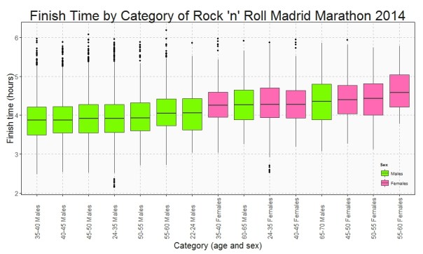
This is the Box plot of the finish time by category:

Finish Time

Who maintains the rhythm better? Since I have the time at the end and at the middle (21.097 km), I can do a Box plot with the variation time between first and second half of the Marathon:

Variation Time

Only a handful of people pull out of the Marathon before finishing but once again this rate is not the same between categories. This is the survival rate by category along the race:

Survival Rate

This plots show some interesting things:

  • Fastest category is 35-40 years old for both genders
  • Fastest individuals are inside 24-35 years old for both genders
  • Youngest ages are not the fastest
  • Between 40-45 category is the second fastest for men and the third one for women
  • Females between 40-45 keep the most constant rhythm of all categories.
  • Young men between 22-24 years old are the most unconstant: their second half rhythm is much slower than the first one.
  • All females between 55-60 years old ended the marathon
  • On the other hand, males between 60-65 are the category with most ‘deads’ during the race

Long life forties:

library(rvest)
library(lubridate)
library(ggplot2)
library(plyr)
library(sqldf)
library(scales)
library(gplots)
setwd("YOUR WORKING DIRECTORY HERE")
maraton_web="http://www.maratonmadrid.org/resultados/clasificacion.asp?carrera=13&parcial=par1&clasificacion=1&dorsal=&nombre=&apellidos=&pais=&pagina=par2"
#Grid with parameters to navigate in the web to do webscraping
searchdf=rbind(expand.grid( 1, 0:32), expand.grid( 2, 0:55), expand.grid( 3, 0:56), expand.grid( 4, 0:56),
               expand.grid( 5, 0:56), expand.grid( 6, 0:55), expand.grid( 7, 0:55), expand.grid( 8, 0:55),
               expand.grid( 9, 0:53), expand.grid(10, 0:55))
colnames(searchdf)=c("parcial", "pagina")
#Webscraping. I open the webpage and download the related table with partial results
results=data.frame()
for (i in 1:nrow(searchdf))
{
  maraton_tmp=gsub("par2", searchdf[i,2], gsub("par1", searchdf[i,1], maraton_web))
  df_tmp=html(maraton_tmp) %>% html_nodes("table") %>% .[[3]] %>% html_table()
  results=rbind(results, data.frame(searchdf[i,1], df_tmp[,1:7]))
}
#Name the columns
colnames(results)=c("Partial", "Place", "Bib", "Name", "Surname", "Cat", "Gross", "Net")
#Since downloadind data takes time, I save results in RData format
save(results, file="results.RData")
load("results.RData")
#Translate Net timestamp variable into hours
results$NetH=as.numeric(dhours(hour(hms(results$Net)))+dminutes(minute(hms(results$Net)))+dseconds(second(hms(results$Net))))/3600
results$Sex=substr(results$Cat, 3, 4)
#Translate Cat into years and gender
results$Cat2=revalue(results$Cat, 
                     c("A-F"="18-22 Females", "A-M"="18-22 Males", "B-F"="22-24 Females", "B-M"="22-24 Males", "C-F"="24-35 Females", "C-M"="24-35 Males", 
                       "D-F"="35-40 Females", "D-M"="35-40 Males", "E-F"="40-45 Females", "E-M"="40-45 Males", "F-F"="45-50 Females", "F-M"="45-50 Males", 
                       "G-F"="50-55 Females", "G-M"="50-55 Males", "H-F"="55-60 Females", "H-M"="55-60 Males", "I-F"="60-65 Females", "I-M"="60-65 Males", 
                       "J-F"="65-70 Females", "J-M"="65-70 Males", "K-F"="+70 Females", "K-M"="+70 Males"))
#Translate partial code into kilometers
results$PartialKm=mapvalues(results$Partial, from = c(1, 2, 3, 4, 5, 6, 7, 8, 9, 10), to = c(5, 10, 15, 20, 21.097, 25, 30, 35, 40, 42.195))
#There are some categories with very few participants. I will remove from the analysis
count(subset(results, Partial==10), "Cat")
#General options for ggplot
opts=theme(
  panel.background = element_rect(fill="gray98"),
  panel.border = element_rect(colour="black", fill=NA),
  axis.line = element_line(size = 0.5, colour = "black"),
  axis.ticks = element_line(colour="black"),
  panel.grid.major = element_line(colour="gray75", linetype = 2),
  panel.grid.minor = element_blank(),
  axis.text = element_text(colour="gray25", size=15),
  axis.title = element_text(size=20, colour="gray10"),
  legend.key = element_blank(),
  legend.background = element_blank(),
  plot.title = element_text(size = 32, colour="gray10"))
#Data set with finish times
results1=subset(results, Partial==10 & !(Cat %in% c("A-F", "A-M", "B-F", "I-F", "J-F", "K-F", "K-M")))
ggplot(results1, aes(x=reorder(Cat2, NetH, FUN=median), y=NetH)) + geom_boxplot(aes(fill=Sex), colour = "gray25")+
  scale_fill_manual(values=c("hotpink", "lawngreen"), name="Sex", breaks=c("M", "F"), labels=c("Males", "Females"))+
  labs(title="Finish Time by Category of Rock 'n' Roll Madrid Marathon 2014", x="Category (age and sex)", y="Finish time (hours)")+
  theme(axis.text.x = element_text(angle = 90, vjust=.5, hjust = 0), legend.justification=c(1,0), legend.position=c(1,0))+opts
#Data set with variation times
results2=sqldf("SELECT 
               a.Bib, a.Sex, b.Cat2, (a.NetH-2*b.NetH)*60 as VarMin
               FROM results1 a INNER JOIN results b ON (a.Bib = b.Bib AND b.Partial=5) order by VarMin asc")
ggplot(results2, aes(x=reorder(Cat2, VarMin, FUN=median), y=VarMin)) + geom_boxplot(aes(fill=Sex))+
  scale_fill_manual(values=c("hotpink", "lawngreen"), name="Sex", breaks=c("M", "F"), labels=c("Males", "Females"))+
  labs(title="Time Variation by Category Between First and Last Half\nof Rock 'n' Roll Madrid Marathon 2014", x="Category (age and sex)", y="Variation (minutes)")+
  theme(axis.text.x = element_text(angle = 90, vjust=.5, hjust = 0), legend.justification=c(1,0), legend.position=c(1,0))+opts
 
results3_tmp1=expand.grid(Cat2=unique(results$Cat2), PartialKm=unique(results$PartialKm))
results3_tmp2=sqldf("SELECT Bib, Sex, Cat2, Max(PartialKm) as PartialKmMax FROM results 
                   WHERE Cat NOT IN ('A-F', 'A-M', 'B-F', 'I-F', 'J-F', 'K-F', 'K-M') GROUP BY 1,2,3")
results3_tmp3=sqldf("SELECT PartialKmMax, Sex, Cat2, COUNT(*) AS Runners FROM results3_tmp2 GROUP BY 1,2,3")
results3_tmp4=sqldf("SELECT a.Cat2, a.PartialKm, SUM(Runners) as Runners FROM results3_tmp1 a INNER JOIN results3_tmp3 b
                    on (a.Cat2 = b.Cat2 AND b.PartialKmMax>=a.PartialKm) 
                    GROUP BY 1,2")
#Data set with survival rates
results3=sqldf("SELECT a.Cat2, a.PartialKm, a.Runners*1.00/b.Runners*1.00 as Po_Survivors
               FROM results3_tmp4 a INNER JOIN (SELECT Cat2, COUNT(*) as Runners FROM results3_tmp2 GROUP BY 1) b
               ON (a.Cat2 = b.Cat2)")
ggplot(results3, aes(x=PartialKm, y=Po_Survivors, group=Cat2, colour=Cat2)) + geom_line(lwd=3)+
  scale_color_manual(values=alpha(rich.colors(15, palette="temperature"), 0.3), name="Category")+
  scale_x_continuous(breaks = unique(results3$PartialKm), labels=c("5", "10", "15", "20", "21.097", "25", "30", "35", "40", "42.195"))+
  scale_y_continuous(labels = percent)+
  labs(title="Survival Rate by Category of Rock 'n' Roll Madrid Marathon 2014", x="Kilometer", y="% of survivors")+
  theme(axis.text.x = element_text(angle = 90, vjust=.5, hjust = 0), legend.justification=c(1,0), legend.position=c(.15,0))+opts