All posts by @aschinchon

Circlizing Numbers

She makes the sound the sea makes to calm me down (Dissolve Me, Alt-J)

Searching how to do draw chord diagrams in the Internet with ggplot2 I found a very-easy-to-use package called circlize which does exactly that. A chord diagram shows relationships between things so the input to draw it is simply a matrix with the intensity of these relations. In this experiment I use this package to circlize numbers in this way:

  • I take a number with many digits (Rmpfr package is very useful to obtain large numbers), I convert it to text and remove punctuation characters (necessary if number has decimals)
  • Function CreateAdjacencyMatrix creates a 10×10 matrix where the element [i,j] contains the number of times that number “i” precedes to number “j” in the previous string (i and j from 0 to 9); this is the input to create diagram.

These diagrams are the result of circlizing four famous constants: Pi (green), Gamma (purple), Catalan (blue) and Logarithm constants (red):

Chords

Just two conclusions of my own to end:

  • Circlize package is very easy to use and generates very nice diagrams
  • Chord diagrams remember me to dreamcatchers
  • The more I use RColorBrewer package the more I like it

This is the code to circlize numbers:

library(Rmpfr)
library(circlize)
library(RColorBrewer)
CreateAdjacencyMatrix = function(x) {
 s=gsub("\\.", "", x)
 m=matrix(0, 10, 10)
 for (i in 1:(nchar(s)-1)) m[as.numeric(substr(s, i, i))+1, as.numeric(substr(s, i+1, i+1))+1]=m[as.numeric(substr(s, i, i))+1, as.numeric(substr(s, i+1, i+1))+1]+1
 rownames(m) = 0:9;colnames(m) = 0:9
 m}
m1=CreateAdjacencyMatrix(formatMpfr(Const("pi",2000)))
m2=CreateAdjacencyMatrix(formatMpfr(Const("gamma",2000)))
m3=CreateAdjacencyMatrix(formatMpfr(Const("catalan",2000)))
m4=CreateAdjacencyMatrix(formatMpfr(Const("log2",2000)))
jpeg(filename = "Chords.jpg", width = 800, height = 800, quality = 100)
par(mfrow=c(2,2), mar = c(1, 1, 1, 1))
chordDiagram(m1, grid.col = "darkgreen",
 col = colorRamp2(quantile(m1, seq(0, 1, by = 0.25)), brewer.pal(5,"Greens")),
 transparency = 0.4, annotationTrack = c("name", "grid"))
chordDiagram(m2, grid.col = "mediumpurple4",
 col = colorRamp2(quantile(m2, seq(0, 1, by = 0.25)), brewer.pal(5,"Purples")),
 transparency = 0.4, annotationTrack = c("name", "grid"))
chordDiagram(m3, grid.col = "midnightblue",
 col = colorRamp2(quantile(m3, seq(0, 1, by = 0.25)), brewer.pal(5,"Blues")),
 transparency = 0.4, annotationTrack = c("name", "grid"))
chordDiagram(m4, grid.col = "red3",
 col = colorRamp2(quantile(m4, seq(0, 1, by = 0.25)), brewer.pal(5,"Reds")),
 transparency = 0.4, annotationTrack = c("name", "grid"))
dev.off()

Hi

Why do some mathematicians wear a white coat? Are they afraid to be splashed by an integral? (Read on Twitter)

If you run into someone wearing a white coat who tells you something like

e raised to minus 3 by zero point five plus x squared plus y squared between two plus e raised to minus x squared minus y squared between two by cosine of four by x

do not be afraid: is just a harmless mathematician waving to you. Look at this:

HI2

This is the code to draw these mathematical greetings:

levelpersp=function(x, y, z, colors=heat.colors, ...) {
  ## getting the value of the midpoint
  zz=(z[-1,-1] + z[-1,-ncol(z)] + z[-nrow(z),-1] + z[-nrow(z),-ncol(z)])/4
  ## calculating the breaks
  breaks=hist(zz, plot=FALSE)$breaks
  ## cutting up zz
  cols=colors(length(breaks)-1)
  zzz=cut(zz, breaks=breaks, labels=cols)
  ## plotting
  persp(x, y, z, col=as.character(zzz), ...)
}
x=seq(-5, 5, length= 30);y=x
f=function(x,y) {exp(-3*((0.5+x)^2+y^2/2))+exp(-x^2-y^2/2)*cos(4*x)}
z=outer(x, y, f)
z[z>.001]=.001;z[z<0]=z[1,1]
levelpersp(x, y, z, theta = 30, phi = 55, expand = 0.5, axes=FALSE, box=FALSE, shade=.25)

3D-Harmonographs In Motion

I would be delighted to co write a post (Andrew Wyer)

One of the best things about writing a blog is that occasionally you get to know very interesting people. Last October 13th I published this post about the harmonograph, a machine driven by pendulums which creates amazing curves. Two days later someone called Andrew Wyer made this comment about the post:

Hi, I was fascinated by the harmonographs – I remember seeing similar things done on paper on kids tv in the seventies. I took your code and extended it into 3d so I could experiment with the rgl package. I created some beautiful figures (which I would attach if this would let me). In lieu of that here is the code:

I ran his code and I was instantly fascinated: resulting curves were really beautiful. I suggested that we co-write a post and he was delighted with the idea. He proposed to me the following improvement of his own code:

I will try to create an animated gif of one figure

Such a good idea! And no sooner said than done: Andrew rewrote his own code to create stunning animated images of 3D-Harmonograph curves like these:

movie

5hd

6hd

Some keys about the code:

  • Andrew creates 3D curves by adding a third oscillation z generated in the same way as x and y and adds a little colour by setting the colour of each point to a colour in the RGB scale related to its point in 3d space
  • Function spheres3d to produce an interactive plot that you can drag around to view from different angles; function spin3d will rotate the figure around the z axis and at 5 rpm in this case and function movie3d renders each frame in a temporary png file and then calls ImageMagick to stitch them into an animated gif file. It is necessary to install ImageMagick separately to create the movie.
  • Giving it a duration of 12 seconds at 5 rpm is one rotation which at 12 frames per second results in 144 individual png files but these (by default) are temporary and deleted when the gif is produced.

Although I don’t know Andrew personally, I know he is a good partner to work with. Thanks a lot for sharing this work of art with me and allowing me to share it in Ripples as well.

Here you have the code. I like to imagine these curves as orbits of unexplored planets in a galaxy far, far away …

library(rgl)
library(scatterplot3d)
#Extending the harmonograph into 3d
#Antonio's functions creating the oscillations
xt = function(t) exp(-d1*t)*sin(t*f1+p1)+exp(-d2*t)*sin(t*f2+p2)
yt = function(t) exp(-d3*t)*sin(t*f3+p3)+exp(-d4*t)*sin(t*f4+p4)
#Plus one more
zt = function(t) exp(-d5*t)*sin(t*f5+p5)+exp(-d6*t)*sin(t*f6+p6)
#Sequence to plot over
t=seq(1, 100, by=.001)
#generate some random inputs
f1=jitter(sample(c(2,3),1))
f2=jitter(sample(c(2,3),1))
f3=jitter(sample(c(2,3),1))
f4=jitter(sample(c(2,3),1))
f5=jitter(sample(c(2,3),1))
f6=jitter(sample(c(2,3),1))
d1=runif(1,0,1e-02)
d2=runif(1,0,1e-02)
d3=runif(1,0,1e-02)
d4=runif(1,0,1e-02)
d5=runif(1,0,1e-02)
d6=runif(1,0,1e-02)
p1=runif(1,0,pi)
p2=runif(1,0,pi)
p3=runif(1,0,pi)
p4=runif(1,0,pi)
p5=runif(1,0,pi)
p6=runif(1,0,pi)
#and turn them into oscillations
x = xt(t)
y = yt(t)
z = zt(t)
#create values for colours normalised and related to x,y,z coordinates
cr = abs(z)/max(abs(z))
cg = abs(x)/max(abs(x))
cb = abs(y)/max(abs(y))
dat=data.frame(t, x, y, z, cr, cg ,cb)
#plot the black and white version
with(dat, scatterplot3d(x,y,z, pch=16,cex.symbols=0.25, axis=FALSE ))
with(dat, scatterplot3d(x,y,z, pch=16, color=rgb(cr,cg,cb),cex.symbols=0.25, axis=FALSE ))
#Set the stage for 3d plots
# clear scene:
clear3d("all")
# white background
bg3d(color="white")
#lights...camera...
light3d()
#action
# draw shperes in an rgl window
spheres3d(x, y, z, radius=0.025, color=rgb(cr,cg,cb))
#create animated gif (call to ImageMagic is automatic)
movie3d( spin3d(axis=c(0,0,1),rpm=5),fps=12, duration=12 )
#2d plots to give plan and elevation shots
plot(x,y,col=rgb(cr,cg,cb),cex=.05)
plot(y,z,col=rgb(cr,cg,cb),cex=.05)
plot(x,z,col=rgb(cr,cg,cb),cex=.05)

A Little Present For Coldplay

Gravity, release me, and don’t ever hold me down, now my feet won’t touch the ground (Coldplay, Life In Technicolor II)

Inspired by this nice post and by this cover of a Coldplay’s album:

20090515-coldplay1

I have dared to do this using ggplot, polar coordinates and Google Fonts:

coldplay

Coldplay: feel free to use it for some future album.

library(ggplot2)
library(extrafont)
windowsFonts(Monoton=windowsFont("Monoton"))
butterfly=function(x) 8-sin(x)+2*sin(3*x)+2*sin(5*x)-sin(7*x)+3*cos(2*x)-2*cos(4*x)
opt=theme(legend.position="none",
          panel.background = element_rect(fill="black"),
          panel.grid = element_blank(),
          axis.ticks=element_blank(),
          axis.title=element_blank(),
          axis.text =element_blank())
ggplot(data.frame(x = c(0, 2*pi)), aes(x)) +
  stat_function(fun=butterfly, geom="density", fill="#FC0C54", colour="#FC0C54") +
  coord_polar(start=-pi)+
  geom_text(x=.5, y=-14, colour="turquoise2", family="Monoton", label="COLDPLAY", size=12)+
  geom_text(x=1.5, y=14, colour="turquoise2", family="Monoton", angle=90, label="Up Down Up Down Up Down", size=6)+
  opt

Size Doesn’t Matter

An invisible red thread connects those destined to meet, regardless of time, place or circumstances. The thread may stretch or tangle, but never break (Ancient Chinese Legend)

I use to play once a year with my friends to Secret Santa (in Spain we call it Amigo Invisible). As you can read in Wikipedia:

Secret Santa is a Western Christmas tradition in which members of a group or community are randomly assigned a person to whom they anonymously give a gift. Often practiced in workplaces or amongst large families, participation in it is usually voluntary. It offers a way for many people to give and receive a gift at low cost, since the alternative gift tradition is for each person to buy gifts for every other person. In this way, the Secret Santa tradition also encourages gift exchange groups whose members are not close enough to participate in the alternative tradition of giving presents to everyone else.

To decide who gives whom, every year is the same: one of us introduces small papers in a bag with the names of participants (one name per paper). Then, each of us picks one paper and sees the name privately. If no one picks their own name,  the distribution is valid. If not, we have to start over. Every year we have to repeat process several times until obtaining a valid distribution. Why? Because we are victims of The Matching Problem.

Following the spirit of this talk I have done 16 simulations of the matching problem (for 10, 20, 30 … to 160 items). For example, given n items, I generate 5.000 random vectors sampling without replacement the set of natural numbers from 1 to n. Comparing these random vectors with the ordered one (1,2, …, n) I obtain number of matchings (that is, number of times where ith element of the random vector is equal to i). This is the result of the experiment:

matching

In spite of each of one represents a different number of matchings, all plots are extremely similar. All of them say that probability of not matching any two identical items is around 36% (look at the first bar of all of them). In concrete terms, this probability tends to 1/e (=36,8%) as n increases but does it very quickly.

This result is shocking. It means that if some day the 7 billion people of the world agree to play Secret Santa all together (how nice it would be!), the probability that at least one person chooses his/her own name is around 2/3. Absolutely amazing.

This is the code (note: all lines except two are for plotting):

library(ggplot2)
library(scales)
library(RColorBrewer)
library(gridExtra)
library(extrafont)
results=data.frame(size=numeric(0), x=numeric(0))
for (i in seq(10, by=10, length.out = 16)){results=rbind(results, data.frame(size=i, x=replicate(5000, {sum(seq(1:i)-sample(seq(1:i), size=i, replace=FALSE)==0)})))}
opts=theme(
  panel.background = element_rect(fill="gray98"),
  panel.border = element_rect(colour="black", fill=NA),
  axis.line = element_line(size = 0.5, colour = "black"),
  axis.ticks = element_line(colour="black"),
  panel.grid.major.y = element_line(colour="gray80"),
  panel.grid.major.x = element_blank(),
  panel.grid.minor = element_blank(),
  axis.text.y = element_text(colour="gray25", size=15),
  axis.text.x = element_text(colour="gray25", size=15),
  text = element_text(family="Humor Sans", size=15, colour="gray25"),
  legend.key = element_blank(),
  legend.position = "none",
  legend.background = element_blank(),
  plot.title = element_text(size = 18))
sizes=unique(results$size)
for (i in 1:length(sizes))
{
  data=subset(results, size==sizes[i])
  assign(paste("g", i, sep=""),
         ggplot(data, aes(x=as.factor(x), weight=1/nrow(data)))+
           geom_bar(binwidth=.5, fill=sample(brewer.pal(9,"Set1"), 1), alpha=.85, colour="gray50")+
           scale_y_continuous(limits=c(0,.4), expand = c(0, 0), "Probability", labels = percent)+
           scale_x_discrete(limit =as.factor(0:8), expand = c(0, 0), "Number of matches")+
           labs(title = paste("Matching", as.character(sizes[i]), "items ...", sep=" "))+
           opts)
}
grid.arrange(g1, g2, g3, g4, g5, g6, g7, g8, g9, g10, g11, g12, g13, g14, g15, g16, ncol=4)

The World We Live In #2: To Study Or To Work

I was getting ready for school and about to wear my uniform when I remembered that our principal had told us not to wear uniforms. So I decided to wear my favorite pink dress (Malala Yousafzai)

After reading the diary of a Pakistani schoolgirl and Malala’s history, there is no doubt of being in front of a brave girl. A girl that will fight against monsters who deprive children of their childhood. A girl who knows that one book, one pen, one child and one teacher can change this unfair world. A girl who knew she had won the Nobel Prize of Peace in her chemistry lesson and finished the school time before making her first statement. A girl for whom the prize is just the beginning: a girl that gives us hope. Long live Malala:
TWWLI2
To know where to obtain data for this plot, check out this post. This is the code:

require("sqldf")
require("plyr")
require("stringdist")
childlabour=read.csv("UNdata_Export_20141013_ChildLabour.csv", nrows=335, header=T, row.names=NULL)
education=read.csv("UNdata_Export_20141013_Education.csv", nrows=2994, header=T, row.names=NULL)
population =read.csv("UNdata_Export_20140930_Population.csv",  nrows=12846, header=T, row.names=NULL)
population=rename(population, replace = c("Country.or.Area" = "Country"))
education=rename(education, replace = c("Reference.Area" = "Country"))
education=rename(education, replace = c("Time.Period" = "Year"))
childlabour=rename(childlabour, replace = c("Country.or.Area" = "Country"))
population=sqldf("SELECT a.Country, a.Year, a.Value as Pop
FROM population a INNER JOIN (SELECT Country, MAX(Year) AS Year FROM population GROUP BY 1) b
ON (a.Country=b.Country AND a.Year=b.Year)
WHERE (a.Country NOT LIKE '%INCOME%')
AND (a.Country NOT LIKE '%WORLD%')
AND (a.Country NOT LIKE '%developing%')
AND (a.Country NOT LIKE '%OECD%')
AND (a.Country NOT LIKE '%countries%')
AND (a.Country NOT LIKE '%South Asia%')
AND (a.Country NOT LIKE '%Small states%')
AND (a.Country NOT LIKE '%Euro area%')
AND (a.Country NOT LIKE '%European Union%')
AND (a.Country NOT LIKE '%North America%')")
childlabour=sqldf("SELECT * FROM childlabour WHERE Subgroup='Total 5-14 yr'")
education=sqldf("SELECT a.* FROM education a INNER JOIN (SELECT Country, MAX(Year) AS Year FROM education GROUP BY 1) b
ON (a.Country=b.Country AND a.Year=b.Year)")
data=sqldf("SELECT a.Country, a.Pop, b.Value as ChildLabour, c.Observation_Value as Education
FROM
population a INNER JOIN childlabour b
ON (a.Country=b.Country) INNER JOIN education c
ON (a.Country=c.Country)")
require(ggplot2)
require(scales)
opts=theme(
panel.background = element_rect(fill="gray98"),
panel.border = element_rect(colour="black", fill=NA),
axis.line = element_line(size = 0.5, colour = "black"),
axis.ticks = element_line(colour="black"),
panel.grid.major = element_line(colour="gray75", linetype = 2),
panel.grid.minor = element_blank(),
axis.text.y = element_text(colour="gray25", size=15),
axis.text.x = element_text(colour="gray25", size=15),
text = element_text(size=20),
legend.key = element_blank(),
legend.position = "none",
legend.background = element_blank(),
plot.title = element_text(size = 45)
)
ggplot(data, aes(x=ChildLabour/100, y=Education/100, size=log(Pop), label=Country), guide=FALSE)+
geom_point(colour="white", fill="red", shape=21, alpha=.55)+
scale_size_continuous(range=c(2,40))+
scale_x_continuous(limits=c(0,.5), labels = percent)+
scale_y_continuous(limits=c(0,.12), labels = percent)+
labs(title="The World We Live In #2: To Study Or To Work",
x="% of Child Workers between 5-14 years old",
y="Public Expenditure on Education as % of GNI")+
geom_text(data=subset(data, ChildLabour/100>.3 | Education/100>.07| Education/10<.022), size=5.5, colour="gray25", hjust=0, vjust=0)+
geom_text(aes(.2, .0), colour="gray25", hjust=0, label="Countries of the world (Source: United Nations Statistics Division) Size of bubble depending on population", size=5)+
opts

Beautiful Curves: The Harmonograph

Each of us has their own mappa mundi (Gala, my indispensable friend)

The harmonograph is a mechanism which, by means of several pendulums, draws trajectories that can be analyzed not only from a mathematical point of view but also from an artistic one. In its double pendulum version, one pendulum moves a pencil and the other one moves a platform with a piece of paper on it. You can see an example here. The harmonograph is easy to use: you only have to put pendulums into motion and wait for them to stop. The result are amazing undulating drawings like this one:

grafico0x2First harmonographs were built in 1857 by Scottish mathematician Hugh Blackburn, based on the previous work of French mathematician Jean Antoine Lissajous. There is not an unique way to describe mathematically the motion of the pencil. I have implemented the one I found in this sensational blog, where motion in both x and y axis depending on time is defined by:

<br /> x(t)=e^{-d_{1}t}sin(f_{1}t+p_{1})+e^{-d_{2}t}sin(f_{2}t+p_{2})\\<br /> y(t)=e^{-d_{3}t}sin(f_{3}t+p_{3})+e^{-d_{4}t}sin(f_{4}t+p_{4})<br />

I initialize parameters randomly so every time you run the script, you obtain a different output. Here is a mosaic with some of mine:
Collage3

This is the code to simulate the harmonograph (no extra package is required). If you create some nice work of art, I will be very happy to admire it (you can find my email here):

f1=jitter(sample(c(2,3),1));f2=jitter(sample(c(2,3),1));f3=jitter(sample(c(2,3),1));f4=jitter(sample(c(2,3),1))
d1=runif(1,0,1e-02);d2=runif(1,0,1e-02);d3=runif(1,0,1e-02);d4=runif(1,0,1e-02)
p1=runif(1,0,pi);p2=runif(1,0,pi);p3=runif(1,0,pi);p4=runif(1,0,pi)
xt = function(t) exp(-d1*t)*sin(t*f1+p1)+exp(-d2*t)*sin(t*f2+p2)
yt = function(t) exp(-d3*t)*sin(t*f3+p3)+exp(-d4*t)*sin(t*f4+p4)
t=seq(1, 100, by=.001)
dat=data.frame(t=t, x=xt(t), y=yt(t))
with(dat, plot(x,y, type="l", xlim =c(-2,2), ylim =c(-2,2), xlab = "", ylab = "", xaxt='n', yaxt='n'))

The World We Live In #1: Obesity And Cells

Lesson learned, and the wheels keep turning (The Killers – The world we live in)

I discovered this site with a huge amount of data waiting to be analyzed. The first thing I’ve done is this simple graph, where you can see relationship between cellular subscribers and obese people. Bubbles are countries and its size depends on the population:
TWWLI1
Some quick conclusions:

  • The more cellular subscribers, the more obese people
  • Pacific islands such as Kiribati, Palau and Tonga are plenty of happy people
  • Singapore people are thinner than they should be
  • How do Saudi Arabian and Panamanian manage two cellulars?

This is the world we live in.

cellular  =read.csv("UNdata_Export_20140930_cellular.csv",   nrows=193,   header=T, row.names=NULL)
obese     =read.csv("UNdata_Export_20140930_obese.csv",      nrows=567,   header=T, row.names=NULL)
population=read.csv("UNdata_Export_20140930_population.csv", nrows=12846, header=T, row.names=NULL)
require("sqldf")
require("plyr")
population=rename(population, replace = c("Country.or.Area" = "Country"))
population=sqldf("SELECT a.Country, a.Year, a.Value as Population
FROM population a INNER JOIN (SELECT Country, MAX(Year) AS Year FROM population GROUP BY 1) b
      ON (a.Country=b.Country AND a.Year=b.Year)")
cellular=rename(cellular, replace = c("Country.or.Area" = "Country"))
cellular=rename(cellular, replace = c("Value" = "Cellular"))
obese=rename(obese, replace = c("Country.or.Area" = "Country"))
obese=rename(obese, replace = c("Year.s." = "Year"))
obese=sqldf("SELECT a.Country, a.Year, SUBSTR(TRIM(Value), 1, CHARINDEX(' [', TRIM(Value))) as Obeses
FROM obese a INNER JOIN (SELECT Country, MAX(Year) AS Year FROM obese WHERE GENDER='Both sexes' GROUP BY 1) b
ON (a.Country=b.Country AND a.Year=b.Year AND a.GENDER='Both sexes')")
obese$Obeses=as.numeric(obese$Obeses)
data=sqldf("SELECT a.Country, a.Cellular, c.Obeses, b.Population FROM cellular a inner join population b on a.Country = b.Country
      inner join obese c on (a.Country = c.Country) WHERE a.Country NOT IN ('World', 'South Asia')")
require(ggplot2)
require(scales)
opts=theme(
  panel.background = element_rect(fill="gray98"),
  panel.border = element_rect(colour="black", fill=NA),
  axis.line = element_line(size = 0.5, colour = "black"),
  axis.ticks = element_line(colour="black"),
  panel.grid.major = element_line(colour="gray75", linetype = 2),
  panel.grid.minor = element_blank(),
  axis.text.y = element_text(colour="gray25", size=15),
  axis.text.x = element_text(colour="gray25", size=15),
  text = element_text(size=20),
  legend.key = element_blank(),
  legend.position = "none",
  legend.background = element_blank(),
  plot.title = element_text(size = 45)
    )
ggplot(data, aes(x=Cellular/100, y=Obeses/100, size=Population, label=Country), guide=FALSE)+
  geom_point(colour="white", fill="red", shape=21, alpha=.65)+
  scale_size_continuous(range=c(3,35))+
  scale_x_continuous(limits=c(0,2.1), labels = percent)+
  scale_y_continuous(limits=c(0,.6), labels = percent)+
  labs(title="The World We Live In #1: Obesity And Cells",
       x="Cellular Subscribers (per 100 population)",
       y="Adults aged >= 20 years who are obese (%)")+
  geom_text(data=subset(data, Cellular/100 > 1.9 | Obeses/100 > .4 | (Cellular/100 > 1.4 & Obeses/100 < .15)), size=5, colour="gray25", hjust=0, vjust=0)+
  geom_text(aes(.9, .0), colour="blue", hjust=0, label="World's Countries (Source: United Nations Statistics Division. Size of bubble depending on population", size=4)+
  opts

Complex Domain Coloring

Why don’t you stop doodling and start writing serious posts in your blog? (Cecilia, my beautiful wife)

Choose a function, apply it to a set of complex numbers, paint  the result using the HSV technique and be ready to be impressed because images can be absolutely amazing. You only need ggplot2 package and your imagination. This is what happens when function is f(x)=(1+i)log(sin((x3-1)/x)):
ComplexDomainColoring

To learn more about complex domain coloring, you can go here. If you want to try your own functions, you can find the code below. I will try to write a serious post next time but meanwhile, long live doodles!

require(ggplot2)
f = function(x) (1+1i)*log(sin((x^3-1)/x))
z=as.vector(outer(seq(-5, 5, by =.01),1i*seq(-5, 5, by =.01),'+'))
z=data.frame(x=Re(z),
y=Im(z),
h=(Arg(f(z))<0)*1+Arg(f(z))/(2*pi),
s=(1+sin(2*pi*log(1+Mod(f(z)))))/2,
v=(1+cos(2*pi*log(1+Mod(f(z)))))/2)
z=z[is.finite(apply(z,1,sum)),]
opt=theme(legend.position="none",
panel.background = element_blank(),
panel.grid = element_blank(),
axis.ticks=element_blank(),
axis.title=element_blank(),
axis.text =element_blank())
ggplot(data=z, aes(x=x, y=y)) + geom_tile(fill=hsv(z$h,z$s,z$v))+ opt

PageRank For SQL Lovers

If you’re changing the world, you’re working on important things. You’re excited to get up in the morning (Larry Page, CEO and Co-Founder of Google)

This is my particular tribute to one of the most important, influential and life-changer R packages I have discovered in the last times: sqldf package.

Because of my job, transforming data through SQL queries is very natural for me. This, together with the power of R made this package indispensable for me since I knew of its existence.

Imagine you have a directed graph like this:PR1

Given a vertex V, these are the steps to calculate its PageRank, lets call it PR(V):

  • Initialize PR(V) to some value (I do it to 1 in my script)
  • Iterate this formula until converges: PR(V)=(1-d)+d*(PR(T1)/C(T1)+ ... +PR(Tn)/C(Tn)) where Ti are the vertex that point to V and C(Ti) is the number of edges going out of Ti

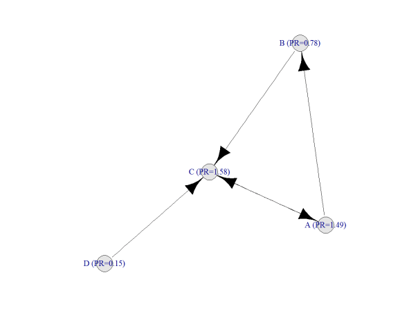
After doing this, result is:

PR2

Following you can find my code to do it with sqldf, which is quite simple from my point of view. I am pretty sure there must be some package which calculates PageRank but the main goal of this post is to show how easy is to calculate it with two simple queries, no more. The example is taken from here, where you can find a good explanation of how PageRank works:

require(sqldf)
require(igraph)
net=data.frame(origin=c("A","A","B","C","D"), end=c("C","B","C","A","C"))
par(family="serif", cex=1, ps=25, bg="white", col.lab="black", col.axis="black")
plot(graph.edgelist(as.matrix(net)), edge.arrow.size=1, vertex.color="gray90", edge.color="black")
#Initialization
netou=sqldf("SELECT origin, COUNT(*) outs FROM net GROUP BY 1")
netpr=sqldf("SELECT origin vertex, 1.0 pagerank FROM net UNION SELECT end, 1.0 FROM net")
for (i in 1:50)
{
netx1=sqldf("SELECT vertex, pagerank/outs factor FROM netou a INNER JOIN netpr b ON (a.origin = b.vertex)")
netpr=sqldf("SELECT a.vertex, 0.15+SUM(0.85*COALESCE(factor,0)) AS pagerank
FROM netpr a LEFT OUTER JOIN net b ON (a.vertex = b.end) LEFT OUTER JOIN netx1 c
ON (b.origin = c.vertex) GROUP BY 1")
}
g=graph.edgelist(as.matrix(net))
names=data.frame(vertex=V(g)$name)
V(g)$name=sqldf("SELECT a.vertex||' (PR='||ROUND(b.pagerank,2)||')' as name from names a inner join netpr b ON (a.vertex=b.vertex)")$name
plot(g, edge.arrow.size=1, vertex.color="gray90", edge.color="black")