For a lonely soul, you’re having such a nice time (Nothing in my way, Keane)
In my previous post, I created the P2 Penrose tessellation according to the instructions of this post. Now it’s time to create the P3 tessellation following the same technique I described already. This is the image of the P3 tessellation:
Note that all tiles are rhombuses. I recognize that I like the P3 more than the P2, I do not really why. What about you? Here you have the code to play with it if you want.
Agarrada a mis costillas le cuelgan las piernas (Godzilla, Leiva)
Penrose tilings are amazing. Apart of the inner beauty of tesselations, they have two interesting properties: they are non-periodic (they lack any translational symmetry) and self-similar (any finite region appears an infinite number of times in the tiling). Both characteristics make them a kind of chaotical as well as ordered mathematical object that make them really appealing.
In this experiment I create Penrose tilings. Concretely, the P2 tiling, according to this article from Simon Tatham, that I will follow and provides a perfect explanation of how these tessellations can be constructed. The code is available here, and you can use it to create Penrose tilings like this one:
I will not explain in depth how to build the P2 tiling, since the article I mentioned before does it perfectly. Instead of that, I will give some highlights of the process together with a brief explanation of the code involved in it.
Everything has to do with triangles. Concretely, everything has to do with two types of triangles. To differenciate them I name their sides with numbers. The first triangle has labels 1, 2 and 3 and the other one has labels 1, 2 and 4. Two triangles of type 123 forms a kyte like this:
On the other hand, two triangles of type 124 forms a dart like this:
Actually, kites and darts don’t contain their inner segments so both of them are polygons of 4 sides. The building of a Penrose tiling is an iterative process that begins with 5 kites (i.e. 10 triangles of type 123) gathered like this:
You can start with many other patterns but this one will result in a round shape tiling and I like it. I build the tiling by subdividing triangles as Simon describes in his article. A triangle of type 123 is subdivided into three triangles: two of type 123 and one of type 124. The following image shows a 123 triangle (left) and the result after its division (right):
A triangle of type 124 is subdivided into two triangles: one of type 123 and one of type 124. The following image shows a 124 triangle (left) and the result after its division (right):
In each iteration, all triangles are subdivided according its type. After 5 iterations, the resulting pattern is like this:
To make calculations easier I arranged the data frame following a segment structure, in which the sides of triangles are defined by two coordinates: (x, y) and (xend, yend). The bad side of it is that I have rounding problems after making some iterations. It makes the points that would be the same differs slightly because they come from different triangles. I fix it using a hierarchical clustering and substituting points by its centroids after cutting up the dendogram using a very low thresold. Once this problem is solved I can remove the inner segments of all kites and darts, which are segments of type 3 or 4. Apart of removing them, I join the xx triengles to form 4-sides polygons. All these tasks are done with the function Arrange_df (remember that the code is here). This is the result:
This pattern is quite similar to its previous one but now the data frame is ready to be arranged as a polygon using the function Create_Polygon. At least, I calculate the area of each polygon with the Shoelace formula to create a columns called area which I use to fill polygons with two nice colors.
I hope that these explanations will help you to understand and improve the code as well as to invite you to create your own Penrose tilings.
La luna es un pozo chico las flores no valen nada lo que valen son tus brazos cuando de noche me abrazan (Zorongo Gitano, Carmen Linares)
When I publish a post showing my drawings, I use to place some outputs, give some highlights about the techniques involved as well as a link to the R code that I write to generate them. That’s my typical generative-art post (here you have an example of it). I think that my audience knows to program in R and is curious enough to run and modify the code by themselves to generate their own outputs. Today I will try to be more educational and will explain step by step how you can obtain drawings like these:
There are two reasons for this decision:
It can illustrate quite well my mental journey from a simple idea to what I think is a interesting enough experiment to publish.
I think that this experiment is a good example of the use of accumulate, a very useful function from the life-changingpurrr package.
Here we go: there are many ways of drawing a pentagon in R. Following you will find a piece of code that does it using accumulate function from purrr package. I will use only two libraries for this experiment: ggplot2 and purrr so I will just load in the tidyverse (both libraries take part of it):
The function accumulate applies sequentially some function a number of times storing all the intermediate results. When I say sequentially I mean that the input of any step is the output of the prevoius one. The accumulate function uses internally two important arguments called .x and .y: my own way to understand its significance is that .x is the previous value of the output vector and .y is the previous value of the one which controls the iteration. Let’s see a example: imagine that I want to create a vector with the first 10 natural numbers. This is an option:
> accumulate(1:10, ~.y)
 [1]  1  2  3  4  5  6  7  8  9 10
The vector which controls the iteration in this case is 1:10 and .y are the values of it so I just have to define a function wich returns that values and this is as simple as ~.y. The first iteration takes the first element of that vector. This is another way to do it:
To replicate the same output with .x I have to change a bit the function to ~.x+1 because if not, it will always return 1. Remember that .x is the previous output of the function and it is initialized with 1 (the first value of the vector 1:10). Intead of initializing .x with the first value of the vector of the first argument of accumulate, you can define exactly its first value using .init:
Note that using .init I have to change the vector to reproduce the same output as before. I hope now you will understand how I generated the initial and ending points of the previous pentagon. Some points to help you if not:
I generate a tibble with 5 rows, each of one defines a different segment of the pentagon
First segments starts at (0,0)
The rotating angle is equal to 2*pi/5
The ending point of each segment becomes the starting point of the following one
The next step is to encapsulate this into a function to draw regular polygons with any given number of edges. I only have to generalize the number of steps and the rotating angle of accumulate:
Now, let’s place another segment in the middle of each edge, perpendicular to it towards its centre. To do it I mutate de data frame to add those segments using simple trigonometry: I just have to add pi/2 to the angle wich forms the edge, obtained with atan2 function:
These new segments have longitude equal to 0.2, smaller than the original edges of the pentagon. Now, let’s connect the ending points of these perpendicular segments. It is easy using mutate and first functions. Another smaller pentagon appears:
Since we are repeating these steps many times, I will write two functions: one to generate perpendicular segments to the edges called mid_points and another one to connect its ending points called con_points. The next code creates both funtions and uses them to add another level to our previous drawing:
This pattern is called Sutcliffe pentagon. In the previous step, I did iterations manually. The function accumulate can help us to do it automatically. This code reproduces exactly the previous plot:
Substituting edges by 7 and niter by 6 as well in the first two rows of the previous code, generates a different pattern, in this case heptagonal:
Let’s start to play with the parameters to change the appearance of the drawings. What if we do not start the perpendicular segments from the midpoints of the edges? It’s easy: we just need to add a parameter that will name p to the function mid_points (p=0.5 means starting from the middle). This is our heptagon pattern when p is equal to 0.3:
Another simple modification is to allow any angle between edges and next iteration segments (perpendicular until now ) so let’s add another parameter, called a, to themid_points function:
That’s nice! It looks like a shutter. Now it’s time to change the longitude of the segments starting from the edges (those perpendicular in our first drawings). Now all them measure 0.2. I will take advantage of the parameter y of accumulate and apply a user defined function to modify that longitude each iteration. This example uses the identity function (FUN = function(x) x) to increase longitude step by step:
mid_points <- function(d, p, a, i, FUN = function(x) x) {
  d %>% mutate(
    angle=atan2(yend-y, xend-x) + a,
    radius=FUN(i),
    x=p*x+(1-p)*xend,
    y=p*y+(1-p)*yend,
    xend=x+radius*cos(angle),
    yend=y+radius*sin(angle)) %>%
    select(x, y, xend, yend)
}

edges <- 7
niter <- 18
polygon(edges) -> df1
accumulate(.f = function(old, y) {
  if (y%%2!=0) mid_points(old, 0.3, pi/5, y) else con_points(old)
},
1:niter,
.init=df1) %>%
  bind_rows() -> df
ggplot(df)+
  geom_segment(aes(x=x, y=y, xend=xend, yend=yend))+
  coord_equal()+
  theme_void()
Not bad, but we can do it better. First of all, note that appart of adding transparency with the parameter alpha inside the ggplot function, I changed the geometry of the plot from geom_segment to geom_curve. Setting curvature = 0 as I did generates straight lines so the result is the same as geom_segment but it will give us an additional degree of freedom to do our plots. I also changed the theme_void by an explicit customization some of the elements of the plot. Concretely, I want to be able to change the background color. This is the definitive code explained:
library(tidyverse)

# This function creates the segments of the original polygon
polygon <- function(n) {
  tibble(
    x    = accumulate(1:(n-1), ~.x+cos(.y*2*pi/n), .init = 0),
    y    = accumulate(1:(n-1), ~.x+sin(.y*2*pi/n), .init = 0),
    xend = accumulate(2:n,     ~.x+cos(.y*2*pi/n), .init = cos(2*pi/n)),
    yend = accumulate(2:n,     ~.x+sin(.y*2*pi/n), .init = sin(2*pi/n)))
}

# This function creates segments from some mid-point of the edges
mid_points <- function(d, p, a, i, FUN = ratio_f) {
  d %>% mutate(
    angle=atan2(yend-y, xend-x) + a,
    radius=FUN(i),
    x=p*x+(1-p)*xend,
    y=p*y+(1-p)*yend,
    xend=x+radius*cos(angle),
    yend=y+radius*sin(angle)) %>%
    select(x, y, xend, yend)
}

# This function connect the ending points of mid-segments
con_points <- function(d) {
  d %>% mutate(
    x=xend,
    y=yend,
    xend=lead(x, default=first(x)),
    yend=lead(y, default=first(y))) %>%
    select(x, y, xend, yend)
}

edges <- 3   # Number of edges of the original polygon
niter <- 250 # Number of iterations
pond <- 0.24  # Weight to calculate the point on the middle of each edge
step  <- 13  # No of times to draw mid-segments before connect ending points
alph  <- 0.25 # transparency of curves in geom_curve
angle <- 0.6 # angle of mid-segment with the edge
curv <- 0.1   # Curvature of curves
line_color <- "black" # Color of curves in geom_curve
back_color <- "white" # Background of the ggplot
ratio_f <- function(x) {sin(x)} # To calculate the longitude of mid-segments

# Generation on the fly of the dataset
accumulate(.f = function(old, y) {
  if (y%%step!=0) mid_points(old, pond, angle, y) else con_points(old)
  }, 1:niter,
.init=polygon(edges)) %>% bind_rows() -> df

# Plot
ggplot(df)+
  geom_curve(aes(x=x, y=y, xend=xend, yend=yend),
             curvature = curv,
             color=line_color,
             alpha=alph)+
  coord_equal()+
  theme(legend.position  = "none",
        panel.background = element_rect(fill=back_color),
        plot.background  = element_rect(fill=back_color),
        axis.ticks       = element_blank(),
        panel.grid       = element_blank(),
        axis.title       = element_blank(),
        axis.text        = element_blank())
The next table shows the parameters of each of the previous drawings (from left to right and top to bottom):
edges
niter
pond
step
alph
angle
curv
line_color
back_color
ratio_f
1
4
200
0.92
9
0.50
6.12
0.0
black
white
function (x) { x }
2
5
150
0.72
13
0.35
2.96
0.0
black
white
function (x) { sqrt(x) }
3
15
250
0.67
9
0.15
1.27
1.0
black
white
function (x) { sin(x) }
4
9
150
0.89
14
0.35
3.23
0.0
black
white
function (x) { sin(x) }
5
5
150
0.27
17
0.35
4.62
0.0
black
white
function (x) { log(x + 1) }
6
14
100
0.87
14
0.15
0.57
-2.0
black
white
function (x) { 1 – cos(x)^2 }
7
7
150
0.19
6
0.45
3.59
0.0
black
white
function (x) { 1 – cos(x)^2 }
8
4
150
0.22
10
0.45
4.78
0.0
black
white
function (x) { 1/x }
9
3
250
0.24
13
0.25
0.60
0.1
black
white
function (x) { sin(x) }
You can also play with colors. By the way: this document will help you to choose them by their name. Some examples:
I will not unveil the parameters of the previous drawings. Maybe it can encourage you to try by yourself and find your own patterns. If you do, I will love to see them. I hope you enjoy this reading. The code is also available here.
If I keep holding out, will the light shine through? (Come Back, Pearl Jam)
Imagine that you are writing the story of your life. Almost sure you will make allusions to your parents, but will both of them have the same prominence in your biography or will you spend more words in one of them? In that case, which one will have more relevance? Your father or your mother?
This experiment analyses 118 autobiographies from the Project Gutenberg and count how many times do authors make allusions to their fathers and mothers. This is what I’ve done:
Download all works from Gutenberg Project containing the word autobiography in its title (there are 118 in total).
Count how many times the bigrams my father and my mother appear in each text. This is what I call allusions to father and mother respectively.
The number of allusions that I measure is a lower bound of the exact amount of them since the calculus has some limitations:
Maybe the author refers to them by their names.
After referring to them as my father or my mother, subsequent sentences may refer them as He or She.
Anyway, I think these constrains do not introduce any bias in the calculus since may affect to fathers and mothers equally. Here you can find the dataset I created after downloading all autobiographies and measuring the number of allusions to each parent.
Some results:
64% of autobiographies have more allusions to the father than the mother.
24% of autobiographies have more allusions to the mother than the father.
12% allude them equally.
Most of the works make more allusions to father than to mother. As a visual proof of this fact, the next plot is a histogram of the difference between the amount of allusions to father and mother along the 118 works (# allusions to father – # allusions to mother):
The distribution is clearly right skeweed, which supports our previous results. Another way to see this fact is this last plot, which situates each autobiography in a scatter plot, where X-axis is the amount of allusions to father and Y-axis to mother. It is interactive, so you can navigate through it to see the details of each point (work):
Most of the points (works) are below the diagonal, which means that they contain more allusions to father than mother. Here you can find a full version of the previous plot.
I don’t have any explanation to this fact, just some simple hypothesis:
Fathers and mothers influence their children differently.
Fathers star in more anecdotes than mothers.
This is the effect of patriarchy (72% of authors was born in the XIX century)
Whatever it is the explanation, this experiment shows how easy is to do text mining with R. Special mention to purrr (to iterate eficiently over the set of works IDs), tidytext (to count the number of appearances of bigrams), highcharter (to do the interactive plot) and gutenbergr (to download the books). You can find the code here.
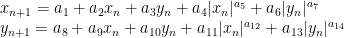
One cannot escape the feeling that these mathematical formulas have an independent existence and an intelligence of their own, that they are wiser than we are, wiser even than their discoverers (Heinrich Hertz)
I love spending my time doing mathematics: transforming formulas into drawings, experimenting with paradoxes, learning new techniques … and R is a perfect tool for doing it. Maths are for me a the best way of escape and evasion from reality. At least, doing maths is a stylish way of wasting my time.
When I read something interesting, many times I feel the desire to try it by myself. That’s what happened to me when I discovered this fabolous book by Julien C. Sprott. I cannot stop doing images with the formulas that contains. Today I present you a mix of mandalas and galaxies that I called Mandalaxies:
This time, the equation that drives these drawings is this one:
where
The equation depends on six parameters (from a1 to a6). Searching randomly for values between -1.2 and 1.3 to each of them, you can generate an infinite number of beautiful images:
Here you can find the code to do your own images. Once again, Rcpp is key to generate the set of points to plot quickly since each of the previous plots contains 4 million points.
Desde que te estoy queriendo yo no sé lo que me pasa cualquier vereda que tomo siempre me lleva a tu casa (Y mira que mira y mira, Camarón de la Isla)
The verses that head this post are taken from a song of Camarón de la Isla and illustrate very well what is a strange attractor in the real life. For non-Spanish speakers a translation is since I’m loving you, I don’t know what happens to me: any path I take, always ends at your house. If you don’t know who is Camarón de la Isla, hear his immense and immortal music.
I will not try to give here a formal definition of a strange attractor. Instead of doing it, I will try to describe them with my own words. A strange attractor can be defined with a system of equations (I don’t know if all strage attractors can be defined like this). These equations determine the trajectory of some initial point along a number of steps. The location of the point at step i, depends on the location of it at step i-1 so the trajectory is calculated sequentially. These are the equations that define the attractor of this experiment:
As you can see there are two equations, describing the location of each coordinate of the point (therefore it is located in a two dimensional space). These equations are impossible to resolve. In other words, you cannot know where will be the point after some iterations directly from its initial location. The adjective attractor comes from the fact of the trajectory of the point tends to be the same independently of its initial location.
Here you have more examples: folds, waterfalls, sand, smoke … images are really appealing:
The code of this experiment is here. You will find there a definition of parameters that produce a nice example image. Some comments:
Each point depends on the previous one, so iteration is mandatory; since each plot involves 10 million points, a very good option to do it efficiently is to use Rcpp, which allows you to iterate directly in C++.
Some points are quite isolated and far from the crowd of points. This is why I locate some breakpoints with quantile to remove tails. If not, the plot may be reduced to a big point.
The key to obtain a nice plot if to find out a good set of parameters (a1 to a14). I have my own method, wich involves the following steps: generate a random value for each between -4 and 4, simulate a mini attractor of only 2000 points and keep it if it doesn’t diverge (i.e. points don’t go to infinite), if x and y are not correlated at all and its kurtosis is bigger than a certain thresold. If the mini attractor overcome these filters, I keep its parameters and generate the big version with 10 million points.
I would have publish this method together with the code but I didn’t. Why? Because this may bring yourself to develop your own since mine one is not ideal. If you are interested in mine, let me know and I will give you more details. If you develop a good method by yourself and don’t mind to share it with me, let me know as well, please.
This post is inspired in this beautiful book from Julien Clinton Sprott. I would love to see your images.
Condenado a estar toda la vida, preparando alguna despedida (Desarraigo, Extremoduro)
I live just a few minutes from the Spanish National Museum of Science and Technology (MUNCYT), where I use to go from time to time with my family. The museum is plenty of interesting artifacts, from a portrait of Albert Einstein made with thousands of small dices to a wind machine to experiment with the Bernoulli’s effect. There is also a device which creates waves. It is formed by a number of sticks, arranged vertically, each of one ending with a ball (so it forms a sort of pin). When you push the start button, all the pins start to move describing circles. Since each pair of consecutive pins are separated by the same angle, the resulting movement imitates a wave. In this experiment I created some other machines. The first one imitates exactly the one of the museum:
If you look carefully only to one pin, you will see how it describes a circle. Each one starts at a different angle and all them move at the same speed. Although an individual pin is pretty boring, all together create a nice pattern. The museum’s machine is formed just by one row of 20 pins. I created a 20×20 grid of pins to make result more appealing.
Playing with the angle between pins you can create another nice patterns like these:
The code is incredibly simple and can be used as a starting point to create much more complicated patterns, changing the speed depending on time or the location of pins. Play with colors or shapes of points, the number of pins or with the separation and speed of them. The magic of movement is created with gganimate package. You can find the code here.
Merry Christmas and Happy New Year. Thanks a lot for reading my posts.
No hables de futuro, es una ilusión cuando el Rock & Roll conquistó mi corazón (El Rompeolas, Loquillo y los Trogloditas)
In this post I create flowers inspired in the Julia Sets, a family of fractal sets obtained from complex numbers, after being iterated by a holomorphic function. Despite of the ugly previous definition, the mechanism to create them is quite simple:
Take a grid of complex numbers between -2 and 2 (both, real and imaginary parts).
Take a function of the form setting parameters and .
Iterate the function over the complex numbers several times. In other words: apply the function on each complex. Apply it again on the output and repeat this process a number of times.
Calculate the modulus of the resulting number.
Represent the initial complex number in a scatter plot where x-axis correspond to the real part and y-axis to the imaginary one. Color the point depending on the modulus of the resulting number after applying the function iteratively.
This image corresponds to a grid of 9 million points and 7 iterations of the function :
To color the points, I pick a random palette from the top list of COLOURLovers site using the colourlovers package. Since each flower involves a huge amount of calculations, I use Reduce to make this process efficiently. More examples:
There are two little Julias in the world whom I would like to dedicate this post. I wish them all the best of the world and I am sure they will discover the beauty of mathematics. These flowers are yours.
¡Hay que ver cómo se estropean los cuerpos! (Pilar, my beloved grandmother)
My grandmother was a master of sewing. When she was young, she worked as dressmaker, and her profession became a hobby with the passage of time. I remember her doing cross-stitch, embroidering tablecloths and doing crochet. I have some of her artworks at home. She spent many hours patiently in silence, moving her knitting needles: my grandmother didn’t use to get bored. As she did with her threads, this drawing is done linking lines:
You can find the code here. If you check it, you will see that the stitches of drawings are defined by a function that I called pattern, which depends on some parameters that I define randomly. This is why each time you run it, you will get a different drawing:
From the technical side, I used accumulate function from purrr package, which makes loops faster and more efficient.
Drawings remind me those I created here, imitating the way that plants arrange their leaves. If you are interesting in using R to create art, check out this free DataCamp’s project.
Sin ese peso ya no hay gravedad
Sin gravedad ya no hay anzuelo
(Mira cómo vuelo, Miss Caffeina)
I love messing around with R to generate mathematical patterns. I always get surprised doing it and gives me lot of satisfaction. I also learn lot of things doing it: not only about R, but also about mathematics. It is one of my favourite hobbies. Some time ago, I published this post showing some drawings, each of them generated with less than 280 characters of code, to be shared on Twitter. This post came to appear in Hacker News, which provoked an incredible peak on visits to my blog. Some comments in the Hacker News entry are very interesting.
This Summer I delved into this concept of Tweetable Art publishing several drawings together with the R code to generate them. In this post I will show some.
Vertiginous Spiral
I came up with this image inspired by this nice pattern. It is a turtle graphic inspired pattern but instead of drawing lines I use geom_polygon to colour the resulting image in black and white:
Code:
library(tidyverse)
df <- data.frame(x=0, y=0)
for (i in 2:500){
  df[i,1] <- df[i-1,1]+((0.98)^i)*cos(i)
  df[i,2] <- df[i-1,2]+((0.98)^i)*sin(i)
}
ggplot(df, aes(x,y)) +
  geom_polygon()+
  theme_void()
Slight modifications of the code can generate appealing patterns like this:
Marine Creature
A combination of sines and cosines. It reminds me a jellyfish:
Sunflowers arrange their seeds according a mathematical pattern called phyllotaxis, whic inspires this image. If you want to create your own flowers, you can do this Datacamp’s project. It’s free and will introduce you to the amazing world of ggplot2, my favourite package to create images:
It is inspired by this other pattern. A lot of almost transparent white points ondulating according to sines and cosines on a dark coloured background:
Try to modify them and generate your own patterns: it is a very funny way to learn R.
Note: in order to make them better readable, some of the pieces of code below may have more than 280 characters but removing unnecessary characters (blanks or carriage return) you can reduce them to make them tweetable.


 setting parameters
  and
and  .
. iteratively.
 :
:


