Tag Archives: rvest

The Hype Bubble Map for Dog Breeds

In the whole history of the world there is but one thing that money can not buy… to wit the wag of a dog’s tail (Josh Billings)

In this post I combine several things:

  • Simple webscraping to read the list of companion dogs from Wikipedia. I love rvest package to do these things
  • Google Trends queries to download the evolution of searchings of breeds during last 6 months. I use gtrendsR package to do this and works quite well
  • A dinamic Highchart visualization using the awesome highcharter package

The experiment is based on a simple idea: what people search on the Internet is what people do. Can be Google Trends an useful tool to know which breed will become fashionable in the future? To be honest, I don’t really know but I will make my own bet.

What I have done is to extract last 6 months of Google trends of this list of companion breeds. After some simple text mining, I divide the set of names into 5-elements subsets because Google API doesn’t allow searchings with more than 5 items. The result of the query to Google trends is a normalized time series, meaning the 0 – 100 values are relative, not absolute, measures. This is done by taking all of the interest data for your keywords and dividing it by the highest point of interest for that date range. To make all 5-items of results comparable I always include King Charles Spaniel breed in all searchings (as a kind of undercover agent I will use to compare searching levels). The resulting number is my “Level” Y-Axis of the plot. I limit searchings to code=”0-66″ which is restrict results to Animals and pets category. Thanks, Philippe, for your help in this point. I also restrict rearchings To the United States of America.

There are several ways to obtain an aggregated trend indicator of a time series. My choice here was doing a short moving average order=2 to the resulting interest over time obtained from Google. The I divide the weekly variations by the smoothed time series. The trend indicator is the mean of these values. To obtains a robust indicator, I remove outliers of the original time series. This is my X-axis.

I discovered recently a wonderful package called highcharter which allows you to create incredibly cool dynamic visualizations. I love it and I could not resist to use it to do the previous plot with the look and feel of The Economist:

Inspired by Gartner’s Hype Cycle of Emerging Technologies I distinguish two sets of dog breeds:

  • Plateau of Productivity Breeds (succesful breeds with very high level indicator and possitive trend): Golden Retriever, Pomeranian, Chihuahua, Collie and Shih Tzu.
  • Innovation Trigger Breeds (promising dog breeds with very high trend indicator and low level): Mexican Hairless Dog, Keeshond, West Highland White Terrier and German Spitz.

And here comes my prediction. After analyzing the set Innovation Trigger Breeds, my bet is Keeshond will increase its popularity in the nearly future: don’t you think it is lovely?

640px-Little_Puppy_Keeshond
Photo by Terri BrownFlickr: IMG_4723, CC BY 2.0

Here you have the code:

library(gtrendsR)
library(rvest)
library(dplyr)
library(stringr)
library(forecast)
library(outliers)
library(highcharter)
library(ggplot2)
library(scales)
 
x="https://en.wikipedia.org/wiki/Companion_dog"
read_html(x) %>% 
  html_nodes("ul:nth-child(19)") %>% 
  html_text() %>% 
  strsplit(., "\n") %>% 
  unlist() -> breeds
breeds=iconv(breeds[breeds!= ""], "UTF-8")
usr <- "YOUR GOOGLE ACCOUNT"
psw <- "YOUR GOOGLE PASSWORD"
gconnect(usr, psw)
#Reference
ref="King Charles Spaniel"
#New set
breeds=setdiff(breeds, ref)
#Subsets. Do not worry about warning message
sub.breeds=split(breeds, 1:ceiling(length(breeds)/4))
results=list()
for (i in 1:length(sub.breeds))
{
  res <- gtrends(unlist(union(ref, sub.breeds[i])), 
          start_date = Sys.Date()-180,
          cat="0-66",
          geo="US")
  results[[i]]=res
}
trends=data.frame(name=character(0), level=numeric(0), trend=numeric(0))
for (i in 1:length(results))
{
  df=results[[i]]$trend
  lr=mean(results[[i]]$trend[,3]/results[[1]]$trend[,3])
  for (j in 3:ncol(df))
  {
    s=rm.outlier(df[,j], fill = TRUE)
    t=mean(diff(ma(s, order=2))/ma(s, order=2), na.rm = T)
    l=mean(results[[i]]$trend[,j]/lr)
    trends=rbind(data.frame(name=colnames(df)[j], level=l, trend=t), trends)
  }
}
 
trends %>% 
  group_by(name) %>% 
  summarize(level=mean(level), trend=mean(trend*100)) %>% 
  filter(level>0 & trend > -10 & level<500) %>% 
  na.omit() %>% 
  mutate(name=str_replace_all(name, ".US","")) %>% 
  mutate(name=str_replace_all(name ,"[[:punct:]]"," ")) %>% 
  rename(
    x = trend,
    y = level
  ) -> trends
trends$y=(trends$y/max(trends$y))*100
#Dinamic chart as The Economist
highchart() %>% 
  hc_title(text = "The Hype Bubble Map for Dog Breeds") %>%
  hc_subtitle(text = "According Last 6 Months of Google Searchings") %>% 
  hc_xAxis(title = list(text = "Trend"), labels = list(format = "{value}%")) %>% 
  hc_yAxis(title = list(text = "Level")) %>% 
  hc_add_theme(hc_theme_economist()) %>%
  hc_add_series(data = list.parse3(trends), type = "bubble", showInLegend=FALSE, maxSize=40) %>% 
  hc_tooltip(formatter = JS("function(){
                            return ('<b>Trend: </b>' + Highcharts.numberFormat(this.x, 2)+'%' + '<br><b>Level: </b>' + Highcharts.numberFormat(this.y, 2) + '<br><b>Breed: </b>' + this.point.name)
                            }"))

A Checkpoint Of Spanish Football League

I am an absolute beginner, but I am absolutely sane (Absolute Beginners, David Bowie)

Some time ago I wrote this post, where I predicted correctly the winner of the Spanish Football League several months before its ending. After thinking intensely about taking the risk of ruining my reputation repeating the analysis, I said “no problem, Antonio, do it again: in the end you don’t have any reputation to keep”. So here we are.

From a technical point of view there are many differences between both analysis. Now I use webscraping to download data, dplyr and pipes to do transformations and interactive D3.js graphs to show results. I think my code is better now and it makes me happy.

As I did the other time, Bradley-Terry Model gives an indicator of  the power of each team, called ability, which provides a natural mechanism for ranking teams. This is the evolution of abilities of each team during the championship (last season was played during the past weekend):

liga1_ability2

Although it is a bit messy, the graph shows two main groups of teams: on the one hand, Barcelona, Atletico de Madrid, Real Madrid and Villareal; on the other hand, the rest. Let’s have a closer look to evolution of the abilities of the top 4 teams:

liga2_ability2

While Barcelona, Atletico de Madrid and Real Madrid walk in parallel,  Villareal seems to be a bit stacked in the last seasons; the gap between them and Real Madrid is increasing little by little. Maybe is the Zidane’s effect. It is quite interesting discovering what teams are increasing their abilities: they are Malaga, Eibar and Getafe. They will probably finish the championship in a better position than they have nowadays (Eibar could reach fifth position):

liga3_ability2

What about Villareal? Will they go up some position? I don’t think so. This plot shows the probability of winning any of the top 3:

liga4_villareal2

As you can see, probability is decreasing significantly. And what about Barcelona? Will win? It is a very difficult question. They are almost tied with Atletico de Madrid, and only 5 and 8 points above Real Madrid and Villareal. But it seems Barcelona keep them at bay. This plot shows the evolution of the probability of be beaten by Atletico, Real Madrid and Villareal:

liga5_Barcelona2

All probabilities are under 50% and decreasing (I supposed a scoring of 2-0 for Barcelona in the match against Sporting of season 16 that was postponed to next February 17th).

Data science is a profession for brave people so it is time to do some predictions. These are mine, ordered by likelihood:

  • Barcelona will win, followed by Atletico (2), Real Madrid (3), Villareal (4) and Eibar (5)
  • Malaga and Getafe will go up some positions
  • Next year I will do the analysis again

Here you have the code:

library(rvest)
library(stringr)
library(BradleyTerry2)
library(dplyr)
library(reshape)
library(rCharts)
nseasons=20
results=data.frame()
for (i in 1:nseasons)
{
  webpage=paste0("http://www.marca.com/estadisticas/futbol/primera/2015_16/jornada_",i,"/")
  html(webpage) %>%
    html_nodes("table") %>%
    .[[1]] %>%
    html_table(header=FALSE, fill=TRUE) %>%
    mutate(X4=i) %>%
    rbind(results)->results
}
colnames(results)=c("home", "score", "visiting", "season")
results %>% 
  mutate(home     = iconv(home,     from="UTF8",to="ASCII//TRANSLIT"),
         visiting = iconv(visiting, from="UTF8",to="ASCII//TRANSLIT")) %>%
  #filter(grepl("-", score)) %>%
  mutate(score=replace(score, score=="18:30 - 17/02/2016", "0-2")) %>% # resultado fake para el Barcelona
  mutate(score_home     = as.numeric(str_split_fixed(score, "-", 2)[,1])) %>%
  mutate(score_visiting = as.numeric(str_split_fixed(score, "-", 2)[,2])) %>%
  mutate(points_home     =ifelse(score_home > score_visiting, 3, ifelse(score_home < score_visiting, 0, 1))) %>%
  mutate(points_visiting =ifelse(score_home > score_visiting, 0, ifelse(score_home < score_visiting, 3, 1))) -> data
prob_BT=function(x, y) {exp(x-y) / (1 + exp(x-y))}
BTabilities=data.frame()
for (i in 13:nseasons)
{
  data %>% filter(season<=i) %>%
    BTm(cbind(points_home, points_visiting), home, visiting, data=.) -> footballBTModel
  BTabilities(footballBTModel) %>%
  as.data.frame()  -> tmp 
  cbind(tmp, as.character(rownames(tmp)), i) %>% 
  mutate(ability=round(ability, digits = 2)) %>%
  rbind(BTabilities) -> BTabilities
}
colnames(BTabilities)=c("ability", "s.e.", "team", "season")
sort(unique(BTabilities[,"team"])) -> teams
BTprobabilities=data.frame()
for (i in 13:nseasons)
{
  BTabilities[BTabilities$season==i,1] %>% outer( ., ., prob_BT) -> tmp
  colnames(tmp)=teams
  rownames(tmp)=teams  
  cbind(melt(tmp),i) %>% rbind(BTprobabilities) -> BTprobabilities
}
colnames(BTprobabilities)=c("team1", "team2", "probability", "season")
BTprobabilities %>% 
  filter(team1=="Villarreal") %>% 
  mutate(probability=round(probability, digits = 2)) %>%
  filter(team2 %in% c("R. Madrid", "Barcelona", "Atletico")) -> BTVillareal
BTprobabilities %>% 
  filter(team2=="Barcelona") %>% 
  mutate(probability=round(probability, digits = 2)) %>%
  filter(team1 %in% c("R. Madrid", "Villarreal", "Atletico")) -> BTBarcelona
AbilityPlot <- nPlot(
  ability ~ season, 
  data = BTabilities, 
  group = "team",
  type = "lineChart")
AbilityPlot$yAxis(axisLabel = "Estimated Ability", width = 62)
AbilityPlot$xAxis(axisLabel = "Season")
VillarealPlot <- nPlot(
  probability ~ season, 
  data = BTVillareal, 
  group = "team2",
  type = "lineChart")
VillarealPlot$yAxis(axisLabel = "Probability of beating", width = 62)
VillarealPlot$xAxis(axisLabel = "Season")
BarcelonaPlot <- nPlot(
  probability ~ season, 
  data = BTBarcelona, 
  group = "team1",
  type = "lineChart")
BarcelonaPlot$yAxis(axisLabel = "Probability of being beaten", width = 62)
BarcelonaPlot$xAxis(axisLabel = "Season")

The Batman’s Ecosystem

If I weren’t crazy, I’d be insane! (Joker)

I present today a dynamical D3.js plot where I combine three things:

  • The Batman curve
  • A text mining analysis to obtain most common words from the Batman’s page at Wikipedia
  • A line plot using morris.js library of rCharts package where point labels are the words obtained in the previous step

This is my particular homage to one of the most amazing superheros ever, together with Daredevil:

The code:

require(ggplot2)
require(dplyr)
require(rCharts)
library(rvest)
library(tm)
f1u <- function(x) {ifelse ((abs(x) >  3 & abs(x) <= 7), 3*sqrt(1-(x/7)^2), 0)}
f1d <- function(x) {ifelse ((abs(x) >= 4 & abs(x) <= 7), -3*sqrt(1-(x/7)^2), 0)}
f2u <- function(x) {ifelse ((abs(x) > 0.50 & abs(x) < 0.75),  3*abs(x)+0.75, 0)}
f2d <- function(x) {ifelse ((abs(x) > -4 & abs(x) < 4), abs(x/2)-(3*sqrt(33)-7)*x^2/112-3 + sqrt(1-(abs(abs(x)-2)-1)^2), 0)}
f3u <- function(x) {ifelse ((x > -0.5 & x < 0.5), 2.25, 0)}
f4u <- function(x) {ifelse ((abs(x) >  1 & abs(x) <= 3), 6 * sqrt(10)/7 + (1.5 - 0.5 * abs(x)) * sqrt(abs(abs(x)-1)/(abs(x)-1)) - 6 * sqrt(10) * sqrt(4-(abs(x)-1)^2)/14, 0)}
f5u <- function(x) {ifelse ((abs(x) >= 0.75 & abs(x) <= 1), 9-8*abs(x), 0)}
fu <- function (x) f1u(x)+f2u(x)+f3u(x)+f4u(x)+f5u(x)
fd <- function (x) f1d(x)+f2d(x)
batman <- function(r,x) {ifelse(r%%2==0, fu(x), fd(x))}
data.frame(x=seq(from=-7, to=7, by=0.125)) %>%
  mutate(y=batman(row_number(), x)) -> df
html("https://en.wikipedia.org/wiki/Batman") %>%
  html_nodes("#bodyContent")  %>%
  html_text() %>%
  VectorSource() %>%
  Corpus() %>%
  tm_map(tolower) %>%
  tm_map(removePunctuation) %>%
  tm_map(removeNumbers) %>%  
  tm_map(stripWhitespace) %>%
  tm_map(removeWords, c(stopwords(kind = "en"), "batman", "batmans")) %>%
  DocumentTermMatrix() %>%
  as.matrix() %>%
  colSums() %>%
  sort(decreasing=TRUE) %>%
  head(n=nrow(df)) %>%
  attr("names") -> df$word
m1=mPlot(x = "x",  y = "y",  data = df,  type = "Line")
m1$set(pointSize = 5,
       lineColors = c('black', 'black'),
       width = 900,
       height = 500,
       hoverCallback = "#! function(index, options, content)
                  { var row = options.data[index]
                  return '<b>' + row.word + '</b>'} !#",
       lineWidth = 2,
       grid=FALSE,
       axes=FALSE)
m1
m1$save('Batman.html', standalone = TRUE)

A Visualization Of The 100 Greatest Love Songs ft. D3.js

What would you do? If my heart was torn in two (More Than Words, Extreme)

Playing with rCharts package I had the idea of representing the list of 100 best love songs as a connected set of points which forms a heart. Songs can be seen putting mouse cursor over each dot:

You can reproduce it with this simple code:

library(dplyr)
library(rCharts)
library(rvest)
setwd("YOUR WORKING DIRECTORY HERE")
heart <- function(r,x) {ifelse(abs(x)<2, ifelse(r%%2==0, sqrt(1-(abs(x)-1)^2), acos(1-abs(x))-pi), 0)} data.frame(x=seq(from=-3, to=3, length.out=100)) %>% 
  mutate(y=jitter(heart(row_number(), x), amount=.1)) -> df
love_songs <- html("http://www.cs.ubc.ca/~davet/music/list/Best13.html") love_songs %>%
  html_nodes("table") %>%
  .[[2]] %>%
  html_table(header=TRUE, fill = TRUE) %>%
  cbind(df) -> df
m1=mPlot(x = "x",  y = "y",  data = df,  type = "Line")
m1$set(pointSize = 5, 
       lineColors = c('red', 'red'),
       width = 850,
       height = 600,
       lineWidth = 2,
       hoverCallback = "#! function(index, options, content){
       var row = options.data[index]
       return '<b>' + row.ARTIST + '</b>' + '<br/>' + row.TITLE} !#",
       grid=FALSE,
       axes=FALSE)
m1$save('Top_100_Greatest_Love_Songs.html', standalone = TRUE)

Going Bananas #2: A Needle In A Haystack

Now I’m gonna tell my momma that I’m a traveller, I’m gonna follow the sun (The Sun, Parov Stelar)

Inspired by this book I read recently, I decided to do this experiment. The idea is comparing how easy is to find sequences of numbers inside Pi, e, Golden Ratio (Phi) and a randomly generated number. For example, since Pi is 3.1415926535897932384… the 4-size sequence 5358 can be easily found at the begining as well as the 5-size sequence 79323. I considered interesting comparing Pi with a random generated number. What I though before doing the experiment is that it would be easier finding sequences inside the andom one. Why? Because despite of being irrational and transcendental I thought there should be some kind of residual pattern in Pi that should make more difficult to find random sequences inside it than do it inside a randomly generated number.

  • I downloaded Pi, e and Phi from the Internet and extract first 100.000 digits of all of them. I generate a random 100.000 number on the fly.
  • I generate a representative sample of 4-size sequences
  • I look for each of these sequences inside first 5.000 digits of Pi, e, Phi and the randomly generated one. I repeat searching for first 10.000, first 15.000 and so on until I search into the whole 100.000 -size number
  • I store how many sequences I find for each searching
  • I repeat this for 5 and 6-size sequences.

At first sight, is equally easy (or difficult), to find random sequences inside all numbers: my hypothesis was wrong.

As you can see here, 100.000 digits is more than enough to find 4-size sequences. In fact, from 45.000 digits I reach 100% of successful matches:

Rplot4_2pp

I only find 60% of 5-size sequences inside 100.000 digits of numbers:

Rplot5_2pp

And only 10% of 6-size sequences:

Rplot06_1pp

Why these four numbers are so equal in order to find random sequences inside them? I don’t know. What I know is that if you want to find your telephone number inside Pi, you will probably need an enormous number of digits.

library(rvest)
library(stringr)
library(reshape2)
library(ggplot2)
library(extrafont);windowsFonts(Comic=windowsFont("Comic Sans MS"))
library(dplyr)
library(magrittr)
library(scales)
p = html("http://www.geom.uiuc.edu/~huberty/math5337/groupe/digits.html")
f = html("http://www.goldennumber.net/wp-content/uploads/2012/06/Phi-To-100000-Places.txt")
e = html("http://apod.nasa.gov/htmltest/gifcity/e.2mil")
p %>%  
  html_text() %>% 
  substr(., regexpr("3.14",.), regexpr("Go to Historical",.)) %>% 
  gsub("[^0-9]", "", .)  %>% 
  substr(., 1, 100000) -> p
f %>%  
  html_text() %>% 
  substr(., regexpr("1.61",.), nchar(.)) %>% 
  gsub("[^0-9]", "", .) %>%  
  substr(., 1, 100000) -> f
e %>%  
  html_text() %>% 
  substr(., regexpr("2.71",.), nchar(.)) %>% 
  gsub("[^0-9]", "", .) %>% 
  substr(., 1, 100000) -> e
r = paste0(sample(0:9, 100000, replace = TRUE), collapse = "")
results=data.frame(Cut=numeric(0), Pi=numeric(0), Phi=numeric(0), e=numeric(0), Random=numeric(0))
bins=20
dgts=6
samp=min(10^dgts*2/100, 10000)
for (i in 1:bins) {
  cut=100000/bins*i
  p0=substr(p, start=0, stop=cut)
  f0=substr(f, start=0, stop=cut)
  e0=substr(e, start=0, stop=cut)
  r0=substr(r, start=0, stop=cut)
  sample(0:(10^dgts-1), samp, replace = FALSE) %>% str_pad(dgts, pad = "0") -> comb
  comb %>% sapply(function(x) grepl(x, p0)) %>% sum() -> p1
  comb %>% sapply(function(x) grepl(x, f0)) %>% sum() -> f1
  comb %>% sapply(function(x) grepl(x, e0)) %>% sum() -> e1
  comb %>% sapply(function(x) grepl(x, r0)) %>% sum() -> r1
  results=rbind(results, data.frame(Cut=cut, Pi=p1, Phi=f1, e=e1, Random=r1))
}
results=melt(results, id.vars=c("Cut") , variable.name="number", value.name="matches")
opts=theme(
  panel.background = element_rect(fill="darkolivegreen1"),
  panel.border = element_rect(colour="black", fill=NA),
  axis.line = element_line(size = 0.5, colour = "black"),
  axis.ticks = element_line(colour="black"),
  panel.grid.major = element_line(colour="white", linetype = 1),
  panel.grid.minor = element_blank(),
  axis.text.y = element_text(colour="black"),
  axis.text.x = element_text(colour="black"),
  text = element_text(size=20, family="Comic"),
  legend.text = element_text(size=25),
  legend.key = element_blank(),
  legend.position = c(.75,.2),
  legend.background = element_blank(),
  plot.title = element_text(size = 30))
ggplot(results, aes(x = Cut, y = matches/samp, color = number))+
  geom_line(size=1.5, alpha=.8)+
  scale_color_discrete(name = "")+
  scale_x_continuous(breaks=seq(100000/bins, 100000, by=100000/bins))+
  scale_y_continuous(labels = percent)+
  theme(axis.text.x = element_text(angle = 90, vjust=.5, hjust = 1))+
  labs(title=paste0("Finding ",dgts, "-size strings into 100.000-digit numbers"), 
       x="Cut Position", 
       y="% of Matches")+opts

Analysing The Rock ‘n’ Roll Madrid Marathon

Nobody’s going to win all the time. On the highway of life you can’t always be in the fast lane (Haruki Murakami, What I Talk About When I Talk About Running)

I started running two years ago and one if my dreams is to run a marathon someday. One month ago I run my first half marathon so this day is become closer but I am in no hurry to do it. Meanwhile, I prefer analysing the results of the last edition of the Rock ‘n’ Roll Madrid marathon which, by the way, will be hold again next weekend. This is the first time I do webscraping to download data from a website and it has been quite easy thanks to rvest package.

Once I go over this website form, I have timings of every runner (more than 11.000) at 5, 10, 15, 20, 21.097, 25, 30, 35, 40, and 42.195 kilometers. This, togheter with the category of each runner is the base for my analysis. I remove categories with a small number of runners.

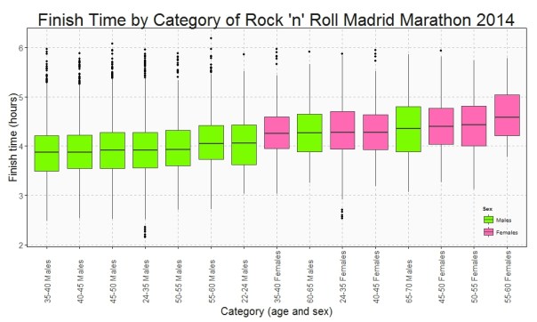
This is the Box plot of the finish time by category:

Finish Time

Who maintains the rhythm better? Since I have the time at the end and at the middle (21.097 km), I can do a Box plot with the variation time between first and second half of the Marathon:

Variation Time

Only a handful of people pull out of the Marathon before finishing but once again this rate is not the same between categories. This is the survival rate by category along the race:

Survival Rate

This plots show some interesting things:

  • Fastest category is 35-40 years old for both genders
  • Fastest individuals are inside 24-35 years old for both genders
  • Youngest ages are not the fastest
  • Between 40-45 category is the second fastest for men and the third one for women
  • Females between 40-45 keep the most constant rhythm of all categories.
  • Young men between 22-24 years old are the most unconstant: their second half rhythm is much slower than the first one.
  • All females between 55-60 years old ended the marathon
  • On the other hand, males between 60-65 are the category with most ‘deads’ during the race

Long life forties:

library(rvest)
library(lubridate)
library(ggplot2)
library(plyr)
library(sqldf)
library(scales)
library(gplots)
setwd("YOUR WORKING DIRECTORY HERE")
maraton_web="http://www.maratonmadrid.org/resultados/clasificacion.asp?carrera=13&parcial=par1&clasificacion=1&dorsal=&nombre=&apellidos=&pais=&pagina=par2"
#Grid with parameters to navigate in the web to do webscraping
searchdf=rbind(expand.grid( 1, 0:32), expand.grid( 2, 0:55), expand.grid( 3, 0:56), expand.grid( 4, 0:56),
               expand.grid( 5, 0:56), expand.grid( 6, 0:55), expand.grid( 7, 0:55), expand.grid( 8, 0:55),
               expand.grid( 9, 0:53), expand.grid(10, 0:55))
colnames(searchdf)=c("parcial", "pagina")
#Webscraping. I open the webpage and download the related table with partial results
results=data.frame()
for (i in 1:nrow(searchdf))
{
  maraton_tmp=gsub("par2", searchdf[i,2], gsub("par1", searchdf[i,1], maraton_web))
  df_tmp=html(maraton_tmp) %>% html_nodes("table") %>% .[[3]] %>% html_table()
  results=rbind(results, data.frame(searchdf[i,1], df_tmp[,1:7]))
}
#Name the columns
colnames(results)=c("Partial", "Place", "Bib", "Name", "Surname", "Cat", "Gross", "Net")
#Since downloadind data takes time, I save results in RData format
save(results, file="results.RData")
load("results.RData")
#Translate Net timestamp variable into hours
results$NetH=as.numeric(dhours(hour(hms(results$Net)))+dminutes(minute(hms(results$Net)))+dseconds(second(hms(results$Net))))/3600
results$Sex=substr(results$Cat, 3, 4)
#Translate Cat into years and gender
results$Cat2=revalue(results$Cat, 
                     c("A-F"="18-22 Females", "A-M"="18-22 Males", "B-F"="22-24 Females", "B-M"="22-24 Males", "C-F"="24-35 Females", "C-M"="24-35 Males", 
                       "D-F"="35-40 Females", "D-M"="35-40 Males", "E-F"="40-45 Females", "E-M"="40-45 Males", "F-F"="45-50 Females", "F-M"="45-50 Males", 
                       "G-F"="50-55 Females", "G-M"="50-55 Males", "H-F"="55-60 Females", "H-M"="55-60 Males", "I-F"="60-65 Females", "I-M"="60-65 Males", 
                       "J-F"="65-70 Females", "J-M"="65-70 Males", "K-F"="+70 Females", "K-M"="+70 Males"))
#Translate partial code into kilometers
results$PartialKm=mapvalues(results$Partial, from = c(1, 2, 3, 4, 5, 6, 7, 8, 9, 10), to = c(5, 10, 15, 20, 21.097, 25, 30, 35, 40, 42.195))
#There are some categories with very few participants. I will remove from the analysis
count(subset(results, Partial==10), "Cat")
#General options for ggplot
opts=theme(
  panel.background = element_rect(fill="gray98"),
  panel.border = element_rect(colour="black", fill=NA),
  axis.line = element_line(size = 0.5, colour = "black"),
  axis.ticks = element_line(colour="black"),
  panel.grid.major = element_line(colour="gray75", linetype = 2),
  panel.grid.minor = element_blank(),
  axis.text = element_text(colour="gray25", size=15),
  axis.title = element_text(size=20, colour="gray10"),
  legend.key = element_blank(),
  legend.background = element_blank(),
  plot.title = element_text(size = 32, colour="gray10"))
#Data set with finish times
results1=subset(results, Partial==10 & !(Cat %in% c("A-F", "A-M", "B-F", "I-F", "J-F", "K-F", "K-M")))
ggplot(results1, aes(x=reorder(Cat2, NetH, FUN=median), y=NetH)) + geom_boxplot(aes(fill=Sex), colour = "gray25")+
  scale_fill_manual(values=c("hotpink", "lawngreen"), name="Sex", breaks=c("M", "F"), labels=c("Males", "Females"))+
  labs(title="Finish Time by Category of Rock 'n' Roll Madrid Marathon 2014", x="Category (age and sex)", y="Finish time (hours)")+
  theme(axis.text.x = element_text(angle = 90, vjust=.5, hjust = 0), legend.justification=c(1,0), legend.position=c(1,0))+opts
#Data set with variation times
results2=sqldf("SELECT 
               a.Bib, a.Sex, b.Cat2, (a.NetH-2*b.NetH)*60 as VarMin
               FROM results1 a INNER JOIN results b ON (a.Bib = b.Bib AND b.Partial=5) order by VarMin asc")
ggplot(results2, aes(x=reorder(Cat2, VarMin, FUN=median), y=VarMin)) + geom_boxplot(aes(fill=Sex))+
  scale_fill_manual(values=c("hotpink", "lawngreen"), name="Sex", breaks=c("M", "F"), labels=c("Males", "Females"))+
  labs(title="Time Variation by Category Between First and Last Half\nof Rock 'n' Roll Madrid Marathon 2014", x="Category (age and sex)", y="Variation (minutes)")+
  theme(axis.text.x = element_text(angle = 90, vjust=.5, hjust = 0), legend.justification=c(1,0), legend.position=c(1,0))+opts
 
results3_tmp1=expand.grid(Cat2=unique(results$Cat2), PartialKm=unique(results$PartialKm))
results3_tmp2=sqldf("SELECT Bib, Sex, Cat2, Max(PartialKm) as PartialKmMax FROM results 
                   WHERE Cat NOT IN ('A-F', 'A-M', 'B-F', 'I-F', 'J-F', 'K-F', 'K-M') GROUP BY 1,2,3")
results3_tmp3=sqldf("SELECT PartialKmMax, Sex, Cat2, COUNT(*) AS Runners FROM results3_tmp2 GROUP BY 1,2,3")
results3_tmp4=sqldf("SELECT a.Cat2, a.PartialKm, SUM(Runners) as Runners FROM results3_tmp1 a INNER JOIN results3_tmp3 b
                    on (a.Cat2 = b.Cat2 AND b.PartialKmMax>=a.PartialKm) 
                    GROUP BY 1,2")
#Data set with survival rates
results3=sqldf("SELECT a.Cat2, a.PartialKm, a.Runners*1.00/b.Runners*1.00 as Po_Survivors
               FROM results3_tmp4 a INNER JOIN (SELECT Cat2, COUNT(*) as Runners FROM results3_tmp2 GROUP BY 1) b
               ON (a.Cat2 = b.Cat2)")
ggplot(results3, aes(x=PartialKm, y=Po_Survivors, group=Cat2, colour=Cat2)) + geom_line(lwd=3)+
  scale_color_manual(values=alpha(rich.colors(15, palette="temperature"), 0.3), name="Category")+
  scale_x_continuous(breaks = unique(results3$PartialKm), labels=c("5", "10", "15", "20", "21.097", "25", "30", "35", "40", "42.195"))+
  scale_y_continuous(labels = percent)+
  labs(title="Survival Rate by Category of Rock 'n' Roll Madrid Marathon 2014", x="Kilometer", y="% of survivors")+
  theme(axis.text.x = element_text(angle = 90, vjust=.5, hjust = 0), legend.justification=c(1,0), legend.position=c(.15,0))+opts