Each of us has their own mappa mundi (Gala, my indispensable friend)
The harmonograph is a mechanism which, by means of several pendulums, draws trajectories that can be analyzed not only from a mathematical point of view but also from an artistic one. In its double pendulum version, one pendulum moves a pencil and the other one moves a platform with a piece of paper on it. You can see an example here. The harmonograph is easy to use: you only have to put pendulums into motion and wait for them to stop. The result are amazing undulating drawings like this one:
 First harmonographs were built in 1857 by Scottish mathematician Hugh Blackburn, based on the previous work of French mathematician Jean Antoine Lissajous. There is not an unique way to describe mathematically the motion of the pencil. I have implemented the one I found in this sensational blog, where motion in both x and y axis depending on time is defined by:
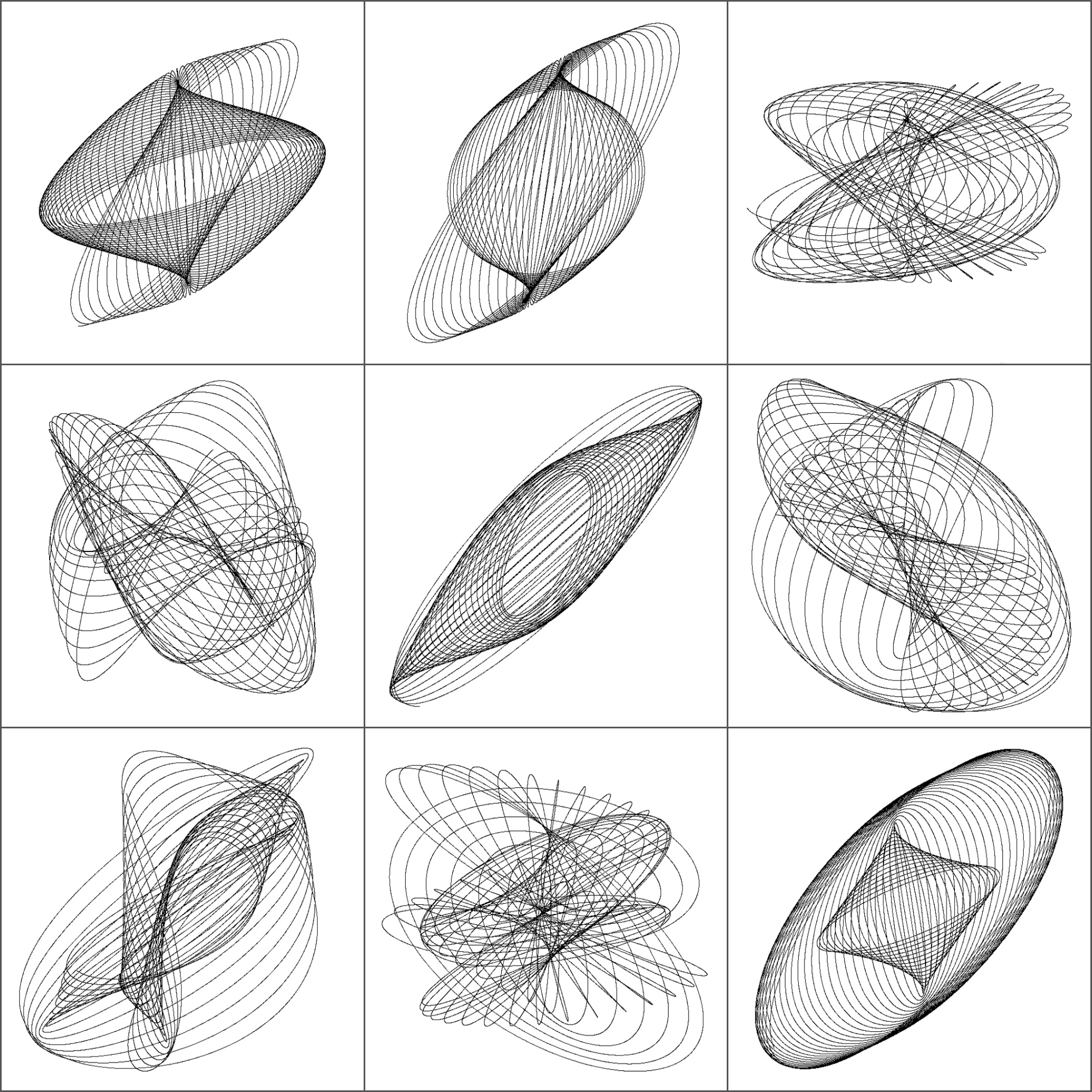
I initialize parameters randomly so every time you run the script, you obtain a different output. Here is a mosaic with some of mine:

This is the code to simulate the harmonograph (no extra package is required). If you create some nice work of art, I will be very happy to admire it (you can find my email here):
f1=jitter(sample(c(2,3),1));f2=jitter(sample(c(2,3),1));f3=jitter(sample(c(2,3),1));f4=jitter(sample(c(2,3),1))
d1=runif(1,0,1e-02);d2=runif(1,0,1e-02);d3=runif(1,0,1e-02);d4=runif(1,0,1e-02)
p1=runif(1,0,pi);p2=runif(1,0,pi);p3=runif(1,0,pi);p4=runif(1,0,pi)
xt = function(t) exp(-d1*t)*sin(t*f1+p1)+exp(-d2*t)*sin(t*f2+p2)
yt = function(t) exp(-d3*t)*sin(t*f3+p3)+exp(-d4*t)*sin(t*f4+p4)
t=seq(1, 100, by=.001)
dat=data.frame(t=t, x=xt(t), y=yt(t))
with(dat, plot(x,y, type="l", xlim =c(-2,2), ylim =c(-2,2), xlab = "", ylab = "", xaxt='n', yaxt='n'))
Amazing
Great post!
I made an alternative with the time colored in rainbow scale and you can see the harmonogram (is that the word?) actually growing:
f1=jitter(sample(c(2,3),1));f2=jitter(sample(c(2,3),1));f3=jitter(sample(c(2,3),1));f4=jitter(sample(c(2,3),1))
d1=runif(1,0,1e-02);d2=runif(1,0,1e-02);d3=runif(1,0,1e-02);d4=runif(1,0,1e-02)
p1=runif(1,0,pi);p2=runif(1,0,pi);p3=runif(1,0,pi);p4=runif(1,0,pi)
xt = function(t) exp(-d1*t)*sin(t*f1+p1)+exp(-d2*t)*sin(t*f2+p2)
yt = function(t) exp(-d3*t)*sin(t*f3+p3)+exp(-d4*t)*sin(t*f4+p4)
t=seq(1, 100, by=.001)
dat=data.frame(t=t, x=xt(t), y=yt(t))
COL <- rainbow(nrow(dat))
plot(dat$x, dat$y, type = "n", xlim =c(-2,2), ylim =c(-2,2), xlab = "", ylab = "", xaxt='n', yaxt='n')
for (i in 1:nrow(dat)) points(dat$x[i], dat$y[i], col = COL[i], pch = 16, cex = 0.2)
Cheers, Andrej
It’s nice! I like it! The next step is to control time to avoid the way R has to throw points in “buckets”. Do you want to try? 🙂 Thank you very much!
No prob! Just flush the graphic device after each point;
for (i in 1:nrow(dat)) {
points(dat$x[i], dat$y[i], col = COL[i], pch = 16, cex = 0.2)
dev.flush()
}
Very nice and interesting!
For the kind of parametric orientation of the problem, you could program a Shiny app to play with them…
Someone have done it already. Look:
https://rstudio-pubs-static.s3.amazonaws.com/36247_ef68afd7b819458f8511052c21284beb.html#/
I am just discovering this very old post. By now I am sure you’ve extended this to 3D.
If not:
library(plotly)
f1=jitter(sample(c(2,3),1));f2=jitter(sample(c(2,3),1));f3=jitter(sample(c(2,3),1));f4=jitter(sample(c(2,3),1));
f5=jitter(sample(c(2,3),1));f6=jitter(sample(c(2,3),1))
d1=runif(1,0,1e-02);d2=runif(1,0,1e-02);d3=runif(1,0,1e-02);d4=runif(1,0,1e-02);d5=runif(1,0,1e-02);d6=runif(1,0,1e-02)
p1=runif(1,0,pi);p2=runif(1,0,pi);p3=runif(1,0,pi);p4=runif(1,0,pi);p5=runif(1,0,pi);p6=runif(1,0,pi)
xt = function(t) exp(-d1*t)*sin(t*f1+p1)+exp(-d2*t)*sin(t*f2+p2)
yt = function(t) exp(-d3*t)*sin(t*f3+p3)+exp(-d4*t)*sin(t*f4+p4)
zt = function(t) exp(-d5*t)*sin(t*f5+p5)+exp(-d6*t)*sin(t*f6+p6)
t=seq(1, 200, by=.001)
dat=data.frame(t=t, x=xt(t), y=yt(t), z = zt(t))
color_samp%
add_paths(line = list(color = color_samp, linesize = 0.1)) %>%
layout(scene = list(xaxis = list(title = ”, autorange = TRUE, showgrid = FALSE, zeroline = FALSE, showline = FALSE, autotick = TRUE, ticks = ”, showticklabels = FALSE),
yaxis = list(title = ”, autorange = TRUE, showgrid = FALSE, zeroline = FALSE, showline = FALSE, autotick = TRUE, ticks = ”, showticklabels = FALSE),
zaxis = list(title = ”, autorange = TRUE, showgrid = FALSE, zeroline = FALSE, showline = FALSE, autotick = TRUE, ticks = ”, showticklabels = FALSE)
)
)
I’ve come up with some beautiful patterns. Thank you for the inspiration.